Lecture 16
Color
Today's Topics
Today’s lecture is about choosing colors for a user interface. We’ll discuss some of the properties of human vision that affect this decision, particularly the limitations of color vision. We’ll go over some models for representing colors, not just the familiar RGB model. And we’ll discuss some guidelines for choosing colors. The most important guidelines will be applications of rules we already discussed in graphic design: simplicity as much as possible, contrast where important.
A good reference about color is Colin Ware, Information Visualization: Perception for Design, Morgan Kaufmann, 2000.
UI Hall of Fame or Shame?


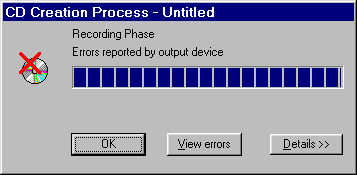
Source: UI Hall of Shame
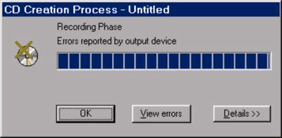
Our Hall of Shame candidate for the day is this dialog box from Adaptec Easy CD Creator, which appears at the end of burning a CD. The top image shows the dialog when the CD was burned successfully; the bottom image shows what it looks like when there was an error.
What does the squint test tell you about these dialogs? How could they use the color visual variable better?
Human Vision
The Eye
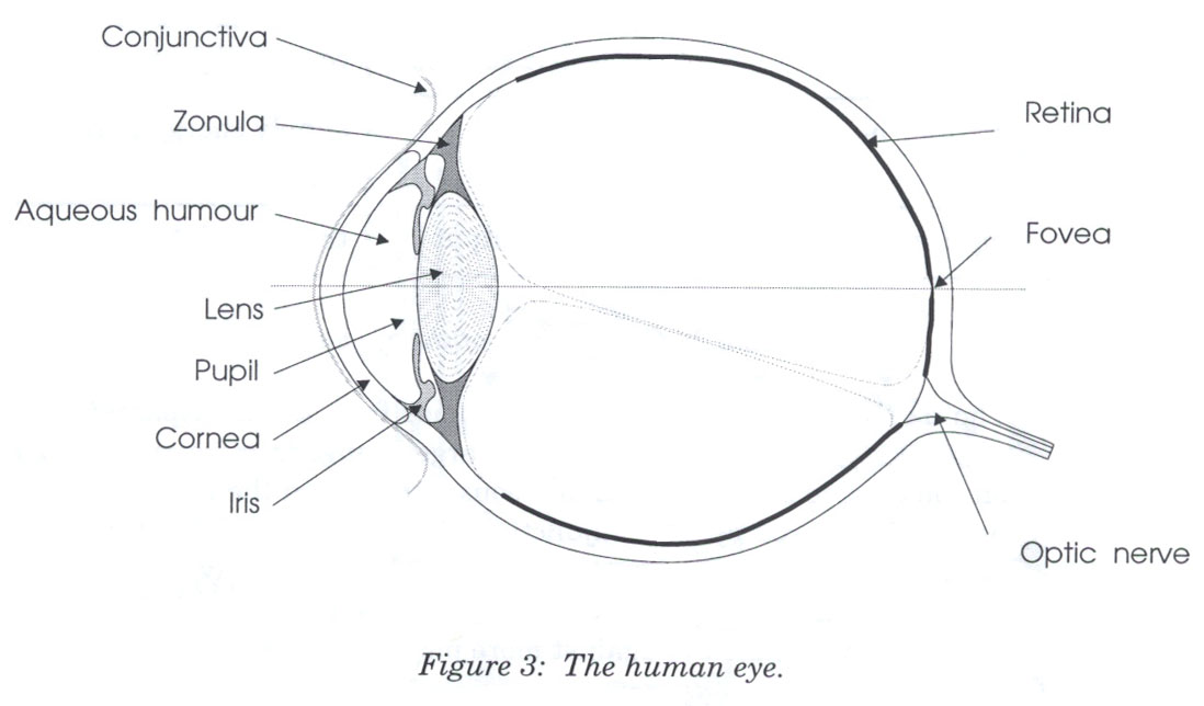
Source: Lilley, Lin, Hewitt, & Howard, “Colour in Computer Graphics”, University of Manchester.
Here are key parts of the anatomy of the eye:
- The cornea is the transparent, curved membrane on the front of the eye.
- The aqueous humor fills the cavity between the cornea and the lens, and provides most of the optical power of the eye because of the large difference between its refractive index and the refractive index of the air outside the cornea.
- The iris is the colored part of the eye, which covers the lens. It is an opaque muscle, with a hole in the center called the pupil that lets light through to fall on the lens. The iris opens and closes the pupil depending on the intensity of light; it opens in dim light, and closes in bright light.
- The lens focuses light. Under muscle control, it can move forward and backward, and also get thinner or fatter to change its focal length.
- The retina is the surface of the inside of the eye, which is covered with light-sensitive receptor cells.
- The fovea is the spot where the optical axis (center of the lens) impinges on the retina. The highest density of photoreceptors can be found in the fovea; the fovea is the center of your visual field.
There are two kinds of photoreceptor cells in the retina. Rods operate under low-light conditions – night vision. There is only one kind of rod, with one frequency response curve centered in green wavelengths, so rods don’t provide color vision. Rods saturate at moderate intensities of light, so they contribute little to daytime vision. Cones respond only in brighter light. There are three kinds of cones, called S, M, and L after the centers of their wavelength peaks. S cones have very weak frequency response centered in blue. M and L cones are two orders of magnitude stronger, and their frequency response curves nearly overlap.
Rods & Cones
- Cones are mostly in the center of the eye.
- Rods are mostly on the edges.
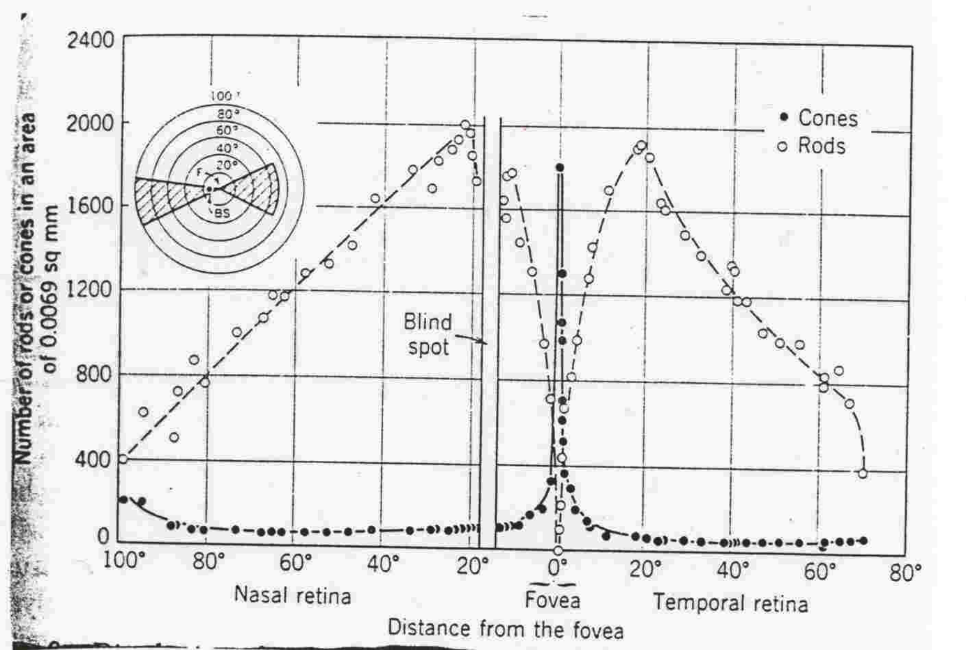
Rods and cones aren’t distributed evenly in the eye.
Most of the cones are in the center, most of the rods are on the edge.
Rods, since they’re on the edge and pick up very coarse-grained information, are what we use for most of our peripheral vision. In fact, if you’re trying to spot shooting stars at night, you often pick out more things in your peripheral vision.
You can also see the blind spot in this poorly-scanned photo. The blind spot is where the optic nerve is located on the back of the eye.
The rods and cones do not send their signals directly to the visual cortex; instead, the signals are recombined into three channels. One channel is brightness, produced by the M and L cones and the rods. This is the only channel really active at night. The other two channels convey color differences, red-green and blue-yellow. For the red-green channel, for example, high responses mean red, and low responses indicate green.
These difference channels drive the theory of opponent colors: red and green are good contrasting colors because they drive the red-green channel to opposite extremes. Similarly, black/white and blue/yellow are good contrasting pairs.
Color deficiency (“color blindness”) affects a significant fraction of human beings. An overwhelming number of them are male.
There are three kinds of color deficiency, which we can understand better now that we understand a little about the eye’s anatomy:
- Protanopia is missing or bad L cones. The consequence is reduced sensitivity to red-green differences (the L-M channel is weaker), and reds are perceived as darker than normal.
- Deuteranopia is caused by missing or malfunctioning M cones. Red-green difference sensitivity is reduced, but reds do not appear darker.
- Tritanopia is caused by missing or malfunctioning S cones, and results in blue-yellow insensitivity.
Red/green color blindness affects about 8% of males and 0.4% of females; blue/yellow color blindness is much much rarer.
But since color blindness affects so many people, it is essential to take it into account when you are deciding how to use color in a user interface. Don’t depend solely on color distinctions, particularly red-green distinctions, for conveying information. Microsoft Office applications fail in this respect: red wavy underlines indicate spelling errors, while identical green wavy underlines indicate grammar errors.
Traffic lights are another source of problems. How do red-green color-blind people know whether the light is green or red? Fortunately, there’s a spatial cue: red is always above (or to the right of) green. Protanopia sufferers (as opposed to deuteranopians) have an additional advantage: the red light looks darker than the green light.
Color Blindness
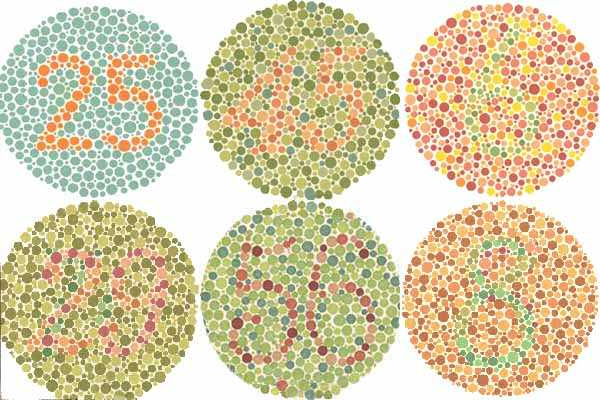
One of the most common ways to detect colorblindness is using the Ishihara plates. Let’s look at a few – can you see the numbers hidden in each of the circles? These test red-green colorblindness.
If you’re colorblind, you can’t see the bottom of the left pair, the top of the middle pair, and neither of the right pair.
Color Blindness
There are online tools for checking your interface against various kinds of color blindness; one good one is Vischeck.
Henry Sturman is a red-green colorblind software developer who has written a good article about what it’s like.
Above, we can see the hall of fame or shame example.
Color Blindness
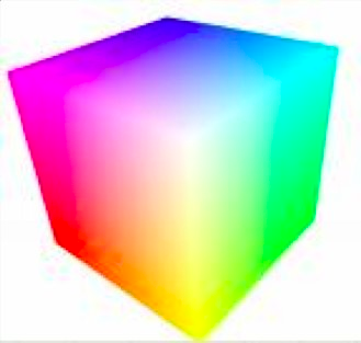
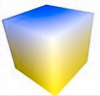
And this cube of colors basically loses the red and green!
Chromatic Aberration
- Different wavelengths focus differently
- Highly separated wavelengths (red & blue) can’t be focused simultaneously
- Guideline: don’t use red-on-blue text
- It looks fuzzy and hurts to read
The refractive index of the lens varies with the wavelength of the light passing through it; just like a prism, different wavelengths are bent at different angles. So your eye needs to focus differently on red features than it does on blue features.
As a result, an edge between widely-separated wavelengths – like blue and red – simply can’t be focused. It always looks a little fuzzy. So blue-on-red or red-on-blue text is painful to read, and should be avoided at all costs.
Apple’s ForceQuit tool in Mac OS X, which allows users to shut down misbehaving applications, unfortunately fell into this trap. In the dialog, unresponding applications are helpfully displayed in red. But the selection is a blue highlight. The result is incredibly hard to read.
Here’s an experiment you can try to demonstrate chromatic aberration. Put a small purple dot on a piece of paper. Hold it close to your eye; it should look blue in the center, surrounded by a red halo. Then move it farther away; the colors should switch places, so that red is in the center and blue is the halo.
A number of anatomical details conspire to make blue a bad color choice when small details matter.
First, the fovea has very few S cones, so you can’t easily see blue features in the center of your vision (unless they have high contrast with the background, activating the M and L cones).
Second, older eyes are far less sensitive to blue, because the lens and aqueous humor slowly grow yellower, filtering out the blue wavelengths.
Finally, the lens gets weaker with age. Blue is at one extreme of its focusing range, so older eyes can’t focus blue features as well.
As a result, avoid blue text, particularly small blue text.
Color Constancy
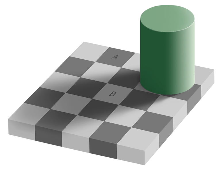
Color constancy is another phenomenon that can modify our color perceptions.
You’ve probably seen this image before. The color of A and the color of B are identical, but our brain sees them as different because of the shadow. We perceive colors as constant, if we have reason to, even if they are under different light.
Color Constancy
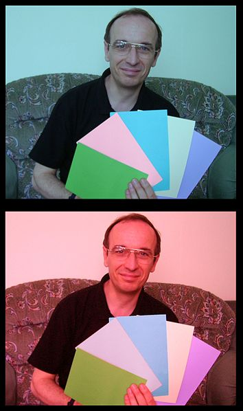
You can see an example of this in these two images. Do any of those sheets of paper look like the same color?
We see the red lighting of the second picture and adapt our assumptions about the colors accordingly. In reality, the second sheet from the left is the same color in both pictures.
We can explore this using an eyedropper tool or the Digital Color Meter in OS X or your OS.
Color Constancy
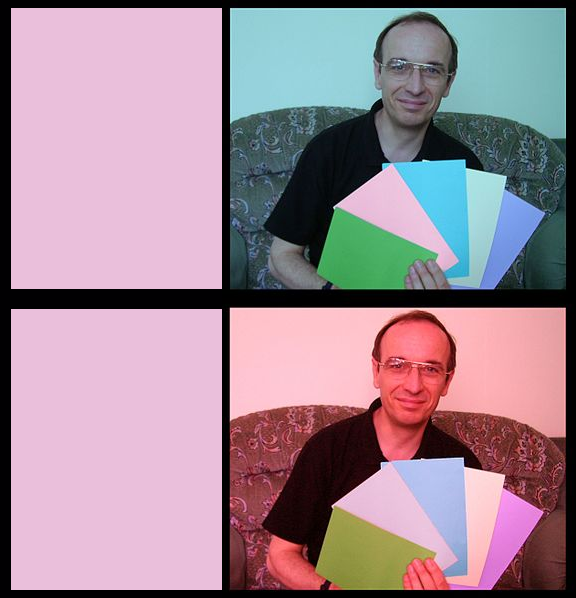
These two rectangles are rectangles made (using the eyedropper in color selection) from the second sheet from each photo.
Source: Sploid
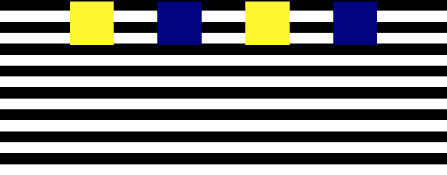
These four squares are all actually moving at the same speed. Your eye has more trouble distinguishing the blue from the black, so the blue squares appear to be moving in a jerky fashion.
Color Models
Color Models
- Red-Green-Blue (RGB)
- Red: 0% - 100%
- Green: 0% - 100%
- Blue: 0% - 100%
- Cyan-Magenta-Yellow (CMYK)
- Used for printing
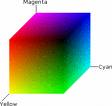
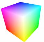
Now let’s look at how colors are represented in GUI software. At the lowest level, the RGB model rules. The RGB model is a unit cube, with (0,0,0) corresponding to black, (1, 1, 1) corresponding to white, and the three dimensions measuring levels of red, green, and blue. The RGB model is used directly by CRT and LCD monitors for display, since each pixel in a monitor has separate red, green, and blue components.
The CMYK (cyan, magenta, yellow, and sometimes black) is similar to the RGB model, but used for print colors, where pigments absorb wavelengths instead of generating them. K stands for key.
More Color Models
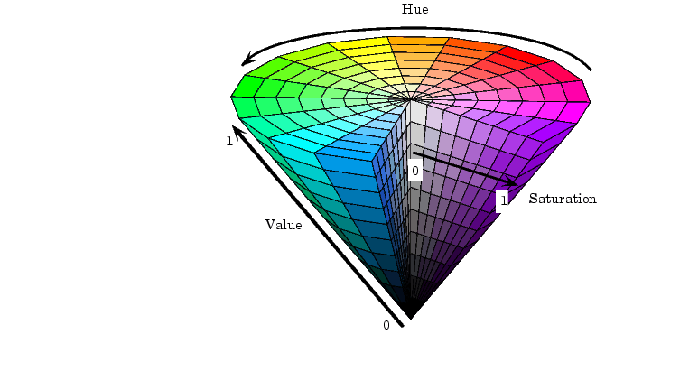
- Hue-Saturation-Value (HSV)
- Hue is wavelength of color
- Saturation is amount of pure color
- 0% = gray, 100% = pure
- Value is brightness
- 0% = dark, 100% = bright
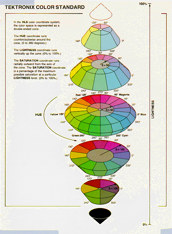
- Hue-Lightness-Saturation (HLS)
- White has lightness 1.0
- Pure colors have lightness 0.5
HSV (hue, saturation value) is a better model for how humans perceive color, and more useful for choosing colors in user interface design. HSV is a cone. We’ve already encountered hue and value in our discussion of visual variables. Saturation is the degree of color, as opposed to grayness. Colors with zero saturation are shades of gray; colors with 100% saturation are pure colors.
HLS (hue, lightness, saturation) is a symmetrical relative of the HSV model, which is elegant. It basically pulls up the center of the HSV cone to make a double-ended cone.
Many applications have a color picker that lets you pick HSV values as an alternative to RGB.
Here’s a fun website that helps you test your color matching skills across hue, saturation, and value.
Obtaining Accurate Color
Although RGB and HSV are commonly used for implementing graphical user interfaces, they are not in fact standardized. The way that a color like pure red (RGB=1,0,0) actually looks depends strongly on the display’s characteristics, so your application can’t be sure it will get exactly the right color.
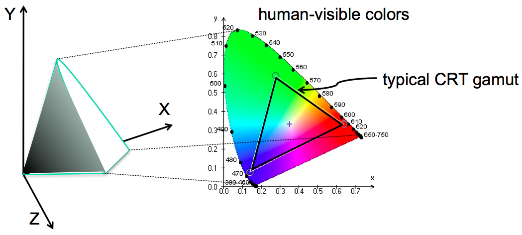
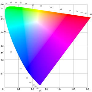
The science of colorimetry is concerned with accurate measurement and reproduction of color. Most of it is outside the scope of this course, but here are a few things you should know. Colorimetry starts with a 3D space based on three primary colors, called XYZ, chosen so that all human-visible colors are bounded within the positive octant – so that any visible color can be made as a mix of positive amounts of X, Y, and Z. The solid area on the left shows the visible colors perceivable to the human eye; black is of course at the origin. Note that X, Y, and Z are imaginary colors in the sense that they cannot be produced by a physical light source or perceived by the human eye; but they’re useful bases for the space, much like imaginary numbers are useful. To consider hue and saturation in isolation, we look at a plane of constant intensity, shown on the right.
The wedge-shaped figure shows the whole space of human-perceivable colors (with fully-saturated, pure-wavelength colors around its perimeter).
Obtaining Accurate Color
Any given display device can produce some triangle of colors on this plane (called the device’s gamut), where the corners are the three colors used by the device as its primary colors – e.g., the exact colors of red, green, and blue in a CRT’s phosphors. The triangle here shows a typical cathode-ray television’s gamut. Devices with different gamuts will produce different colors from the same RGB value. This problem can be addressed by calibrating the display device, producing an ICC profile that specifies how the device’s RGB space maps into a standardized space like XYZ.
Different devices have different gamuts, so if you make something that uses a specific range of colors, some devices may not be able to see this.
Color Gamuts and YOU
Different devices have different gamuts, so if you make something that uses a specific range of colors, some devices may not be able to see this.
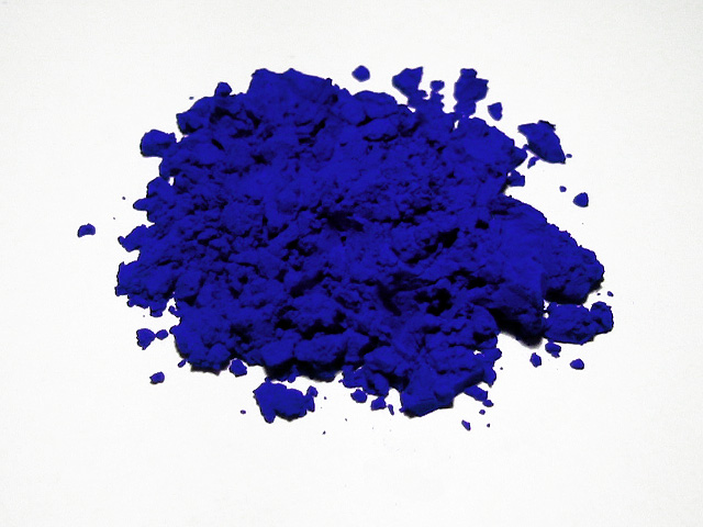
This is a picture of some ultramarine pigment, which is my favorite color, International Klein Blue. While the picture looks pretty intense, odds are good it’s not actually reproducing what it looks like in person, because it’s outside of the gamut of my computer. The projector doesn’t help either – and if you look at it on your computer it probably looks slightly different too.
Other Color Spaces
This is a comparison of the CIE 1931 model on the top, and the CIE LUV model on the bottom.
CIE is the International Committee on Illumination. The new model, which is one of two current standards, is easier to compute, and is used more frequently in computer graphics. One of the goals of this new model was to have the sizes of each area better conform to our perceptual mappings.
Other standardized color spaces exist. One drawback of XYZ is that it’s not perceptually uniform – green occupies a huge chunk at the top of the wedge, while yellow is a narrow little line; it would be preferable if the distance in color space produced the same difference in perception in both areas. LUV is an alternative model that addresses that by distorting the projection. But neither XYZ or LUV is particularly useful for programming because they’re imaginary colors; sRGB aims to fix that by standardizing the RGB color space instead.
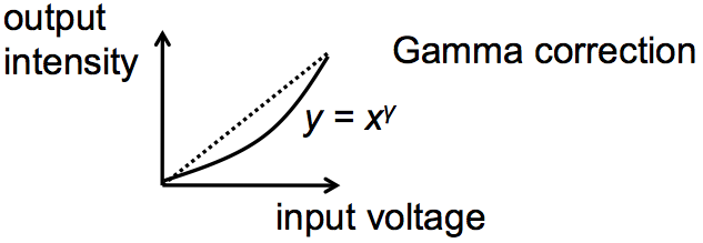
Another issue in accurate color reproduction is the intensity (value) of the color. Different display devices have different response curves. When the red component of an RGB value (0-1) is mapped directly to a voltage applied to an electron gun, the intensity of light produced does not vary linearly from 0 to 1, but typically follows a power curve (y=xgamma, for some gamma > 1). Gamma correction is the process of standardizing the intensity so that a linear response is obtained.
All these issues also apply to cameras as well as displays, of course. Cameras have gamuts (for the hues and saturations they can record) and response curves (to intensity) that require calibration and correction. To learn more about human perception and color, take 6.098/6.882 Computational Photography.
Design Guidelines
Avoid Saturated Colors
In general, avoid strongly saturated colors – i.e., the colors around the outside edge of the HSV cone. Saturated colors can cause visual fatigue because the eye must keep refocusing on different wavelengths. They also tend to saturate the viewer’s receptors (hence the name). One study found that air traffic controllers who viewed strongly saturated green text on their ATC interfaces for many hours had trouble seeing pink or red (the other end of the red/green color channel) for up to 15 minutes after their shift was over.
Use less saturated, “pastel” colors instead, which mix gray or white into the pure color.
The examples on top use colors with high saturation; on the bottom, low saturation. Shades of gray have minimum saturation.
Saturating one color in your vision can have a temporary effect on your perception of other colors. Think of when you take off colored sunglasses, for instance. You can use this to change perception in cool ways – for instance, making grass look greener – but it can also be detrimental.
To see what this feels like, look at a full screen of bright red for a little bit. Then look at a full screen of green. The green that you see will be more green than you can normally perceive, because your red-perceiving cones won’t be firing at all. This green is an imaginary color. It’s visible light, but it’s greener than the range of normal human vision.
Use Few Colors


In general, colors should be used sparingly. An interface with many colors appears more complex, more cluttered, and more distracting. Use only a small number of different hues.
The toolbar on top uses too many colors (many of them highly saturated), so none of the buttons stand out, and the toolbar feels hard to scan. In contrast, the toolbar at the bottom uses only a handful of colors. It’s more restful to look at, and the buttons that actually use color (like the Open File button) really pop out.
A simple and very effective color scheme uses just one hue (like blue or green, weakly saturated and in various values), combined with black, white, and shades of gray. On top of a scheme like that, a bit of red in an icon will pop out wonderfully.
Background Colors
Background colors should establish a good contrast with the foreground. White is a good choice, since it provides the most contrast; but it also produces bright displays, since our computer displays emit light rather than reflecting it. Pale (desaturated) yellow and very light gray are also good background colors. Dark backgrounds are tricky; it’s too easy to mess up the contrast and make text less legible, as shown in this example.
Be Consistent with Expectations
Finally, match expectations. One of the problems with the Adaptec dialogs at the beginning of this lecture was the use of red for OK. Red generally means stop, warning, error, or hot. Green conventionally means go, or OK. Yellow means caution, or slow.
(But note that these conventional meanings for colors are culturally dependent, and what works in Western cultures may not work for all users.)
Given all these rules about what colors not to choose, what colors should you choose? There are no hard-and-fast rules here, but there are a few heuristics. The first heuristic is an old standby – use color schemes that seem to work well for other interfaces on the desktop or the web. There are several tools you can use to probe your web browser (Firebug for Firefox) or desktop screen (EclipsePalette for Windows, Digital Color Meter for Mac) to determine what color is being used by a particular display element.
Another effective heuristic is to find a photograph of a natural scene that looks appealing to you, and extract colors from it (using the same tools, or using the eyedropper tool in a paint program). The intuitive basis for this heuristic is that our visual systems evolved to easily perceive and appreciate the natural world.
Keep your choices simple. You can’t go far wrong by choosing one weakly saturated color and a few shades of gray. As soon as you choose two colors, however, you run the risks of an aesthetic clash between them; it’s good to get some other opinions on your choice, particularly if you might be somewhat colorblind yourself.
There are also some sites out there that help you choose colors. ColourLovers is a large collection of user-contributed color schemes, with ratings and votes. The NASA Color Tool helps select a palette of colors using HLS and view them side-by-side on sample data.