Lecture 1
Usability
Today's Topics
UI Hall of Fame and Shame
Usability is about creating effective user interfaces (UIs). Slapping a pretty window interface on a program does not automatically confer usability on it.
This example shows why.
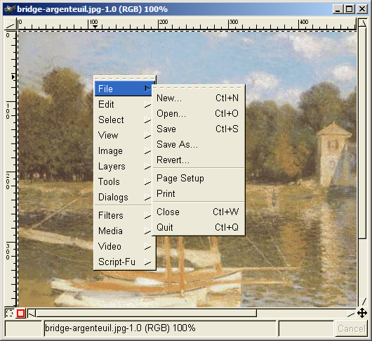
User Interface Hall of Shame
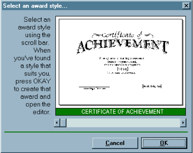
Source: Interface Hall of Shame
This dialog box, which appeared in a program that prints custom award certificates, presents the task of selecting a template for the certificate. This interface is clearly graphical. It’s mouse-driven—no memorizing or typing complicated commands. It’s even what-you-see-is-what-you-get (WYSIWYG)—the user gets a preview of the award that will be created.
So why isn’t it usable?
The first clue that there might be a problem here is the long help message on the left side. Why so much help for a simple selection task? Because the interface is bizarre! The scrollbar is used to select an award template.
Each position on the scrollbar represents a template, and moving the scrollbar back and forth changes the template shown.
This is a cute but poor use of a scrollbar. Notice that the scrollbar doesn’t have any marks on it. How many templates are there? How are they sorted? How far do you have to move the scrollbar to select the next one? You can’t even guess from this interface.
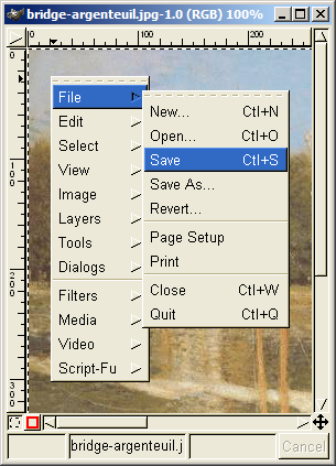
User Interface Hall of Shame
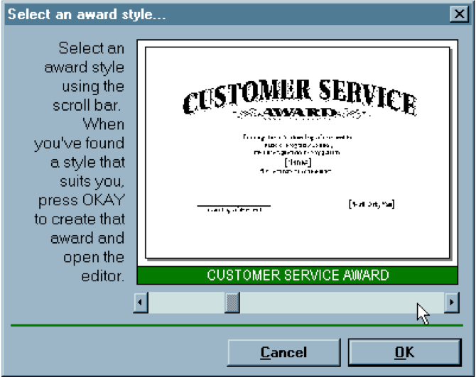
Source: Interface Hall of Shame
Normally, a horizontal scrollbar underneath an image (or document, or some other content) is designed for scrolling the content horizontally. A new or infrequent user looking at the window sees the scrollbar, assumes it serves that function, and ignores it. Inconsistency with prior experience and other applications tends to trip up new or infrequent users.
Another way to put it is that the horizontal scrollbar is an affordance for continuous scrolling, not for discrete selection. We see affordances out in the real world, too; a door knob says “turn me”, a handle says “pull me”.
We’ve all seen those apparently-pullable door handles with a little sign that says “Push”; and many of us have had the embarrassing experience of trying to pull on the door before we notice the sign. The help text on this dialog box is filling the same role here.
But the dialog doesn’t get any better for frequent users, either. If a frequent user wants a template they’ve used before, how can they find it? Surely they’ll remember that it’s 56% of the way along the scrollbar? This interface provides no shortcuts for frequent users. In fact, this interface takes what should be a random access process and transforms it into a linear process. Every user has to look through all the choices, even if they already know which one they want. The computer scientist in you should cringe at that algorithm.
Even the help text has usability problems. “Press OKAY”? Where is that? And why does the message have a ragged left margin? You don’t see ragged left too often in newspapers and magazine layout, and there’s a good reason.
On the plus side, the designer of this dialog box at least recognized that there was a problem—hence the help message. But the help message is indicative of a flawed approach to usability.
Usability can’t be left until the end of software development, like package artwork or an installer. It can’t be patched here and there with extra messages or more documentation. It must be part of the process, so that usability bugs can be fixed, instead of merely patched.
How could this dialog box be redesigned to solve some of these problems?
The Example, Redesigned

Source: Interface Hall of Shame
Here’s one way it might be redesigned. The templates now fill a list box on the left; selecting a template shows its preview on the right. This interface suffers from none of the problems of its predecessor: list boxes clearly afford selection to new or infrequent users; random access is trivial for frequent users. And no help message is needed.
More UI Hall of Shame
Source: Interface Hall of Shame
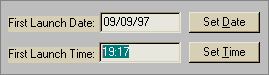
Here’s another bizarre interface, taken from a program that launches housekeeping tasks at scheduled intervals.
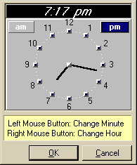
The date and time look like editable fields (affordance), but you can’t edit them with the keyboard. Instead, if you want to change the time, you have to click on the Set Time button to bring up a dialog box.
This dialog box displays time differently, using 12-hour time (7:17 pm) where the original dialog used 24-hour time (consistency). Just to increase the confusion, it also adds a third representation, an analog clock face.
So how is the time actually changed? By clicking mouse buttons: clicking the left mouse button increases the minute by 1 (wrapping around from 59 to 0), and clicking the right mouse button increases the hour. Sound familiar? This designer has managed to turn a sophisticated graphical user interface, full of windows, buttons, and widgets, and controlled by a hundred-key keyboard and two-button mouse, into a clock radio!
Perhaps the worst part of this example is that it’s not a result of laziness. Somebody went to a lot of effort to draw that clock face with hands. If only they’d spent some of that time thinking about usability instead.
Why UI Design is Hard
UI Hall of Fame or Shame?
Gimp is an open-source image editing program, comparable to Adobe Photoshop. Gimp’s designers made a strange choice for its menus. Gimp windows have no menu bar. Instead, all Gimp menus are accessed from a context menu, which pops up on right-click.
This is certainly inconsistent with other applications, and new users are likely to stumble trying to find, for example, the File menu, which never appears on a context menu in other applications. (I certainly stumbled as a new user of Gimp.) But Gimp’s designers were probably thinking about expert users when they made this decision. A context menu should be faster to invoke, since you don’t have to move the mouse up to the menu bar. A context menu can be popped up anywhere. So it should be faster. Right?
Wrong. With Gimp’s design, as soon as the mouse hovers over a choice on the context menu (like File or Edit), the submenu immediately pops up to the right. That means, if I want to reach an option on the File menu, I have to move my mouse carefully to the right, staying within the File choice, until it reaches the File submenu. If my mouse ever strays into the Edit item, the File menu I’m aiming for vanishes, replaced by the Edit menu. So if I want to select File/Quit, I can’t just drag my mouse in a straight line from File to Quit—I have to drive into the File menu, turn 90 degrees and then drive down to Quit! Hierarchical submenus are actually slower to use than a menu bar.
Part of the problem here is the way GTK (the UI toolkit used by Gimp) implements submenus. Changing the submenu immediately is probably a bad idea. Microsoft Windows does it a little better—you have to hover over a choice for about half a second before the submenu appears, so if you veer off course briefly, you won’t lose your target. But you still have to make that right-angle turn.
Apple Macintosh does even better: when a submenu opens, there’s a triangular zone, spreading from the mouse to the submenu, in which the mouse pointer can move without losing the submenu. So you can drive diagonally toward Quit without losing the File menu, or you can drive straight down to get to the Edit menu instead. Gimp’s designers made a choice without fully considering how it interacted with human capabilities. We’ll see that there are some techniques and principles that we can use to predict how decisions like this will affect a user interface—and we’ll also see how we can measure and evaluate the actual effects.
UI Hall of Fame or Shame?
There’s another interesting design feature in Gimp’s menus—well-intentioned and clever, but problematic in practice. Suppose my mouse is halfway down the File menu when I notice that the Quit command actually has a keyboard shortcut: Ctrl-Q. Great! So I press it.
But it doesn’t invoke the Quit command. Instead, it changes the shortcut of whatever command my mouse is hovering over—in this case, Save—to Ctrl-Q. This is a mode: a state of the system in which a user action has a different meaning than it does in other states. Modes may be inevitable in user interfaces, but mode errors—using the action in the wrong mode, so it does something you don’t intend—do not have to be inevitable.
Worse, it’s not an easy error to undo. (Pressing Ctrl-Z, the conventional undo shortcut, only makes it worse!) I have to reassign the old shortcut to the Save command—if I can remember the original shortcut. Then I have find the command whose original shortcut was Ctrl-Q, and restore that one as well. This error wasn’t easily recoverable.
Gimp’s designers had a terrific idea here—making it easy to assign keyboard shortcuts by just pointing at the menu item you want to change and pressing the shortcut. That’s simple and elegant, in fact far simpler than most customization interfaces. But they’ve given us too much rope, and it’s easy to hang ourselves. This interface isn’t safe to use.
UI Hall of Fame or Shame?
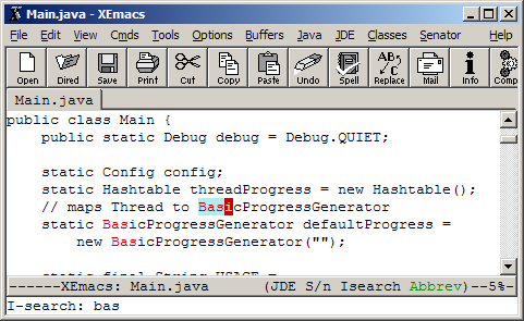
In Emacs, Ctrl-S starts an incremental search. This is a well-designed feature. it’s highly *responsive: updates as fast as the user can type * it’s easily and obviously **reversible: press Backspace if you made a mistake * it provides immediate feedback about what it’s doing * successful searches may even achieve early success: only 3 letters was enough to find BasicProgressGenerator, and I could instantly tell that it was enough * user gets early feedback about typos and failed searches
What’s the downside? All its controls are invisible. How do you start the incremental search? How do you search again? How do you go backwards? How do you do a case-sensitive search?
Once learned, however, these commands are simple. Ctrl-S starts the search. Pressing Ctrl-S again looks for a later match. (But now there is the possibility of mode error!) Pressing Ctrl-R looks backwards for a previous match. (What does Backspace do?) Using any capitalized letters in your query forces a case-sensitive search. (But how do I search for an all-lowercase string case-sensitively?)
UI Hall of Fame or Shame?
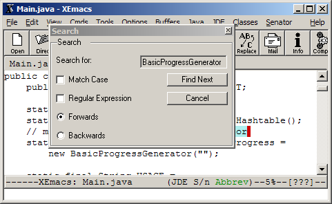
XEmacs has menus (the original Emacs didn’t). Alas, XEmacs isn’t interested in helping users learn incremental search. Instead, it pops up this conventional Find dialog, which scores great on visibility, but lacks the responsiveness, easy reversibility, and fast performance of incremental search. Even worse, it covers up the matches you’re trying to find unless you manhandle it out of the way!
UI Hall of Fame or Shame?
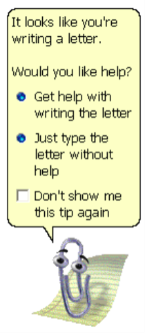
Finally, we have the much-reviled Microsoft Office Paperclip.
Clippy was a well-intentioned effort to solve a real usability problem. Users don’t read the manual, don’t use the online help, and don’t know how to find the answers to their problems. Clippy tries to suggest answers to the problem it thinks you’re having.
You Are Not the User
- Most software engineering
is about communicating with
other programmers
- …who are a lot like you
- UI is about communicating
with users
- Users are NOT LIKE YOU
- The user is ALWAYS right
- Usability problems are the design’s fault
Unfortunately it’s often wrong, often intrusive, and often annoying.
The subjective quality of your interface matters too.
Unfortunately, user interfaces are not easy to design. You (the developer) are not a typical user. You know far more about your application than any user will. You can try to imagine being your mother, or your grandma, but it doesn’t help much. It’s very hard to forget things you know.
This is how usability is different from everything else you learn about software engineering. Specifications, assertions, and object models are all about communicating with other programmers, who are probably a lot like us. Usability is about communicating with other users, who are probably not like us.
The user is always right. Don’t blame the user for what goes wrong. If users consistently make mistakes with some part of your interface, take it as a sign that your interface is wrong, not that the users are dumb. This lesson can be very hard for a software designer to swallow!
Don’t Expect Users to be Designers
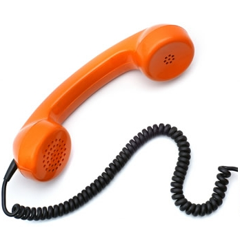
- Telephone handset weight
- Users said: it’s fine
- But they really wanted: lighter
- # of Google search results
- Users said: 30 results
- But they really wanted: 10
- Command abbreviations
- Users make 2x errors with their own custom abbreviations
Unfortunately, the user is not always right. Users aren’t oracles. They don’t always know what they want, or what would help them. In a study conducted in the 1950s, people were asked whether they would prefer lighter telephone handsets, and on average, they said they were happy with the handsets they had (which at the time were made rather heavy for durability). Yet an actual test of telephone handsets, identical except for weight, revealed that people preferred the handsets that were about half the weight that was normal at the time. (Klemmer, Ergonomics, Ablex, 1989, pp 197-201).
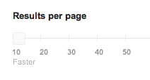
Another example: Google has discovered that when they survey users about how many search results they want per page (10, 20, 30), users overwhelmingly say “30 results”. But when Google actually deploys 30-result search pages (as part of an “A/B test”, which we’ll talk about in a later lecture), usage drops by 20% relative to the conventional 10-result page. Why? Probably because the 30-result page takes a half second longer to load. (http://perspectives.mvdirona.com/2009/10/31/TheCostOfLatency.aspx)
Users aren’t designers, either, and shouldn’t be forced to fill that role.
It’s easy to say, “Yeah, the interface is bad, but users can customize it however they want it.” There are two problems with this statement: (1) most users don’t, and (2) user customizations may be even worse! One study of command abbreviations found that users made twice as many errors with their own command abbreviations than with a carefully-designed set (Grudin & Barnard, “When does an abbreviation become a word?”, CHI ‘85). So customization isn’t the silver bullet.
Usability, Defined
Usability Defined
- Usability = how well users can use the system’s functionality
- Dimensions of usability
- Learnability (L): is it easy to learn?
- Efficiency (E): once learned, is it fast to use?
- Safety (S): are errors few and recoverable?


- Other dimensions are relevant too
- Ergonomics: comfort, fatigue
- Aesthetics: satisfaction, happiness, pleasure
- But we’ll mostly focus on LES
The property we’re concerned with here, usability, is more precise than just how “good” the system is. A system can be good or bad in many ways.
If important requirements are unsatisfied by the system, that’s probably a deficiency in functionality, not in usability.
If the system is very expensive or crashes frequently, those problems certainly detract from the user’s experience, but we don’t need user testing to tell us that.
More narrowly defined, usability measures how well users can use the system’s functionality. Usability has several dimensions: learnability, efficiency, and safety.
These aren’t the only aspects of a user interface that you might care about (for example, subjective feelings are important too, as is fatigue), but these are the primary ones we’ll care about in this class.
Notice that we can quantify all these measures of usability. Just as we can say algorithm X is faster than algorithm Y on some workload, we can say that interface X is more learnable, or more efficient, or more safe than interface Y for some set of tasks and some class of users, by designing an experiment that measures the two interfaces.
Usability Dimensions Vary In Importance
- Depends on the user
- Novice users need learnability
- Experts need efficiency
- But no user is uniformly novice or expert
- Depends on the task
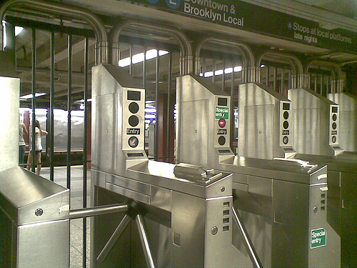
- Missile launchers need safety
- Subway turnstiles need efficiency

The usability dimensions are not uniformly important for all classes of users, or for all applications. That’s one reason why it’s important to understand your users, so that you know what you should optimize for. A web site used only once by millions of people—e.g., the national telephone do-not-call registry—has such a strong need for ease of learning, in fact zero learning, that it far outweighs other concerns. A stock trading program used on a daily basis by expert traders, for whom lost seconds translate to lost dollars, must put efficiency above all else.
But users can’t be simply classified as novices or experts, either. For some applications (like stock trading), your users may be domain experts, deeply knowledgeable about the stock market, and yet still be novices at your particular application. Even users with long experience using an application may be novices or infrequent users when it comes to some of its features.
Usability doesn’t exist in isolation, of course, and it may not even be the most important property of some systems. Astronauts may care more about reliability of their navigation computer than its usability; military systems would rather be secure than easy to log into. Ideally these should be false dichotomies: we’d rather have systems that are reliable, secure, and usable. But in the real world, development resources are finite, and tradeoffs must be made.
In this class, we’ll take an extreme position: usability will be our primary goal. Here’s a familiar UI design. You’ve probably used it before, but probably without thinking much about its usability. We’re handing some out for you to play with and think about.
Here’s a familiar UI design. You’ve probably used it before, but probably without thinking much about its usability. We’re handing some out for you to play with and think about.
Course Overview
This course will be structured as four threads of lectures: design principles; design techniques; implementation techniques; and research methods. You have to gain experience in the first three in order to do your group project, which takes the entire semester, and the fourth is necessary for the 6.831 version of the course, which introduces graduate students to research in HCI.
Each lecture will be accompanied by lecture notes available on the course web site.
Here are the key objectives of the course. This is what I hope you’ll take away from the class.
Administrivia can be found on the Stellar course website.