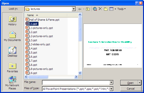
Lecture 5
Efficiency
Today's Topics
UI Hall of Fame or Shame?
Source: Interface Hall of Shame
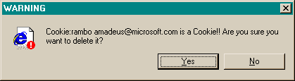
This message used to appear when you tried to delete the contents of your Internet Explorer cache from inside Windows Explorer (i.e., you browse to the cache directory, select a file containing one of IE’s browser cookies, and delete it).
Put aside the fact that the message is almost tautological (“Cookie… is a Cookie”) and overexcited (“!!”).
Does it give the user enough information to make a decision?
Hall of Shame
Source: Interface Hall of Shame
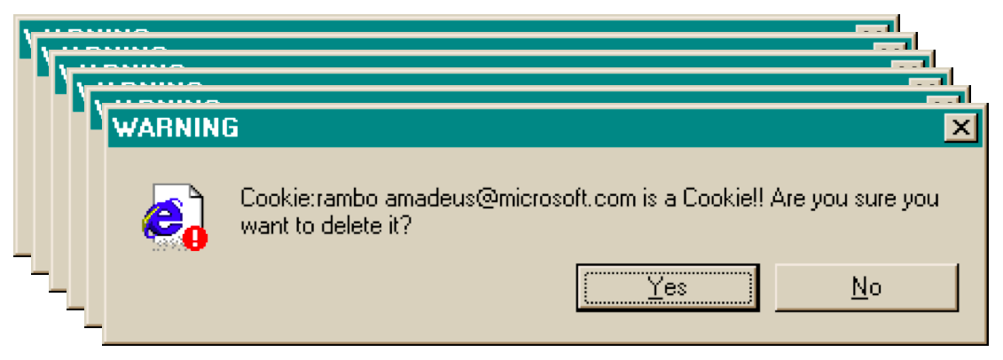
Suppose you selected all your cookie files and tried to delete them all in one go. You get one dialog for every cookie you tried to delete! What button is missing from this dialog?
Hall of Fame or Shame?
Source: Interface Hall of Shame
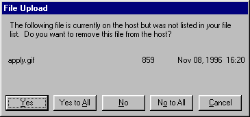
One way to fix the too-many-questions problem is Yes To All and No To All buttons, which short-circuit the rest of the questions by giving a blanket answer. That’s a helpful shortcut, which improves efficiency, but this example shows that it’s not a panacea.
This dialog is from Microsoft’s Web Publishing Wizard, which uploads local files to a remote web site. Since the usual mode of operation in web publishing is to develop a complete copy of the web site locally, and then upload it to the web server all at once, the wizard suggests deleting files on the host that don’t appear in the local files, since they may be orphans in the new version of the web site.
But what if you know there’s a file on the host that you don’t want to delete? What would you have to do?
Hall of Fame
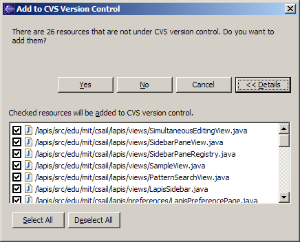
If your interface has a potentially large number of related questions to ask the user, it’s much better to aggregate them into a single dialog. Provide a list of the files, and ask the user to select which ones should be deleted. Select All and Unselect All buttons would serve the role of Yes to All and No to All.
Here’s an example of how to do it right, found in Eclipse. If there’s anything to criticize in Eclipse’s dialog box, it might be the fact that it initially doesn’t show the filenames, just their count—you have to press Details to see the whole dialog box. Simply knowing the number of files not under version control is rarely enough information to decide whether you want to say yes or no, so most users are likely to press Details anyway.
Chunking
Chunking
- “Chunk” is a unit of memory or perception
- Depends both on presentation and on what you already know
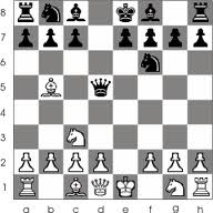
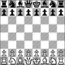
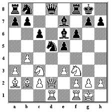
The elements of perception and memory are called chunks. In one sense, chunks are defined symbols; in another sense, a chunk represents the activation of past experience. Chunking is illustrated well by a famous study of chess players. Novices and chess masters were asked to study chess board configurations and recreate them from memory. The novices could only remember the positions of a few pieces. Masters, on the other hand, could remember entire boards, but only when the pieces were arranged in legal configurations. When the pieces were arranged randomly, masters were no better than novices. The ability of a master to remember board configurations derives from their ability to chunk the board, recognizing patterns from their past experience of playing and studying games. (De Groot, A. D., Thought and choice in chess, 1965.)
Working memory is where you do your conscious thinking. The currently favored model in cognitive science holds that working memory is not actually a separate place in the brain, but rather a pattern of activation of elements in the long-term memory. A famous old result is that the capacity of working memory is roughly 7 ± 2 chunks. A recent reanalysis of the same experiment has amended that estimate to 4 ± 1 chunks (Parker, “Acta is a four-letter word,” Acta Psychiatrica Scandinavica, 2012). Either way, it’s pretty small! Although working memory size can be increased by practice (if the user consciously applies mnemonic techniques that convert arbitrary data into more memorable chunks), it’s not a good idea to expect the user to do that. A good interface won’t put heavy demands on the user’s working memory.
Data put in working memory disappears in a short time—a few seconds or tens of seconds. Maintenance rehearsal—repeating the items to yourself—fends off this decay, but maintenance rehearsal requires attention. So distractions can easily destroy working memory.
Long-term memory is probably the least understood part of human cognition. It contains the mass of our memories. Its capacity is huge, and it exhibits little decay. Long-term memories are apparently not intentionally erased; they just become inaccessible.
Maintenance rehearsal (repetition) appears to be useless for moving information into long-term memory. Instead, the mechanism seems to be elaborative rehearsal, which seeks to make connections with existing chunks. Elaborative rehearsal lies behind the power of mnemonic techniques like associating things you need to remember with familiar places, like rooms in your childhood home. But these techniques take hard work and attention on the part of the user. One key to good learnability is making the connections as easy as possible to make—and consistency is a good way to do that.
Our ability to form chunks in working memory depends strongly on how the information is presented: a sequence of individual letters tend to be chunked as letters, but a sequence of three-letter groups tend to be chunked as groups. It also depends on what we already know. If the three letter groups are well-known TLAs (three-letter acronyms) with well-established chunks in long-term memory, we are better able to retain them in working memory.
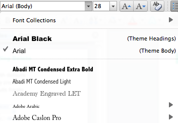
Take advantage of this as a designer: don’t present information as long undifferentiated strings of random characters or numbers. At the very least, break them up into 3- or 4-character groups. Still better, find a way to make the chunks more familiar. This applies not just to random numbers or hashes, but to all kinds of data displayed in an interface.
Example
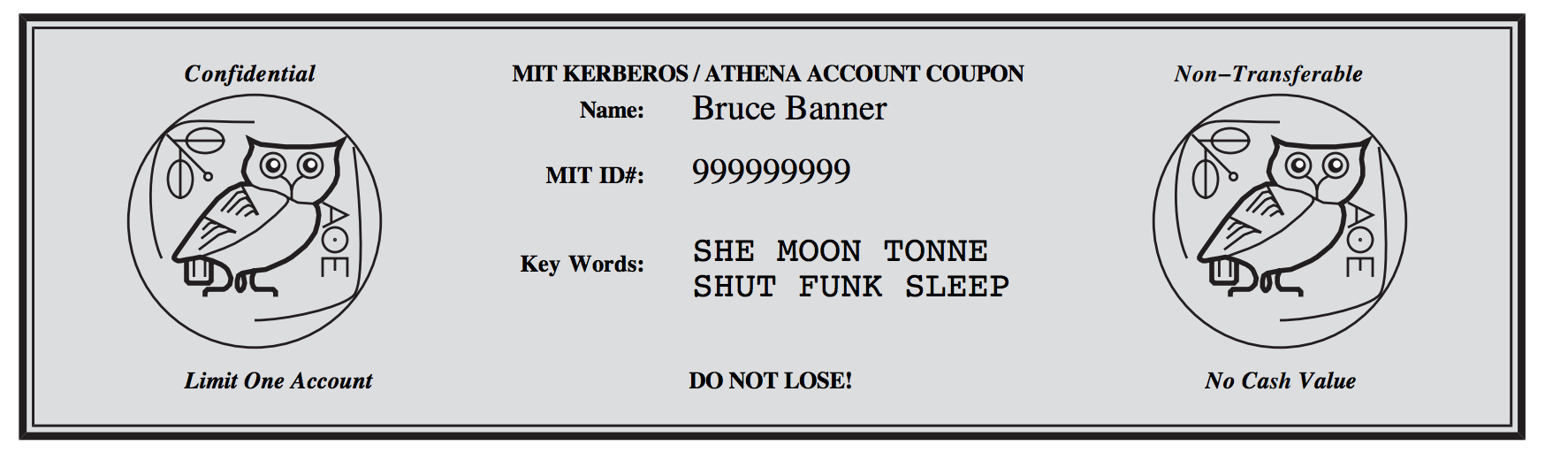
You probably saw this example when you signed up for your MIT Athena account. The keywords that you use to prove you have this account coupon are words—much easier to remember and type than the 10-digit, unchunked MIT identifier right above them. Thanks to Kyle Murray for this example)
Pointing and Steering
Fitts’s Law
Fitt’s Law
Time T to move your hand to a target of size S at distance D away is:
- T = RT + MT = a + b log (D/S + 1)
Depends only on index of difficulty log(D/S + 1)
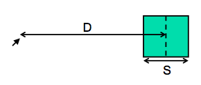
Fitts’s Law specifies how fast you can move your hand to a target of a certain size at a certain distance away (within arm’s length, of course). It’s a fundamental law of the human sensory-motor system, which has been replicated by numerous studies. Fitts’s Law applies equally well to using a mouse to point at a target on a screen. In the equation shown here, RT is reaction time, the time to get your hand moving, and MT is movement time, the time spent moving your hand.
Explanation of Fitts’s Law
- Moving your hand to a target is closed-loop control
- Each cycle covers remaining distance D with error εD
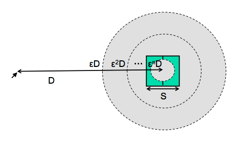
We can explain Fitts’s Law by appealing to the human information processing model. Fitt’s Law relies on closed-loop control. Assume that D >> S, so your hand is initially far away from the target. In each cycle, your motor system instructs your hand to move the entire remaining distance D. The accuracy of that motion is proportional to the distance moved, so your hand gets within some error εD of the target (possibly undershooting, possibly overshooting). Your perceptual and cognitive processors perceive where your hand arrived and compare it to the target, and then your motor system issues a correction to move the remaining distance εD—which it does, but again with proportional error, so your hand is now within ε2D. This process repeats, with the error decreasing geometrically, until n iterations have brought your hand within the target—i.e., εnD ≤ S. Solving for n, and letting the total time T = n (Tp + Tc + Tm), we get:
T = a + b log (D/S)
where a is the reaction time for getting your hand moving, and b = - (Tp + Tc + Tm)/log ε.
The graphs above show the typical trajectory of a person’s hand, demonstrating this correction cycle in action. The position-time graph shows an alternating sequence of movements and plateaus; each one corresponds to one cycle. The velocity-time graph shows the same effect, and emphasizes that hand velocity of each subsequent cycle is smaller, since the motor processor must achieve more precision on each iteration.
Implications of Fitts’s Law
- Targets at screen edge are easy to hit
- Mac menubar beats Windows menubar
- Unclickable margins are foolish
- Linear popup menus vs. pie menus

Fitts’s Law has some interesting implications.
The edge of the screen stops the mouse pointer, so you don’t need more than one correcting cycle to hit it. Essentially, the edge of the screen acts like a target with infinite size. (More precisely, the distance D to the center of the target is virtually equal to S, so T = a + b log (D/S + 1) solves to the minimum time T=a.) So edge-of-screen real estate is precious. The Macintosh menu bar, positioned at the top of the screen, is faster to use than a Windows menu bar (which, even when a window is maximized, is displaced by the title bar).
Similarly, if you put controls at the edges of the screen, they should be active all the way to the edge to take advantage of this effect. Don’t put an unclickable margin beside them.
Fitts’s Law also explains why pie menus are faster to use than linear popup menus. With a pie menu, every menu item is a slice of a pie centered on the mouse pointer. As a result, each menu item is the same distance D away from the mouse pointer, and its size S (in the radial direction) is comparable to D. Contrast that with a linear menu, where items further down the menu have larger D, and all items have a small S (height).
According to one study, pie menus are 15-20% faster than linear menus (Callahan et al. “An empirical comparison of pie vs. linear menus,” CHI 1991). Pie menus are used occasionally in practice—in some computer games, for example, and in the Sugar GUI created for the One- Laptop-Per-Child project. The picture here shows a pie menu for Firefox available as an extension. Pie menus are not widely used, however, perhaps because the efficiency benefits aren’t large enough to overcome the external consistency and layout simplicity of linear menus.
Related to efficiency in general (though not to Fitts’s Law) is the idea of a gesture, a particular movement of the mouse (or stylus or finger) that triggers a command. For example, swiping the mouse to the left might trigger the Back command in a web browser. Pie menus can help you learn gestures, when the same movement of your mouse is used for triggering the pie menu command (note that the Back icon is on the left of the pie menu shown). The combination of pie menus and gestures is called “marking menus”, which have been used with good results in some research systems (Kurtenbach & Buxton, “User Learning and Performance with Marking Menus,” CHI 1994.)
Steering Tasks
- Time T to move your hand through a tunnel of length D and width S is: T = a + b D/S
- Index of difficulty is now linear, not logarithmic
- So steering is much harder than pointing
- Thus cascading submenus are hard to use
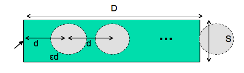
As we discussed in the first lecture, cascading submenus are hard to use, because the mouse pointer is constrained to a narrow tunnel in order to get over into the submenu. Unlike the pointing tasks that Fitts’s Law applies to, this steering task puts a strong requirement on the error your hand is allowed to make: instead of iteratively reducing the error until it falls below the size of the target, you have to continuously keep the error smaller than the size of the tunnel. The figure shows an intuition for why this works. Each cycle of the motor system can only move a small distance d such that the error εd is kept below S. The total distance D therefore takes D/d = εD/S cycles to cover. As a result, the time is proportional to D/S, not log D/S. It takes exponentially longer to hit a menu item on a cascading submenu than it would if you weren’t constrained to move down the tunnel to it. Windows tries to solve this problem with a 500 ms timeout, and now we know another reason that this solution isn’t ideal: it exceeds Tp (even for the slowest value of Tp), so it destroys perceptual fusion and our sense of causality. Intentionally moving the mouse down to the next menu results in a noticeable delay.
The Mac gets a Hall of Fame nod here: when a submenu opens, it provides an invisible triangular zone, spreading from the mouse to the submenu, in which the mouse pointer can move without losing the submenu.
The user can point straight to the submenu without unusual corrections, and without even noticing that there might be a problem. (Hall of Fame interfaces may sometimes be invisible to the user! They simply work better, and you don’t notice why.)
Example: Steering Tasks on the Web
- WSDM 2012 site

Steering tasks are surprisingly common in systems with cascading submenus. Here’s one on a website. Try hovering over Authors to see its submenu. How do you have to move the mouse in order to get to “Paper instructions”?
Now that we’ve discussed aspects of the human cognitive system that are relevant to user interface efficiency, let’s derive some practical rules for improving efficiency.
First, let’s consider mouse tasks, which are governed by pointing (Fitts’s Law) and steering. Since size matters for Fitts’s Law, frequently-used mouse affordances should be big. The bigger the target, the easier the pointing task is. Similarly, consider the path that the mouse must follow in a frequently-used procedure. If it has to bounce all over the screen, from the bottom of the window to the top of the window, or back and forth from one side of the window to the other, then the cost of all that mouse movement will add up, and reduce efficiency. Targets that are frequently used together should be placed near each other.
We mentioned the value of screen edges and screen corners, since they trap the mouse and act like infinite-size targets. There’s no point in having an unclickable margin at the edge of the screen. Finally, since steering tasks are so much slower than pointing tasks, avoid steering whenever possible. When you can’t avoid it, minimize the steering distance. Cascading submenus are much worse when the menu items are long, forcing the mouse to move down a long tunnel before it can reach the submenu.
Shortcuts
Keyboard Shortcuts
- Keyboard commands
- Menu accelerators
A common way to increase efficiency of an interface is to add keyboard shortcuts —– easily memorable key combinations. There are conventional techniques for displaying keyboard shortcuts (like Ctrl+N and Ctrl-O) in the menubar. Menubars and buttons often have accelerators as well (the underlined letters, which are usually invoked by holding down Alt to give keyboard focus to the menubar, then pressing the underlined letter). Choose keyboard shortcuts so that they are easily associated with the command in the user’s memory.
Keyboard operation also provides accessibility benefits, since it allows your interface to be used by users who can’t see well enough to point a mouse. We’ll have more to say about accessibility in a future lecture.
Defaults & Pending Delete
- Fill in a form with defaults
- from history, by prediction
- Make the defaults fragile
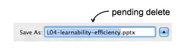
Defaults are common answers already filled into a form. Defaults help in lots of ways: they provide shortcuts to both novices and frequent users; and they help the user learn the interface by showing examples of legal entries. Defaults should be fragile; when you click on or Tab to a field containing a default value, it should be fully selected so that frequent users can replace it immediately by simply starting to type a new value. (This technique, where typing replaces the selection, is called pending delete. It’s the way most GUIs work, but not all. Emacs, for example, doesn’t use pending delete; when you highlight some text, and then start typing, it doesn’t delete the highlighted text automatically.) If the default value is wrong, then using a fragile default allows the correct value to be entered as if the field were empty, so having the default costs nothing.
Incidentally, it’s a good idea to remove the word “default” from your interface’s vocabulary. It’s a technical term with some very negative connotations in the lending world.
History
- Offer recently-used or frequently-used choices
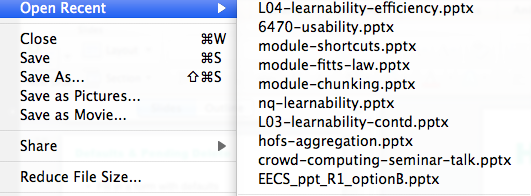
Many inputs exhibit temporal locality—i.e., the user is more likely to enter a value they entered recently. File editing often exhibits temporal locality, which is why Recently-Used Files menus (like this) are very helpful for making file opening more efficient. Keep histories of users’ previous choices, not just of files but of any values that might be useful. When you display the Print dialog again, for example, remember and present as defaults the settings the user provided before.
Autocomplete
- Minimize typing with autocomplete
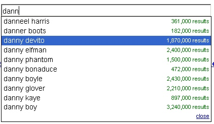
Autocomplete doesn’t just help with efficiency. What other usability dimensions does it help?
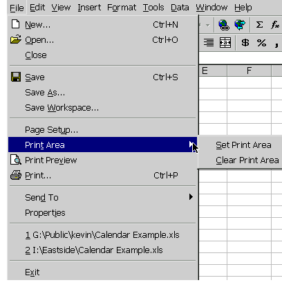
Aggregation
multiple selection for action
multiple drag & drop
Hearkening back to the Hall of Fame & Shame for this lecture, aggregation is an excellent way to add efficiency to an interface. Think about ways that a user can collect a number of items—data objects, decisions, graphical objects, whatever—and handle them all at once, as a group. Multiple selection is a good design pattern for aggregation, and there are many idioms now for multiple selection with mouse and keyboard (dragging an outline around the items, shift-click to select a range, etc.)
Not every command needs aggregation, however. If the common case is only one item, and it’s never more than a handful of items, than it may not be worth the complexity.
Anticipation
Anticipation means that a good design should put all needed information and tools for a particular task within the user’s easy reach. If the task requires a feature from the interface that isn’t immediately available in the current mode, then the user may have to back out of what they’re doing, at a cost to efficiency.
For example, here’s the File Open dialog in Windows XP. This dialog demonstrates a number of anticipations:
- The toolbar icons across the top show some evidence of anticipating the user’s needs. Probably the most important is the New Folder icon, which lets you create a new folder to save your file in.
- The icons on the left side are bookmarks for very common places that users go to open files, like the Desktop or the My Documents folder.
- The History icon captures another aspect of the file-opening task: that users often need to open a file that they’ve opened recently.
- If you click on My Network Places, you’ll see more evidence of anticipation: not just a list of the network places that you’ve already created (network places are basically bookmarks pointing to file servers), but also icons for the common subtasks involved in managing the list of network places: Add Network Place to add a new one; and the Network Setup Wizard if you aren’t connected to the network yet.
It’s worth noting that all these operations are available elsewhere in Windows—recently opened files are found in PowerPoint’s File menu, the Network Setup wizard can be found from the Start menu or the Control Panel, and new folders can be made with Windows Explorer. So they’re here only as shortcuts to functionality that was already available—shortcuts that serve both learnability (since the user doesn’t have to learn about all those other places in order to perform the task of this dialog) and efficiency (since even if I know about those other places, I’m not forced to navigate to them to get the job done).
Picoquiz
Which efficiency techniques are used by this UI? (choose all good answers)
A. aggregation
B. history
C. autocomplete
D. pending delete
Keystroke level model
Now we’re going to turn to the question of how we can predict the efficiency of a user interface before we build it. Predictive evaluation is one of the holy grails of usability engineering. There’s something worthy of envy in other branches of engineering—even in computer systems and computer algorithm design—in that they have techniques that can predict (to some degree of accuracy) the behavior of a system or algorithm before building it. Order-of-growth approximation in algorithms is one such technique. You can, by analysis, determine that one sorting algorithm takes O(n log n) time, while another takes O(n2) time, and decide between the algorithms on that basis. Predictive evaluation in user interfaces follows the same idea.
At its heart, any predictive evaluation technique requires a model for how a user interacts with an interface. This model needs to be abstract — it can’t be as detailed as an actual human being (with billions of neurons, muscles, and sensory cells), because it wouldn’t be practical to use for prediction.
It also has to be quantitative, i.e., assigning numerical parameters to each component. Without parameters, we won’t be able to compute a prediction. We might still be able to do qualitative comparisons, such as we’ve already done to compare, say, Mac menu bars with Windows menu bars, or cascading submenus. But our goals for predictive evaluation are more ambitious.
These numerical parameters are necessarily approximate; first because the abstraction in the model aggregates over a rich variety of different conditions and tasks; and second because human beings exhibit large individual differences, sometimes up to a factor of 10 between the worst and the best. So the parameters we use will be averages, and we may want to take the variance of the parameters into account when we do calculations with the model.
Where do the parameters come from? They’re estimated from experiments with real users. The numbers seen here for the general model of human information processing (e.g., cycle times of processors and capacities of memories) were inferred from a long literature of cognitive psychology experiments. But for more specific models, parameters may actually be estimated by setting up new experiments designed to measure just that parameter of the model.
Predictive evaluation doesn’t need real users (once the parameters of the model have been estimated, that is). Not only that, but predictive evaluation doesn’t even need a prototype. Designs can be compared and evaluated without even producing design sketches or paper prototypes, let alone code.
Another key advantage is that the predictive evaluation not only identifies usability problems, but actually provides an explanation of them based on the theoretical model underlying the evaluation. So it’s much better at pointing to solutions to the problems than either inspection techniques or user testing. User testing might show that design A is 25% slower than design B at a doing a particular task, but it won’t explain why. Predictive evaluation breaks down the user’s behavior into little pieces, so that you can actually point at the part of the task that was slower, and see why it was slower.
The first predictive model was the keystroke level model (proposed by Card, Moran & Newell, “The Keystroke Level Model for User Performance Time with Interactive Systems”, CACM, v23 n7, July 1978).
This model seeks to predict efficiency (time taken by expert users doing routine tasks) by breaking down the user’s behavior into a sequence of the five primitive operators shown here.
Most of the operators are physical—the user is actually moving their muscles to perform them. The M operator is different—it’s purely mental (which is somewhat problematic, because it’s hard to observe and estimate). The M operator stands in for any mental operations that the user does. M operators separate the task into chunks, or steps, and represent the time needed for the user to recall the next step from long-term memory.
Here’s how to create a keystroke level model for a task.
First, you have to focus on a particular method for doing the task. Suppose the task is deleting a word in a text editor. Most text editors offer a variety of methods for doing this, e.g.:
- click and drag to select the word, then press the Del key
- click at the start and shift-click at the end to select the word, then press the Del key
- click at the start, then press the Del key N times
- double-click the word, then select the Edit/Delete menu command; etc.
Next, encode the method as a sequence of the physical operators: K for keystrokes, B for mouse button presses or releases, P for pointing tasks, H for moving the hand between mouse and keyboard, and D for drawing tasks.
Next, insert the mental preparation operators at the appropriate places, before each chunk in the task. Some heuristic rules have been proposed for finding these chunk boundaries.
Finally, using estimated times for each operator, add up all the times to get the total time to run the whole method.
The operator times can be estimated in various ways.
Keystroke time can be approximated by typing speed. Second, if we use only an average estimate for K, we’re ignoring the 10x individual differences in typing speed.
Button press time is approximately 100 milliseconds. Mouse buttons are faster than keystrokes because there are far fewer mouse buttons to choose from (reducing the user’s reaction time) and they’re right under the user’s fingers (eliminating lateral movement time), so mouse buttons should be faster to press. Note that a mouse click is a press and a release, so it costs 0.2 seconds in this model.
Pointing time can be modelled by Fitts’s Law, but now we’ll actually need numerical parameters for it. Empirically, you get a better fit to measurements if the index of difficulty is log(D/S+1); but even then, differences in pointing devices and methods of measurement have produced wide variations in the parameters (some of them seen here). There’s even a measurable difference between a relaxed hand (no mouse buttons pressed) and a tense hand (dragging). Also, using Fitts’s Law depends on keeping detailed track of the location of the mouse pointer in the model, and the positions of targets on the screen. An abstract model like the keystroke level model dispenses with these details and just assumes that Tp ~ 1.1s for all pointing tasks. If your design alternatives require more detailed modeling, however, you would want to use Fitts’s Law more carefully.
Drawing time, likewise, can be modeled by the steering law: T = a + b (D/S).
Homing time is estimated by a simple experiment in which the user moves their hand back and forth from the keyboard to the mouse.
Finally we have the Mental operator. The M operator does not represent planning, problem solving, or deep thinking. None of that is modeled by the keystroke level model. M merely represents the time to prepare mentally for the next step in the method—primarily to retrieve that step (the thing you’ll have to do) from long-term memory. A step is a chunk of the method, so the M operators divide the method into chunks.
The time for each M operator was estimated by modeling a variety of methods, measuring actual user time on those methods, and subtracting the time used for the physical operators—the result was the total mental time. This mental time was then divided by the number of chunks in the method. The resulting estimate (from the 1978 Card & Moran paper) was 1.35 sec—unfortunately large, larger than any single physical operator, so the number of M operators inserted in the model may have a significant effect on its overall time. (The standard deviation of M among individuals is estimated at 1.1 sec, so individual differences are sizeable too.) Kieras recommends using 1.2 sec based on more recent estimates.
One of the trickiest parts of keystroke-level modeling is figuring out where to insert the M’s, because it’s not always clear where the chunk boundaries are in the method. Here are some heuristic rules, suggested by Kieras (“Using the Keystroke-Level Model to Estimate Execution Times”, 2001).
Here are keystroke-level models for two methods that delete a word.
The first method clicks at the start of the word, shift-clicks at the end of the word to highlight it, and then presses the Del key on the keyboard. Notice the H operator for moving the hand from the mouse to the keyboard. That operator may not be necessary if the user uses the hand already on the keyboard (which pressed Shift) to reach over and press Del.
The second method clicks at the start of the word, then presses Del enough times to delete all the characters in the word.
Empirical Validation of KLM
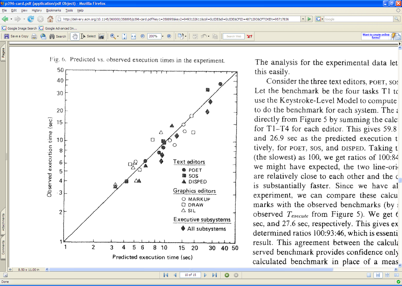
The developers of the KLM model tested it by comparing its predications against the actual performance of users on 11 different interfaces (3 text editors, 3 graphical editors, and 5 command-line interfaces like FTP and chat).
28 expert users were used in the test (most of whom used only one interface, the one they were expert in).
The tasks were diverse but simple: e.g. substituting one word with another; moving a sentence to the end of a paragraph; adding a rectangle to a diagram; sending a file to another computer. Users were told the precise method to use for each task, and given a chance to practice the method before doing the timed tasks.
Each task was done 10 times, and the observed times are means of those tasks over all users.
The results are pretty close—the predicted time for most tasks is within 20% of the actual time. (To give you some perspective, civil engineers usually expect that their analytical models will be within 20% error in at least 95% of cases, so KLM is getting close to that.)
One flaw in this study is the way they estimated the time for mental operators—it was estimated from the study data itself, rather than from separate, prior observations.
For more details, see the paper from which this figure was taken: Card, Moran & Newell, “The Keystroke Level Model for User Performance Time with Interactive Systems”, CACM, v23 n7, July 1978.
Applications of KLM
- Comparing designs & methods
- Parametric analysis
Keystroke level models can be useful for comparing efficiency of different user interface designs, or of different methods using the same design.
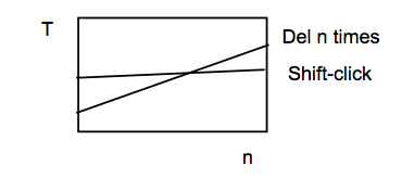
One kind of comparison enabled by the model is parametric analysis—e.g., as we vary the parameter n (the length of the word to be deleted), how do the times for each method vary?
Using the approximations in our keystroke level model, the shift-click method is roughly constant, while the Del-n-times method is linear in n. So there will be some point n below which the Del key is the faster method, and above which Shift-click is the faster method. Predictive evaluation not only tells us that this point exists, but also gives us an estimate for n.
But here the limitations of our approximate models become evident. The shift-click method isn’t really constant with n—as the word grows, the distance you have to move the mouse to click at the end of the word grows likewise. Our keystroke-level approximation hasn’t accounted for that, since it assumes that all P operators take constant time. On the other hand, Fitts’s Law says that the pointing time would grow at most logarithmically with n, while pressing Del n times clearly grows linearly. So the approximation may be fine in this case.
Keystroke level models have some limitations—we’ve already discussed the focus on expert users and efficiency. But KLM also assumes no errors made in the execution of the method, which isn’t true even for experts. Methods may differ not just in time to execute but also in propensity of errors, and KLM doesn’t account for that. KLM also assumes that all actions are serialized, even actions that involve different hands (like moving the mouse and pressing down the Shift key). Real experts don’t behave that way; they overlap operations.
KLM also doesn’t have a fine-grained model of mental operations. Planning, problem solving, different levels of working memory load can all affect time and error rate; KLM lumps them into the M operator.