|
To print these notes, use the PDF version. |
|
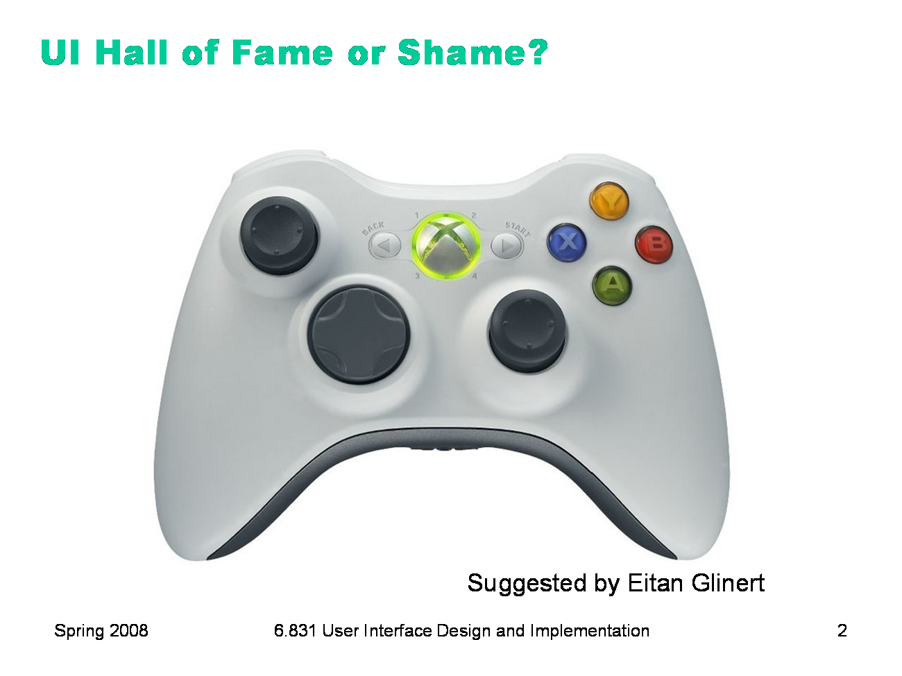
From Eitan Glinert: “On the XBox 360 controller, there is a large button in the middle which stops the game and takes the user to the high level system control panel for the console. The idea is to have a consistent button that is easy to find that will always allow the user to get back to the familiar top level system control interface.” Let’s discuss this controller’s: - simplicity - efficiency - error prevention
|
|
Today’s lecture is about error in user interfaces. First we’ll look at some definitions and principles from cognitive science, which will help us understand why and how people make errors. Then we’ll talk about how to apply those principles to user interfaces to prevent errors, at least as much as possible. Finally, since not all errors can be prevented, we’ll discuss how to write good error messages.
|
|
Errors can be classified into slips and lapses and mistakes according to how they occur. Slips and lapses are found in skilled behavior — execution of procedures that the user has already learned. For example, pressing an onscreen button — moving the mouse pointer over it, pressing the mouse button, releasing the mouse button — is a skill-based procedure for virtually any computer user. An error in executing this procedure, like clicking before the mouse pointer is over the button, is a slip. This is just a low-level example, of course. We have many higher-level, learned procedures too — attaching a file to an email, submitting a search to Google, drawing a rectangle in a paint program, etc. An error in execution of any learned procedure would be a slip. Slips are distinguished from lapses by the source of the failure. A slip is a failure of execution or control — for example, substituting one action for another one in the procedure. A lapse is a failure of memory — for example, forgetting the overall goal, or forgetting where you are in the procedure. A mistake, on the other hand, is an error made in planning or rule application. One framework for classifying cognitive behavior divides behavior into skill-based (learned procedures), rule-based (application of learned if-then rules), and knowledge-based (problem solving, logic, experimentation, etc.) Mistakes are errors in rule-based or knowlege-based behavior; e.g., applying a rule in a situation where it shouldn’t apply, or using faulty reasoning. We won’t have much to say about mistakes in this course, but much research in human error is concerned with this level — e.g., suboptimal or even irrational heuristics that people use for decision making and planning. (James Reason, Human Error, Cambridge University Press, 1990) |
|
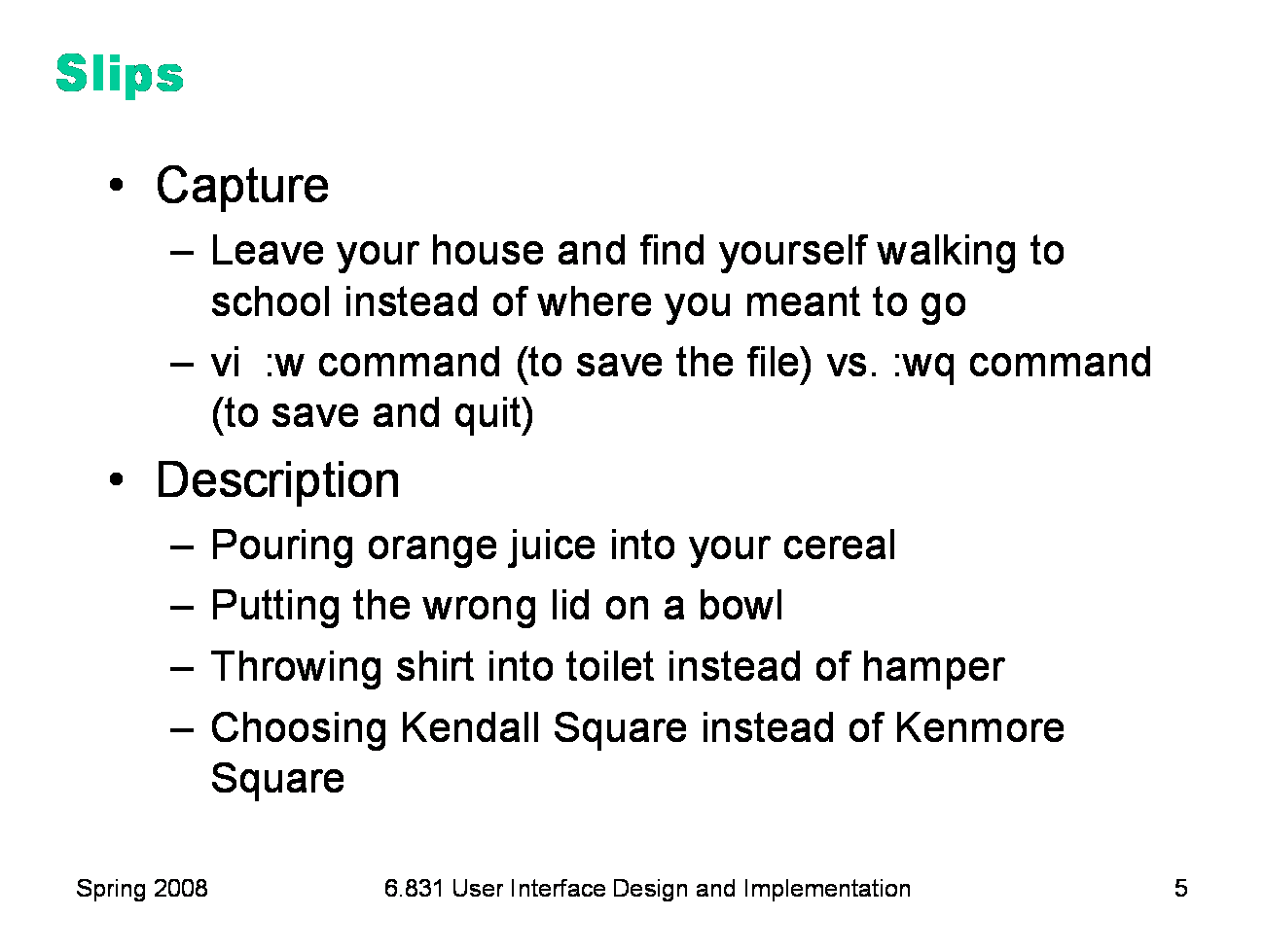
Here are some examples of common slips. A capture slip occurs when a person starts executing one sequence of actions, but then veers off into another (usually more familiar) sequence that happened to start the same way. A good mental picture for this is that you’ve developed a mental groove from executing the same sequence of actions repeatedly, and this groove tends to capture other sequences that start the same way. In the text editor vi, it’s common to quit the program by issuing the command “:wq”, which saves the file (w) and quits (q). If a user intends just to save the file (:w) but accidentally quits as well (:wq), then they’ve committed a capture error. A description slip occurs when two actions are very similar. The user intends to do one action, but accidentally substitutes the other. A classic example of a description error is reaching into the refrigerator for a carton of milk, but instead picking up a carton of orange juice and pouring it into your cereal. The actions for pouring milk in cereal and pouring juice in a glass are nearly identical — open fridge, pick up half-gallon carton, open it, pour— but the user’s mental description of the action to execute has substituted the orange juice for the milk.
|
|
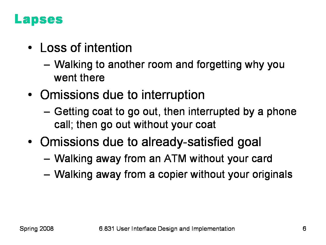
Lapses are due to failures of memory, particularly the short-term memory that is managing the execution of a procedure. A loss of intention lapse happens when you start executing a procedure and forget your goal in the interim. For example, when you walk to another room to fetch something, and by the time you get there, you no longer remember what you wanted. Lapses can also happen because of interruptions, which disrupt short-term memory and make you lose track of your place in the interrupted procedure. Another common lapse happens when your goal is actually satisfied in the middle of the procedure. The remaining steps are cleanup or shutdown subtasks, which you may forget because you’ve already discharged your original intention. For example, if an ATM machine gives you the cash first, you may walk away from it without taking your card, because your original goal was getting cash. This is a clear example of an error that good user interface design can prevent. |
|
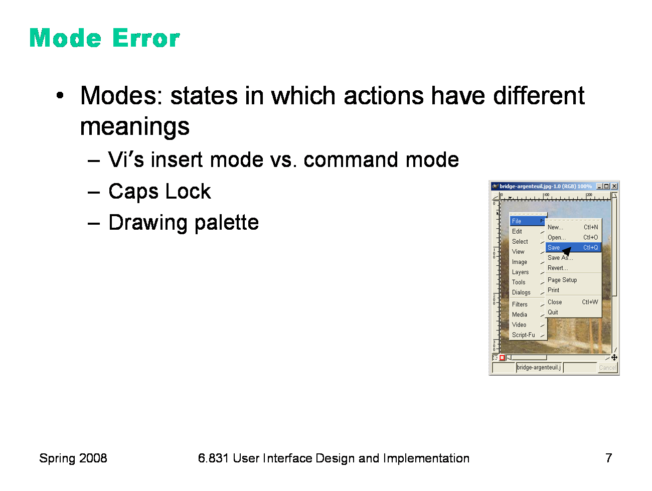
Another kind of error, clearly due to user interface, is a mode error. Modes are states in which the same action has different meanings. For example, when Caps Lock mode is enabled on a keyboard, the letter keys produce uppercase letters. The text editor vi is famous for its modes: in insert mode, letter keys are inserted into your text file, while in command mode (the default), the letter keys invoke editing commands. In the first lecture, we talked about a mode error in Gimp: accidentally changing a menu shortcut because your mouse is hovering over it. Mode errors occur when the user tries to invoke an action that doesn’t have the desired effect in the current mode. For example, if the user means to type lowercase letters but doesn’t notice that Caps Lock is enabled, then a mode error occurs. Mode errors are generally slips, an error in the execution of a learned procedure, caused by failing to correctly evaluate the state of the interface.
|
|
The slips and lapses we’ve discussed have a few features in common. First, the root cause of these errors is often inattention. Since slips and lapses occur in skilled behavior, execution of already well-learned procedures, they are generally associated with insufficient attention to the execution of the procedure, or omission or distraction of attention at a key moment. Second, the particular erroneous behavior chosen is often selected because of its high similarity to the correct behavior (as in capture and description slips), or of its high frequency relative to the correct behavior (as in capture slips). Very common, or very similar, patterns are strongly available for retrieval from human memory. So errors are often strong-but-wrong behavior.
|
|
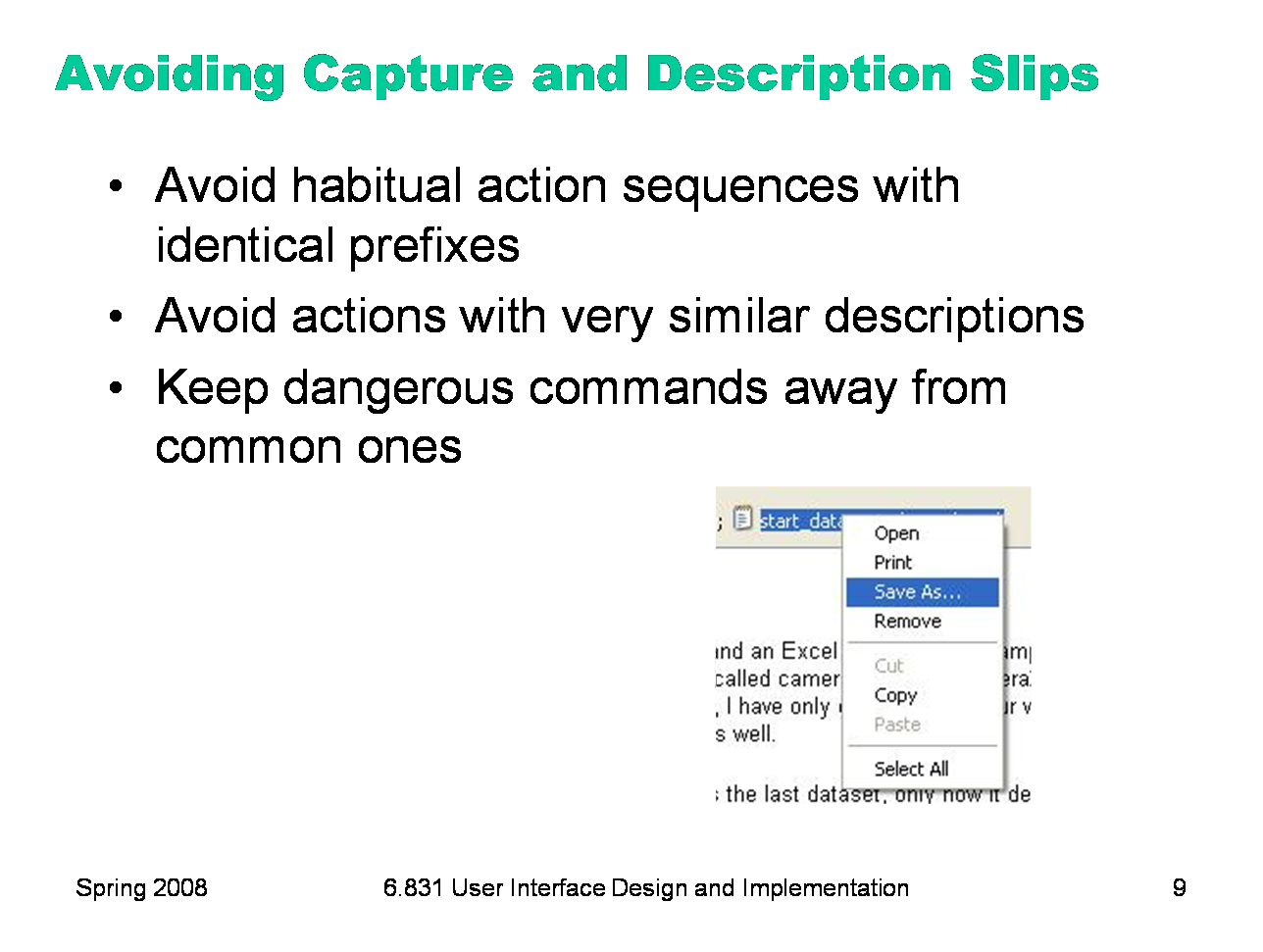
Let’s discuss how to prevent errors of these sorts. In a computer interface, you can deal with capture errors by avoiding very common action sequences that have identical prefixes. Description errors can be fought off by applying the converse of the Consistency heuristic: different things should look and act different, so that it will be harder to make description errors between them. Avoid actions with very similar descriptions, like long rows of identical buttons. You can also reduce description errors by making sure that dangerous functions (hard to recover from if invoked accidentally) are well-separated from frequently-used commands. Outlook 2003 makes this mistake: when you right-click on an email attachment, you get a menu that mixes common commands (Open, Save As) with less common and less recoverable ones — if you print that big file by mistake, you can’t get the paper back. And if you Remove the attachment, it’s even worse — undo won’t bring it back! (Thanks to Amir Karger for this example.)
|
|
There are many ways to avoid or mitigate mode errors. Eliminating the modes entirely is best, although not always possible. Modes do have some uses — they make command sets smaller, for example. When modes are necessary, it’s essential to make the mode visible. But visibility is a much harder problem for mode status than it is for affordances. When mode errors occur, the user isn’t actively looking for the mode, like they might actively look for a control. As a result, mode status indicators must be visible in the user’s locus of attention. That’s why the Caps Lock light, which displays the status of the Caps Lock mode on a keyboard, doesn’t really work. Other solutions are spring-loaded or temporary modes. With a spring-loaded mode, the user has to do something active to stay in the alternate mode, essentially eliminating the chance that they’ll forget what mode they’re in. The Shift key is a spring-loaded version of the uppercase mode. Drag-and-drop is another spring-loaded mode; you’re only dragging as long as you hold down the mouse button. Temporary modes are similarly short-term. For example, in many graphics programs, when you select a drawing object like a rectangle or line from the palette, that drawing mode is active only for one mouse gesture. Once you’ve drawn one rectangle, the mode automatically reverts to ordinary pointer selection. Finally, you can also mitigate the effects of mode errors by designing action sets so that no two modes share any actions. Mode errors may still occur, when the user invokes an action in the wrong mode, but the action can simply be ignored rather than triggering any undesired effect.
|
|
One way to avoid lapses in procedure execution is to keep procedures short, so that users have fewer steps to potentially forget. (Striving for simplicity often does this as a side-effect.) It’s also helpful to put more obvious structure on the procedure, a technique called dialog closure (Shneiderman, Designing the User Interface). Action sequences should be designed with a beginning, a middle, and an end. For example, think about drag and drop: At the beginning, you press the mouse button and see the object picked up with your cursor. In the middle, you move the object across the screen towards your target, getting feedback that it’s coming along. At the end, you release the mouse button, and see the effects of the drop. The key feature of closure is the feedback you get at the end of the operation. This assurance that the operation completed provides the user with a sense of accomplishment, some relief, and an opportunity to clear their working memory of the details of the task in preparation for another. Some lapses can be addressed by designing forcing functions into the interface. A forcing function is a feature that forces one step to be performed before another step. For example, many cash machines require you to take your card back before they dispense any cash to you. Forcing functions should be used sparingly, since they reduce user control and freedom, but when the forced step would be a costly lapse (like leaving your ATM card behind), then a forcing function may be worth it.
|
|
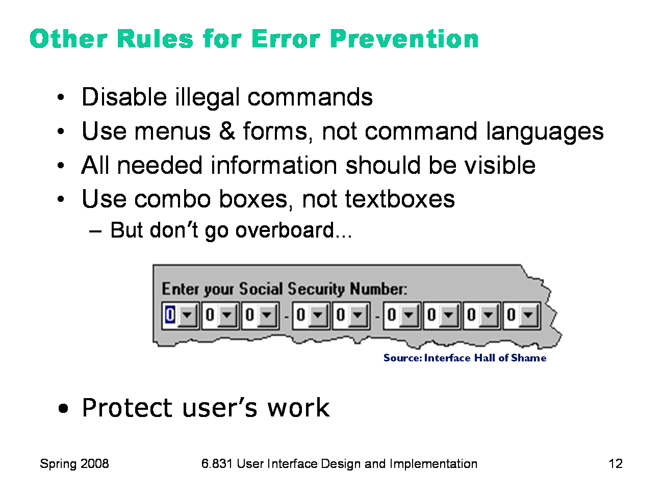
Here are some other ways to prevent errors. If a command is illegal in the current state of the interface — e.g., Copy is impossible if nothing is selected — then the command should be disabled (“grayed out”) so that it simply can’t be selected in the first place. One way to prevent errors is to allow users to select rather type. Misspellings then become impossible. This attitude can be taken to an extreme, however, as shown in this example. One reason why selection is better is that it reduces the user’s memory load. Command languages demand lots of knowledge in the head, while menus rely on knowledge in the world. Any information needed by a task should be visible or otherwise accessible in the interface for that task. The interface shouldn’t depend on users to remember the email address they want to send mail to, or the product code for the product they want to buy. Relying too heavily on the user’s short-term memory will lead to errors. Protect users’ work is an important value judgment: errors that lose or destroy the user’s work are the worst kind. It’s worth substantial engineering to prevent this from happening — implementing automatic save, undo, file version histories, etc.
|
|
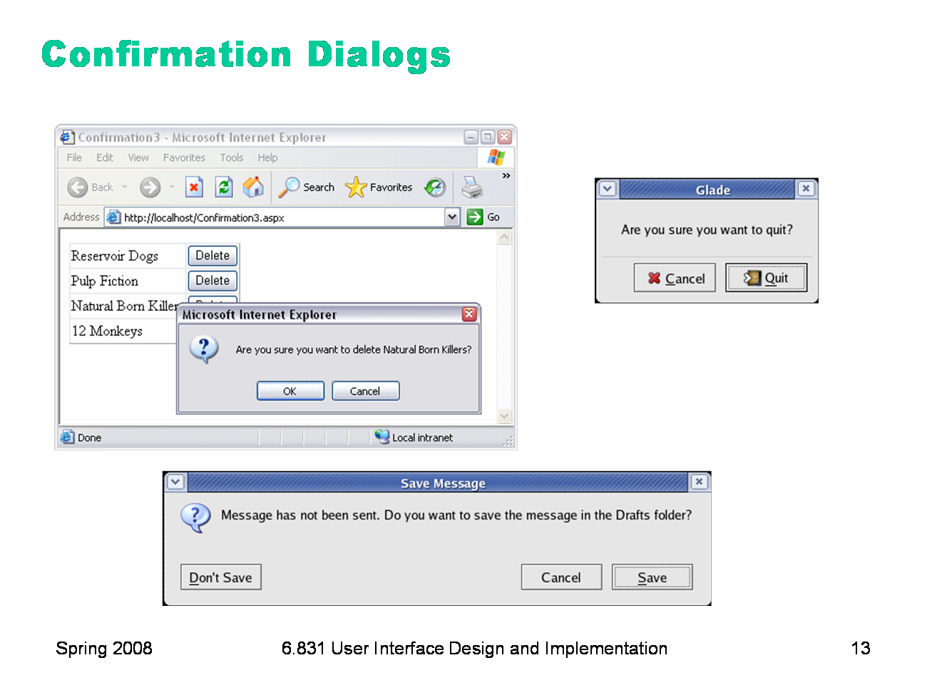
An unfortunately common strategy for error prevention is the confirmation dialog, or “Are you sure?” dialog. It’s not a good approach, and should be used only sparingly, for several reasons: ·Confirmation dialogs can substantially reduce the efficiency of the interface. In the example above, a confirmation dialog pops up whenever the user deletes something, forcing the user to make two button presses for every delete, instead of just one. Frequent commands should avoid confirmations. ·If a confirmation dialog is frequently seen — for example, every time the Delete button is pressed — then the expert users will learn to expect it, and will start to include it in their habitual procedure. In other words, to delete something, the user will learn to push Delete and then OK, without reading or even thinking about the confirmation dialog! The dialog has then completely lost its effectiveness, serving only to slow down the interface without actually preventing any errors. In general, reversibility (i.e. undo) is a far better solution than confirmation. Even a web interface can provide at least single-level undo (undoing the last operation). Operations that are very hard to reverse may deserve confirmation, however. For example, quitting an application with unsaved work is hard to undo — but a well-designed application could make even this undoable, using automatic save or keeping unsaved drafts in a special directory.
|
|
Finally, let’s talk about how to write error messages. But before you try to write an error message, stop and ask yourself whether it’s really necessary. An error message is evidence of a limitation or lack of flexibility on the part of the system — a failure to prevent or absorb an error without complaint. So try to eliminate the error first. Some errors simply aren’t worth a message. For example, suppose the user types “abc” into the font size combo box. Don’t pop up a message complaining about an “invalid entry”. Just ignore it and immediately replace it with the current font size. (Why is this enough feedback, for a font size combo box?) Similarly, if the user drags a scrollbar thumb too far, the scrollbar doesn’t pop up an error message (“Too far! Too far!”). It simply stops. If the effect of the erroneous action is easily visible, as in these cases, then you don’t have to beat the user over the head with a superfluous error message.
|
|
Assuming you can’t design the error message out of the system, here are some guidelines for writing good ones. First, be precise. Don’t lump together multiple error conditions into a single all-purpose message. Find out what’s really wrong, and display a targeted message. If the error is due to limitations of your system, like sizes or allowed characters, then be specific about what the limitations are, so that the user can adapt. (Then ask yourself why you have those limitations!) It often helps to restate the user’s input, so that they can relate what they did to the error message, and perhaps even detect the problem immediately (“oh, I didn’t mean paper.doc...”) In error messages, it’s particularly important to speak the user’s language, and avoid letting technical terms or details like exceptions and stack traces leak through. |
|
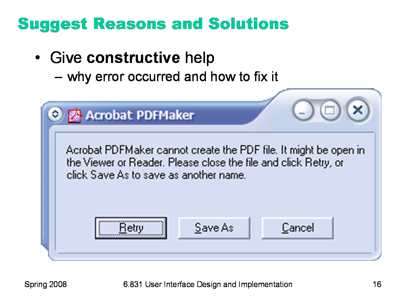
Next, your message should be constructive, not just reporting the error but helping the user correct it. Suggest possible reasons for the error and offer ways to correct them — ideally in the error message dialog itself. Here’s a good example from Adobe Acrobat.
|
|
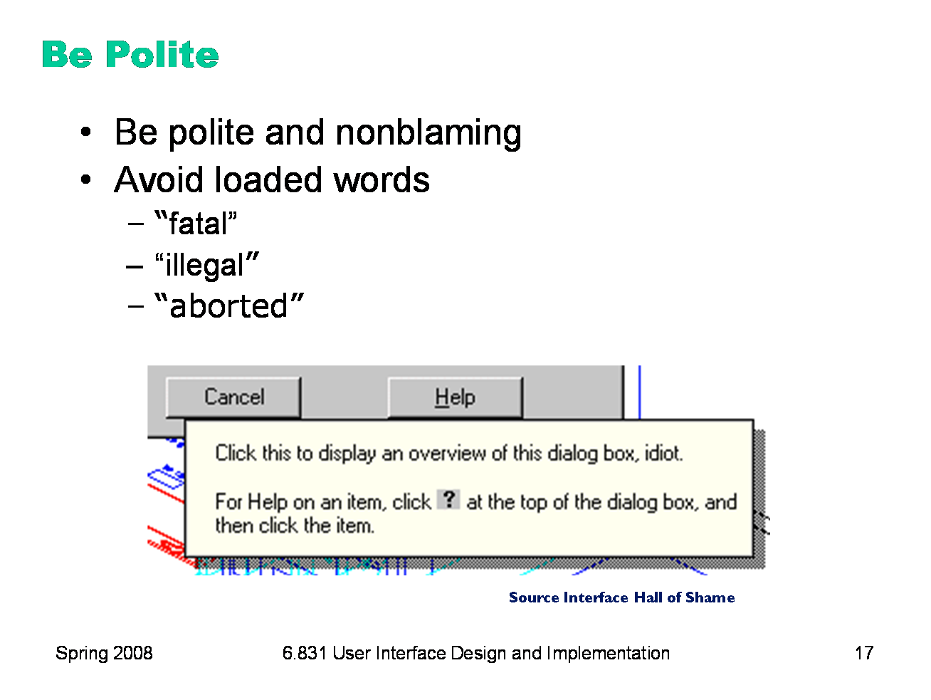
Finally, be polite. The message should be worded to take as much blame as possible away from the user and heap the blame instead on the system. Save the user’s face; don’t worry about the computer’s. The computer doesn’t feel it, and in many cases it is the interface’s fault anyway for not finding a way to prevent the error in the first place. Many words that are unfortunately common in technical error messages have emotionally-charged meanings in ordinary language; examples include “fatal”, “illegal”, “abort”, etc. Avoid them. Use neutral language. The tooltip shown at the bottom isn’t strictly an error message, but it actually appeared in a production version of AutoCad! As the story goes, it was inserted by a programmer as a joke, but somehow never removed before release. Even as a joke, it demonstrates a lack of respect for the intelligence of the human being on the other side of the screen. That attitude is exactly wrong for user interface design. |
|
|