|
To print these notes, use the PDF version. |
|
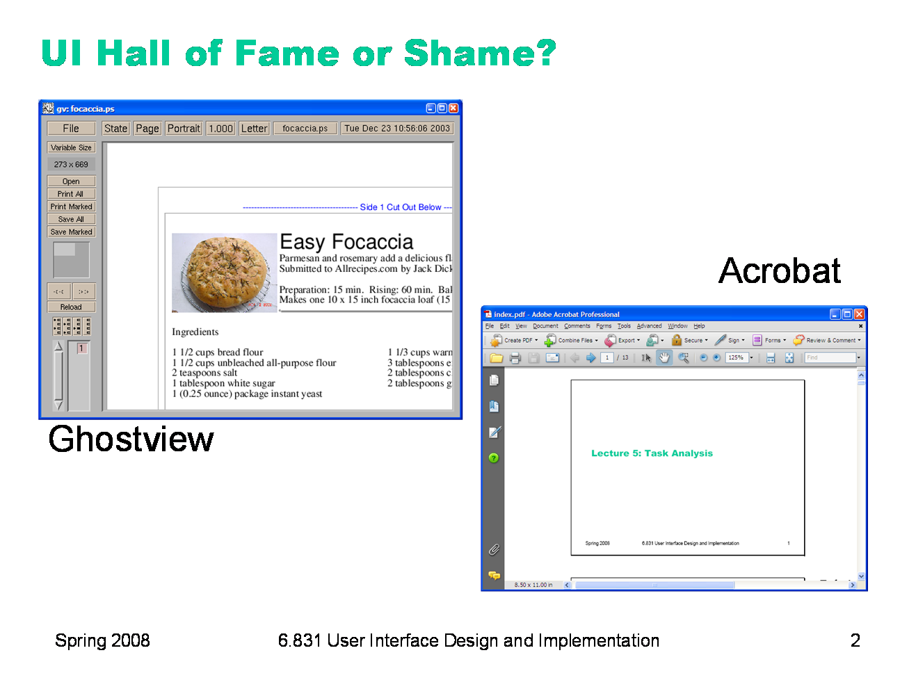
On the left is Ghostview, a Unix program that displays Postscript files. Ghostview has no scrollbars; instead, it scrolls by direct manipulation of the page image. Clicking and dragging on the page scrolls it around, and it turns out that dragging to the left moves the page image to the right. That is, when you drag the mouse to the left, more of the page image come into view at the left side of the window. Does this make sense? What mental model, or physical analogy, does this correspond to? On the right is Acrobat, which displays PDF files. Acrobat has scrollbars, but you can also directly manipulate the page image, as in Ghostview — only now clicking and dragging to the left moves the page to the left. What mental model does this correspond to? What if you used both Acrobat and Ghostview frequently (one for PDF, say, and the other for Postscript)? |
|
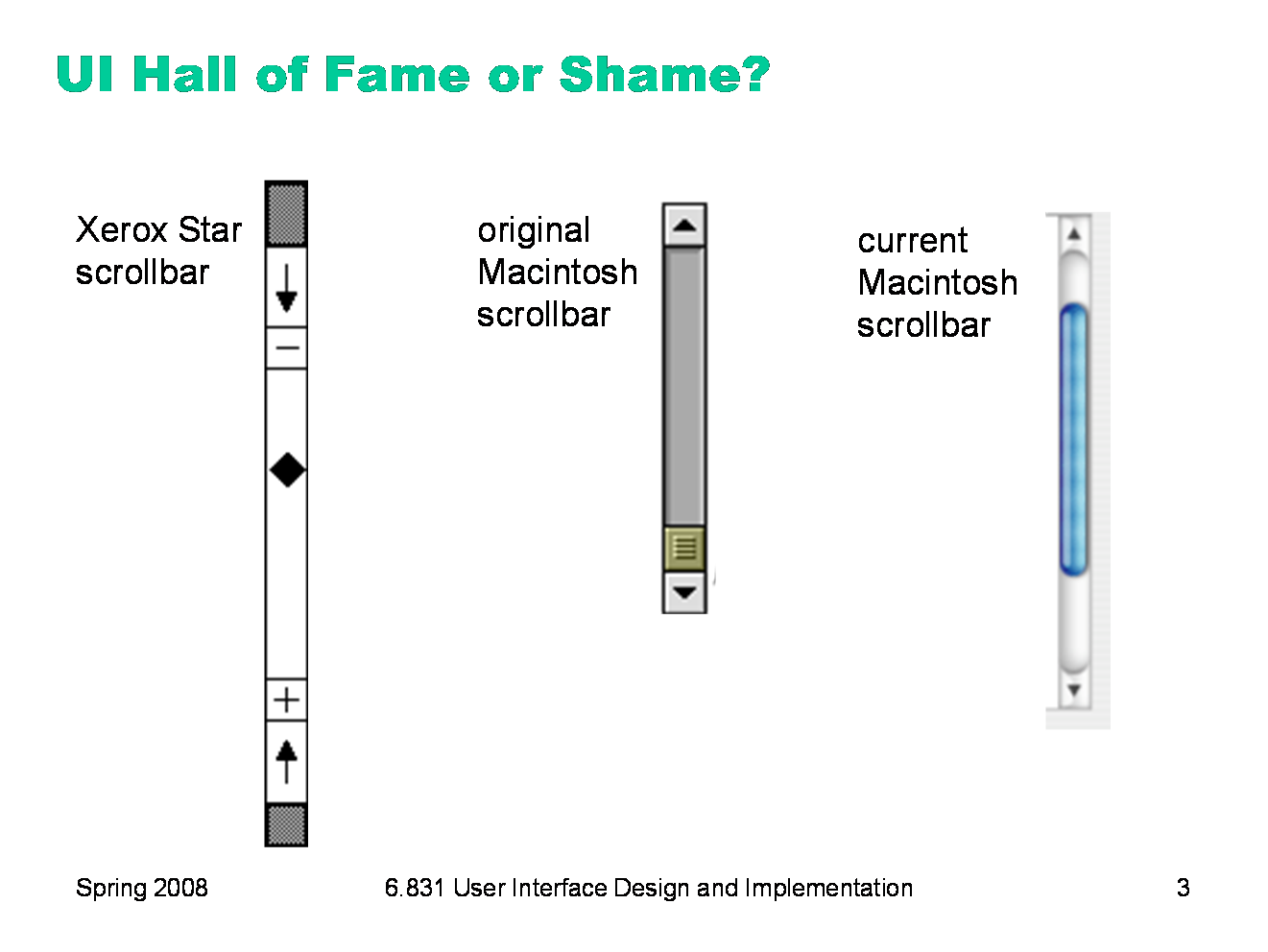
Let’s look at scrolling some more. Scrollbars have evolved considerably over the history of graphical user interfaces. The Xerox Star offered the earliest incarnation of a graphical user interface, and its scrollbar already had many of the features we recognize in modern scrollbars, such as a track containing a scrollbar thumb (the handle that you can drag up and down). Even its arrow buttons do the same thing — e.g., pushing on the top button makes more of the page appear at the top of the window, just like the modern scrollbar. But they’re labeled the opposite way — the top button has a down arrow on it. Why is that? What mental model would lead you to call that button down? Is that consistent with the mental model of the scrollbar thumb? Another interesting difference between the Star scrollbar and modern scrollbars are the - and + buttons, which move by whole pages. This functionality hasn’t been eliminated from the modern scrollbar; instead, the modern scrollbar just drops the obvious affordance for it. You can still click on the track above or below the thumb in order to jump by whole pages. Think about how the three scrollbars compare in: - simplicity - visibility - natural mapping
|
|
Today’s lecture is about the next step of the user-centered design process. Now that we’ve collected information about our domain — user analysis, task analysis, domain analysis — we want to start designing the user interface, driven by the information we collected. We’ll talk about some common techniques for doing design, including drawing lots of sketches, devising scenarios (stories involving users and tasks), and creating storyboards from those scenarios. We’ll also discuss some general ideas that may be useful for your designs, specifically design patterns and the overarching goal of simplicity. Simplicity is a property of crucial importance in user interface design (in most system design, in fact), so we’ll give it some special attention in this class. If you start your design process striving for simplicity, and keep it in mind throughout, then you’ll have a much better chance of producing a usable result.
|

|
Probably the most important design technique is sketching. Don’t just try to picture your user interface mentally, or write down a lot of words about it. Think with a pencil in your hand, and draw a lot of pictures. Paper is really a wonderful design medium; it’s cheap, it’s flexible, it’s easy to use. You can lay out many ideas on a big table or tape them up on a wall, stand back, point at them, talk about them, move them around. Generate many ideas. Don’t fixate on an early vision and stop brainstorming. You want to put a lot of ideas on the table. You’re doing this project in a group, so exploit that — do your design as a group, not as separate individuals. You can make the most of your group meetings if each group member comes up with some ideas beforehand, bringing a handful of sketches to the meeting. (At design firms, if you don’t consistently bring 5 ideas to every meeting, you’re out on the street. [Buxton, Sketching Experience, 2007]) The sketches go down on a table or up on a wall, and you talk about them, praise them, critique them, synthesize them, make riffs on them, etc. |
|
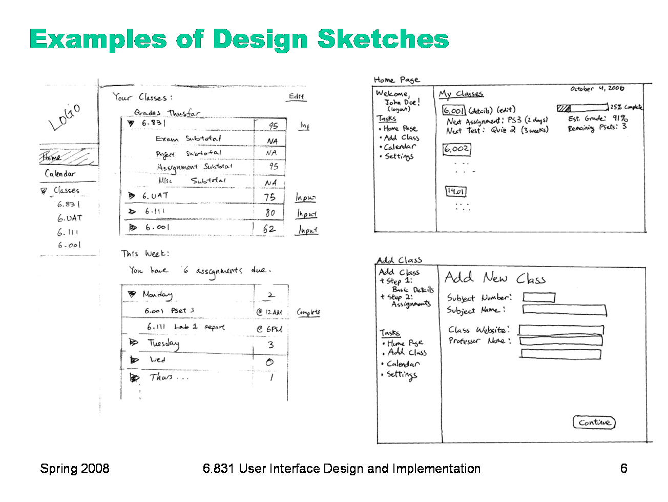
Here are some nice examples of design sketches from an earlier 6.831 class. These are alternative designs (left and right) for key pages of a grade management web site. Notice the sketchiness, the handwritten labels. But these sketches have some realistic data in them, which is a good idea, but if you find that coming up with fake data inhibits your thought process, you can often use squiggles for the data too. |
|
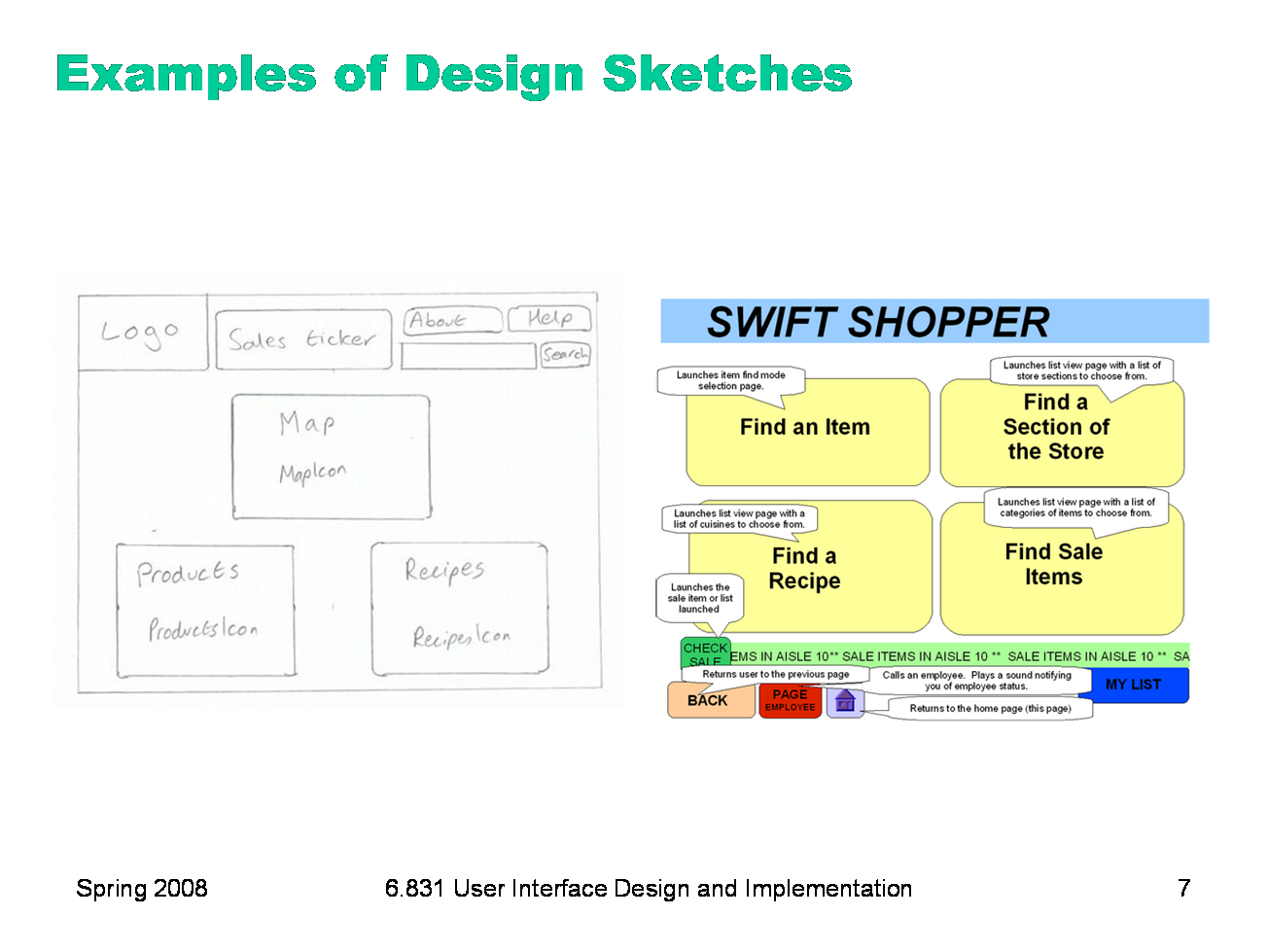
Your drawings should be done by hand. For most people, hand-sketching on paper is much faster than using a drawing program. Further, hand sketches in particular are valuable because they focus attention on the issues that matter in early design, without distracting you with details like font, color, alignment, whitespace, etc. In a drawing program, you would be faced with all these decisions, and you might spend a lot of time on them — time that would clearly be wasted if you have to throw away this design. Hand sketching also improves the feedback you get from users. They’re less likely to nitpick about details that aren’t relevant at this stage. They won’t complain about the color scheme if there isn’t one. More important, however, a hand-sketch design seems less finished, less set in stone, and more open to suggestions and improvements. Architects have known about this phenomenon for many years. If they show clean CAD drawings to their clients in the early design discussions, the clients are less able to discuss needs and requirements that may require radical changes in the design. In fact, many CAD tools have an option for rendering drawings with a “sketchy” look for precisely this reason. Here’s a comparison of two early-design sketches made for the same project. The hand-sketch on the left focuses on what you care about in the early stage of design — e.g., what buttons need to be on this screen? The one on the right probably took longer to draw, and it’s full of distracting details. I have trouble looking at it without thinking, “do I really like the SWIFT SHOPPER title shown that way?” Detailed graphic design simply isn’t relevant at this stage of design, so don’t use tools that focus your attention on it. |

|
It’s important to brainstorm radically different design alternatives, and put them down in sketches. Here’s an example from an application for plotting trip photos on a map. An important task of the problem was assigning geographical locations to photos you’d taken. These sketches show two significantly different alternatives for this task — one using a map to select a location and checkboxes to associate a subset of photos with that location, and the other using a list of locations (which can be edited on a separate screen) and color-coded highlighting to associate locations with photos. Sketching multiple alternatives gives you the ability to talk about them with your teammates, to discuss the pros and cons, to mix and match and build on them.
|

|
Another useful tool for early design is scenarios, which take your task analysis and turns it into stories. A scenario is a concrete, realistic story that sets up a situation involving a user with a goal to satisfy, and then follows the user through the tasks they do to satisfy that goal. Where task descriptions are abstract (e.g. "Buy a subway ticket"), scenarios are concrete, complete with imaginary users and imaginary details (e.g. "Frodo is going to the Red Sox game with 3 of his friends. He needs to buy a ticket, but the T station is packed with commuters and other Red Sox fans...") A scenario is the task-analysis equivalent of a persona, as a fictitious, concrete example of an abstract task.
|
|
A scenario can be used to create the first prototype of your design (of a sort): a storyboard. A storyboard is a sequence of sketches showing what a design looks like at key points in the scenario. We can think of a storyboard as a prototype because it tests the design in an important way: given a user and a goal (albeit imaginary), does the design actually provide a way to achieve that goal?
|
|
While you explore the design space with sketching, scenarios, and storyboards, you should be using the information you collected in user/task/domain analysis. Scenarios help you check how important tasks are handled by your designs. You should also think about what aspects of usability are important, given what you’ve learned about the user classes and the tasks. Are the users mostly computer novices? Then learnability might matter the most. Will the user only occasionally do this task? If so, then memorability may be key. Is the task hard to perform correctly, with many preconditions or exceptions? If so, then maybe error prevention and recovery matter the most. Information about the domain is also a big help. If the interface has to display a list, it helps to know how many items may typically be found in that list, so you can size it correctly. Interfaces that make sense for a few items (like a set of radio buttons) don’t make sense for a hundred. When data collections become large, you also need to help the user with new features like sorting, filtering, and searching. In some of the patterns we’ll look at next, size is an important parameter.
|

|
Let’s turn now away from design techniques and toward design ideas, concepts that you might use in the user interfaces you create. Design patterns are good solutions to common problems, which have been named and codified. We’ve already seen design patterns for the internals of user interface software (observer, MVC, etc). But you can also talk about design patterns for the user interface itself. Some patterns are structural. For example, a wizard breaks a task down into a linear sequence of steps, often presented as a sequence of dialog boxes with Next and Previous buttons. The center stage pattern (a term coined by Jenifer Tidwell) puts a workspace or data display in the middle of the screen, and surrounds it with secondary displays and controls. This pattern is widely used in office applications, like word processors and drawing programs. The high-density information display pattern structures the application around a display of dense information, like the messages in your email, or Google Maps displaying a map. Other patterns are navigational, helping you get around the interface, particularly if it’s a web site. Breadcrumbs show the path you took into a web site (e.g. Travel > Guides > North America), using hyperlinks to allow you to pop up to a higher level. Pagination divides up a long list of data into pages, with a control showing the page numbers (e.g. 1 2 3 4 ... 103) as hyperlinks. There are some good pattern collections out there that you can look at to develop more experience. One of the best is the book Designing Interfaces by Jenifer Tidwell. Selected patterns from the book can be found at http://designinginterfaces.com/. Other pattern collections include: User Interface Design Patterns, http://www.cs.helsinki.fi/u/salaakso/patterns/index.html Yahoo Design Pattern Library, http://developer.yahoo.com/ypatterns/ Martijn van Welie, http://www.welie.com/patterns
|
|
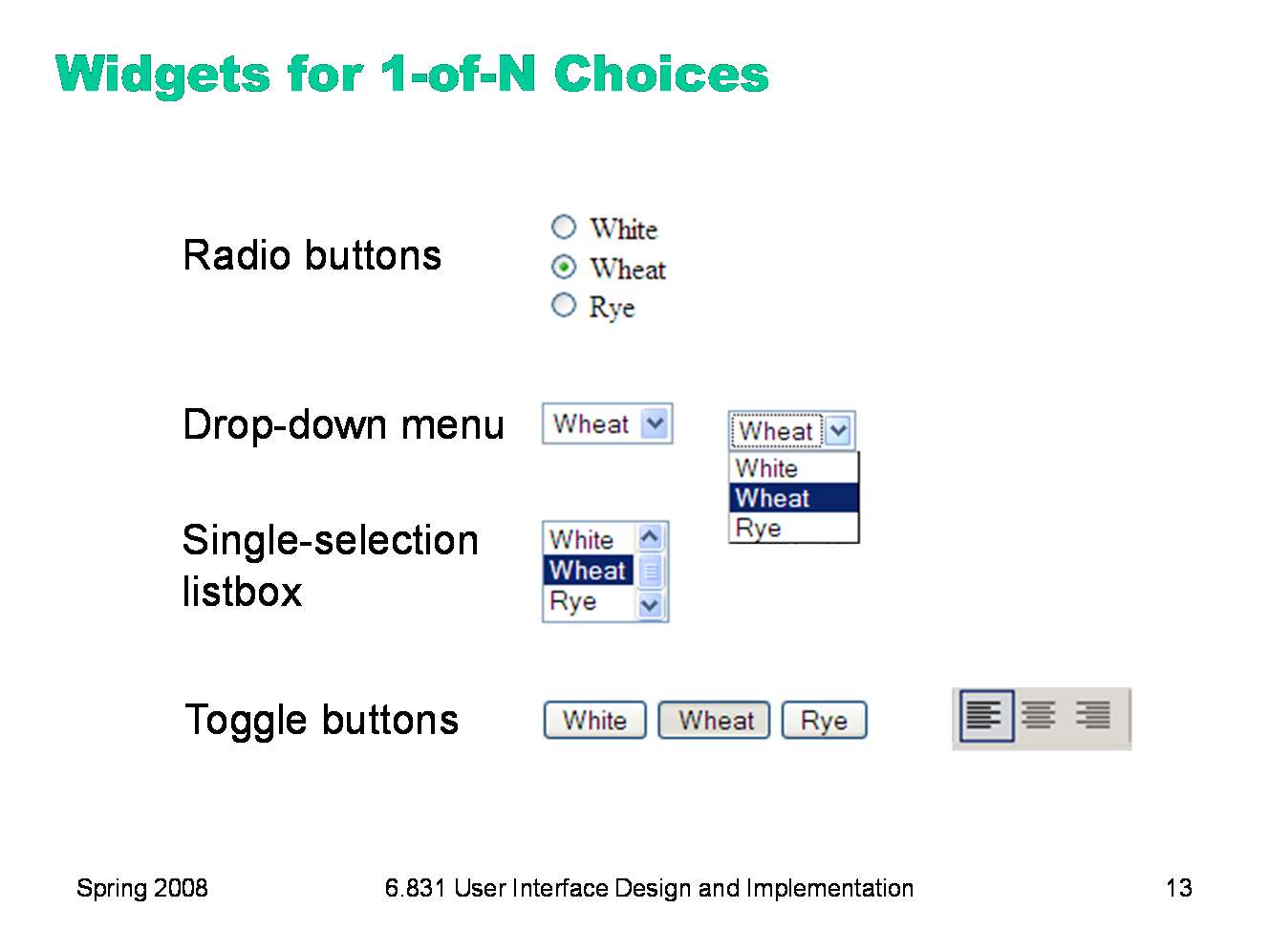
For the rest of this lecture, we’ll look at some patterns involving widgets (reusable graphical user interface objects). We’ll start by considering choices: asking the user to choose from a set of fixed options. Suppose we’re designing the interface for an on-campus sandwich delivery service, and we want to ask what kind of bread the user wants: white, wheat, or rye. This is a 1-of-N choice, where in this case N=3. Here are the various ways to do it with familiar widgets: Radio buttons are named after the station preset buttons in old car radios. Pushing one button in popped out all the others, using a mechanical linkage. (Radio buttons are sometimes called option buttons.) Radio buttons are the conventional idiom for making 1-of-N selections. They’re fast (all the choices are visible and only one point-and-click makes the choice), but use a lot of screen real estate as N gets large. If we wanted to ask which MIT building the sandwich should be delivered to, we probably wouldn’t want to use radio buttons — N is too big. Toggle buttons look like ordinary buttons, but if you push them, they toggle back and forth between depressed and undepressed states. In Java, you can get a set of toggle buttons to behave like radio buttons just by adding them to a ButtonGroup. Toggle buttons can offer larger targets than radio buttons (which would make them faster to use), or tiny targets if screen real estate is at a premium (using icons instead of text labels). Toggle buttons are often used for mode switches, or for 1-of-N choices in toolbars. A drop-down menu shows the current selection, with an arrow next to it for pulling down the list of N choices to choose from. A single-selection listbox is a static version of the same thing, where the list of N choices is always visible, and the chosen item is indicated by a highlight. Drop-down menus are very compact, but require two pointing operations (point and click to open the list, then point to the new choice), and possibly scrolling if it’s a long list. Drop-down menus and listboxes often support keyboard access, however — you can type the first character (or even a prefix) of your choice, and it will jump to it. All these widgets are useful for 1-of-N choices, but one problem in many GUI toolkits is that they have radically different APIs — so once you’ve decided on a widget, changing that decision might affect all the code that interacts with it. In Java, for example, even similar widgets like JList (for single-selection listboxes) and JComboBox (for drop-down menus) have completely different interfaces for providing the list of choices and getting and setting the selected item. HTML is a little better -- the <select> element can generate either a drop-down menu or a listbox using the same code (although web browsers conventionally only give you a drop-down menu for a 1-of-N choice, reserving listboxes for K-of-N choices). But if you want N radio buttons instead, you have to radically change your HTML, into N <input type=radio> elements. Avoid using N checkboxes for 1-of-N choices. Radiobuttons are a visually distinct widget that communicates the affordance that the choices are exclusive (i.e., that you can only select one at a time). Checkboxes fail to convey this.
|
|
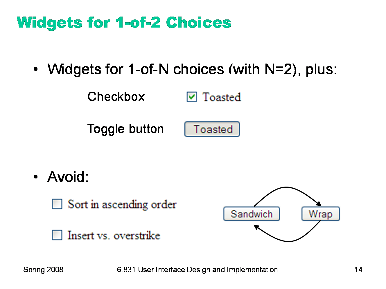
For the special case where N=2, you can also use a single checkbox or toggle button. Only do this if it’s a boolean choice, where the alternative (when the checkbox is unchecked or the toggle button is undepressed) is actually a negation. The checkboxes on the bottom show some of the nasty ambiguities that can result. One mistake often seen here is using an ordinary push button for a 1-of-2 choice, where the label of the button is changed when the user pushes it. This raises serious confusion about what the label means: is it the current state (am I getting a sandwich right now), or the future state (should I push this button to get a sandwich)? Even worse would be using this kind of idiom for a 1-of-N choice, where clicking the button cycles through all the choices. There’s no excuse for that kind of interface, given the rich set of widgets available for these kinds of choices.
|
|
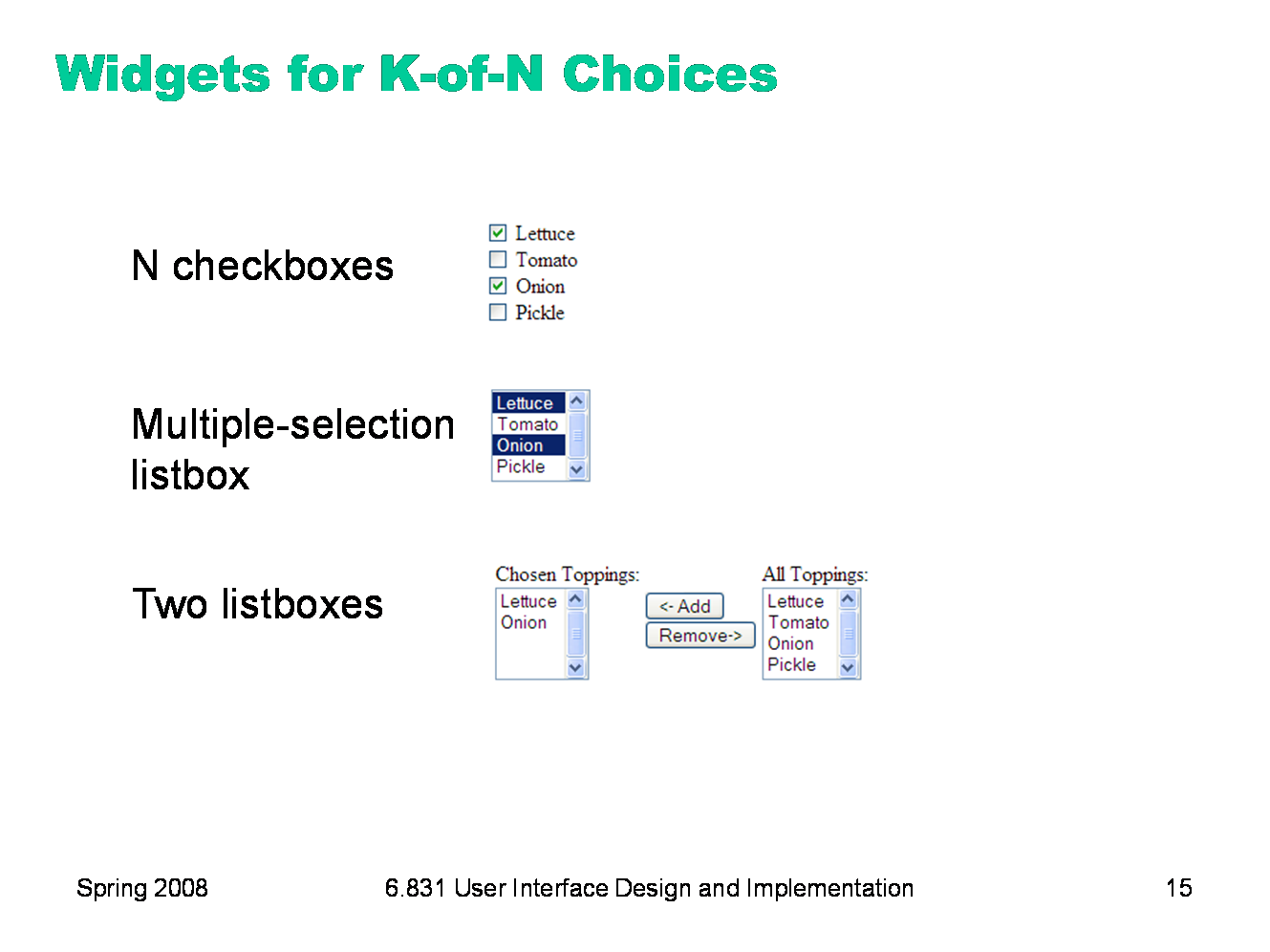
Here are widgets commonly used for choose any number of items from a set of N fixed choices. Checkboxes are a natural way to do this. A multiple-selection listbox is another way to do it. (Most listbox widgets have a property you can set that determines whether it should support multiple selection or not.) This approach has a few problems. First is learnability -- the conventions for multiple selection (click to clear and make one selection, control-click to toggle additional selections, shift-click to select a range) aren’t visible or known to all users. Another is errors -- the selection is very fragile. One accidental click can clear a carefully-created selection, and recovering from the error may take a lot of work if the list of choices is long. Two listboxes are still another way: one listbox for the K selected choices, the other listing all N. It uses lots of screen real estate (more than twice as much as a single listbox), may be slower to use (hopping between listboxes and buttons, although often this idiom allows double-clicking to move an item to the other listbox), but on the plus side, it’s far less fragile than multiple selection, and the K choices you’ve made are clearly visible, rather than being distributed throughout the N items. Here’s a design question: when the user moves an item over to the K list, should it disappear from the N list? Maybe not disappear, since that would remove visual search landmarks from the N list; but some indication in the N list of which items have already been selected would improve the visibility of system status and reduce errors (like selecting the same item again). Alas, no toolkit provides a double-listbox like this as a built-in widget, so you generally have to roll your own.
|
|
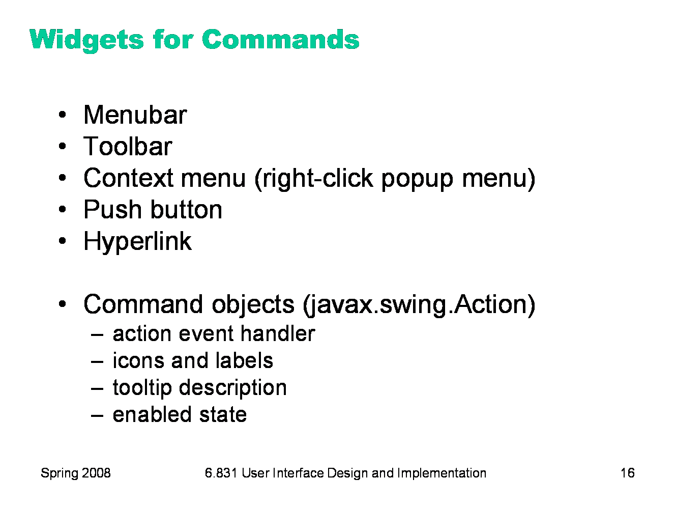
Many widgets are available for commands. It’s a good idea to put the same command in multiple widgets (menubar item, toolbar item, context menu, keyboard shortcut). But it’s not a good idea to put the same command in multiple menus in the menubar, or to use several different labels for the same command, because of consistency. In most toolkits, the command widgets (unlike the choice widgets) actually have a similar API, so you can easily use multiple different widgets for the same application command. In Swing, this interface is the Action interface, and it represents (among other things) an event handler that actually performs the command, descriptions of the command (like an icon, a label, and a tooltip), and a boolean flag that indicates whether the command is currently enabled or disabled. Using Actions allows you to disable all the widgets that might invoke the command with a single line of code. In general, don’t remove command widgets from the UI if they can’t be used at the moment; just disable them. Removing the widgets slows down visual search, because the user might be relying on them as landmarks; it also reduces visibility, since the user can’t tell the difference between a command that doesn’t exist in the application and one that just isn’t available right now.
|
|
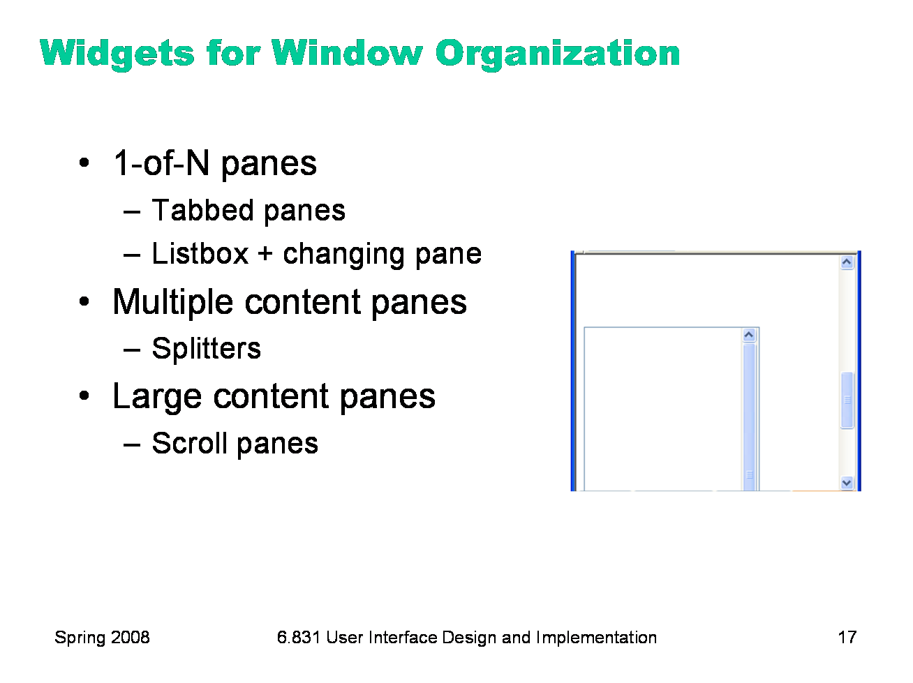
Most toolkits also have widgets for organizing other widgets and navigating through the organization. A common problem is grouping an interface into N pages that can be viewed one at a time. Tabbed panes are a well-understood idiom for this problem; we’ve seen in an earlier Hall of Fame & Shame, however, that tabs don’t scale well, and are largely limited to the number of tabs you can fit into one row. A more scalable solution is a table of contents listbox whose single-selection controls which page is visible. An application window may have several content panes, often separated by splitters that allow the user to adjust the share of screen real estate given to each pane. Mail clients like Outlook or Thunderbird, for example, have one pane for the folder list, another for a message list, and another for the current message. One design issue to pay attention to is keyboard focus and selection. Make sure that the pane with the keyboard focus displays its selection in a way that is visually distinguishable from selections in the other panes. Otherwise, actions like Copy, Paste, or Delete become ambiguous — leading to mode errors. Content that’s too large to fit in the window will require scrollbars — and scrollpane widgets fortunately make this easy to handle. Be aware that horizontal scrolling is harder than vertical scrolling, first because mouse scroll wheels don’t optimize for it (since vertical scrolling is far more common), and second because reading text with a horizontal scrollbar requires scraping the scrollbar back and forth. If you have a choice, organize your UI for vertical scrolling only. Nested scrollpanes are also problematic — a scrollpane inside another scrollpane -- because the inner scrollbar can’t bring the inner content fully into view. Text areas and listboxes are often nested inside scrollpanes (like, say, a web browser), and the result may look something like this. Avoid it when possible.
|
|
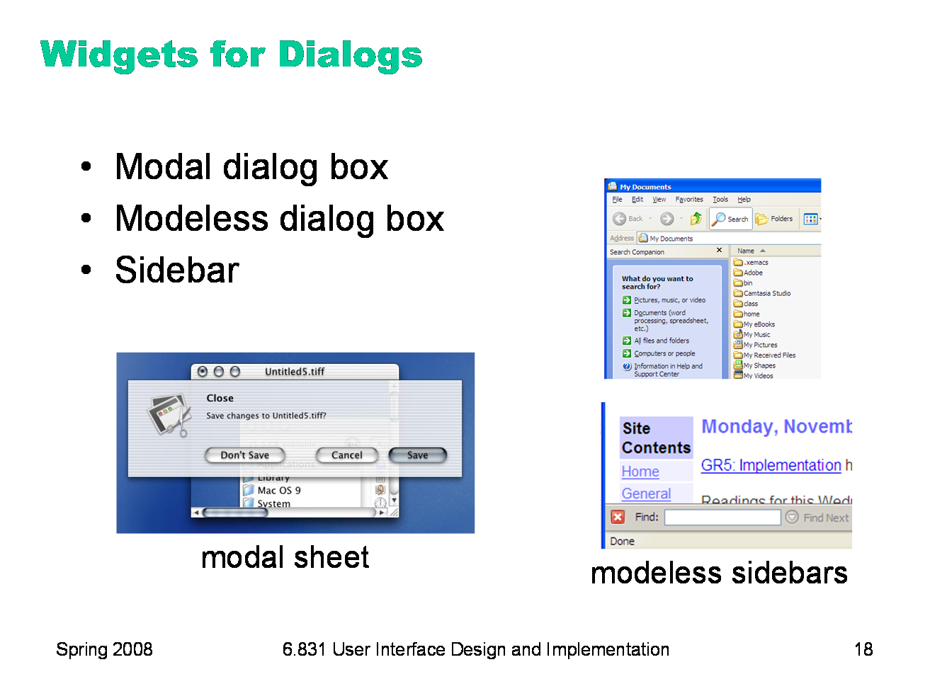
Finally, most toolkits provide widgets for creating dialogs — temporary or long-term satellite windows. Modal dialog boxes are the most common kind of dialog box. They’re called modal because the application enters a mode in which the only legal actions are interactions with the dialog box — you can’t use any other part of the application. On Windows, you can’t even move the other windows of the application! The reason is that modal dialog boxes are often implemented on Windows by entering a new event loop, which can only handle events for the dialog box; all events for the main window, including the move-window events that the Windows window manager sends it when the user drags the title bar, are simply queued up waiting for the second event loop to return. This behavior, incidentally, makes modal dialog boxes trivial to program with, even when you’re writing single-threaded code: you can just call the dialog box as if it were a function, and the whole application stops responding until the user fills it out and dismisses it. It’s like a throwback to synchronous I/O programming: the program pops up a prompt (the dialog box) and waits for the user to answer it, with no other user actions allowed. Modal dialogs do have some usability advantages, such as error prevention (the modal dialog is always on top, so it can’t get lost or be ignored, and the user can’t accidentally change the selection in the main window while working on a modal dialog that affects that selection) and dialog closure. But there are usability disadvantages too, chief among them loss of user control, reduced visibility (e.g., you can’t see important information or previews in the main window), and failures in task analysis might bite you hard (e.g., forcing the user to remember information from one modal dialog to another, rather than viewing both side-by-side). On Windows, modal dialogs are generally application-modal — all windows in the application stop responding until the dialog is dismissed. (The old days of GUIs also had system-modal dialogs, which suspended all applications.) Mac OS X has a neat improvement, window-modal dialogs, which are displayed as translucent sheets attached to the titlebar of the blocked window. This tightly associates the dialog with its window, gives a little visibility of what’s underneath it in the main window — and allows you to interact with other windows, even if they’re from the same application. Modeless dialogs don’t prevent using other windows. They’re often used for ongoing interactions with the main window, like Find/Replace. One problem is that a modeless dialog box can get in the way of viewing or interacting with the main window (as when a Find/Replace dialog covers up the match). Another problem is that there’s often no strong visual distinction between a modal dialog and a modeless dialog; sometimes the presence of a Minimize button is a clue, but it’s not very strong. (This is another advantage of Mac sheets — the modal sheet is easy to distinguish from a modeless window.) A modeless dialog may be better represented as a sidebar, a temporary pane in the main window that’s anchored to one side of the window. Then it can’t obscure the user’s work, can’t get lost, and is clearly visually different from a modal dialog box. The screenshots here show the Find Files sidebar in Windows Explorer, and the Find pane (actually anchored to the bottom of the window, not the side) in Firefox.
|
|
Using widgets has advantages and disadvantages for user interface design. First, widgets provide the conventional software engineering benefits of reusing code, like shorter development time and greater reliability. A widget encapsulates a lot of effort that somebody else has already put in. Second, widgets come with usability benefits, too. Widget reuse increases consistency among the applications on a platform. It also (potentially) represents usability effort that its designers have put into it. A scrollbar’s affordances and behavior have been carefully designed, and hopefully evaluated. By reusing the scrollbar widget, you don’t have to do that work yourself. But one problem with widgets is that they constrain your design thinking. If you try to design an interface using a GUI builder like Visual Basic — with a palette limited to standard widgets — you may produce a clunkier, more complex interface than you would if you sat down with paper and pencil and allowed yourself to think freely. A related problem is that most widget sets consist mostly of form-style widgets: text fields, labels, checkboxes — which leads a designer to think in terms of menu/form style interfaces. There are few widgets that support direct visual representations of application objects, because those representations are so application-dependent. So if you think too much in terms of widgets, you may miss the possibilities of direct manipulation. Finally, widgets can be abused, and applied to UI problems for which they aren’t suited. We saw an example in Lecture 1 where a scrollbar was used for selection, rather than scrolling. A great book with tips about how to use common widgets is GUI Bloopers: Don’ts and Dos for Software Developers and Web Designers, by Jeff Johnson (Morgan Kaufmann, 2000).
|

|
I want to close the lecture by talking about a very important design principle: simplicity. This is a program called FileMatrix. I have no idea what it does, but it seems to do it all. The complexity of this interface actually interferes with a lot of our usability goals: it's less learnable (because there are so many things you have to learn), less efficient (because cramming all the functions into the window means that each button is tiny), and more error-prone (because so many things look alike). Incidentally, this may be a good example of designing for yourself, rather than for others. The programmer who wrote this probably understands it completely, and maybe even uses a significant fraction of those features; but few other users will need that much, and it will just interfere with their ability to use it. |
|
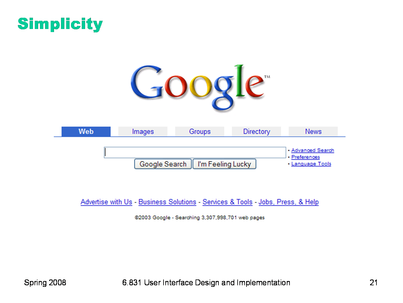
In contrast to the previous example, here’s Google’s start page. Google is an outstanding example of simplicity. Its interface is as simple as possible. Unnecessary features and hyperlinks are omitted, lots of whitespace is used. Google’s page is fast to load and simple to use.
|
|
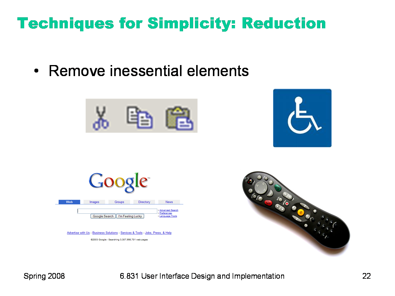
Simplicity is a valuable goal. Here are two ways to make your designs simpler. Reduction means that you eliminate whatever isn’t necessary. This technique has three steps: (1) decide what essentially needs to be conveyed by the design; (2) critically examine every element (label, control, color, font, line weight) to decide whether it serves an essential purpose; (3) remove it if it isn’t essential. Even if it seems essential, try removing it anyway, to see if the design falls apart. Icons demonstrate the principle of reduction well. A photograph of a pair of scissors can’t possibly work as a 32x32 pixel icon; instead, it has to be a carefully-drawn picture which includes the bare minimum of details that are essential to scissors: two lines for the blades, two loops for the handles. The standard US Department of Transportation symbol for handicapped access is likewise a marvel of reduction. No element remains that can be removed from it without destroying its meaning. We’ve already discussed the minimalism of Google. The Tivo remote is another notable example, because it’s so much simpler than comparable remote controls (which tend to be dense arrays of tiny rectangular buttons, all alike). Tivo’s designers aggressively removed functions from the remote, to keep it as simple as possible (“Now Preening on the Coffee Table”, New York Times, Feb 19, 2004).
|
|
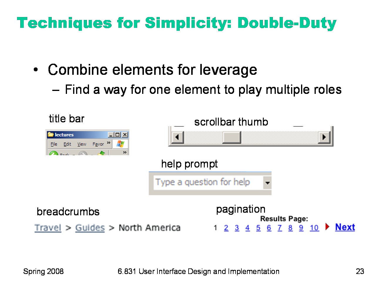
Another technique for simplicity is to combine elements, making them serve multiple roles in the design. Desktop and web interfaces have a number of patterns in which elements have multiple duties. For example, the “thumb” in a scroll bar actually serves three roles. It affords dragging, indicates the position of the scroll window relative to the entire document, and indicates the fraction of the document displayed in the scroll window. Similarly, a window’s title bar plays several roles: label, dragging handle, window activation indicator, and location for window control buttons. In the classic Mac interface, in fact, even the activation indicator played two roles. When the window was activated, closely spaced horizontal lines filled the title bar, giving it a perceived affordance for dragging. The breadcrumbs pattern and the pagination pattern also do double duty, not only showing you where you are but also providing an affordance for navigating somewhere else. Pagination links, like a scrollbar, may also show you how many pages there are.
|
|
|