|
To print these notes, use the PDF version. |
|
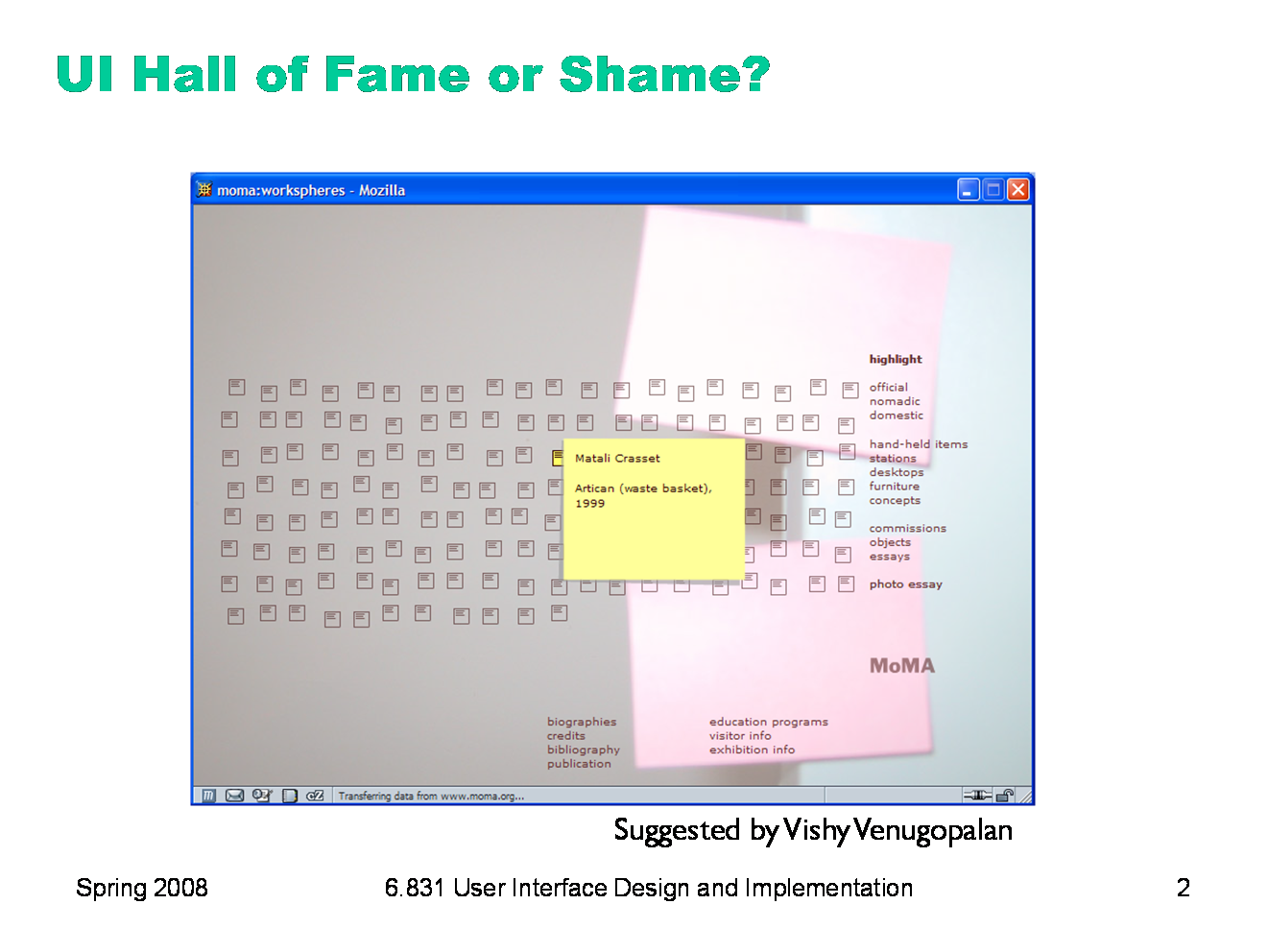
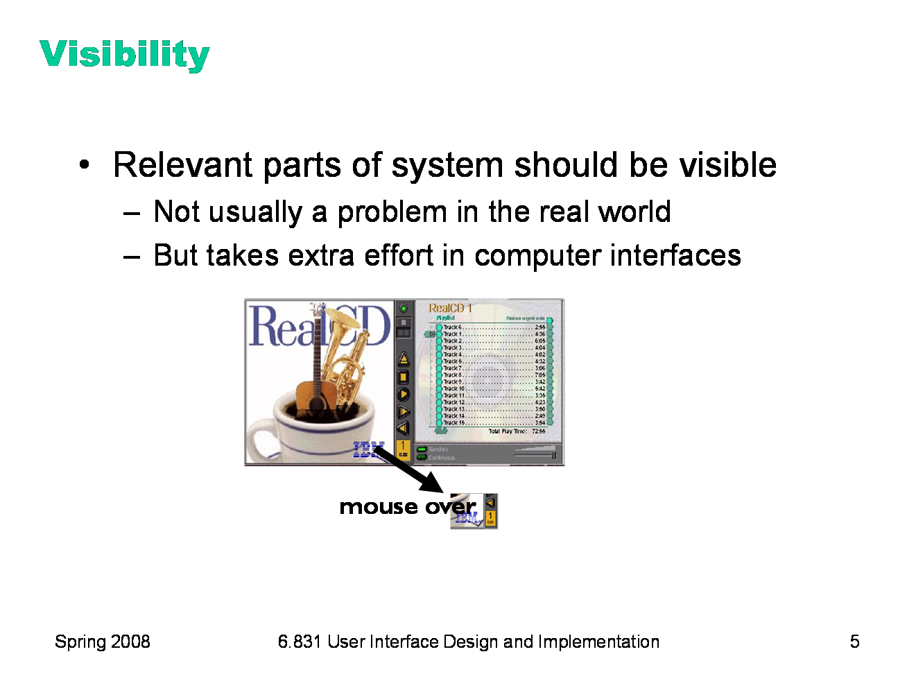
This Flash-driven web site is the Museum of Modern Art’s Workspheres exhibition (http://www.moma.org/exhibitions/2001/workspheres/), a collection of objects related to the modern workplace. This is its main menu: an array of identical icons. Mousing over any icon makes its label appear (the yellow note shown), and clicking brings up a picture of the object. Think about this site with respect to: - metaphor - simplicity - visibility
|
|
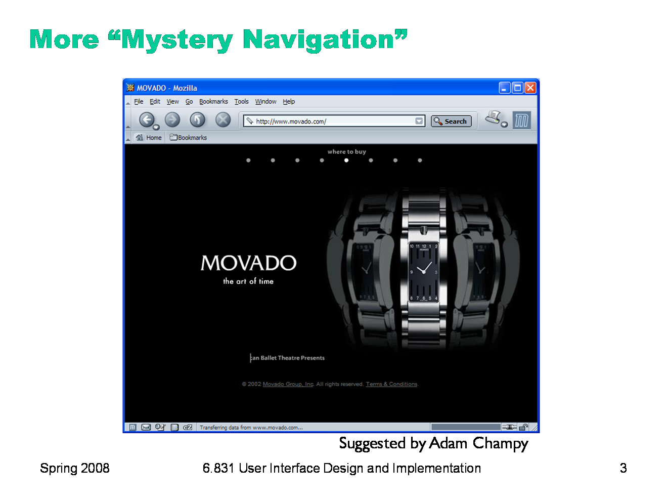
This was once the home page for Movado, a company that makes expensive, stylish watches. (They’ve since changed their design.) The little white dots at the top of the window are menu options. If you watched the opening animation that precedes this screen, you’d see each menu label appear briefly over each dot. But if you skipped over the intro, you wouldn’t see that, and you may not even realize that a menu is hiding up there under those stylish white dots. When you mouse over a dot, you actually have to wait for a cute little animation (a watch hand sweeping around the dot) before the menu label appears. Each little animation takes 2 seconds. Moving the mouse off the dot makes the label disappear again. How does this interface fare in terms of: - simplicity - visibility - efficiency |
|
Today’s lecture is about visibility — making the invisible state and behavior of software perceivable by the user. We’ll look at three kinds of things to make visible. Actions are the things the user can do in the interface, like commands that can be issued or places that can be visited. State is the current configuration of the interface and its backend, like which objects are selected or what data is in the model. Feedback is the result of a user’s action, which might be a change in visible state or might simply be an acknowledgement that the action took effect. Along the way, we’ll mention several phenomena related to human cognition and perception, such as the spotlight model of attention, and the notion of perceptual fusion and its practical implications for system response time. We’ll do this in future design-principles lectures as well, because understanding the properties and limitations of the human beings on one side of a user interface is as important as understanding how to program the computer on the other side. We don’t have time in this course to cover human cognition in depth, however, so we’ll pick and choose as necessary to support the design topics we’re discussing. If you’re interested in learning more, you should check out courses in Course 9 (Brain & Cognitive Sciences).
|
|
Visibility is an essential principle of graphical user interface design. If the user can’t see an important control, they would have to (1) guess that it exists, and (2) guess where it is. Recall that this was exactly the problem with RealCD’s online help facility. There was no visible clue that the help system existed in the first place, and no perceivable affordance for getting into it. Visibility is not usually a problem with physical objects, because you can usually tell its parts just by looking at it. Look at a bicycle, or a pair of scissors, and you can readily identify the pieces that make it work. Although parts of physical objects can be made hidden or invisible — for example, a door with no obvious latch or handle — in most cases it takes more design work to hide the parts than just to leave them visible. The opposite is true in computer interfaces. A window can interpret mouse clicks anywhere in its boundaries in arbitrary ways. The input need not be related at all to what is being displayed. In fact, it takes more effort to make the parts of a computer interface visible than to leave them invisible. So you have to guard carefully against invisibility in computer interfaces.
|
|
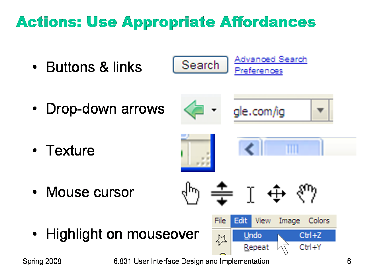
The first kind of visibility is for actions: what can the user do? (Or where can the user go, if we’re talking about an information-rich web site?) We’ve already talked about affordances, which are the actual and perceived properties of an object that indicate how it should be operated. Note the word perceived — if the user can’t perceive affordances, then they won’t effectively communicate. Here are some more examples of commonly-seen affordances in graphical user interfaces. Buttons and hyperlinks are the simplest form of affordance for actions. Buttons are typically metaphorical of real-world buttons, but the underlined hyperlink has become an affordance all on its own, without reference to any physical metaphor. Downward-pointing arrows, for example, indicate that you can see more choices if you click on the arrow. The arrow actually does double-duty — it makes visible the fact that more choices are available, and it serves as a hotspot for clicking to actually make it happen. Texture suggests that something can be clicked and dragged — relying on the physical metaphor, that physical switches and handles often have a ridged or bumpy surface for fingers to more easily grasp or push. Mouse cursor changes are another kind of affordance — a visible property of a graphical object that suggests how you operate it. When you move the mouse over a hyperlink, for example, you get a finger cursor. When you move over the corner of a window, you often get a resize cursor; when you move over a textbox, you get a text cursor (the “I-bar”). Finally, the visible highlighting that you get when you move the mouse over a menu item or a button is another kind of affordance. Because the object visibly responds to the presence of the mouse, it suggests that you can interact with it by clicking.
|
|
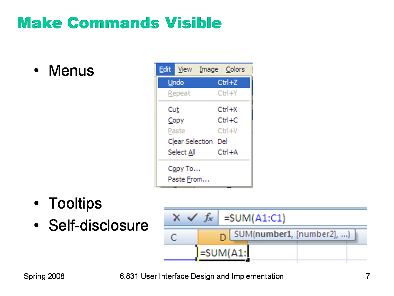
Affordances are low-level properties that tell you what a graphical object is and how to interact with it. At a higher level in a user interface are the commands that are available to be invoked. A command might be represented in a variety of low-level ways: as a menu item (e.g. File / Open), as a toolbar button (e.g. labeled by a little folder icon), as a keyboard shortcut (e.g. Ctrl-O), or as a command-line command (e.g. “open” typed in at a command prompt). Some of these ways have better visibility than others. The standard pulldown menubar is a beautiful design pattern. It keeps the top-level menu set constantly visible, without using much screen real estate. It provides a very efficient way to scan all the menus, and see all the available commands at a glance. And menu items do double-duty, not only naming the command and providing something to click on to invoke it, but also providing a place to make other ways to invoke the command visible too — like the keyboard shortcut (Ctrl-Z) and menu accelerator key (U for undo). On the other hand, the menubar is at the periphery of the screen, or near it anyway, so it’s not always the most visible place to put a command. For many desktop users, however, the menubar is the place to look if they don’t see an appropriate command in the main section of the window — which makes the menubar like documentation of sorts. So it’s important to take advantage of the menubar in your design, particularly if you have many commands. One rule of thumb is that every command your interface offers should appear in the menubar, even if it also has a toolbar button or a keyboard shortcut that you expect users to use more frequently. Making a command visible in the menubar is certainly better than merely describing it in the online documentation, which is likely to be the last place a user looks. Tooltips are another nice design pattern for providing a more descriptive label of a small control, and also a place for making other shortcuts visible. Self-disclosure is a technique for making a command language more visible, helping the user learn the available commands and syntax. Self-disclosure is useful for interfaces that have both a traditional GUI (with menus and forms and possibly direct manipulation) as well as a command language (for scripting). When the user issues a command in the GUI part, the interface also displays the command in the command language that corresponds to what they did. A primitive form of self-disclosure is the address bar in a web browser — when you click on a hyperlink, the system displays to you the URL that you could have typed in order to visit the page. A more sophisticated kind of self-disclosure happens in Excel: when you choose the sum function from the toolbar, and drag out a range of cells to be summed, Excel shows you how you could have typed the formula instead. (Notice that Excel also uses a tooltip, to make the syntax of the formula more visible.)
|
|
Users depend on visible cues to figure out how to achieve their goals with the least effort. For information gathering tasks, like searching for information on the web, it turns out that this behavior can be modeled much like animals foraging for food. An animal feeding in a natural environment asks questions like: Where should I feed? What should I try to eat (the big rabbit that’s hard to catch, or the little rabbit that’s less filling)? Has this location been exhausted of food that’s easy to obtain, and should I try to move on to a more profitable location? Information foraging theory claims that we ask similar questions when we’re collecting information: Where should I search? Which articles or paragraphs are worth reading? Have I exhausted this source, should I move on to the next search result or a different search? (Pirolli & Card, “Information Foraging in Information Access Environments,” CHI ‘95.) An important part of information foraging is the decision about whether a hyperlink is worth following — i.e., does this smell good enough to eat? Users make this decision with relatively little information — sometimes only the words in the hyperlink itself, sometimes with some context around it (e.g., a Google search result also includes a snippet of text from the page, the site’s domain name, the length of the page, etc.) These cues are information scent — the visible properties of a link that indicate how profitable it will be to follow the link. (Chi et al, “Using Information Scent to Model User Information Needs and Actions on the Web”, Chi 2001.) |
|
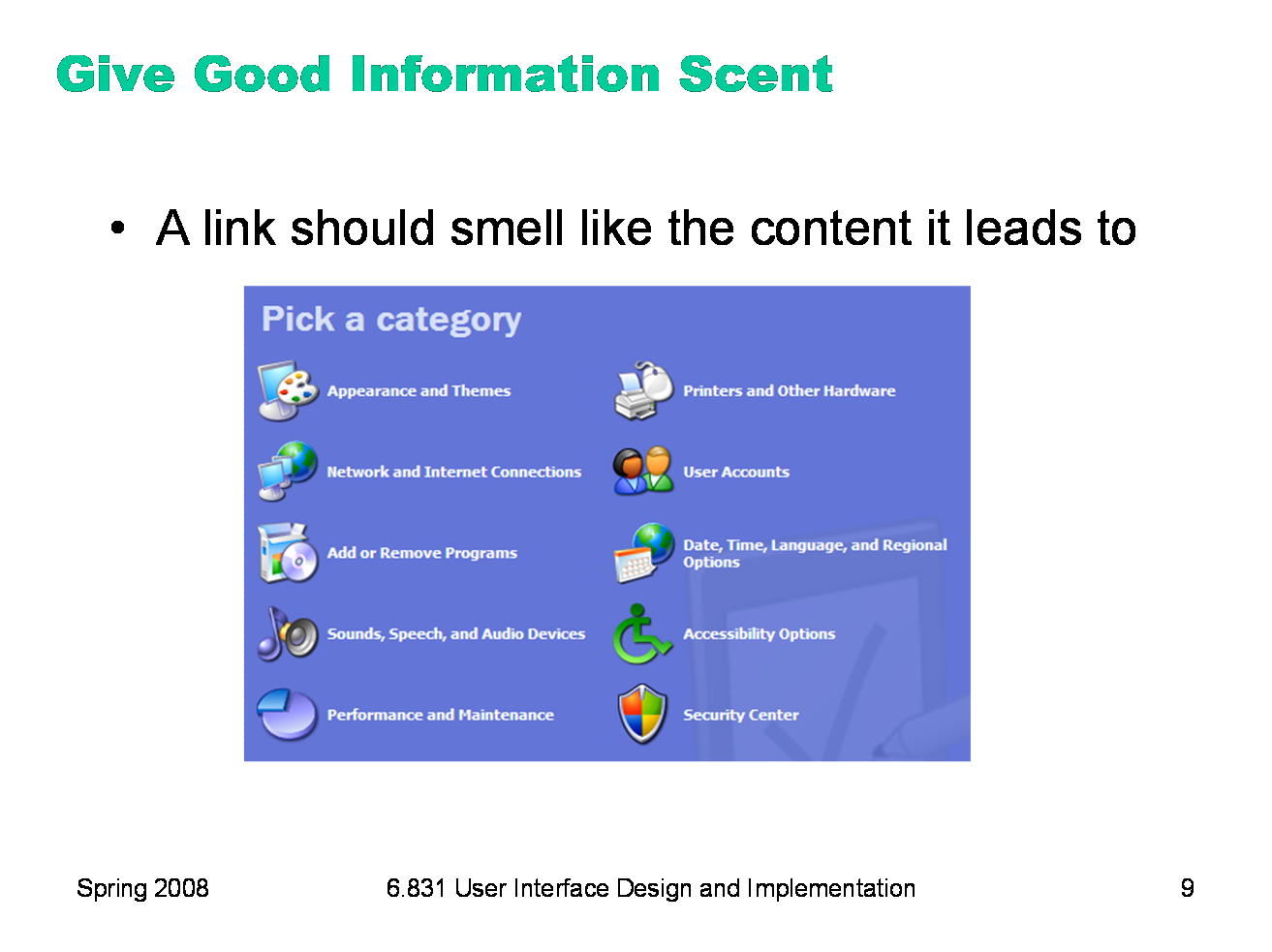
Hyperlinks in your interface — or in general, any kind of navigation, commands that go somewhere else — should provide good, appropriate information scent. Examples of bad scent include misleading terms, incomprehensible jargon (like “Set Program Access and Defaults” on the Windows XP Start menu), too-general labels (“Tools”), and overlapping categories (“Customize” and “Options” found in old versions of Microsoft Word). Examples of good scent can be seen in the (XP-style) Windows Control Panel on the left, which was carefully designed. Look, for example, at “Printers and Other Hardware.” Why do you think printers were singled out? Presumably because task analysis (and collected data) indicated that printer configuration was a very common reason for visiting the Control Panel. Including it in the label improves the scent of that link for users looking for printers. (Look also at the icon — what does that add to the scent of Printers & Other Hardware?) Date, Time, Language, and Regional Options is another example. It might be tempting to find a single word to describe this category — say, Localization — but its scent for a user trying to reset the time would be much worse. Notice that the quality of information scent depends on the user’s particular goal. A design with good scent for one set of goals might fail for another set. For example, if a shopping site has categories for Music and Movies, then where would you look for a movie soundtrack? One solution to this is to put it in both categories, or to provide “See Also” links in each category that direct the user sideways in the hierarchy. |
|
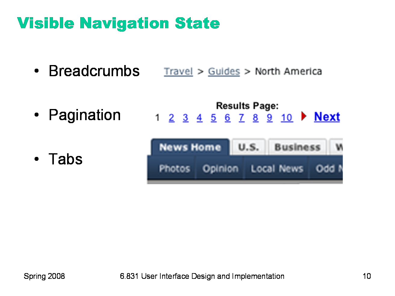
So far we’ve been looking at how to make the set of available actions visible. Let’s turn now to visualizing the state of the system. Navigation is one important kind of state to visualize — i.e., where am I now? On the Web, in particular, users are in danger of getting lost as they move around in deep, information-rich sites. We’ve already seen in previous lectures a couple of patterns for preventing this by visualizing the user’s location. Breadcrumb trails show where you are as a path through the site’s hierarchy (e.g. Travel, Guides, North America), in a very compact form. Showing the hierarchy in a tree widget with the current node highlighted is another way to do it, but costs more screen space and complexity. Pagination and highlighted tabs are similar patterns that show the user where they are, along with some context of where else they could go.
|
|
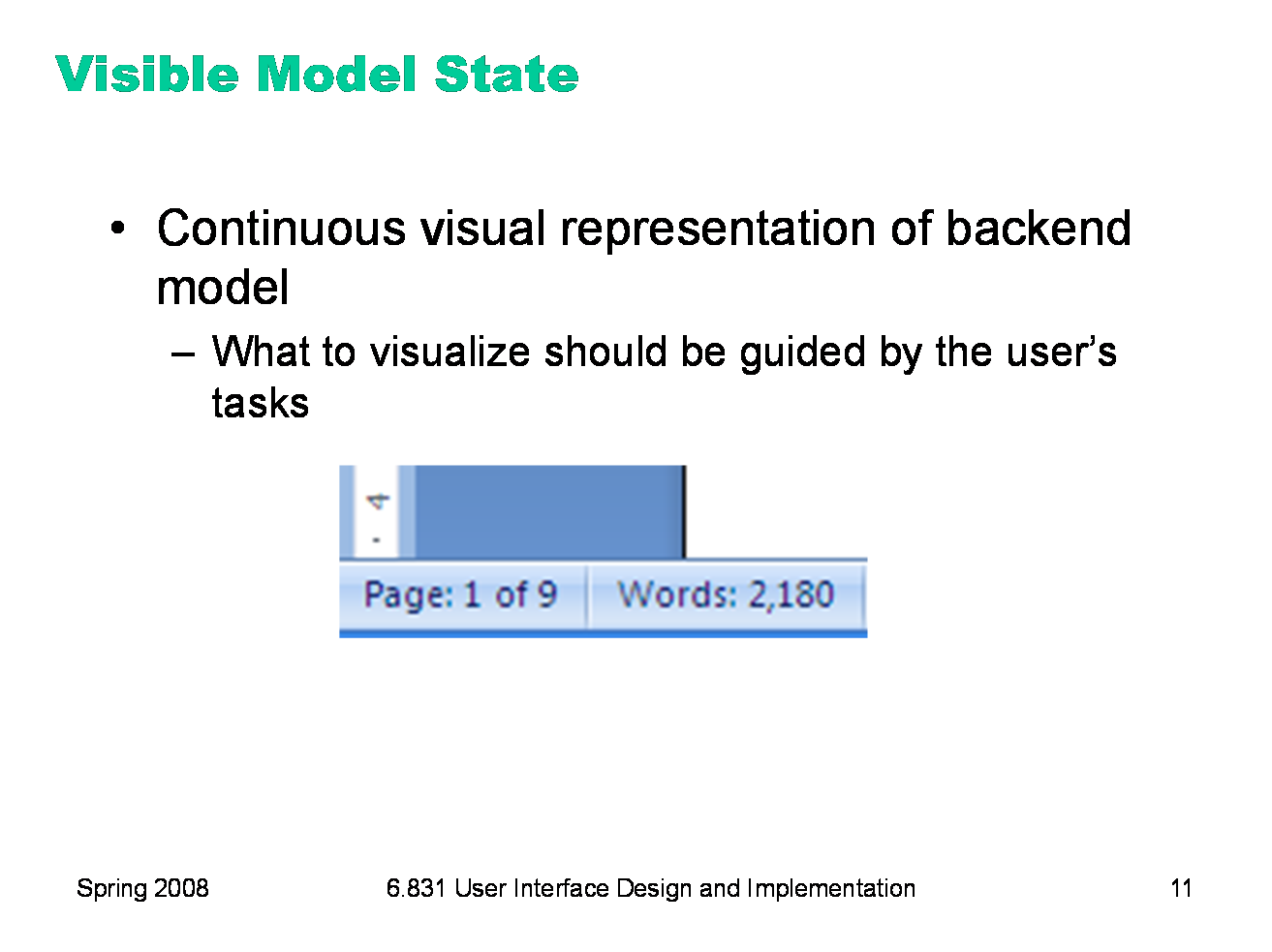
It hardly seems necessary to say that the backend model should be visualized in an interface. That’s one of the essential properties of a direct-manipulation interface: a continuous visual representation of the state of the application. The hard design issues in model visibility tend to lie in what to make visible (i.e. which aspects of the model), and how to display it (i.e., in what representation). We’ll discuss the how, the visual representation, in much greater detail in a future lecture on graphic design. The what may involve a tension between visibility and simplicity; visibility argues for showing more, but simplicity argues for showing less. Task analysis and user analysis may help resolve the tension. For example, Microsoft Word displays a word count continuously in the status bar, since counting words is an important subtask for many users of Word (such as students, journalists, and book authors). Making it always visible saves the need to invoke a word-count command.
|
|
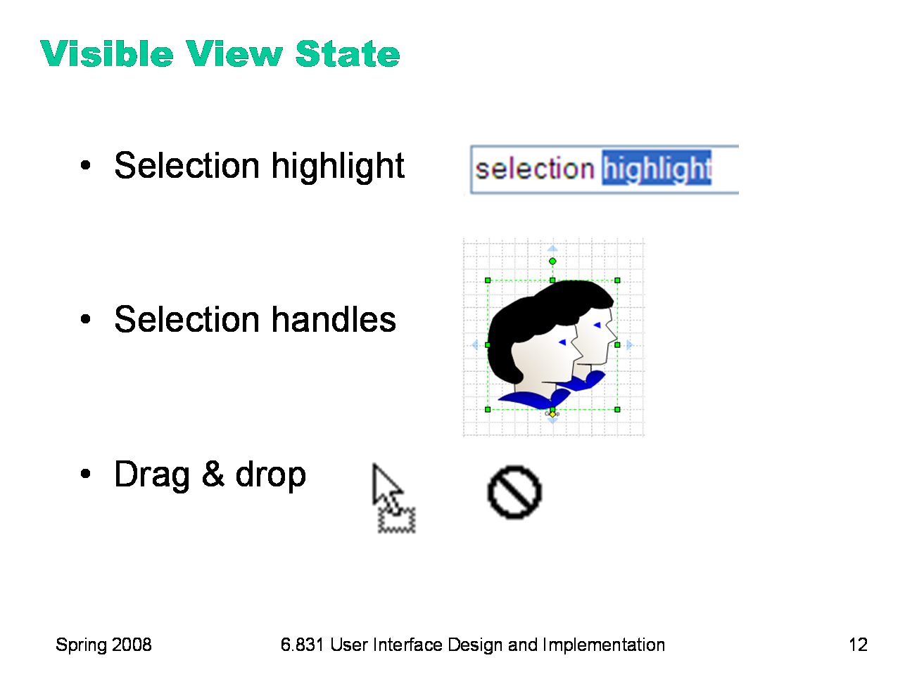
Still other state is stored in the view (or controller), not in the backend model. This “view state” is the current state of the user’s interaction with the interface. Selections are particularly important. When the user selects an object to operate on, highlight the object somehow. Don’t just leave the selection invisible and implicit. Selection highlighting provides important feedback that the selection operation was successful; it also shows the current state of the selection if the user has forgotten what was previously selected. A common technique for showing a selection highlight in text is reverse video (white text on dark colored background). For shapes and objects, the selection highlight may be done by selection handles, or by a dotted or animated border around the object (“crawling ants”). Selection handles are appealing because they do double-duty — both indicating the selection, and providing visible affordances for resizing the object. When the user selects objects or text and then operates on the selection with a command, keep it selected, especially if it changes appearance drastically or moves somewhere else. If the selected thing is offscreen when the user finally invokes a command on it, scroll it back into view. That allows the user to follow what happened to the object, so they can easily evaluate its final state. Similarly, if the user makes a selection and then invokes an unrelated command (like scrolling or sorting or filtering, none of which actually use the selection), preserve the selection, even if it means you have to remember it and regenerate it. User selections, like user data, are precious, and contribute to the visibility of what the system is doing. Another form of view state is the state of an input controller, like a drag & drop operation. Drag & drop is often indicated by a cursor change. |
|
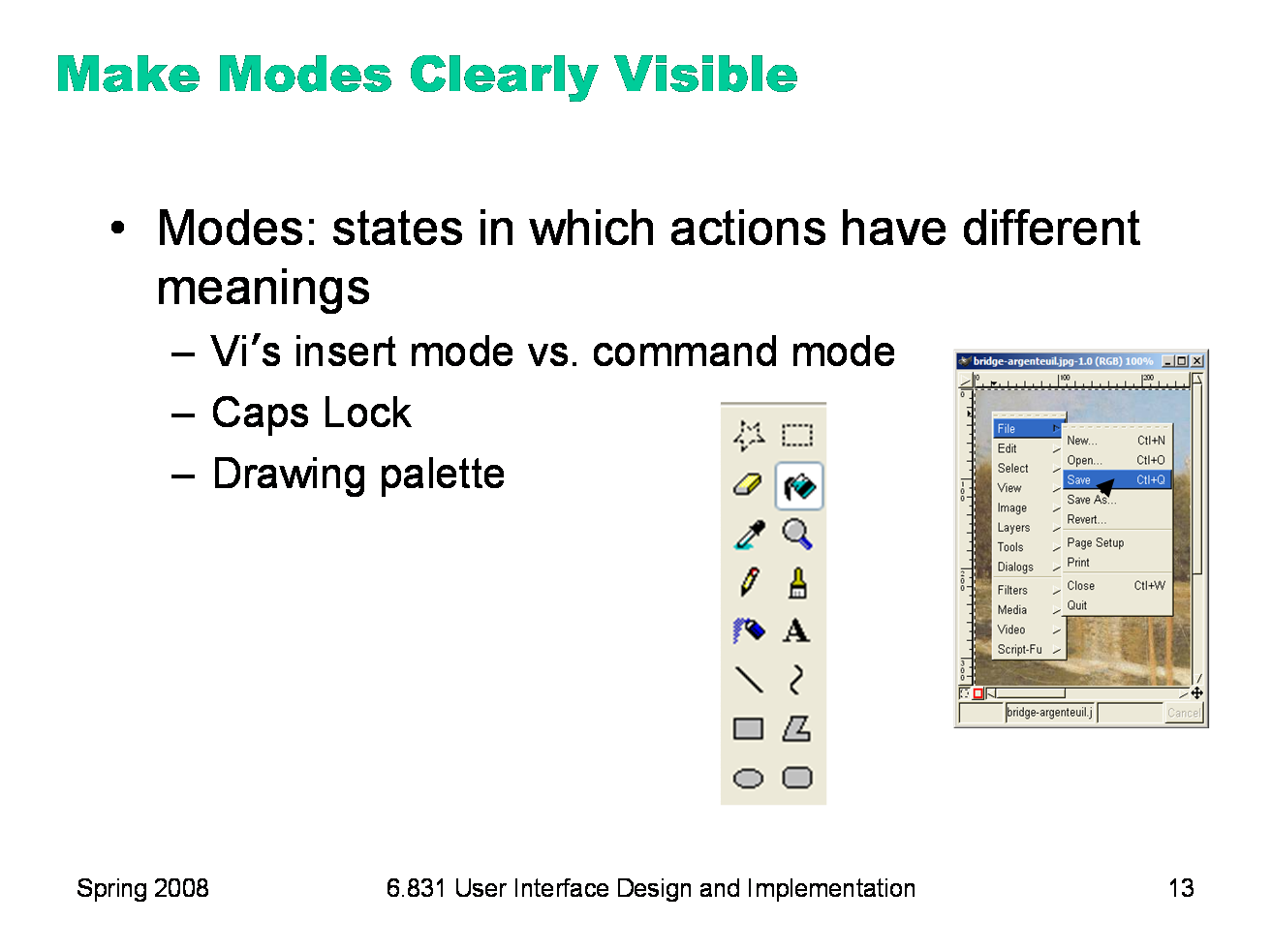
Modes are interface states in which the same action has different meanings. For example, when Caps Lock mode is enabled on a keyboard, the letter keys produce uppercase letters. The text editor vi is famous for its modes: in insert mode, letter keys are inserted into your text file, while in command mode (the default), the letter keys invoke editing commands. In the first lecture, we talked about another mode error in Gimp: accidentally changing a menu shortcut because your mouse is hovering over it. Mode errors occur when the user tries to invoke an action that doesn’t have the desired effect in the current mode. For example, if the user means to type lowercase letters but doesn’t notice that Caps Lock is enabled, then a mode error occurs. One way to avoid or mitigate mode errors is to make the mode visible. But visibility is a much harder problem for mode status than it is for affordances. When mode errors occur, the user isn’t actively looking for the mode, like they might actively look for a control. As a result, mode status indicators must be visible in the user’s locus of attention. That’s why the Caps Lock light, which displays the status of the Caps Lock mode on a keyboard, doesn’t really work.
|
|
The metaphor used by cognitive psychologists for how attention behaves in perception is the spotlight: you can focus your attention on only one input channel in your environment at a time. This input channel might be a location in your visual field, or it might be a location or voice in your auditory field. You can shift your attention to another channel, but at the cost of giving up your previous focus. So when you’re thinking about how to make something important visible, you should think about where the user’s attention is likely to be focused — their document? The text cursor? The animated banner ads on the web site? Raskin, The Humane Interface, 2000 has a good discussion of attention as it relates to mode visibility. Raskin argues that we should think of it as the locus of attention, rather than focus, to emphasize that it’s merely the place where the user’s attention happens to be, and doesn’t necessarily reflect any conscious focusing process on the user’s part. The status bar probably isn’t often in the locus of attention. There’s an amusing story (possibly urban legend) about a user study mainly involving ordinary spreadsheet editing tasks, in which every five minutes the status bar would display “There’s a $50 bill taped under your chair. Take it!” In a full day of testing, more than a dozen users, nobody took the money. (Alan Cooper, The Inmates Are Running the Asylum.) But there’s also evidence that many users pay no attention to the status bar when they’re considering whether to click on a hyperlink; in other words, the URL displayed in the status bar plays little or no role in the link’s information scent. Phishing web sites (fake web sites that look like major sites like eBay or PayPal or CitiBank and try to steal passwords and account informations) exploit this to hide their stinky links. The Mac OS menubar has a similar problem — it’s at the periphery of the screen, so it’s likely to be far from the user’s locus of attention. Since the menubar is the primary indicator of which application is currently active — in Mac OS, an application can be active even if it has no windows on the screen — users who use keyboard shortcuts heavily may make mode errors, because they aren’t attending to the menubar. What about the shape of the mouse cursor? Surely that’s reliably in the user’s locus of attention? It may be likely to be in the user’s field of vision (or fovea), but that doesn’t necessarily mean they’re paying attention to the cursor, as opposed to the objects they’re working with. Raskin describes a mode error he makes repeatedly with his favorite drawing program, despite the fact that the mode is clearly indicated by a different mouse cursor.
|
|
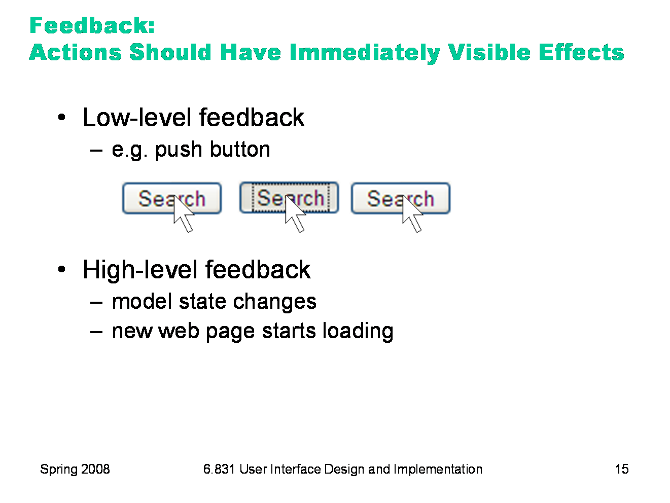
The third and final aspect of visibility is feedback: how the system changes when you perform an action. When the user invokes a part of the interface, it should appear to respond. Push buttons should depress and release. Scrollbar thumbs and dragged objects should move with the mouse cursor. Pressing a key should make a character appear in a textbox. Low-level feedback is provided by a view object itself, like push-button feedback. This kind of feedback shows that the interface at least took notice of the user’s input, and is responding to it. (It also distinguishes between disabled widgets, which don’t respond at all.) High-level feedback is the actual result of the user’s action, like changing the state of the model.
|
|
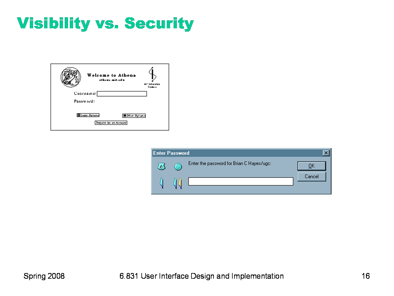
Sometimes feedback must be traded off with other properties, such as security. The Athena login screen provides no feedback at all when you enter your password. There’s a security explanation for that — it doesn’t want to leak any information about your password to somebody reading the screen over your shoulder — but it probably goes too far. A new user might think the interface is broken, that the computer is hung, or that the keyboard has been disconnected by some joker. Most password entry fields provide at least some low-level feedback, such as the conventional row of asterisks. The bottom dialog, from Lotus Notes, provides even more feedback: a set of hieroglyphics derived from the password you typed in. If you can remember what hieroglyphics you usually see, then you can check them to see if you typed your password correctly, before pressing OK.
|
|
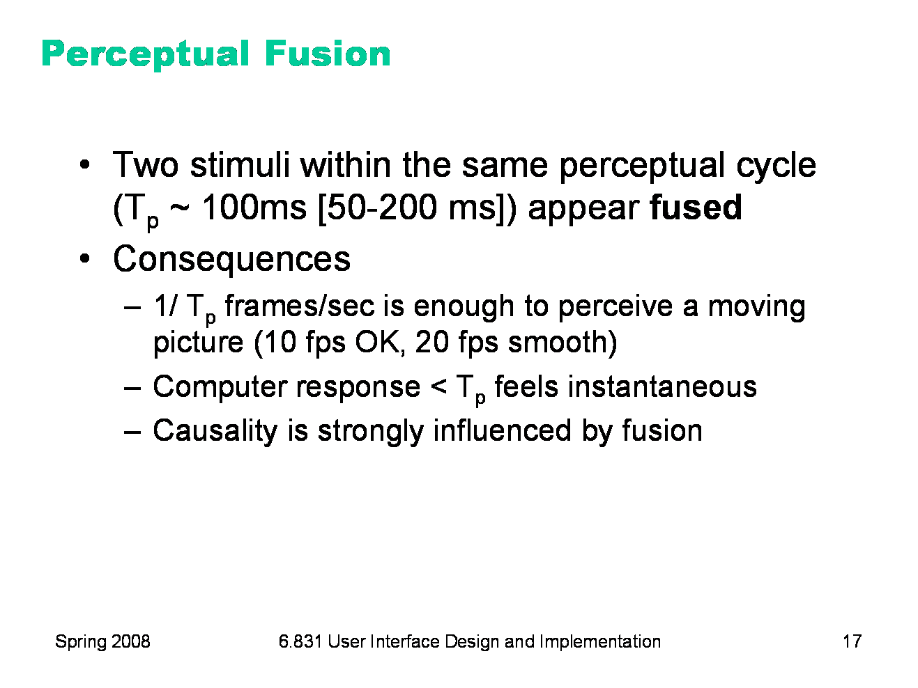
One interesting effect of human perceptual system is perceptual fusion. Here’s an intuition for how fusion works. Our “perceptual processor” runs at a certain frame rate, grabbing one frame (or picture) every cycle, where each cycle takes Tp seconds. Two events occurring less than the cycle time apart are likely to appear in the same frame. If the events are similar — e.g., Mickey Mouse appearing in one position, and then a short time later in another position — then the events tend to fuse into a single perceived event — a single Mickey Mouse, in motion. The cycle time of the perceptual processor can be derived from a variety of psychological experiments over decades of research (summarized in Card, Moran, Newell, The Psychology of Human-Computer Interaction, Lawrence Erlbaum Associates, 1983). 100 milliseconds is a typical value which is useful for a rule of thumb. But it can range from 50 ms to 200 ms, depending on the individual (some people are faster than others) and on the stimulus (for example, brighter stimuli are easier to perceive, so the processor runs faster). Perceptual fusion is responsible for the way we perceive a sequence of movie frames as a moving picture, so the parameters of the perceptual processor give us a lower bound on the frame rate for believable animation. 10 frames per second is good enough for a typical case, but 20 frames per second is better for most users and most conditions. Perceptual fusion also gives an upper bound on good computer response time. If a computer responds to a user’s action within Tp time, its response feels instantaneous with the action itself. Systems with that kind of response time tend to feel like extensions of the user’s body. If you used a text editor that took longer than Tp response time to display each keystroke, you would notice. Fusion also strongly affects our perception of causality. If one event is closely followed by another — e.g., pressing a key and seeing a change in the screen — and the interval separating the events is less than Tp, then we are more inclined to believe that the first event caused the second.
|
|
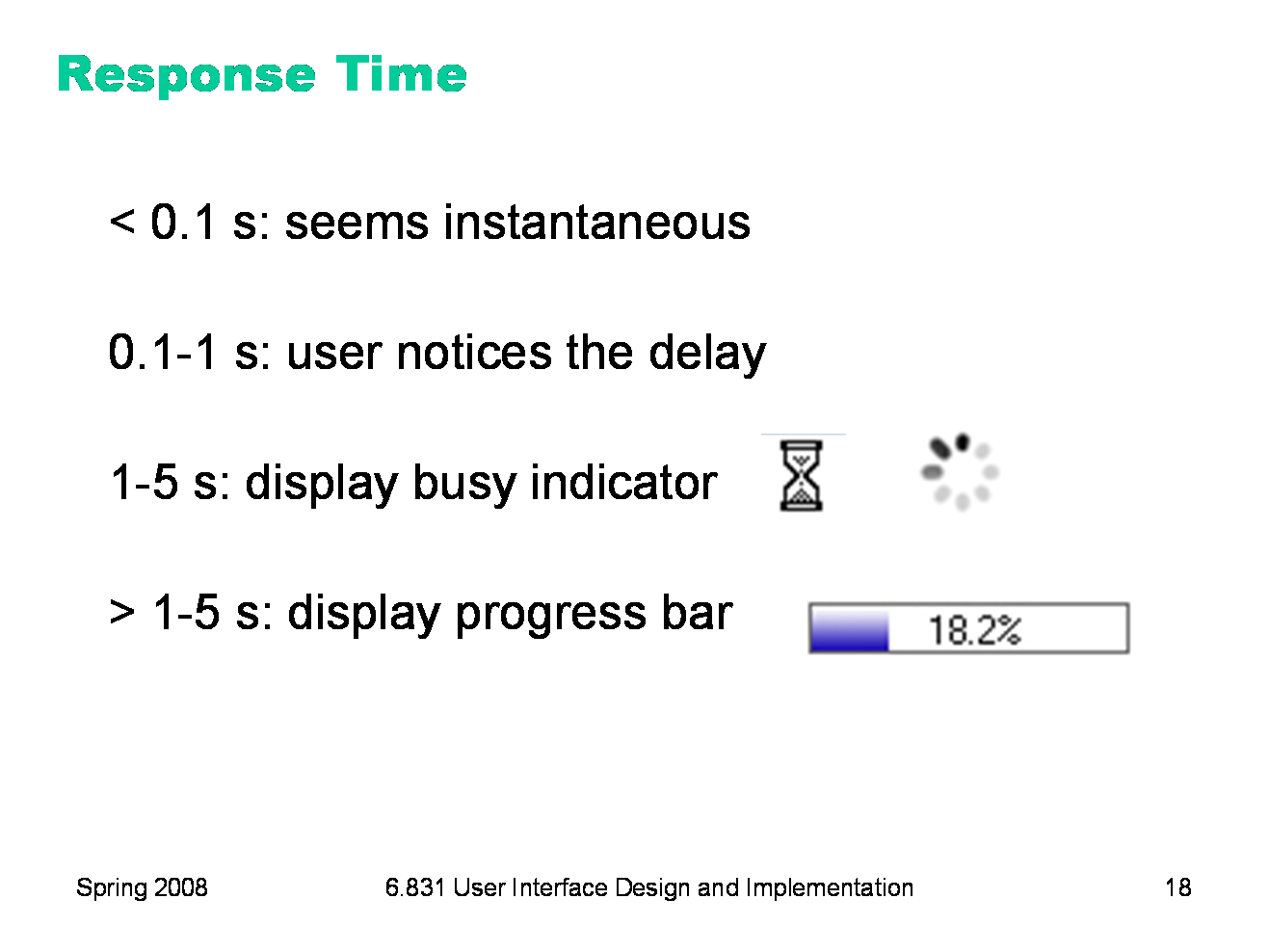
Perceptual fusion provides us with some rules of thumb for responsive feedback. If the system can perform a command in less than 100 milliseconds, then it will seem instantaneous, or near enough. As long as the result of the command itself is clearly visible — e.g., in the user’s locus of attention — then no additional feedback is required. If it takes longer than the perceptual fusion interval, then the user will notice the delay — it won’t seem instantaneous anymore. Something should change, visibly, within 100 ms, or perceptual fusion will be disrupted. Normally, however, ordinary low-level feedback is enough to satisfy this requirement, such as a push-button popping back, or a menu disappearing. One second is a typical turn-taking delay in human conversation — the maximum comfortable pause before you feel the need to fill the gap with something, even if it’s just “uh” or “um”. If the system’s response will take longer than a second, then it should display additional feedback. For short delays, the hourglass cursor (or spinning cursor, or throbber icon) is a common design pattern. For longer delays, show a progress bar, and give the user the ability to cancel the command. Note that progress bars don’t necessarily have to be accurate. (This one is actually preposterous — who cares about 3 significant figures of progress?) An effective progress bar has to show that progress is being made, and allow the user to estimate completion time at least within an order of magnitude — a minute? 10 minutes? an hour? a day?
|
|
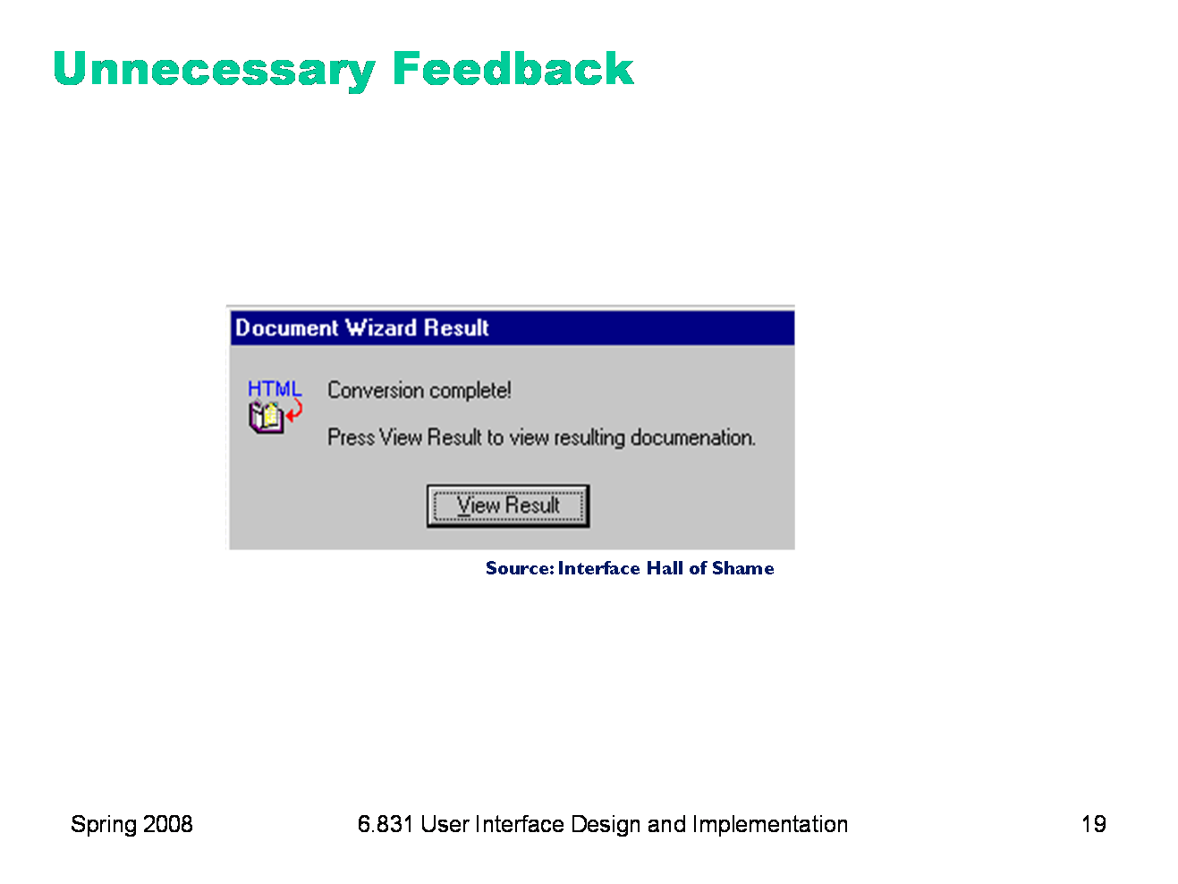
Feedback is important, but don’t overdo it. This dialog box demands a click from the user. Why? Does the interface need a pat on the back for finishing the conversion? It would be better to just skip on and show the resulting documentation.
|
|
Feedback doesn’t always have to be visual. Audio feedback — like the clicks that a keyboard makes — is another form. So is haptic feedback, conveyed by the sense of touch. The mouse button gives you haptic feedback in your finger when you feel the vibration of the click. That’s much better feedback then you get from a touchscreen, which doesn’t give you any physical sense when you’ve pressed it hard enough to register. Audio and haptic feedback are excellent for low-level feedback, reassuring you that you successfully pushed the button hard enough.
|
|
Let’s summarize the lecture with a case study of (in)visibility: the Unix command line. Unix may be beautiful for many reasons, but visibility is not one of them. The actions available to the user are completely invisible; the user must recall a command name from memory, along with the syntax for its arguments. The state of the underlying system is likewise mostly hidden. Many users customize their prompts to make some state visible, such as the current directory or the hostname. The contents of the current directory are not visible, even though many commands operate on files. The feedback from a command is minimal — in fact, one Unix design principle is that commands should say nothing when they succeed. |
|
Now that we’ve spent a whole lecture talking about visibility, why do we want it? First, visibility is essential for conveying information. Information has to be visible (or perceivable by some sense, if not vision) in order to reach the user. Visibility also supports learnability. Many of the ideas we discussed under the heading of learnability — such as affordances and feedback — come up again when discussing learnability. It’s very hard to learn an interface with poor visibility, because the user can’t tell what actions are possible, can’t evaluate the system’s current state to compare it against the desired state, and can’t evaluate the effects of the actions they try to learn how they work. But excessive visibility may conflict with simplicity. If you show too much — say, displaying every property of an object, regardless of how useful it is — then the sheer volume of information may overwhelm, making the important bits actually less visible because they’re surrounded by so much chaff.
|
|
|