|
To print these slides, use the PDF version.
|
|
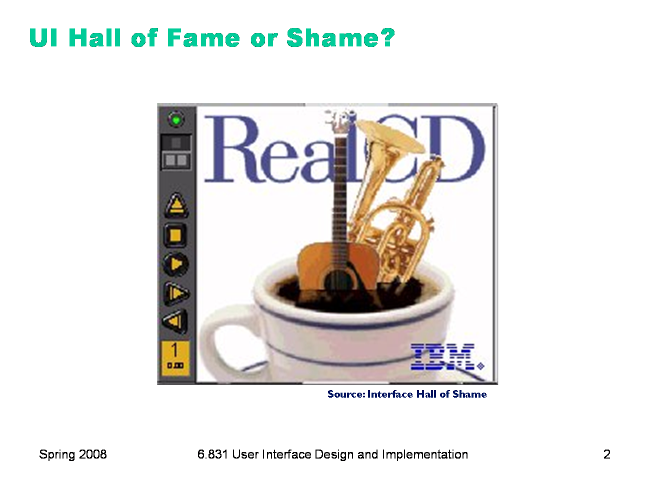
IBM’s RealCD is CD player software, which allows you to play an audio CD in your CD-ROM drive. Why is it called “Real”? Because its designers based it on a real-world object: a plastic CD case. This interface has a metaphor, an analogue in the real world. Metaphors are one way to make an interface more learnable, since users can make guesses about how it will work based on what they already know about the interface’s metaphor. Unfortunately, the designers’ careful adherence to this metaphor produced some remarkable effects, none of them good. Here’s how RealCD looks when it first starts up. Notice that the UI is dominated by artwork, just like the outside of a CD case is dominated by the cover art. That big RealCD logo is just that — static artwork. Clicking on it does nothing. There’s an obvious problem with the choice of metaphor, of course: a CD case doesn’t actually play CDs. The designers had to find a place for the player controls — which, remember, serve the primary task of the interface — so they arrayed them vertically along the case hinge. The metaphor is dictating control layout, against all other considerations. Slavish adherence to the metaphor also drove the designers to disregard all consistency with other desktop applications. Where is this window’s close box? How do I shut it down? You might be able to guess, but is it obvious? Learnability comes from more than just metaphor.
|
|
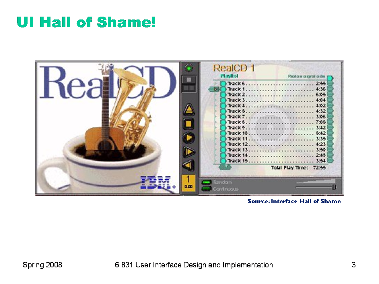
But it gets worse. It turns out, like a CD case, this interface can also be opened. Oddly, the designers failed to sensibly implement their metaphor here. Clicking on the cover art would be a perfectly sensible way to open the case, and not hard to discover once you get frustrated and start clicking everywhere. Instead, it turns out the only way to open the case is by a toggle button control (the button with two little gray squares on it). Opening the case reveals some important controls, including the list of tracks on the CD, a volume control, and buttons for random or looping play. Evidently the metaphor dictated that the track list belongs on the “back” of the case. But why is the cover art more important than these controls? A task analysis would clearly show that adjusting the volume or picking a particular track matters more than viewing the cover art. And again, the designers ignore consistency with other desktop applications. It turns out that not all the tracks on the CD are visible in the list. Could you tell right away? Where is its scrollbar?
|
|
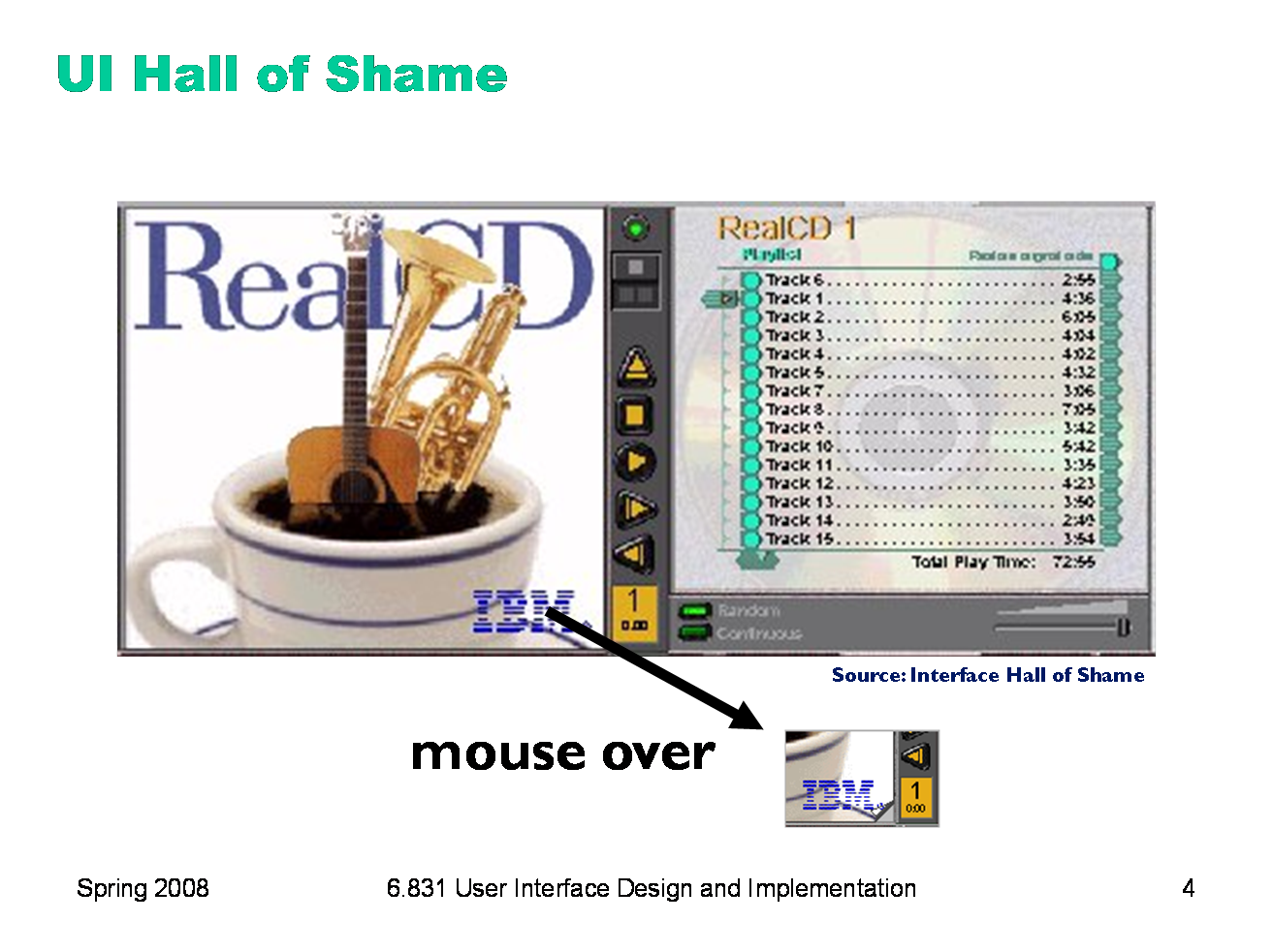
We’re not done yet. Where is the online help for this interface? First, the CD case must be open. You had to figure out how to do that yourself, without help. With the case open, if you move the mouse over the lower right corner of the cover art, around the IBM logo, you’ll see some feedback. The corner of the page will seem to peel back. Clicking on that corner will open the Help Browser. The aspect of the metaphor in play here is the liner notes included in a CD case. Removing the liner notes booklet from a physical CD case is indeed a fiddly operation, and alas, the designers of RealCD have managed to replicate that part of the experience pretty accurately. But in a physical CD case, the liner notes usually contain lyrics or credits or goofy pictures of the band, which aren’t at all important to the primary task of playing the music. RealCD puts the instructions in this invisible, nearly unreachable, and probably undiscoverable booklet. This example has several lessons: first, that interface metaphors can be horribly misused; and second, that the presence of a metaphor does not at all guarantee an “intuitive”, or easy-to-learn, user interface. (There’s a third lesson too, unrelated to metaphor — that beautiful graphic design doesn’t equal usability, and that graphic designers can be just as blind to usability problems as programmers can.) Fortunately, metaphor is not the only way to achieve learnability. In fact, it’s probably the hardest way, fraught with the most pitfalls for the designer. In this lecture, we’ll look at some other ways.
|
|
Today’s lecture is about learnability and memorability — making interfaces easier for new users to learn, and for casual users to remember. We’ll talk about how users learn about an interface by forming a mental model of its parts and their behaviors. We’ll look at the evolution of graphical user interfaces from a learnability point of view, surveying three interface styles that have been (and still are) used. We’ll also talk about some design principles that you can apply if learnability is an important criterion for your interface.
|
|
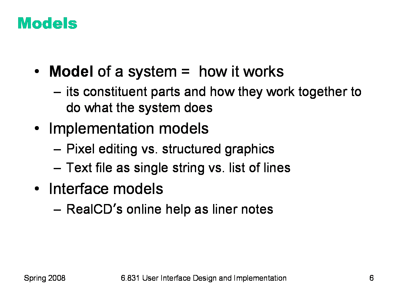
A model of a system is a way of describing how the system works. A model specifies what the parts of the system are, and how those parts interact to make the system do what it’s supposed to do. Consider image editing software. Programs like Photoshop and Gimp use a pixel editing model, in which an image is represented by an array of pixels (plus a stack of layers). Programs like Visio and Illustrator, on the other hand, use a structured graphics model, in which an image is represented by a collection of graphical objects, like lines, rectangles, circles, and text. In this case, the choice of model strongly constrains the kinds of operations available to a user. You can easily tweak individual pixels in Photoshop, but you can’t easily move an object once you’ve drawn it into the picture. Similarly, most modern text editors model a text file as a single string, in which line endings are just like other characters. But it doesn’t have to be this way. Some editors represent a text file as a list of lines instead. When this implementation model is exposed in the user interface, as in old Unix text editors like ed, line endings can’t be deleted in the same way as other characters. ed has a special join command for deleting line endings.
|
|
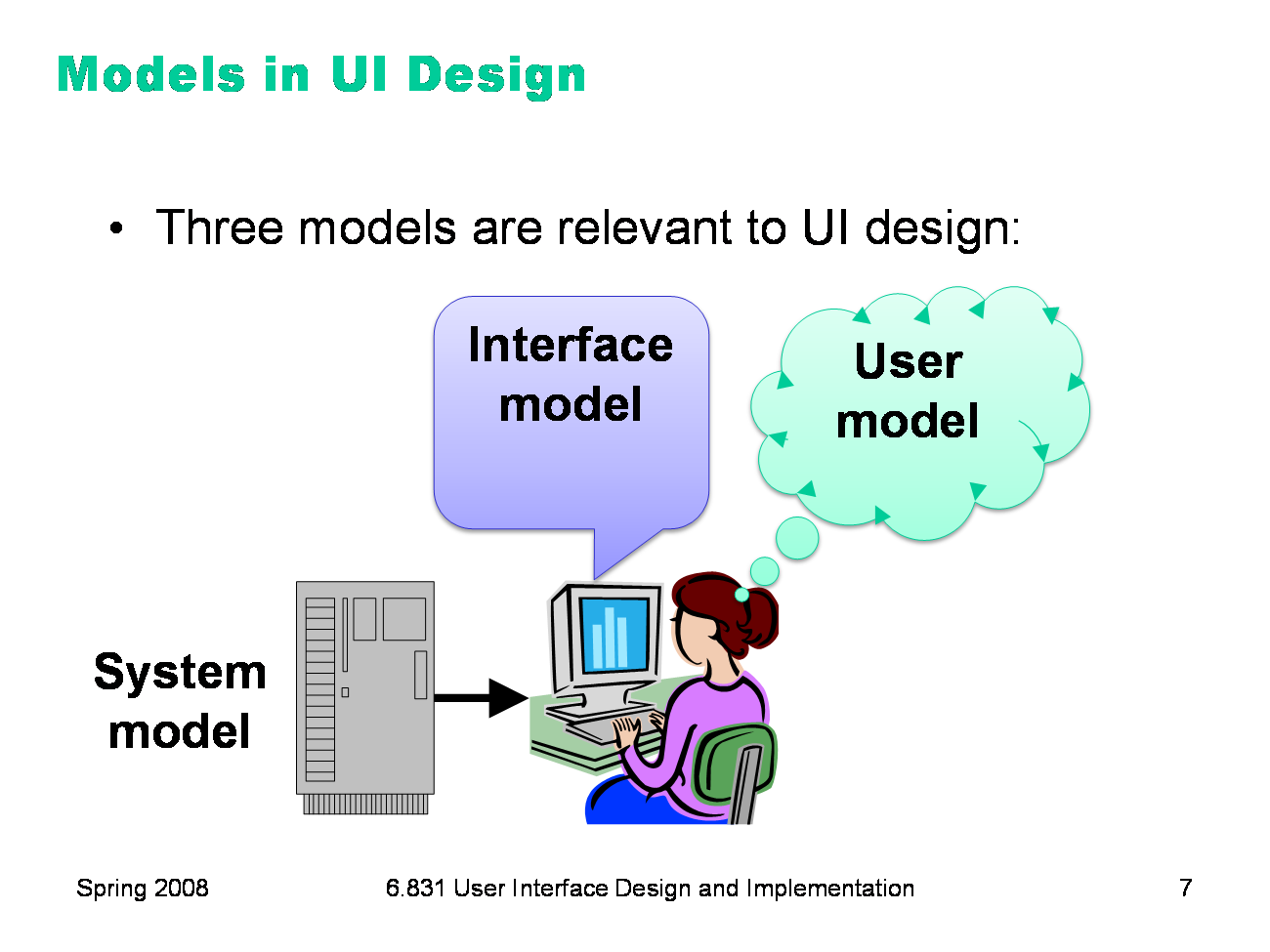
The preceding discussion hinted that there are actually several models you have to worry about in UI design: ·The system model (sometimes called implementation model) is how the system actually works. ·The interface model (or manifest model) is the model that the system presents to the user through its user interface. ·The user model (or conceptual model) is how the user thinks the system works. Note that we’re using model in a more general and abstract sense here than when we talk about the model-view-controller pattern. In MVC, the model is a software component (like a class or group of classes) that stores application data and implements the application behavior behind an interface. Here, a model is an abstracted description of how a system works. The system model on this slide might describe the way an MVC model class behaves (for example, storing text as a list of lines). The interface model might describe the way an MVC view class presents that system model (e.g., allowing end-of-lines to be “deleted” just as if they were characters). Finally, the user model isn’t software at all; it’s all in the user’s mind.
|
|
The interface model might be quite different from the system model. A text editor whose system model is a list of lines doesn’t have to present it that way through its interface. The interface could allow deleting line endings as if they were characters, even though the actual effect on the system model is quite different. Similarly, a cell phone presents the same simple interface model as a conventional wired phone, even though its system model is quite a bit more complex. A cell phone conversation may be handed off from one cell tower to another as the user moves around. This detail of the system model is hidden from the user. As a software engineer, you should be quite familiar with this notion. A module interface offers a certain model of operation to clients of the module, but its implementation may be significantly different. In software engineering, this divergence between interface and implementation is valued as a way to manage complexity and plan for change. In user interface design, we value it primarily for other reasons: the interface model should be simpler and more closely reflect the user’s model of the actual task, which we can learn from task analysis.
|
|
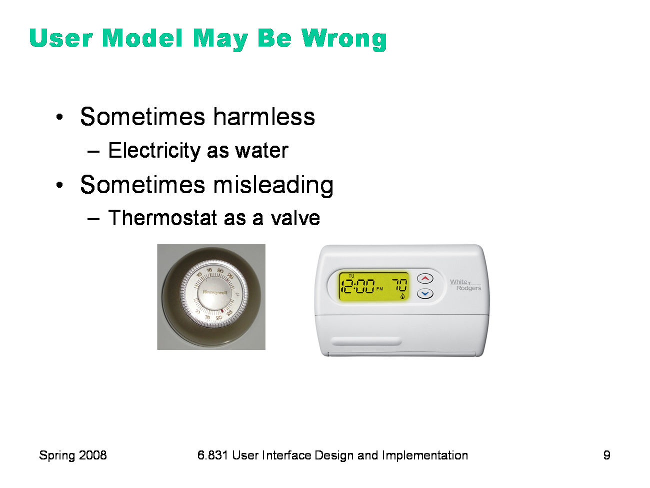
The user’s model may be totally wrong without affecting the user’s ability to use the system. A popular misconception about electricity holds that plugging in a power cable is like plugging in a water hose, with electrons traveling up through the cable into the appliance. The actual system model of household AC current is of course completely different: the current changes direction many times a second, and the actual electrons don’t move much. But the user model is simple, and the interface model supports it: plug in this tube, and power flows to the appliance. But a wrong user model can lead to problems, as well. Consider a household thermostat, which controls the temperature of a room. If the room is too cold, what’s the fastest way to bring it up to the desired temperature? Some people would say the room will heat faster if the thermostat is turned all the way up to maximum temperature. This response is triggered by an incorrect mental model about how a thermostat works: either the timer model, in which the thermostat controls the duty cycle of the furnace, i.e. what fraction of time the furnace is running and what fraction it is off; or the valve model, in which the thermostat affects the amount of heat coming from the furnace. In fact, a thermostat is just an on-off switch at the set temperature. When the room is colder than the set temperature, the furnace runs full blast until the room warms up. A higher thermostat setting will not make the room warm up any faster. (Norman, Design of Everyday Things, 1988) These incorrect models shouldn’t simply be dismissed as “ignorant users.” (Remember, the user is always right! If there’s a consistent problem in the interface, it’s probably the interface’s fault.) These user models for heating are perfectly correct for other systems: the heater in a car, for example, or a burner on a stove both use the valve model. And users have no problem understanding the model of a dimmer switch, which performs the analogous function for light that a thermostat does for heat. When a room needs to be brighter, the user model says to set the dimmer switch right at the desired brightness. The problem here is that the thermostat isn’t effectively communicating its model to the user. In particular, there isn’t enough feedback about what the furnace is doing for the user to form the right model.
|
|
Today’s lecture is about learnability, which was one of the major goals in the evolution of graphical user interfaces over the last few decades. Let’s look at three major kinds of user interface styles for desktop computing (i.e., a computer with a screen, keyboard, and mouse) that have been used. We’ll tackle them in roughly chronological order as they were developed. In general, the progression of these styles has been towards greater and greater learnability, and we’ll see why.
|
|
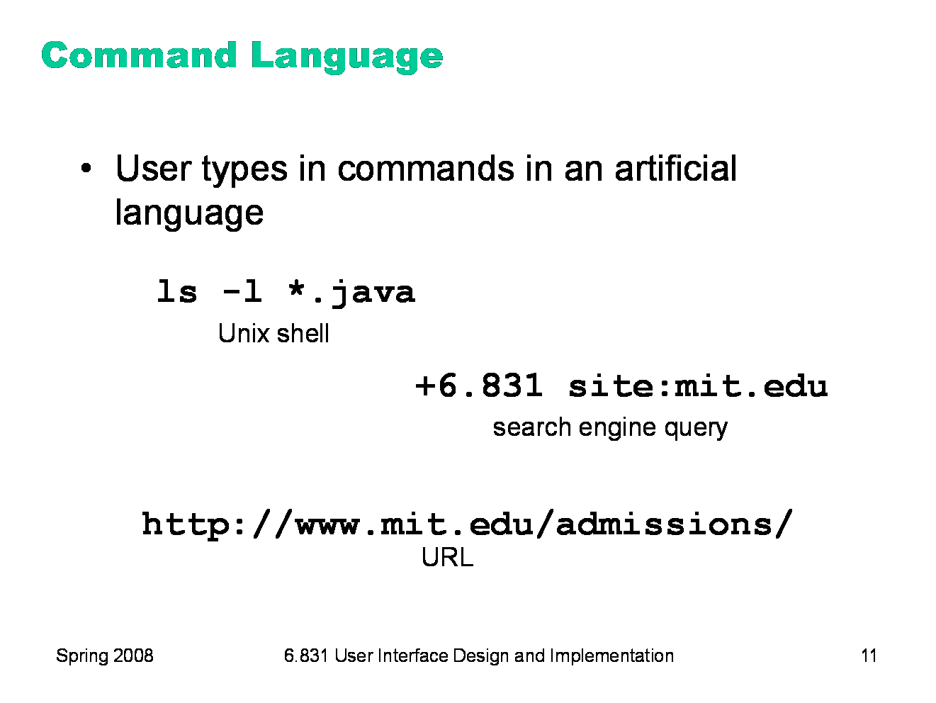
The earliest computer interfaces were command languages: job control languages for early computers, which later evolved into the Unix command line. Although a command language is rarely the first choice of a user interface designer nowadays, they still have their place — often as an advanced feature embedded inside another interaction style. For example, Google’s query operators form a command language. Even the URL in a web browser is a command language, with particular syntax and semantics.
|
|
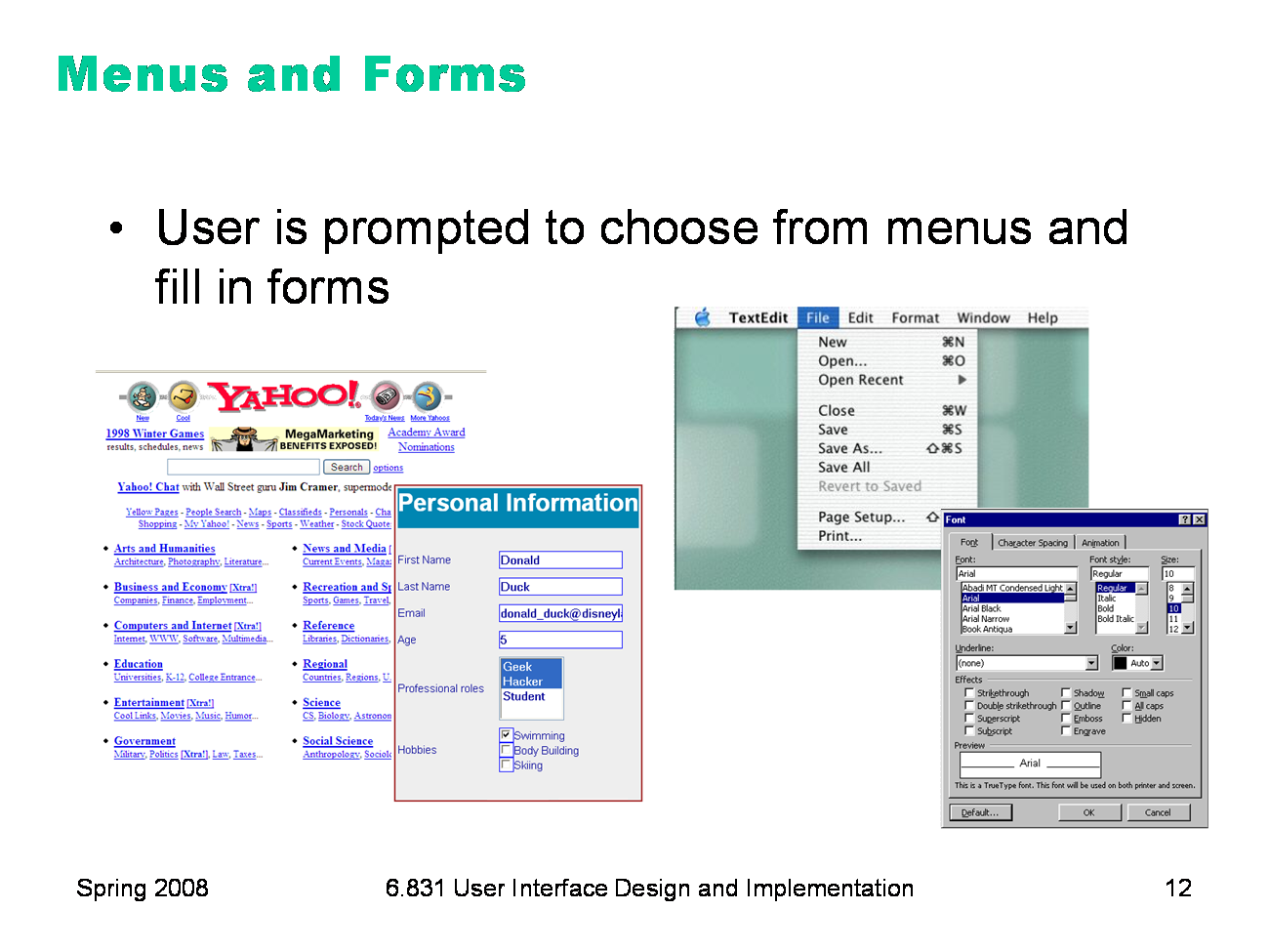
A menu/form interface presents a series of menus or forms to the user. Traditional (Web 1.0) web sites behave this way. Most graphical user interfaces have some kind of menu/forms interaction, such as a menubar (which is essentially a tree of menus) and dialog boxes (which are essentially forms). |
|
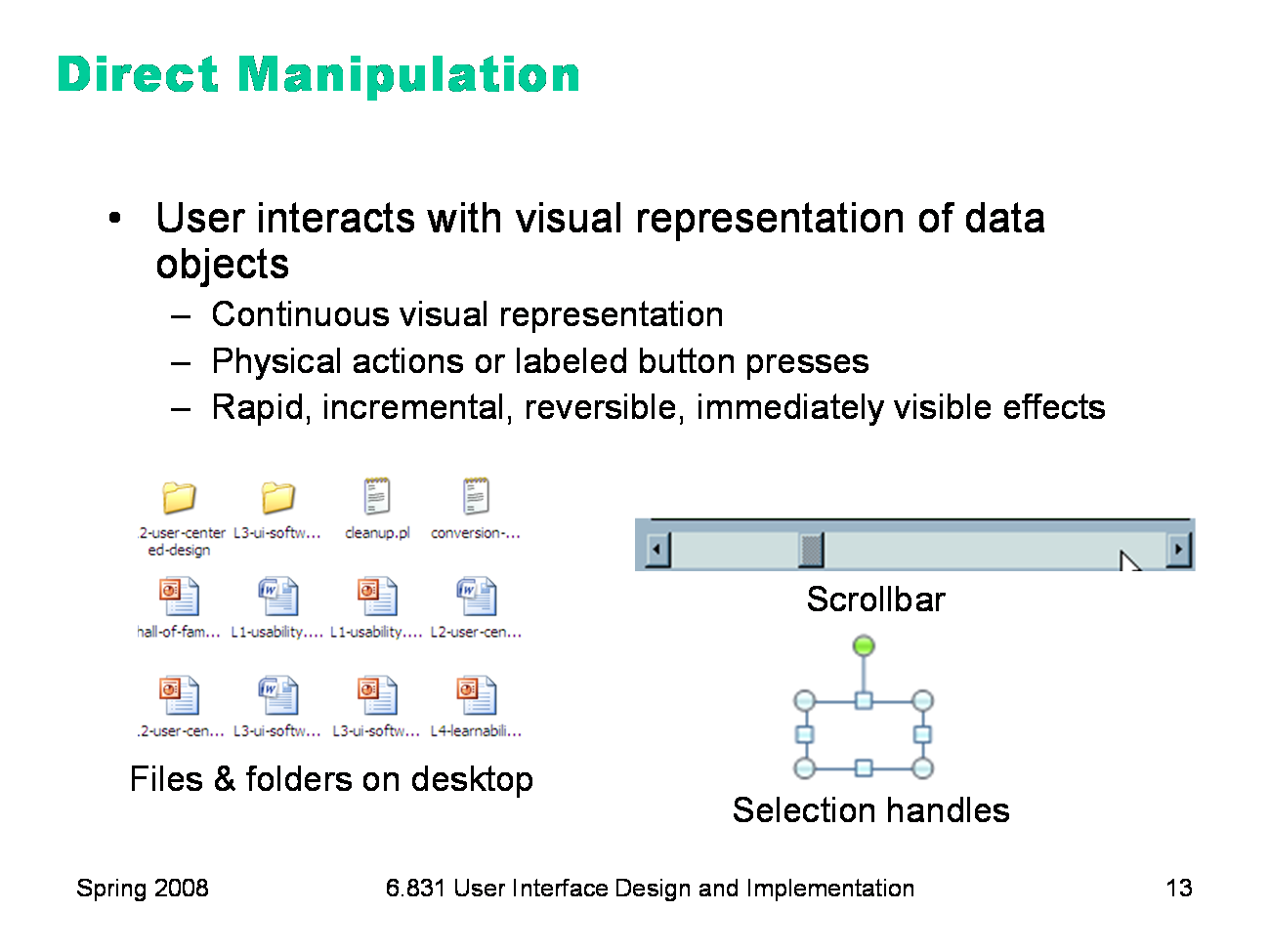
Finally, we have direct manipulation: the preeminent interface style for graphical user interfaces. Direct manipulation is defined by three principles [Shneiderman, Designing the User Interface, 2004]: 1. A continuous visual representation of the system’s data objects. Examples of this visual representation include: icons representing files and folders on your desktop; graphical objects in a drawing editor; text in a word processor; email messages in your inbox. The representation may be verbal (words) or iconic (pictures), but it’s continuously displayed, not displayed on demand. Contrast that with the behavior of ed, a command-language-style text editor: ed only displayed the text file you were editing when you gave it an explicit command to do so. 2. The user interacts with the visual representation using physical actions or labeled button presses. Physical actions might include clicking on an object to select it, dragging it to move it, or dragging a selection handle to resize it. Physical actions are the most direct kind of actions in direct manipulation — you’re interacting with the virtual objects in a way that feels like you’re pushing them around directly. But not every interface function can be easily mapped to a physical action (e.g., converting text to boldface), so we also allow for “command” actions triggered by pressing a button — but the button should be visually rendered in the interface, so that pressing it is analogous to pressing a physical button. 3. The effects of actions should be rapid (visible as quickly as possible), incremental (you can drag the scrollbar thumb a little or a lot, and you see each incremental change), reversible (you can undo your operation — with physical actions this is usually as easy as moving your hand back to the original place, but with labeled buttons you typically need an Undo command), and immediately visible. Why is direct manipulation so powerful? It exploits perceptual and motor skills of the human machine — and depends less on linguistic skills than command or menu/form interfaces. So it’s more “natural” in a sense, because we learned how to manipulate the physical world long before we learned how to talk, read, and write. |
|
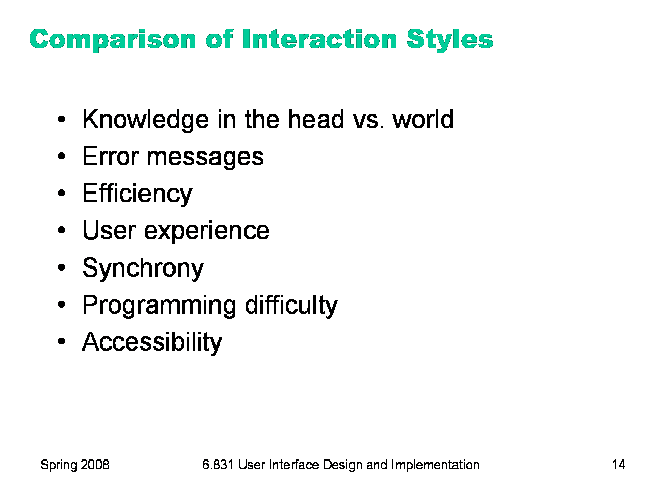
Let’s compare and contrast the three styles: command language (CL), menus and forms (MF), and direct manipulation (DM). Learnability: knowledge in the head vs. knowledge in the world. CL requires significant learning. Users must put a lot of knowledge into their heads in order to use the language, by reading, training, practice, etc. (Or else compensate by having manuals, reference cards, or online help close at hand while using the system.) The MF style puts much more information into the world, i.e. into the interface itself. Well-designed DM also has information in the world, delivered by the affordances, feedback, and constraints of the visual metaphor. Error messages: CL and MF often have error messages (e.g. “you didn’t enter a phone number”), but DM rarely needs error messages. There’s no error message when you drag a scrollbar too far, for example; the scrollbar thumb simply stops, and the visual constraints of the scrollbar make it obvious why it stopped. Efficiency: Experts can be very efficient with CL, since they don’t need to wait for and visually scan system prompts, and many CL systems have command histories and scripting facilities that allow commands to be reused rather than constantly retyped. Efficient performance with MF interfaces demands good shortcuts (e.g. keyboard shortcuts, tabbing between form fields, typeahead). Efficient performance with DMs is possible when the DM is appropriate to the task; but using DM for a task it isn’t well-suited for may feel like manual labor with a mouse. User type: CL is generally better for expert users, who keep their knowledge active and who are willing to invest in training and learning in exchange for greater efficiency. MF and DM are generally better for novices and infrequent users. Synchrony: Command languages are synchronous (first the user types a complete command, then the system does it). So are menu systems and forms; e.g., you fill out a web form, and then you submit it. DM, on the other hand, is asynchronous: the user can point the mouse anywhere and do anything at any time. DM interfaces are necessarily event-driven. Programming difficulty: CL interfaces are relatively easy to implement: just parsing text with rigid syntax requirements. MF interfaces have substantial toolkit support; e.g., it’s easy to create an MF web site using plain vanilla HTML, or an MF Java program using nothing but Java Swing widgets like textboxes, buttons, and checkboxes. DM is hardest to program: you have to draw, you have to handle low-level keyboard and mouse input, and you have to display feedback. Relatiavely few off-the-shelf components are available to help. You won’t find a “selection handles” widget or a “rubber-band selection rectangle” included with Swing, for example; you have to build them yourself. Accessibility: CL and MF interfaces are more textual, so they are easier for vision-impaired users to read with screen readers. DM interfaces are much harder for these users.
|
|
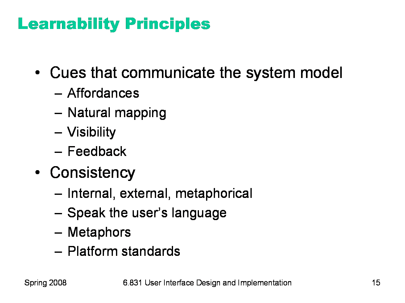
Now we turn to some practical design advice for increasing learnability. The first set of principles come from Don Norman’s book The Design of Everyday Things. He identified a number of cues that we use in our interaction with physical objects, like doors and scissors, to figure out a mental model of how they work. Since a direct manipulation interface is intended to be a visual metaphor for physical interaction, we’ll look at some of these cues and how they apply to computer interfaces. The second set of principles fall under the general umbrella of consistency: interfaces are easier to learn if they’re already familiar, and if they have fewer special cases, exceptions, or internal contradictions.
|
|
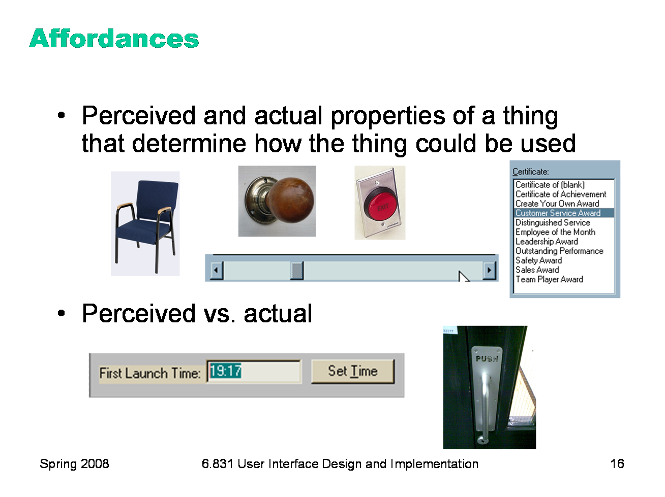
According to Norman, affordance refers to “the perceived and actual properties of a thing”, primarily the properties that determine how the thing could be operated. Chairs have properties that make them suitable for sitting; doorknobs are the right size and shape for a hand to grasp and turn. A button’s properties say “push me with your finger.” Scrollbars say that they continuously scroll or pan something that you can’t entirely see. Affordances are how an interface communicates nonverbally with the user, telling them how to operate it. Affordances are rarely innate — they are learned from experience. We recognize properties suitable for sitting on the basis of our long experience with chairs. We recognize that listboxes allow you to make a selection because we’ve seen and used many listboxes, and that’s what they do. Note that perceived affordance is not the same as actual affordance. A facsimile of a chair made of papier-mache has a perceived affordance for sitting, but it doesn’t actually afford sitting: it collapses under your weight. Conversely, a fire hydrant has no perceived affordance for sitting, since it lacks a flat, human-width horizontal surface, but it actually does afford sitting, albeit uncomfortably. Recall the textbox from our first lecture, whose perceived affordance (type a time here) disagrees with what it can actually do (you can’t type, you have to push the Set Time button to change it). Or the door handle on the right, whose nonverbal message (perceived affordance) clearly says “pull me” but whose label says “push” (which is presumably what it actually affords). The parts of a user interface should agree in perceived and actual affordances. |
|
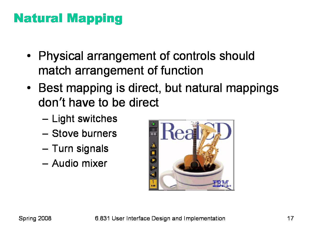
Another important principle of interface communication is natural mapping of functions to controls. Consider the spatial arrangement of a light switch panel. How does each switch correspond to the light it controls? If the switches are arranged in the same fashion as the lights themselves, it is much easier to learn which switch controls which light. Direct mappings are not always easy to achieve, since a control may be oriented differently from the function it controls. Light switches are mounted vertically, on a wall; the lights themselves are mounted horizontally, on a ceiling. So the switch arrangement may not correspond directly to a light arrangement. Other good examples of mapping include: ·Stove burners. Many stoves have four burners arranged in a square, and four control knobs arranged in a row. Which knobs control which burners? Most stoves don’t make any attempt to provide a natural mapping. ·Car turn signals. The turn signal switch in most cars is a stalk that moves up and down, but the function it controls is a signal for left or right turn. So the mapping is not direct, but it is nevertheless natural. Why? ·An audio mixer for DJs (proposed by Max Van Kleek for the Hall of Fame) has two sets of identical controls, one for each turntable being mixed. The mixer is designed to sit in between the turntables, so that the left controls affect the turntable to the left of the mixer, and the right controls affect the turntable to the right. The mapping here is direct. The controls on the RealCD interface don’t have a natural mapping. Why not?
|
|
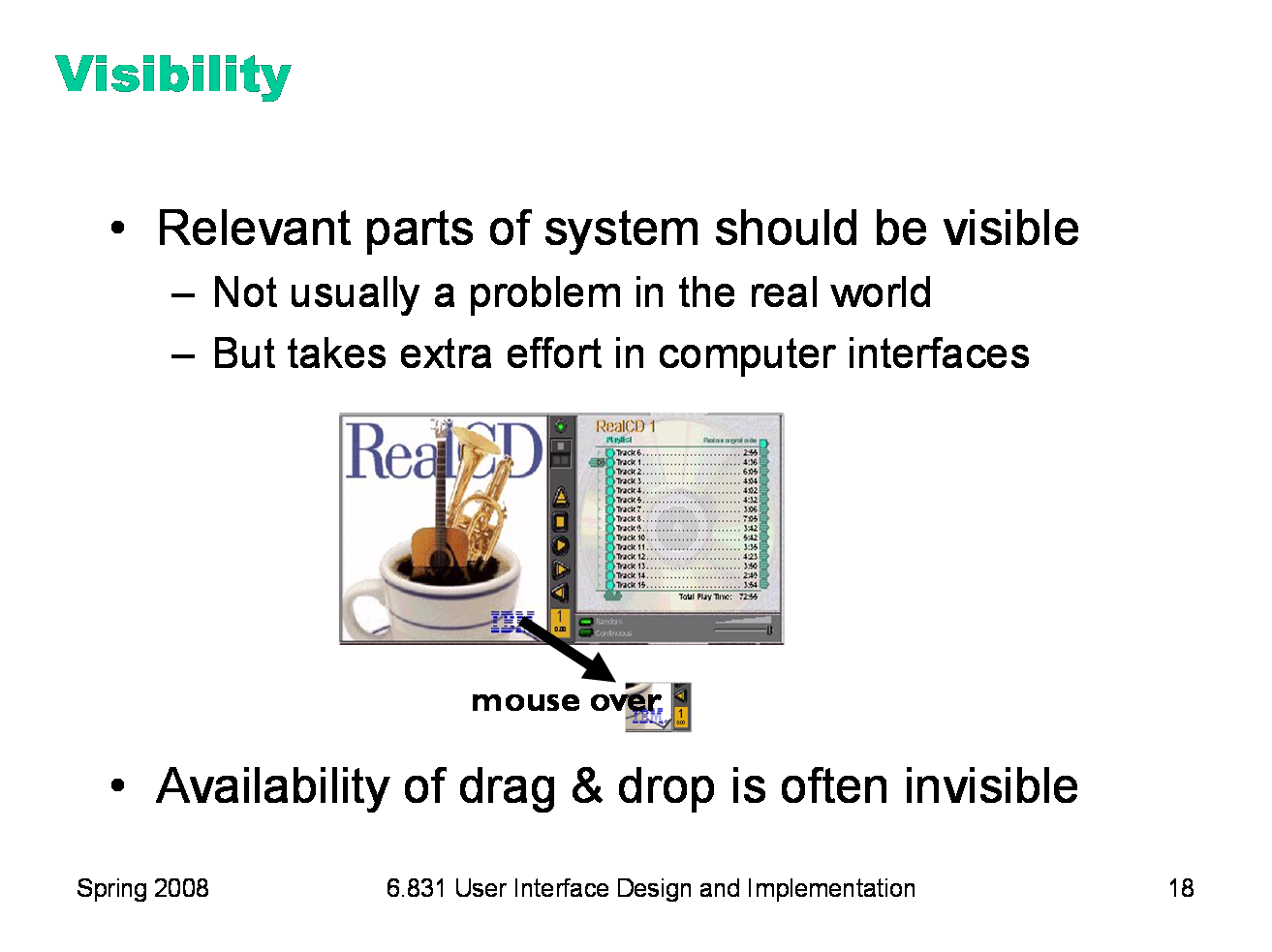
Visibility is an essential principle — probably the most important — in communicating a model to the user. If the user can’t see an important control, they would have to (1) guess that it exists, and (2) guess where it is. Recall that this was exactly the problem with RealCD’s online help facility. There was no visible clue that the help system existed in the first place, and no perceivable affordance for getting into it. Visibility is not usually a problem with physical objects, because you can usually tell its parts just by looking at it. Look at a bicycle, or a pair of scissors, and you can readily identify the pieces that make it work. Although parts of physical objects can be made hidden or invisible — for example, a door with no obvious latch or handle — in most cases it takes more design work to hide the parts than just to leave them visible. The opposite is true in computer interfaces. A window can interpret mouse clicks anywhere in its boundaries in arbitrary ways. The input need not be related at all to what is being displayed. In fact, it takes more effort to make the parts of a computer interface visible than to leave them invisible. So you have to guard carefully against invisibility of parts in computer interfaces. Interestingly, lack of visibility is responsible for a common learnability flaw in direct manipulation interfaces that use drag & drop. Drag & drop is an incredibly powerful direct manipulation technique, but it has so little visibility that many users simply don’t realize when drag & drop is possible, and when it isn’t. As a result, this wonderful direct-manipulation technique is often secondary, a shortcut used only by expert users who know about it, while some less usable (often menu & form style) interface is used by the bulk of novice and casual users. A quick poll for Firefox users: Who knew that you can drag the website’s icon out of the address bar to make a bookmark? Who knew that you can rearrange tabs by dragging them around? Who knew that you can rearrange bookmarks on the Bookmarks menu? We’ll have much more to say about visibility in a future lecture.
|
|
The final principle of interface communication is feedback: what the system does when you perform an action. When the user successfully makes a part work, it should appear to respond. Push buttons depress and release. Scrollbar thumbs move. Dragged objects follow the cursor. Feedback doesn’t always have to be visual. Audio feedback — like the clicks that a keyboard makes — is another form. So is haptic feedback, conveyed by the sense of touch. The mouse button gives you haptic feedback in your finger when you feel the vibration of the click. That’s much better feedback then you get from a touchscreen, which doesn’t give you any physical sense when you’ve pressed it hard enough to register.
|
|
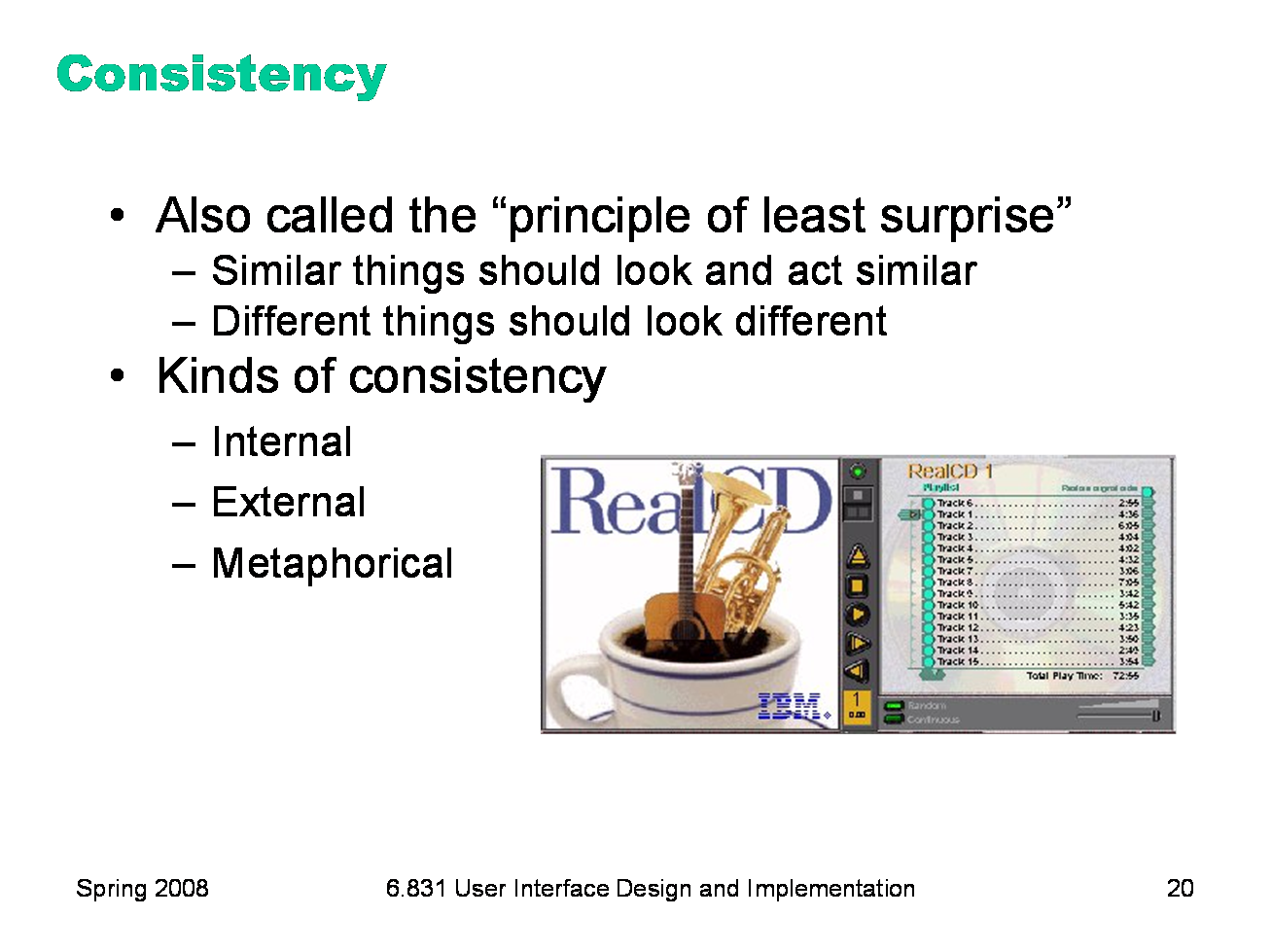
Affordances and natural mapping are examples of a general principle of learnability: consistency. This rule is often given the hifalutin’ name the Principle of Least Surprise, which basically means that you shouldn’t surprise the user with the way a command or interface object works. Similar things should look, and act, in similar ways. Conversely, different things should be visibly different. There are three kinds of consistency you need to worry about: internal consistency within your application; external consistency with other applications on the same platform; and metaphorical consistency with your interface metaphor or similar real-world objects. The RealCD interface has problems with both metaphorical consistency (CD jewel cases don’t play; you don’t open them by pressing a button on the spine; and they don’t open as shown), and with external consistency (the player controls aren’t arranged horizontally as they’re usually seen; and the track list doesn’t use the same scrollbar that other applications do).
|
|
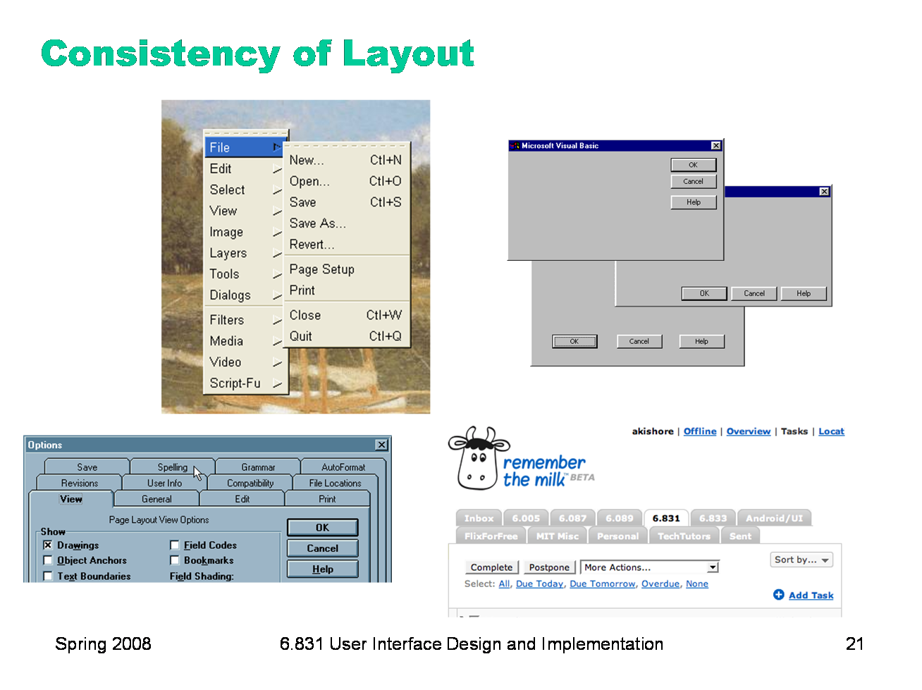
One important area of consistency is in layout — where controls and information are displayed on the screen. This is the reason that menubars appear at the top of the screen (or window). The GIMP definitely reduced its learnability by putting all its menus in a right-click menu, because this design is externally inconsistent. The dialog boxes on the right are three different layouts used in Visual Basic’s dialog boxes, showing a lack of internal consistency. Preserving consistency of layout over time is also important. The multi-row tab widget on the bottom sacrifies consistency of layout in favor of consistency with the tabbed-notebook metaphor, and it’s not a good tradeoff.
|

|
Another important kind of consistency, often overlooked, is in wording. Use the same terms throughout your user interface. If your interface says “share price” in one place, “stock price” in another, and “stock quote” in a third, users will wonder whether these are three different things you’re talking about. Don’t get creative when you’re writing text for a user interface; keep it simple and uniform, just like all technical writing. Here are some examples from the Course VI Underground Guide web site — confusion about what’s a “review” and what’s an “evaluation”.
|
|
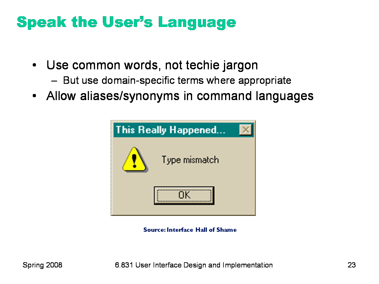
External consistency in wording is important too — in other words, speak the user’s language as much as possible, rather than forcing them to learn a new one. If the user speaks English, then the interface should also speak English, not Geekish. Technical jargon should be avoided. Use of jargon reflects aspects of the system model creeping up into the interface model, unnecessarily. How might a user interpret the dialog box shown here? One poor user actually read type as a verb, and dutifully typed M-I-S-M-A-T-C-H every time this dialog appeared. The user’s reaction makes perfect sense when you remember that most computer users do just that, type, all day. But most programmers wouldn’t even think of reading the message that way. Yet another example showing that you are not the user. Technical jargon should only be used when it is specific to the application domain and the expected users are domain experts. An interface designed for doctors shouldn’t dumb down medical terms. When designing an interface that requires the user to type in commands or search keywords, support as many aliases or synonyms as you can. Different users rarely agree on the same name for an object or command. One study found that the probability that two users would mention the same name was only 7-18%. (Furnas et al, “The vocabulary problem in human-system communication,” CACM v30 n11, Nov. 1987). Incidentally, we’ve only looked at two heuristics, but already we have a contradiction! Speaking the User’s Language argues for synonyms and aliases, so a command language should include not only delete but erase and remove too. But Consistency in Wording argued for only one name for each command, or else users will wonder whether these are three different commands that do different things. One way around the impasse is to look at the context in which you’re applying the heuristic. When the user is talking, the interface should make a maximum effort to understand the user, allowing synonyms and aliases. When the interface is speaking, it should be consistent, always using the same name to describe the same command or object. What if the interface is smart enough to adapt to the user — should it then favor matching its output to the user’s vocabulary (and possibly the user’s inconsistency) rather than enforcing its own consistency? Perhaps, but adaptive interfaces are still an active area of research, and not much is known.
|
|
External consistency also comes from following platform standards, which many platforms have codified into a rulebook. (All the guidelines listed here are online; find them with your favorite search engine.) The guidelines in these books tend to be very specific, e.g. the Windows rulebook says that you should have a File menu, and there should be a command called Exit on it (not Quit, not Leave, not Go Away). Some of these guidelines even get down to very specific graphic design conventions, such as the pixel distances between OK and Cancel buttons on a dialog. Following platform guidelines ensures consistency among different applications running on the same platform, which is valuable for novice and frequent users alike. However, platform guidelines are relatively limited in scope, offering solutions for only a few of the design decisions in a typical UI. In the absence of a well-defined standard, you can achieve external consistency by looking at the popular programs on your platform, and imitating them where reasonable.
|
|
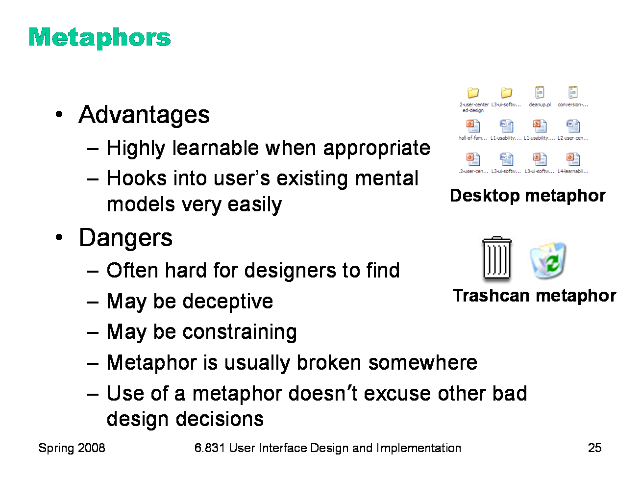
Metaphors are one way you can bring the real world into your interface. We started out by talking about RealCD, an example of an interface that uses a strong metaphor in its interface. A well-chosen, well-executed metaphor can be quite effective and appealing, but be aware that metaphors can also mislead. A computer interface must deviate from the metaphor at some point -- otherwise, why aren’t you just using the physical object instead? At those deviation points, the metaphor may do more harm than good. For example, it’s easy to say “a word processor is like a typewriter,” but you shouldn’t really use it like a typewriter. Pressing Enter every time the cursor gets close to the right margin, as a typewriter demands, would wreak havoc with the word processor’s automatic word-wrapping. The advantage of metaphor is that you’re borrowing a conceptual model that the user already has experience with. A metaphor can convey a lot of knowledge about the interface model all at once. It’s a notebook. It’s a CD case. It’s a desktop. It’s a trashcan. Each of these metaphors carries along with it a lot of knowledge about the parts, their purposes, and their interactions, which the user can draw on to make guesses about how the interface will work. Some interface metaphors are famous and largely successful. The desktop metaphor — documents, folders, and overlapping paper-like windows on a desk-like surface — is widely used and copied. The trashcan, a place for discarding things but also for digging around and bringing them back, is another effective metaphor — so much so that Apple defended its trashcan with a lawsuit, and imitators are forced to use a different look. (Recycle Bin, anyone?) The basic rule for metaphors is: use it if you have one, but don’t stretch for one if you don’t. Appropriate metaphors can be very hard to find, particularly with real-world objects. The designers of RealCD stretched hard to use their CD-case metaphor (since in the real world, CD cases don’t even play CDs), and it didn’t work well. Metaphors can also be deceptive, leading users to infer behavior that your interface doesn’t provide. Sure, it looks like a book, but can I write in the margin? Can I rip out a page? Metaphors can also be constraining. Strict adherence to the desktop metaphor wouldn’t scale, because documents would always be full-size like they are in the real world, and folders wouldn’t be able to have arbitrarily deep nesting. The biggest problem with metaphorical design is that your interface is presumably more capable than the real-world object, so at some point you have to break the metaphor. Nobody would use a word processor if really behaved like a typewriter. Features like automatic word-wrapping break the typewriter metaphor, by creating a distinction between hard carriage returns and soft returns. Most of all, using a metaphor doesn’t save an interface that does a bad job communicating itself to the user. Although RealCD’s model was metaphorical — it opened like a CD case, and it had a liner notes booklet inside the cover — these features had such poor visibility and perceived affordances that they were ineffective.
|
|
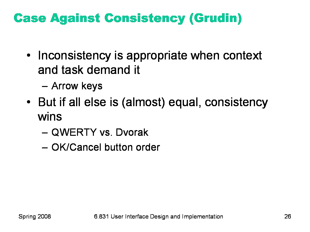
Jonathan Grudin (in “The Case Against User Interface Consistency, CACM v32 n10, Oct 1989) finesses the issue of consistency still further. His argument is that consistency should not be treated as a sacred cow, but rather remain subservient to the needs of context and task. For example, although the inverted-T arrow-key arrangement on modern keyboards is both internally and metaphorically inconsistent in the placement of the down arrow, it’s the right choice for efficiency of use. If two design alternatives are otherwise equivalent, however, consistency should carry the day. Designs that are seriously inconsistent but provide only a tiny improvement in performance will probably fail. The Dvorak keyboard, for example, is slightly faster than the standard QWERTY keyboard, but not enough to overcome the power of an entrenched standard.
|
|
|