|
To print these notes, use the PDF version. |
|
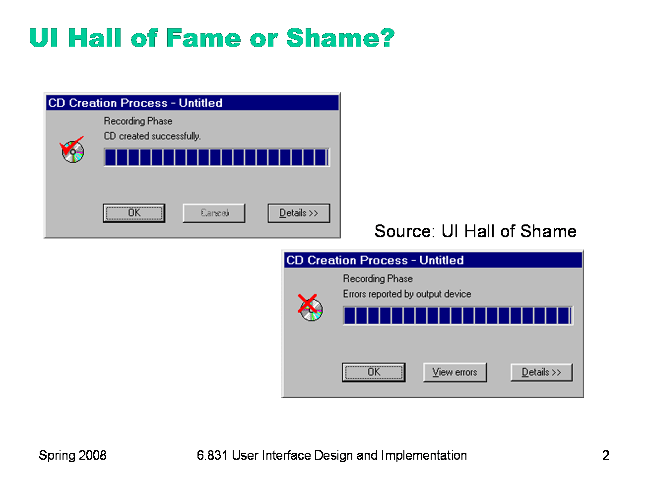
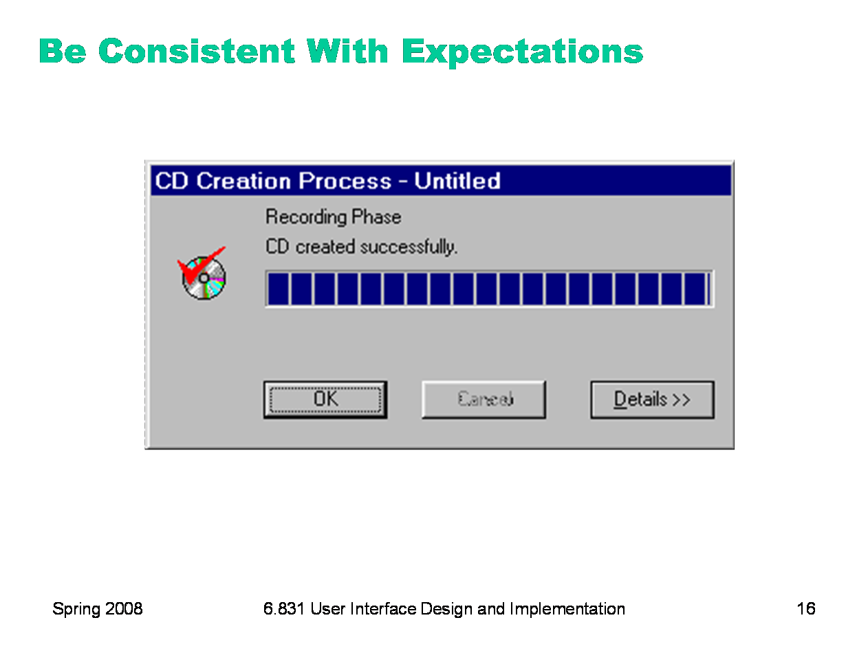
Our Hall of Shame candidate for the day is this dialog box from Adaptec Easy CD Creator, which appears at the end of burning a CD. The top image shows the dialog when the CD was burned successfully; the bottom image shows what it looks like when there was an error. What does the squint test tell you about these dialogs?
|
|
Today’s lecture is about choosing colors for a user interface. We’ll discuss some of the properties of human vision that affect this decision, particularly the limitations of color vision. We’ll go over some models for representing colors, not just the familiar RGB model. And we’ll discuss some guidelines for choosing colors. The most important guidelines will be applications of rules we already discussed in graphic design: simplicity as much as possible, contrast where important.
|
|
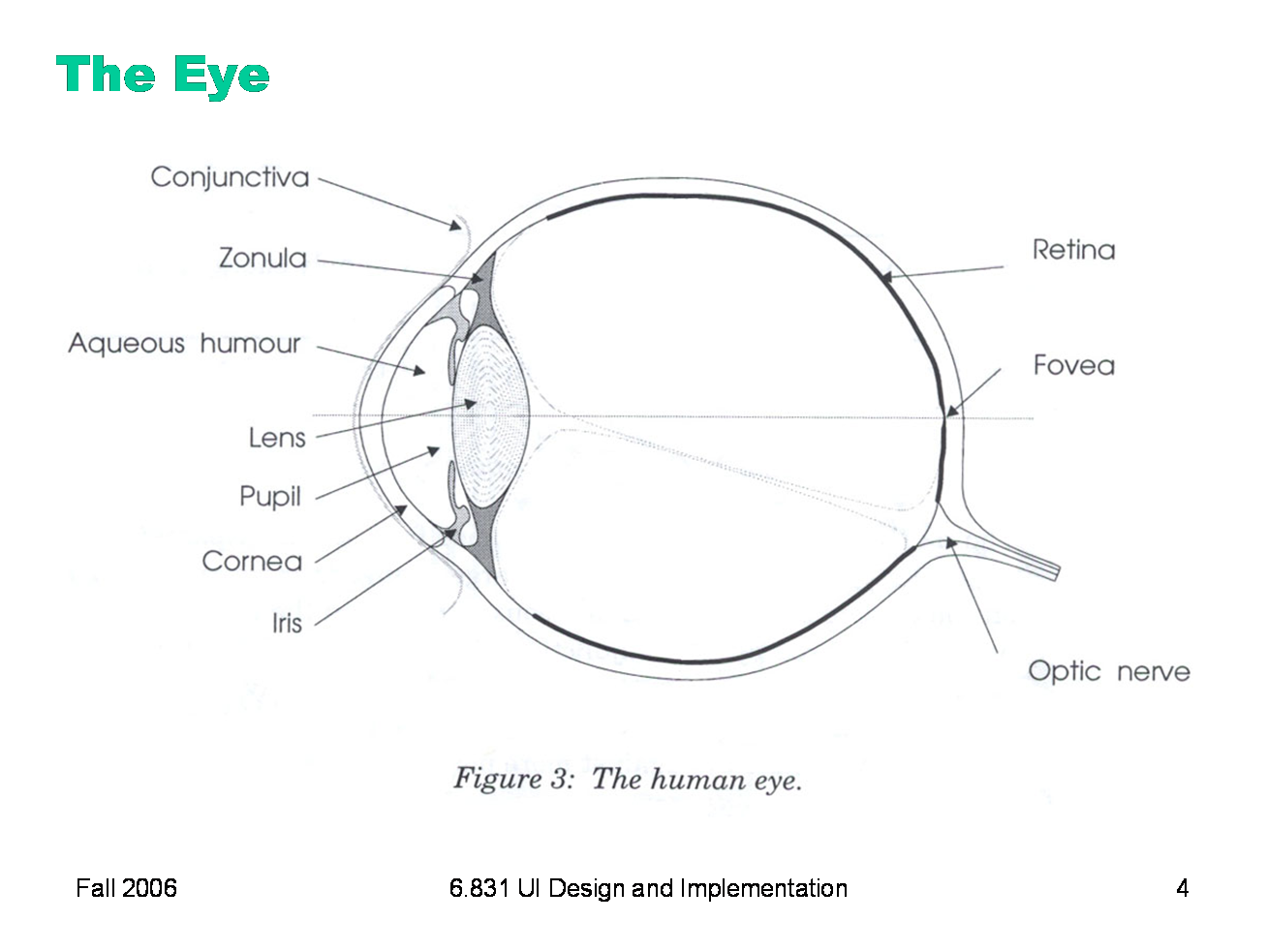
Here are key parts of the anatomy of the eye: ·The cornea is the transparent, curved membrane on the front of the eye. ·The aqueous humor fills the cavity between the cornea and the lens, and provides most of the optical power of the eye because of the large difference between its refractive index and the refractive index of the air outside the cornea. ·The iris is the colored part of the eye, which covers the lens. It is an opaque muscle, with a hole in the center called the pupil that lets light through to fall on the lens. The iris opens and closes the pupil depending on the intensity of light; it opens in dim light, and closes in bright light. ·The lens focuses light. Under muscle control, it can move forward and backward, and also get thinner or fatter to change its focal length. ·The retina is the surface of the inside of the eye, which is covered with light-sensitive receptor cells. ·The fovea is the spot where the optical axis (center of the lens) impinges on the retina. The highest density of photoreceptors can be found in the fovea; the fovea is the center of your visual field.
Figure from Lilley, Lin, Hewitt, & Howard, “Colour in Computer Graphics”, University of Manchester.
|
|
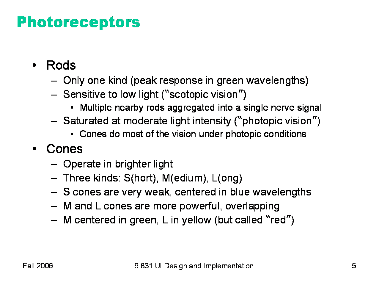
There are two kinds of photoreceptor cells in the retina. Rods operate under low-light conditions — night vision. There is only one kind of rod, with one frequency response curve centered in green wavelengths, so rods don’t provide color vision. Rods saturate at moderate intensities of light, so they contribute little to daytime vision. Cones respond only in brighter light. There are three kinds of cones, called S, M, and L after the centers of their wavelength peaks. S cones have very weak frequency response centered in blue. M and L cones are two orders of magnitude stronger, and their frequency response curves nearly overlap.
|
|
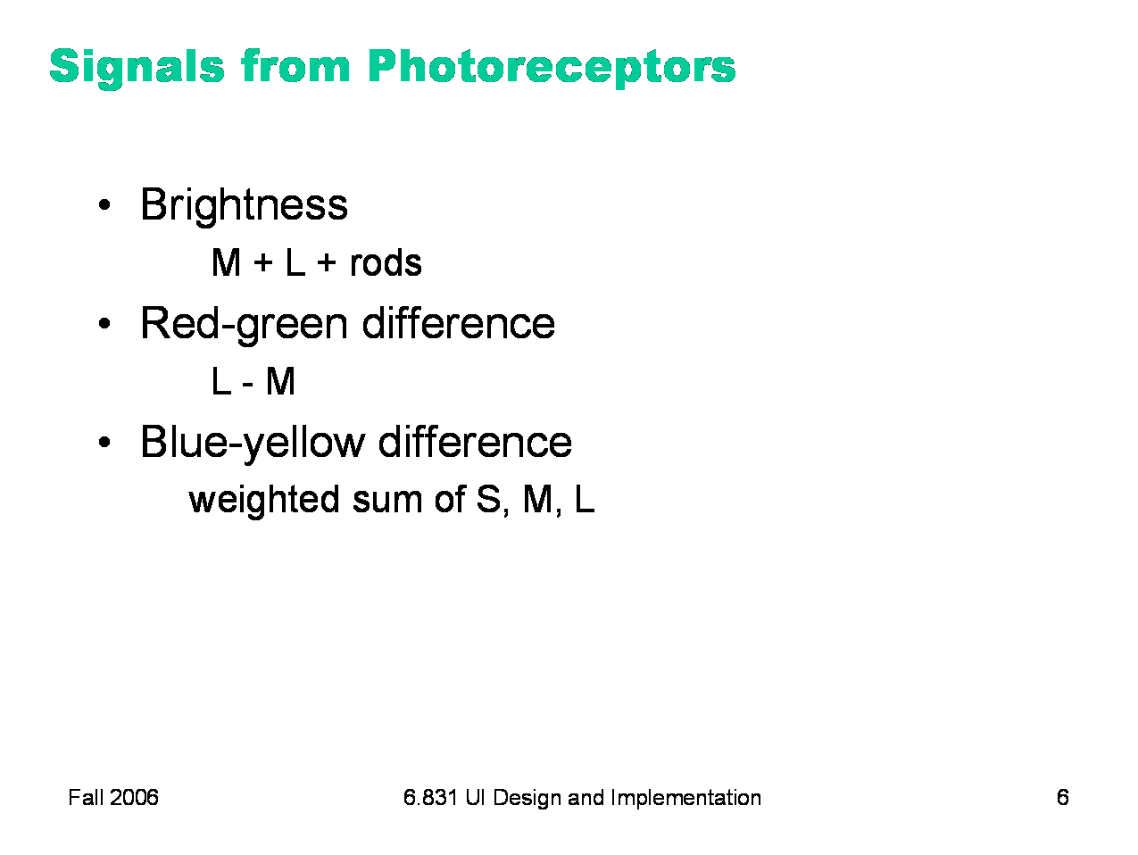
The rods and cones do not send their signals directly to the visual cortex; instead, the signals are recombined into three channels. One channel is brightness, produced by the M and L cones and the rods. This is the only channel really active at night. The other two channels convey color differences. High responses mean red, and low responses indicate green. These difference channels drive the theory of opponent colors: red and green are good contrasting colors because they drive the red-green channel to opposite extremes. Similarly, black/white and blue/yellow are good contrasting pairs.
|
|
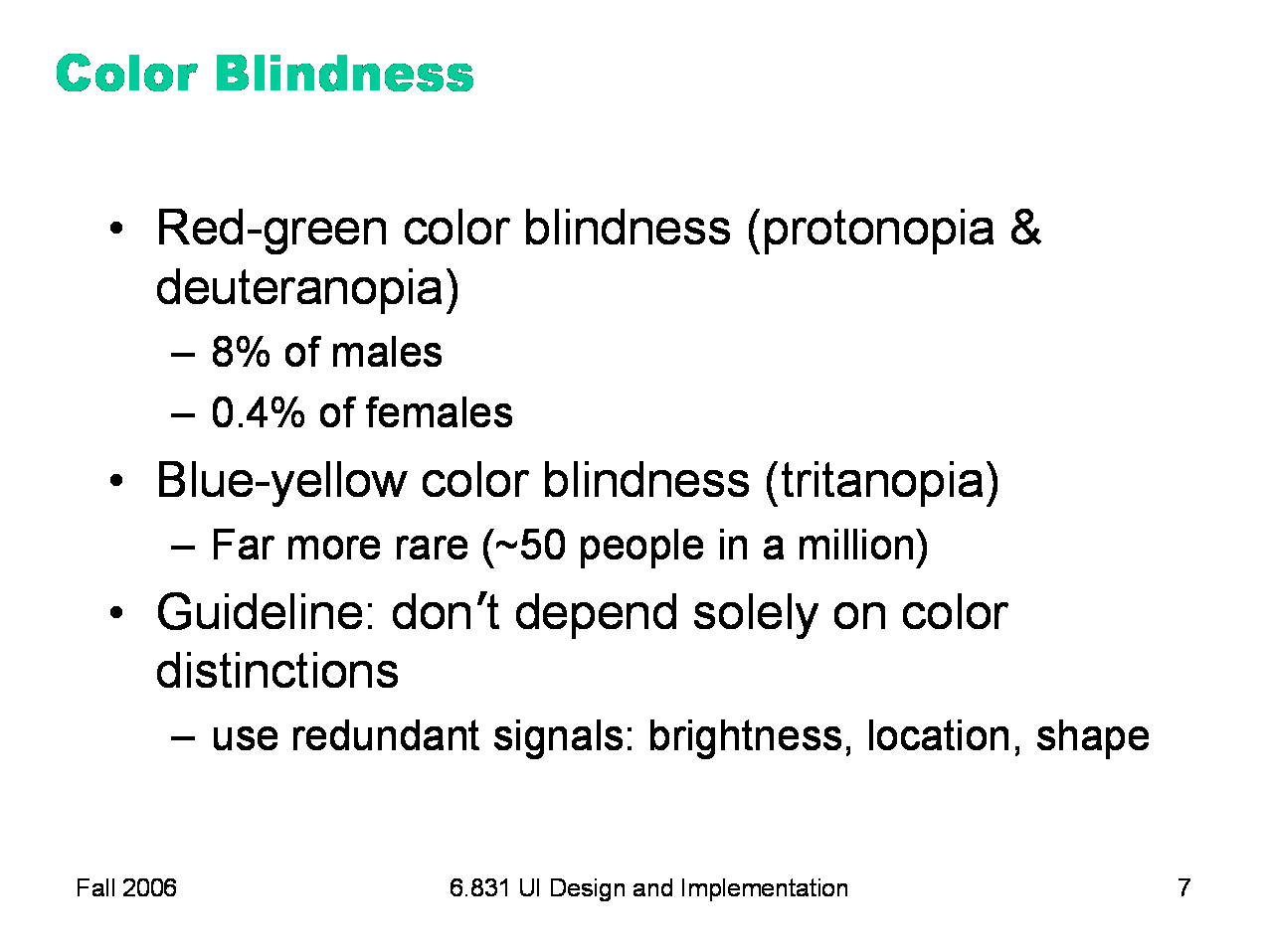
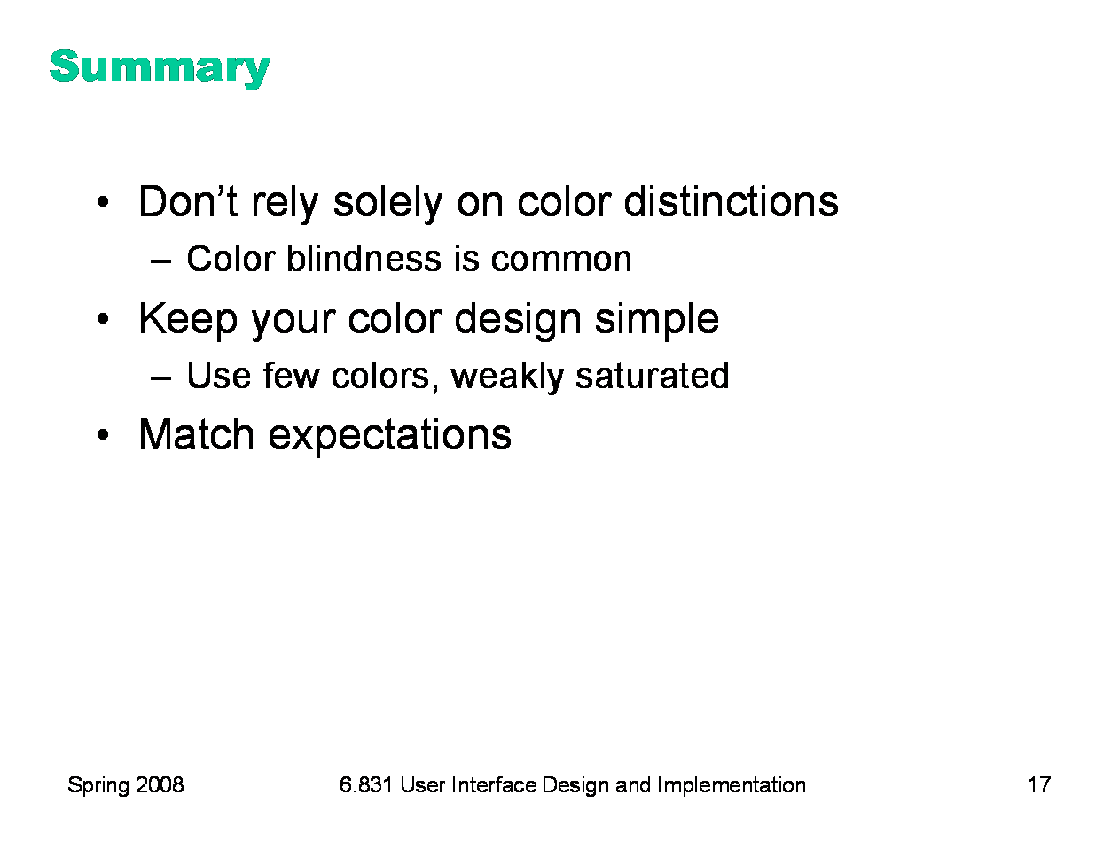
Color deficiency (“color blindness”) affects a significant fraction of human beings. An overwhelming number of them are male. There are three kinds of color deficiency, which we can understand better now that we understand a little about the eye’s anatomy: ·Protonopia is missing or bad L cones. The consequence is reduced sensitivity to red-green differences (the L-M channel is weaker), and reds are perceived as darker than normal. ·Deuteranopia is caused by missing or malfunctioning M cones. Red-green difference sensitivity is reduced, but reds do not appear darker. ·Tritanopia is caused by missing or malfunctioning S cones, and results in blue-yellow insensitivity. Red/green color blindness affects about 8% of males and 0.4% of females; blue/yellow color blindness is much much rarer. But since color blindness affects so many people, it is essential to take it into account when you are deciding how to use color in a user interface. Don’t depend solely on color distinctions, particularly red-green distinctions, for conveying information. Microsoft Office applications fail in this respect: red wavy underlines indicate spelling errors, while identical green wavy underlines indicate grammar errors. Traffic lights are another source of problems. How do red-green color-blind people know whether the light is green or red? Fortunately, there’s a spatial cue: red is always above (or to the right of) green. Protonopia sufferers (as opposed to deuteranopians) have an additional advantage: the red light looks darker than the green light. There are online tools for checking your interface against various kinds of color blindness; one good one is Vischeck (http://www.vischeck.com/vischeck/).
|
|
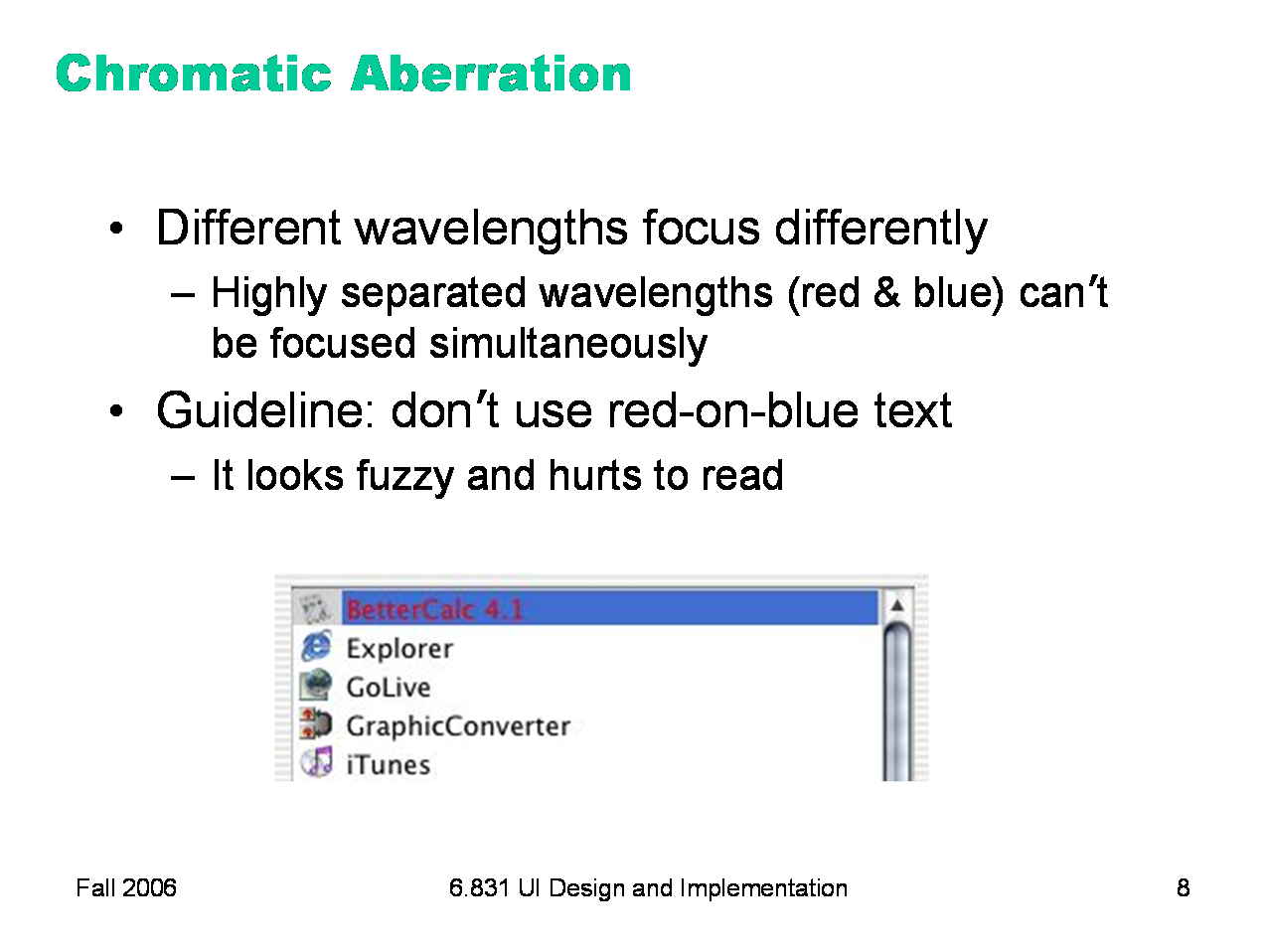
The refractive index of the lens varies with the wavelength of the light passing through it; just like a prism, different wavelengths are bent at different angles. So your eye needs to focus differently on red features than it does on blue features. As a result, an edge between widely-separated wavelengths — like blue and red — simply can’t be focused. It always looks a little fuzzy. So blue-on-red or red-on-blue text is painful to read, and should be avoided at all costs. Apple’s ForceQuit tool in Mac OS X, which allows users to shut down misbehaving applications, unfortunately fell into this trap. In the dialog, unresponding applications are helpfully displayed in red. But the selection is a blue highlight. The result is incredibly hard to read.
|
|
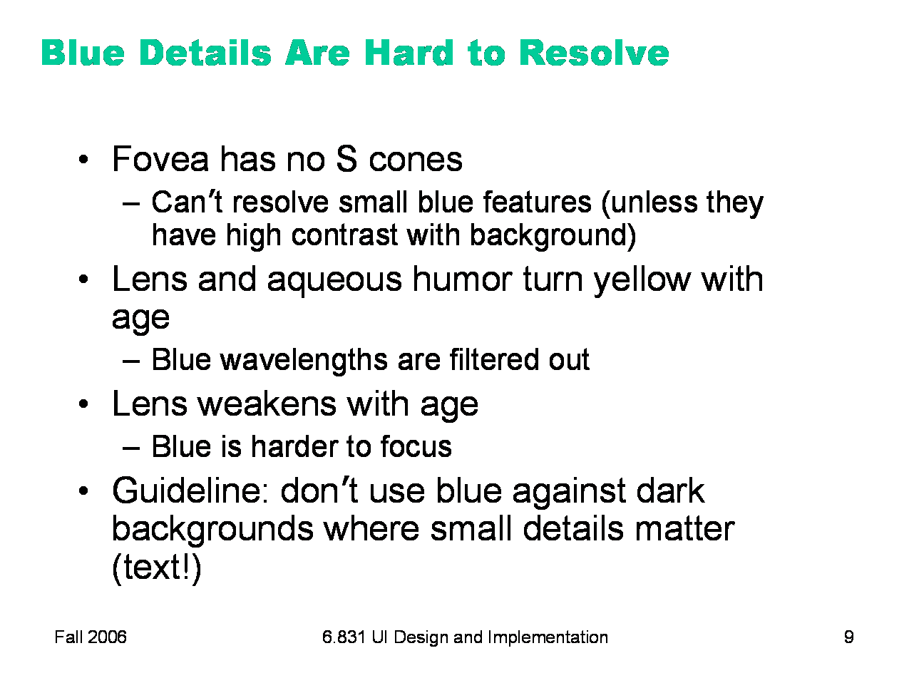
A number of anatomical details conspire to make blue a bad color choice when small details matter. First, the fovea has very few S cones, so you can’t easily see blue features in the center of your vision (unless they have high contrast with the background, activating the M and L cones). Second, older eyes are far less sensitive to blue, because the lens and aqueous humor slowly grow yellower, filtering out the blue wavelengths. Finally, the lens gets weaker with age. Blue is at one extreme of its focusing range, so older eyes can’t focus blue features as well. As a result, avoid blue text, particularly small blue text.
|
|
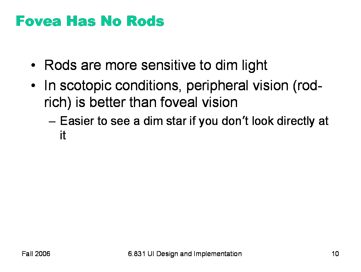
Incidentally, the fovea has no rods, either. That explains why it’s easier to see a dim star if you look beside it, rather than directly at it.
|
|
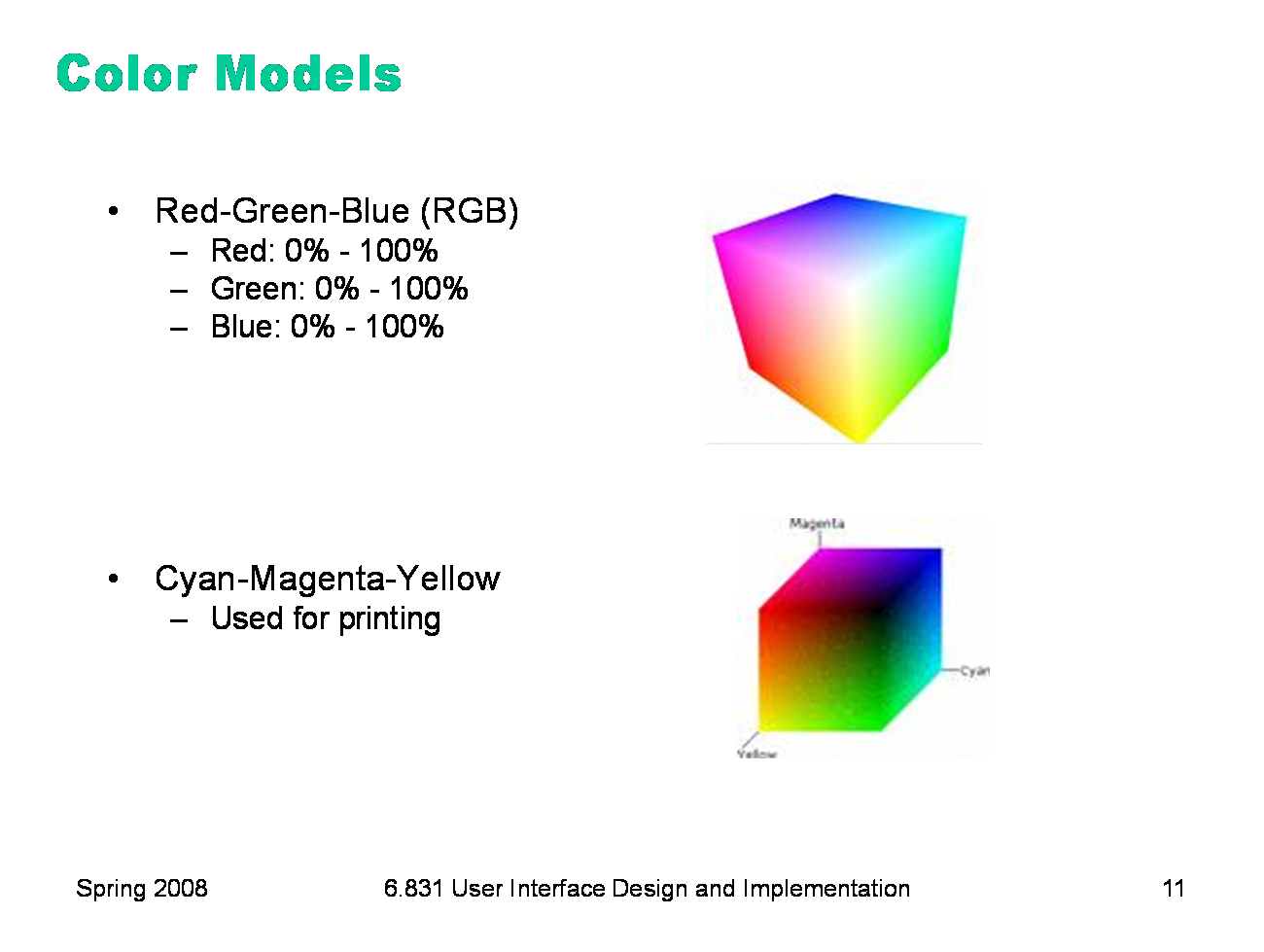
Now let’s look at how colors are represented in GUI software. At the lowest level, the RGB model rules. The RGB model is a unit cube, with (0,0,0) corresponding to black, (1, 1, 1) corresponding to white, and the three dimensions measuring levels of red, green, and blue. The RGB model is used directly by CRT and LCD monitors for display, since each pixel in a monitor has separate red, green, and blue components. The CMYK (cyan, magenta, yellow, and sometimes black) is similar to the RGB model, but used for print colors, where pigments absorb wavelengths instead of generating them.
|
|
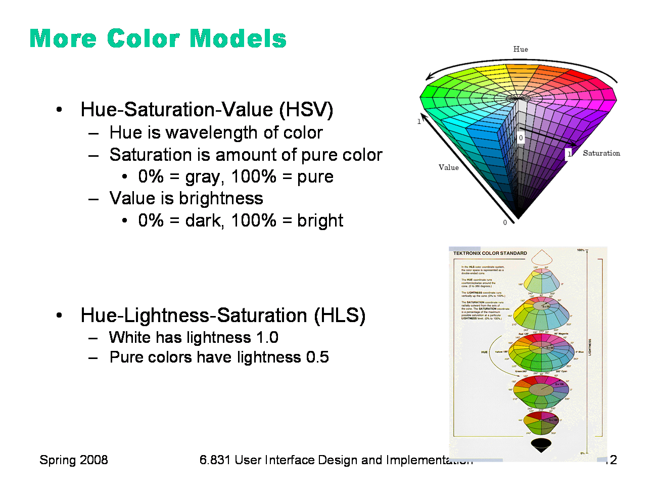
HSV (hue, saturation value) is a better model for how humans perceive color, and more useful for choosing colors in user interface design. HSV is a cone. We’ve already encountered hue and value in our discussion of visual variables. Saturation is the degree of color, as opposed to grayness. Colors with zero saturation are shades of gray; colors with 100% saturation are pure colors. HLS (hue, lightness, saturation) is a symmetrical relative of the HSV model, which is elegant. It basically pulls up the center of the HSV cone to make a double-ended cone. Many applications have a color picker that lets you pick HSV values as an alternative to RGB. You can also explore these models with an online tool from NASA Ames called Color Tool (http://colorusage.arc.nasa.gov/ColorTool.php).
|
|
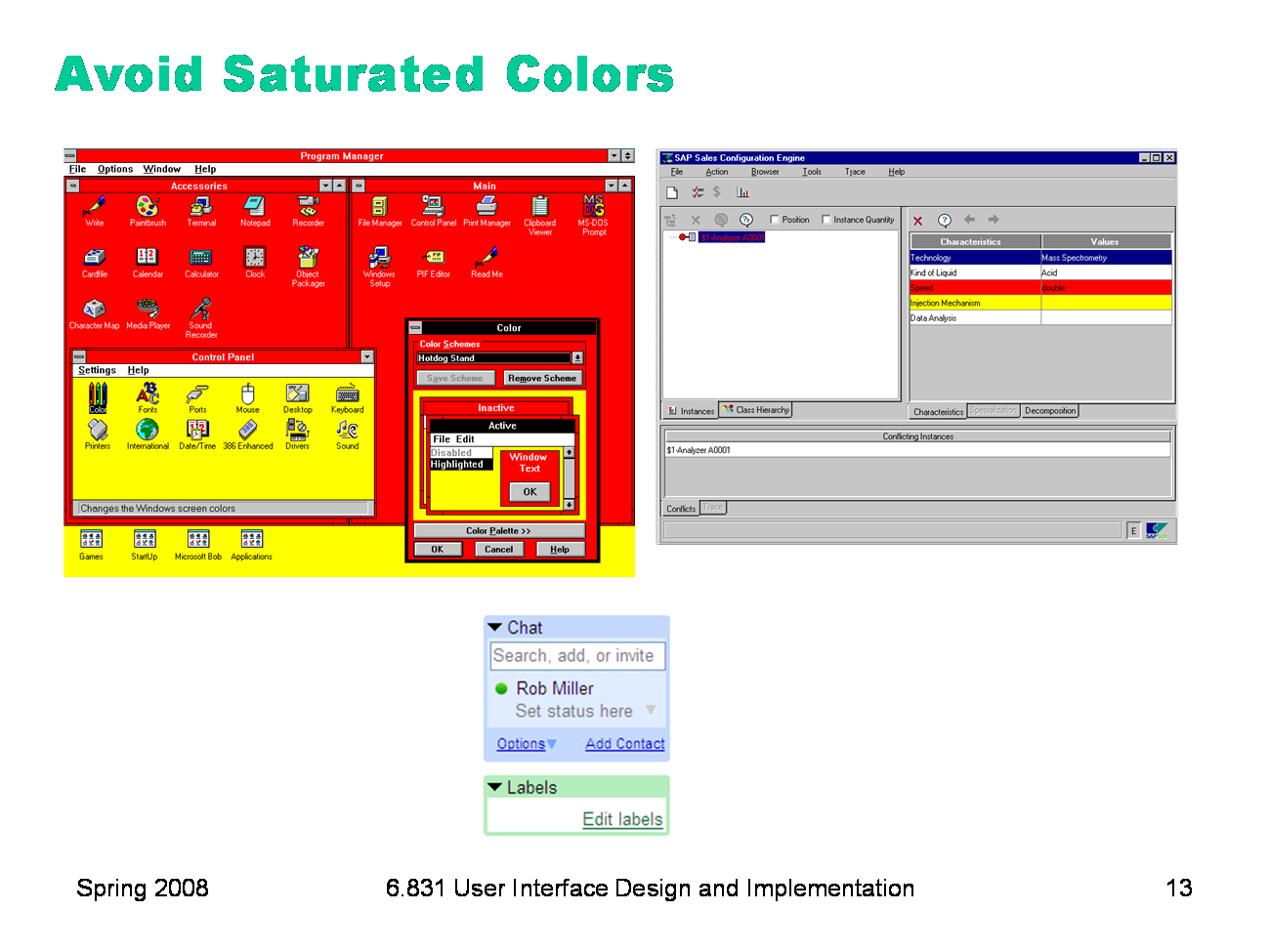
In general, avoid strongly saturated colors — i.e., the colors around the outside edge of the HSV cone. Saturated colors can cause visual fatigue because the eye must keep refocusing on different wavelengths. They also tend to saturate the viewer’s receptors (hence the name). One study found that air traffic controllers who viewed strongly saturated green text on their ATC interfaces for many hours had trouble seeing pink or red (the other end of the red/green color channel) for up to 15 minutes after their shift was over. Use less saturated versions instead, pushing them towards gray or white. The examples on top use colors with high saturation; on the bottom, low saturation. Shades of gray have minimum saturation.
|
|
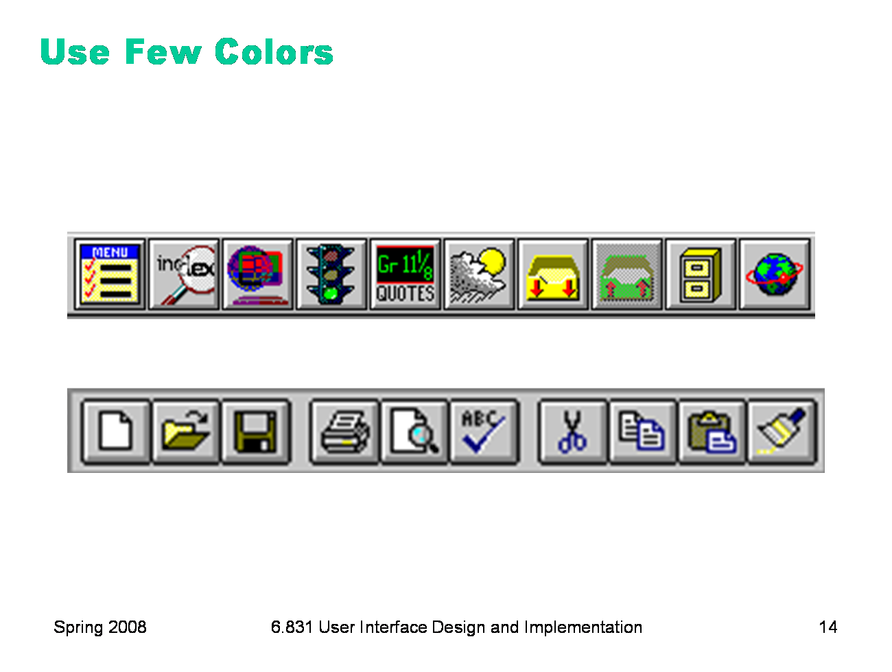
In general, colors should be used sparingly. An interface with many colors appears more complex, more cluttered, and more distracting. Use only a small number of different hues. The toolbar on top uses too many colors (many of them highly saturated), so none of the buttons stand out, and the toolbar feels hard to scan. In contrast, the toolbar at the bottom uses only a handful of colors. It’s more restful to look at, and the buttons that actually use color (like the Open File button) really pop out. A simple and very effective color scheme uses just one hue (like blue or green, weakly saturated and in various values), combined with black, white, and shades of gray. On top of a scheme like that, a bit of red in an icon will pop out wonderfully.
|
|
Background colors should establish a good contrast with the foreground. White is a good choice, since it provides the most contrast; but it also produces bright displays, since our computer displays emit light rather than reflecting it. Pale (desaturated) yellow and very light gray are also good background colors. Dark backgrounds are tricky; it’s too easy to mess up the contrast and make text less legible, as shown in this example.
|
|
Finally, match expectations. One of the problems with the Adaptec dialogs at the beginning of this lecture was the use of red for OK. Red generally means stop, warning, error, or hot. Green conventionally means go, or OK. Yellow means caution, or slow. (But note that these conventional meanings for colors are culturally dependent, and what works in Western cultures may not work for all users.)
|
|
|