|
To print these notes, use the PDF version. |
|
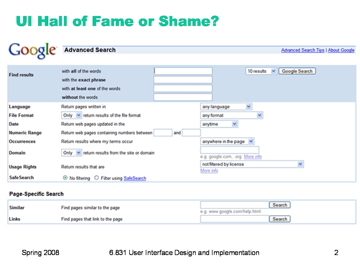
Today’s Hall of Fame and Shame is a comparison of two generations of Google Advanced Search. This is the old interface.
|

|
And this is the new interface. Let’s compare and contrast these two interfaces in terms of: - visibility (specifically self-disclosure) - graphic design - task analysis - efficiency
|

|
Today’s lecture is about efficiency. Note that when we say efficiency, we’re not concerned with the performance of the backend, or choices of algorithms or data structures, or analyzing or proving their peformance. Those are important questions, but you can take other courses about answering them. We’re concerned with the channel between the user and the system; how quickly can we get instructions and information across that interface? In other words, assuming that the user interface is the performance bottleneck, how fast can the whole system go? To examine this question, we’ll first look at a simple model of human information processing, an engineering model for the human cognitive system. Then we’ll talk about some practical design principles and patterns for making interfaces more efficient.
|

|
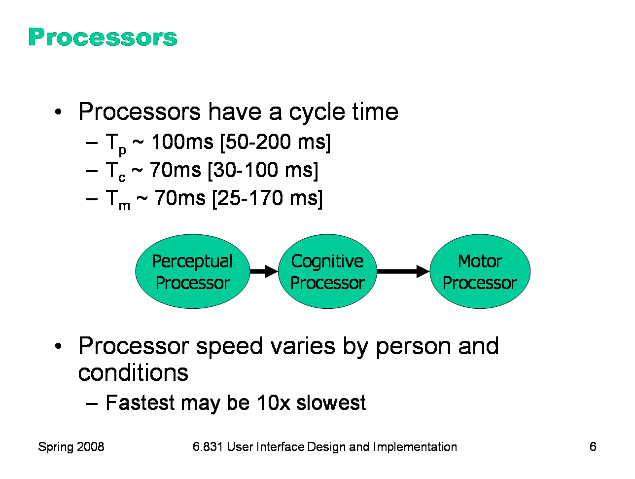
Here’s a high-level look at the cognitive abilities of a human being -- really high level, like 30,000 feet. This is a version of the Model Human Processor was developed by Card, Moran, and Newell as a way to summarize decades of psychology research in an engineering model. (Card, Moran, Newell, The Psychology of Human-Computer Interaction, Lawrence Erlbaum Associates, 1983) This model is different from the original MHP; I’ve modified it to include a component representing the human’s attention resources (Wickens, Engineering Psychology and Human Performance, Charles E. Merrill Publishing Company, 1984). This model is an abstraction, of course. But it’s an abstraction that actually gives us numerical parameters describing how we behave. Just as a computer has memory and processor, so does our model of a human. Actually, the model has several different kinds of memory, and several different processors. Input from the eyes and ears is first stored in the short-term sensory store. As a computer hardware analogy, this memory is like a frame buffer, storing a single frame of perception. The perceptual processor takes the stored sensory input and attempts to recognize symbols in it: letters, words, phonemes, icons. It is aided in this recognition by the long-term memory, which stores the symbols you know how to recognize. The cognitive processor takes the symbols recognized by the perceptual processor and makes comparisons and decisions. It might also store and fetch symbols in working memory (which you might think of as RAM, although it’s pretty small). The cognitive processor does most of the work that we think of as “thinking”. The motor processor receives an action from the cognitive processor and instructs the muscles to execute it. There’s an implicit feedback loop here: the effect of the action (either on the position of your body or on the state of the world) can be observed by your senses, and used to correct the motion in a continuous process. Finally, there is a component corresponding to your attention, which might be thought of like a thread of control in a computer system. Note that this model isn’t meant to reflect the anatomy of your nervous system. There probably isn’t a single area in your brain corresponding to the perceptual processor, for example. But it’s a useful abstraction nevertheless. In this lecture, we’ll concentrate on the feedback loop involving the three processors: perceptual, cognitive, and motor.
|
|
The main property of a processor is its cycle time, which is analogous to the cycle time of a computer processor. It’s the time needed to accept one input and produce one output. Like all parameters in the MHP, the cycle times shown above are derived from a survey of psychological studies. Each parameter is specified with a typical value and a range of reported values. For example, the typical cycle time for perceptual processor, Tp, is 100 milliseconds, but studies have reported between 50 and 200 milliseconds. The reason for the range is not only variance in individual humans; it is also varies with conditions. For example, the perceptual processor is faster (shorter cycle time) for more intense stimuli, and slower for weak stimuli. You can’t read as fast in the dark. Similarly, your cognitive processor actually works faster under load. Consider how fast your mind works when you’re driving or playing a video game, relative to sitting quietly and reading. The cognitive processor is also faster on practiced tasks. It’s reasonable, when we’re making engineering decisions, to deal with this uncertainty by using all three numbers, not only the nominal value but also the range.
|
|
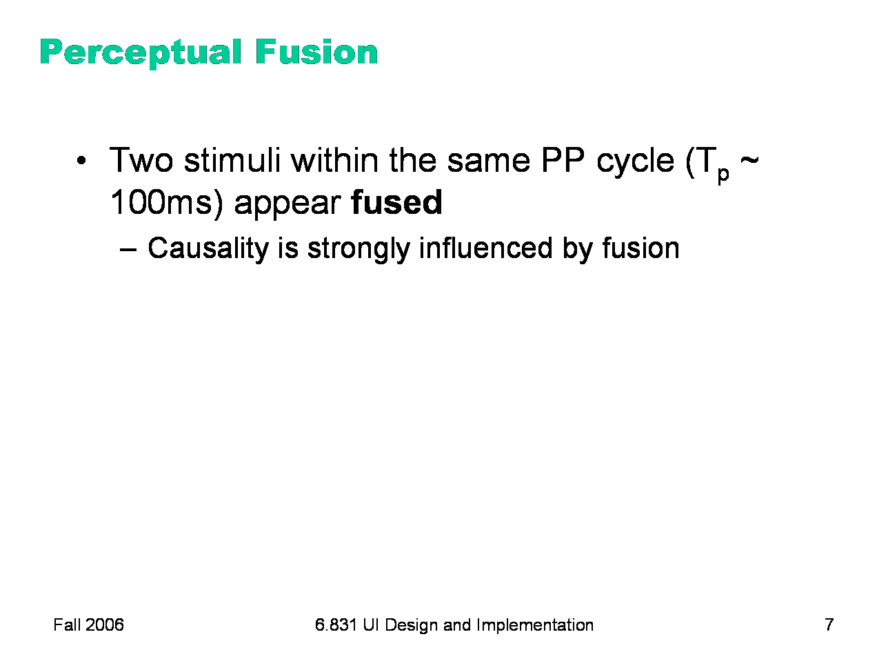
We’ve already encountered one interesting effect of the perceptual processor: perceptual fusion. Here’s an intuition for how fusion works. Every cycle, the perceptual processor grabs a frame (snaps a picture). Two events occurring less than the cycle time apart are likely to appear in the same frame. If the events are similar — e.g., Mickey Mouse appearing in one position, and then a short time later in another position — then the events tend to fuse into a single perceived event — a single Mickey Mouse, in motion. Fusion also strongly affects our perception of causality. If one event is closely followed by another — e.g., pressing a key and seeing a change in the screen — and the interval separating the events is less than Tp, then we are more inclined to believe that the first event caused the second. |
|
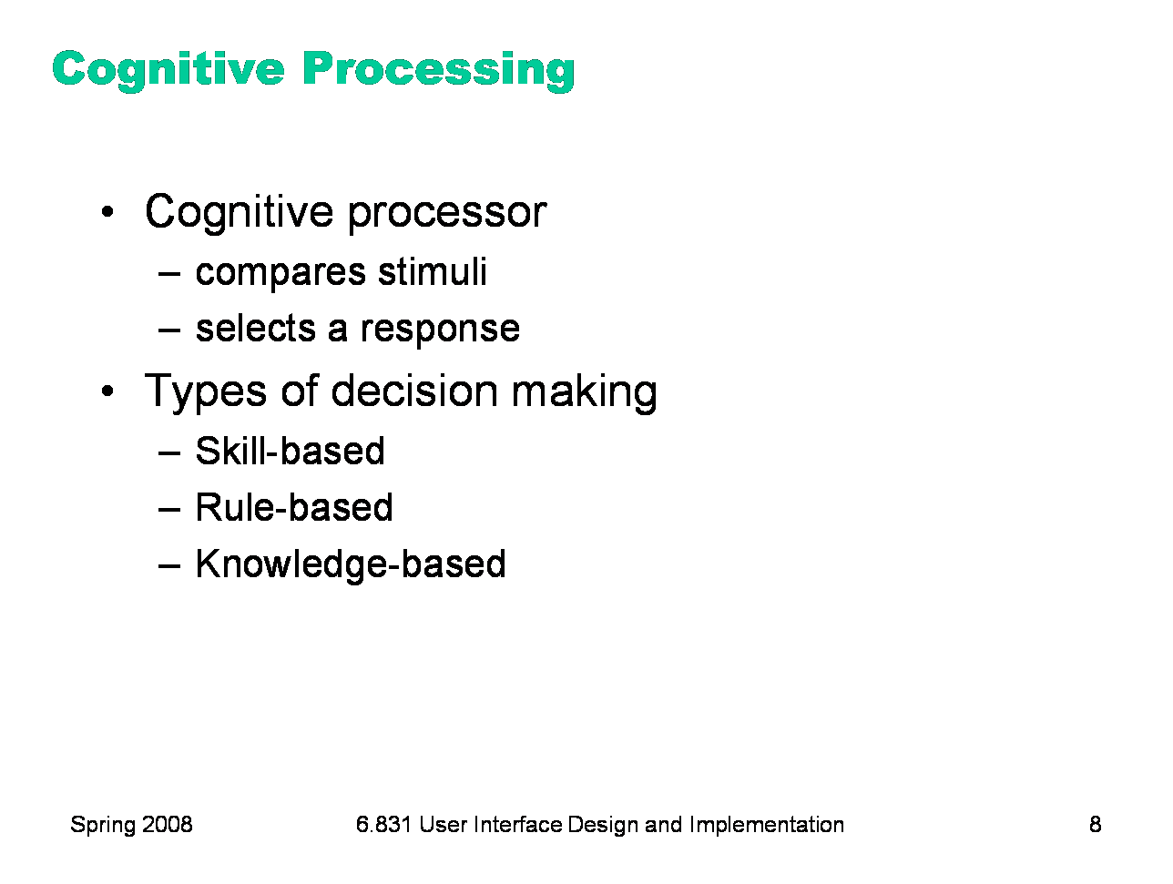
The cognitive processor is responsible for making comparisons and decisions. Cognition is a rich, complex process. The best-understood aspect of it is skill-based decision making. A skill is a procedure that has been learned thoroughly from practice; walking, talking, pointing, reading, driving, typing are skills most of us have learned well. Skill-based decisions are automatic responses that require little or no attention. Since skill-based decisions are very mechanical, they are easiest to describe in a mechanical model like the one we’re discussing. Two other kinds of decision making are rule-based, in which the human is consciously processing a set of rules of the form if X, then do Y; and knowledge-based, which involves much higher-level thinking and problem-solving. Rule-based decisions are typically made by novices at a task: when a student driver approaches an intersection, for example, they must think explicitly about what they need to do in response to each possible condition. Knowledge-based decision making is used to handle unfamiliar or unexpected problems, such as figuring out why your car won’t start. We’ll focus on skill-based decision making for the purposes of this lecture, because it’s well understood, and because efficiency is most important for well-learned procedures.
|
|
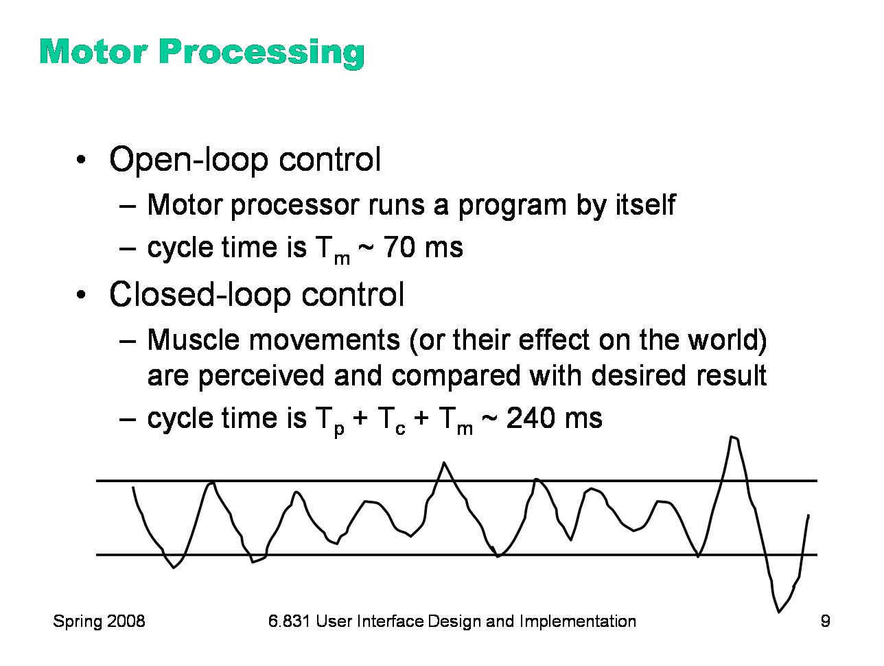
The motor processor can operate in two ways. It can run autonomously, repeatedly issuing the same instructions to the muscles. This is “open-loop” control; the motor processor receives no feedback from the perceptual system about whether its instructions are correct. With open loop control, the maximum rate of operation is just Tm. The other way is “closed-loop” control, which has a complete feedback loop. The perceptual system looks at what the motor processor did, and the cognitive system makes a decision about how to correct the movement, and then the motor system issues a new instruction. At best, the feedback loop needs one cycle of each processor to run, or Tp + Tc + Tm ~ 240 ms. Here’s a simple but interesting experiment that you can try: take a sheet of lined paper and scribble a sawtooth wave back and forth between two lines, going as fast as you can but trying to hit the lines exactly on every peak and trough. Do it for 5 seconds. The frequency of the sawtooth carrier wave is dictated by open-loop control, so you can use it to derive your Tm. The frequency of the wave’s envelope, the corrections you had to make to get your scribble back to the lines, is closed-loop control. You can use that to derive your value of Tp + Tc.
|
|
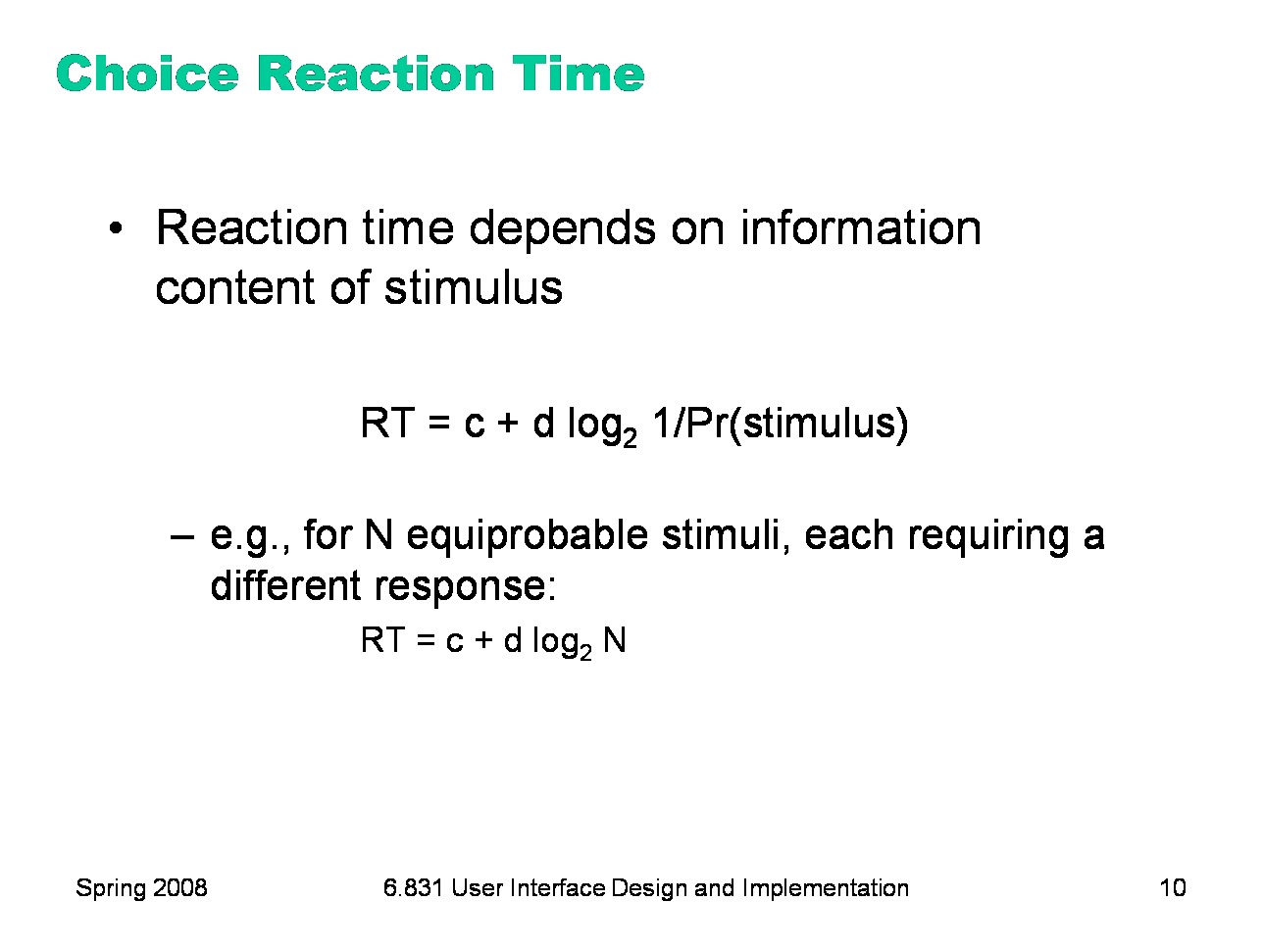
Simple reaction time — responding to a single stimulus with a single response — takes just one cycle of the human information processor, i.e. Tp+Tc+Tm. But if the user must make a choice — choosing a different response for each stimulus — then the cognitive processor may have to do more work. The Hick-Hyman Law of Reaction Time shows that the number of cycles required by the cognitive processor is proportional to amount of information in the stimulus. For example, if there are N equally probable stimuli, each requiring a different response, then the cognitive processor needs log N cycles to decide which stimulus was actually seen and respond appropriately. So if you double the number of possible stimuli, a human’s reaction time only increases by a constant. Keep in mind that this law applies only to skill-based decision making; we assume that the user has practiced responding to the stimuli, and formed an internal model of the expected probability of the stimuli.
|
|
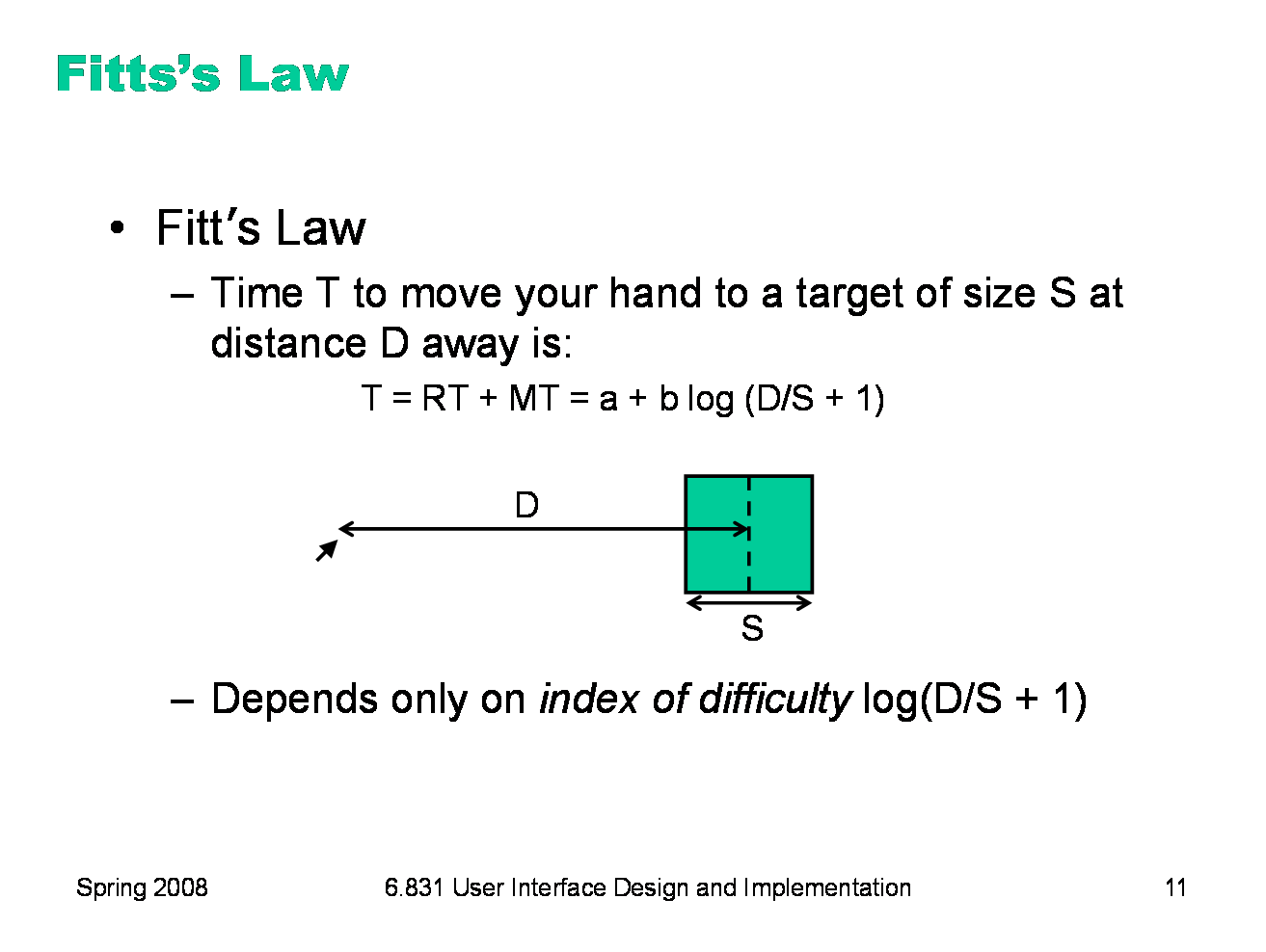
Fitts’s Law specifies how fast you can move your hand to a target of a certain size at a certain distance away (within arm’s length, of course). It’s a fundamental law of the human sensory-motor system, which has been replicated by numerous studies. Fitts’s Law applies equally well to using a mouse to point at a target on a screen.
|
|
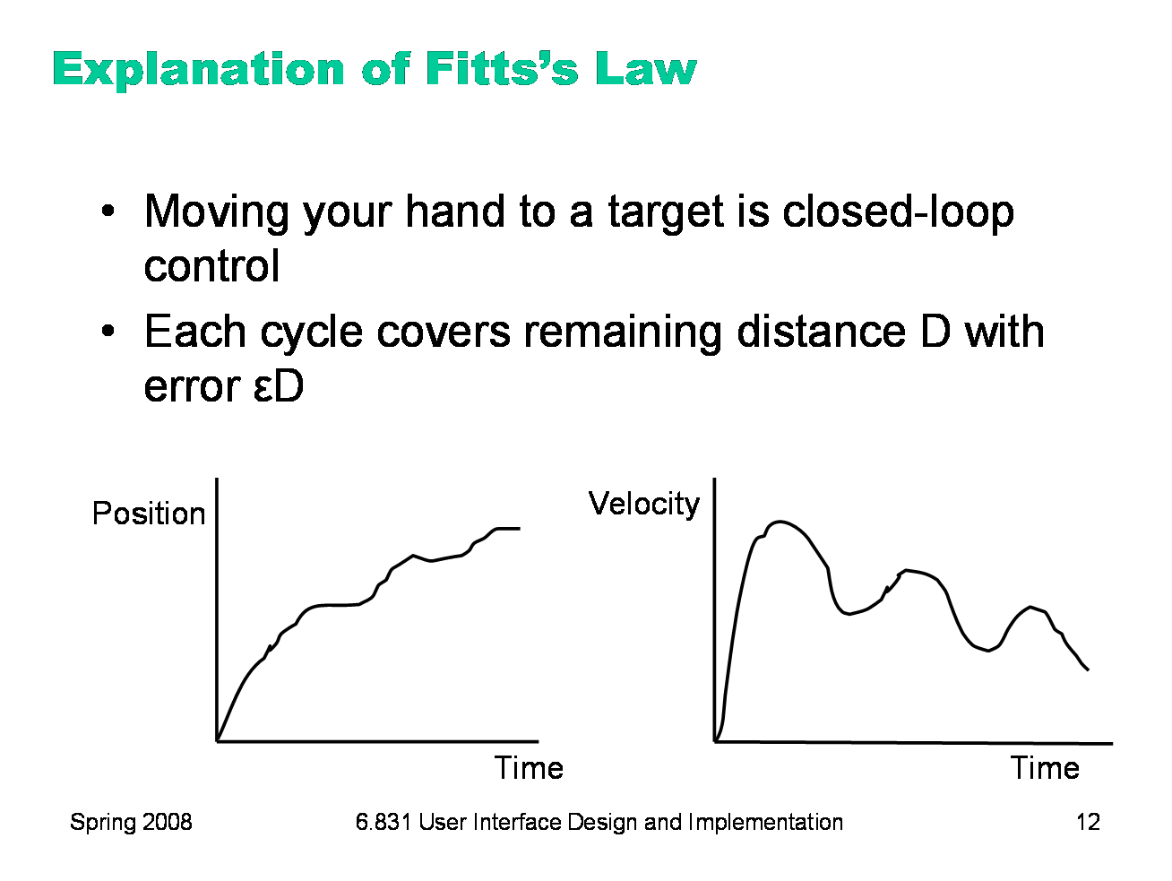
We can explain Fitts’s Law by appealing to the human information processing model. Fitt’s Law relies on closed-loop control. Assume that D >> S, so your hand is initially far away from the target. In each cycle, your motor system instructs your hand to move the entire remaining distance D. The accuracy of that motion is proportional to the distance moved, so your hand gets within some error εD of the target (possibly undershooting, possibly overshooting). Your perceptual and cognitive processors perceive where your hand arrived and compare it to the target, and then your motor system issues a correction to move the remaining distance εD — which it does, but again with proportional error, so your hand is now within ε2D. This process repeats, with the error decreasing geometrically, until n iterations have brought your hand within the target — i.e., εnD ≤ S. Solving for n, and letting the total time T = n (Tp + Tc + Tm), we get: T = a + b log (D/S) where a is the reaction time for getting your hand moving, and b = - (Tp + Tc + Tm)/log ε. The graphs above show the typical trajectory of a person’s hand, demonstrating this correction cycle in action. The position-time graph shows an alternating sequence of movements and plateaus; each one corresponds to one cycle. The velocity-time graph shows the same effect, and emphasizes that hand velocity of each subsequent cycle is smaller, since the motor processor must achieve more precision on each iteration.
|
|
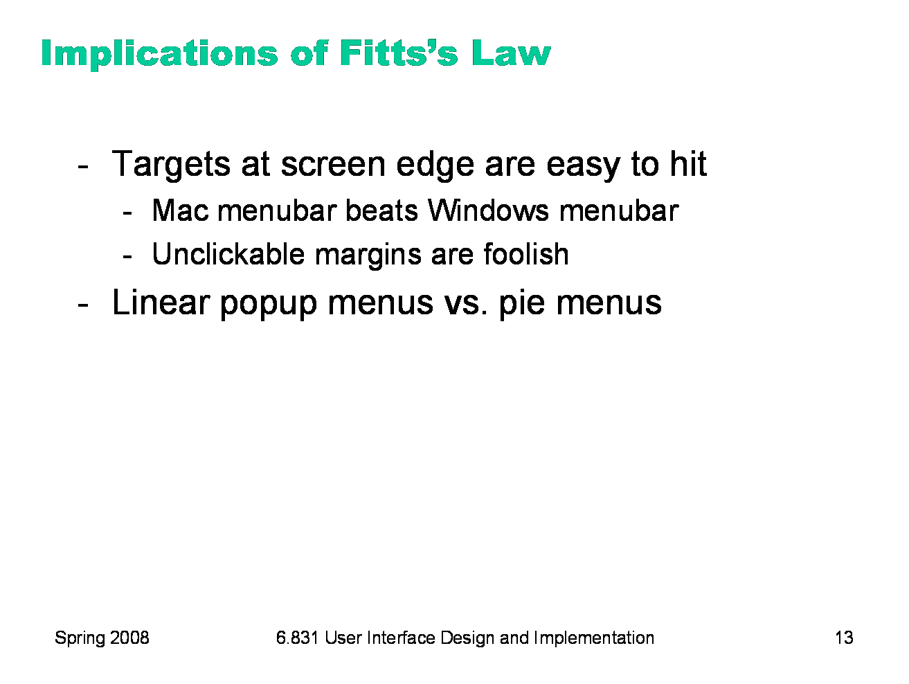
Fitts’s Law has some interesting implications: ·The edge of the screen stops the mouse pointer, so you don’t need more than one correcting cycle to hit it. Essentially, the edge of the screen acts like a target with infinite size. (More precisely, the distance D to the center of the target is virtually equal to S, so T = a + b log (D/S + 1) solves to the minimum time T=a.) So edge-of-screen real estate is precious. The Macintosh menu bar, positioned at the top of the screen, is faster to use than a Windows menu bar (which, even when a window is maximized, is displaced by the title bar). Similarly, if you put controls at the edges of the screen, they should be active all the way to the edge to take advantage of this effect. Don’t put an unclickable margin beside them. ·Fitts’s Law also explains why pie menus are faster to use than linear popup menus. With a pie menu, every menu item is a slice of a pie centered on the mouse pointer. As a result, each menu item is the same distance D away from the mouse pointer, and its size S (in the radial direction) is comparable to D. Contrast that with a linear menu, where items further down the menu have larger D, and all items have a small S (height).
|
|
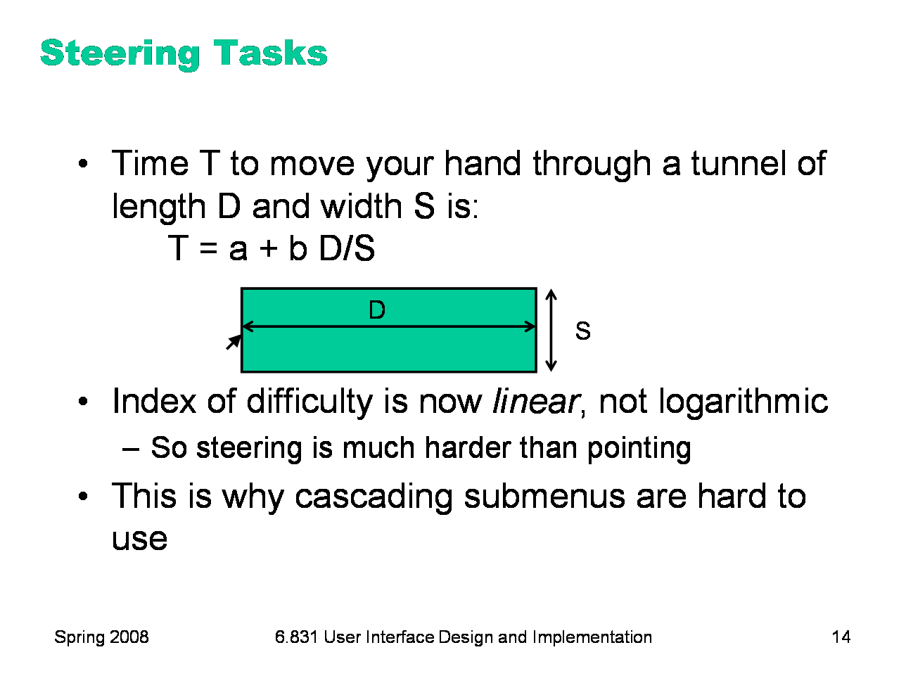
As we discussed in the first lecture, cascading submenus are hard to use, because the mouse pointer is constrained to a narrow tunnel in order to get over into the submenu. Unlike the pointing tasks that Fitts’s Law applies to, this steering task puts a strong requirement on the error your hand is allowed to make: instead of iteratively reducing the error until it falls below the size of the target, you have to continuously keep the error smaller than the size of the tunnel. As a result, the time is proportional to D/S, not log D/S. It takes exponentially longer to hit a menu item on a cascading submenu than it would if you weren’t constrained to move down the tunnel to it. Windows tries to solve this problem with a 500 ms timeout, and now we know another reason that this solution isn’t ideal: it exceeds Tp (even for the slowest value of Tp), so it destroys perceptual fusion and our sense of causality. Intentionally moving the mouse down to the next menu results in a noticeable delay. The Mac gets a Hall of Fame nod here, for doing it right with a triangular zone of activation for the submenu. The user can point straight to the submenu without unusual corrections, and without even noticing that there might be a problem. (Hall of Fame interfaces may sometimes be invisible to the user! They simply work better, and you don’t notice why.)
|
|
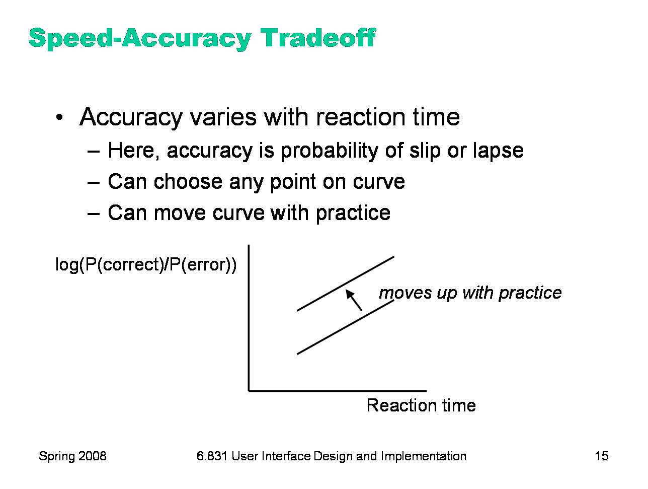
Another important phenomenon of the cognitive processor is the fact that we can tune its performance to various points on a speed-accuracy tradeoff curve. We can force ourselves to make decisions faster (shorter reaction time) at the cost of making some of those decisions wrong. Conversely, we can slow down, take a longer time for each decision and improve accuracy. It turns out that for skill-based decision making, reaction time varies linearly with the log of odds of correctness; i.e., a constant increase in reaction time can double the odds of a correct decision. The speed-accuracy curve isn’t fixed; it can be moved up by practicing the task. Also, people have different curves for different tasks; a pro tennis player will have a high curve for tennis but a low one for surgery. One consequence of this idea is that efficiency can be traded off against error prevention. Most users will seek a speed that keeps slips to a low level, but doesn’t completely eliminate them.
|

|
One more relevant feature of the entire perceptual-cognitive-motor system is that the time to do a task decreases with practice. In particular, the time decreases according to a power law. The power law describes a linear curve on a log-log scale of time and number of trials. In practice, the power law means that novices get rapidly better at a task with practice, but then their performance levels off to nearly flat (although still slowly improving).
|
|
Now that we’ve discussed aspects of the human cognitive system that are relevant to user interface efficiency, let’s derive some practical rules for improving efficiency. First, let’s consider mouse tasks, which are governed by pointing (Fitts’s Law) and steering. Since size matters for Fitts’s Law, frequently-used mouse affordances should be big. The bigger the target, the easier the pointing task is. Similarly, consider the path that the mouse must follow in a frequently-used procedure. If it has to bounce all over the screen, from the bottom of the window to the top of the window, or back and forth from one side of the window to the other, then the cost of all that mouse movement will add up, and reduce efficiency. Targets that are frequently used together should be placed near each other. We mentioned the value of screen edges and screen corners, since they trap the mouse and act like infinite-size targets. There’s no point in having an unclickable margin at the edge of the screen. Finally, since steering tasks are so much slower than pointing tasks, avoid steering whenever possible. When you can’t avoid it, minimize the steering distance. Cascading submenus are much worse when the menu items are long, forcing the mouse to move down a long tunnel before it can reach the submenu.
|
|
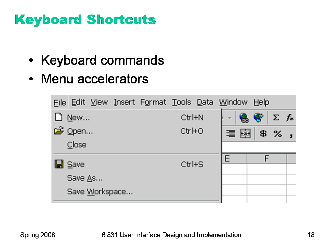
Another common way to increase efficiency of an interface is to add keyboard shortcuts — easily memorable key combinations. There are conventional techniques for displaying keyboard shortcuts (like Ctrl+N and Ctrl-O) in the menubar. Menubars and buttons often have accelerators as well (the underlined letters, which are usually invoked by holding down Alt to give keyboard focus to the menubar, then pressing the underlined letter). Choose keyboard shortcuts so that they are easily associated with the command in the user’s memory. Keep the risks of description slips in mind, too, and don’t make dangerous commands too easy to invoke by accident. Keyboard operation also provides accessibility benefits, since it allows your interface to be used by users who can’t see well enough to point a mouse. We’ll have more to say about accessibility in a future lecture.
|
|
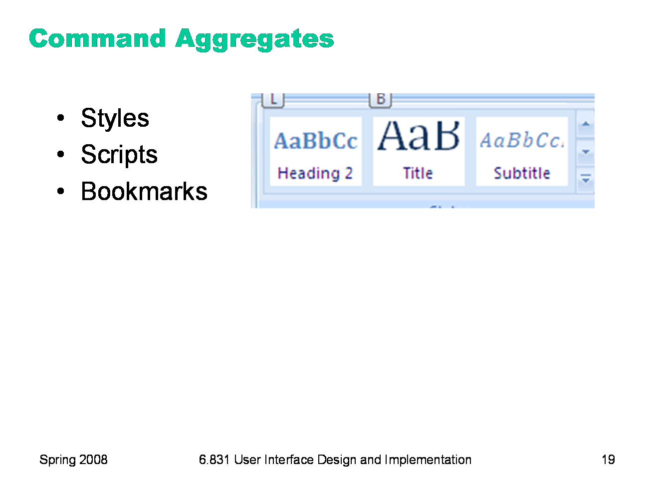
Another kind of shortcut aggregates a group of commands into a single item that invokes them all at once. Styles in word processors are an example of this idea. A named style bundles up a number of properties (font, font size, text color, margins, line spacing, etc.) into a single command that can be invoked with a single click. A scripts of commands in a command language are another kind of aggregate. Bookmarks are another useful shortcut.
|
|
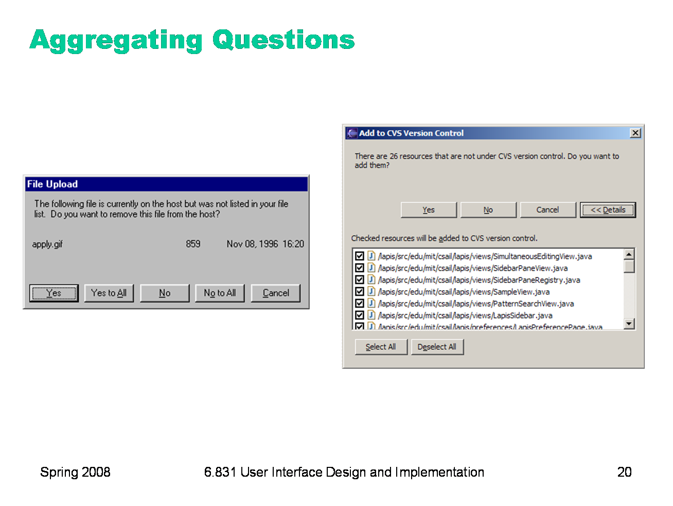
We’ve talked about another kind of aggregation in an earlier hall of fame & shame: aggregating a set of questions that the system wants to ask the user. Yes to All and No to All are good, but they don’t smoothly handle the case where the user wants to choose a mix of Yes and No. Eclipse’s list of checkboxes, with Select All and Deselect All, provides a good mix of flexibility and efficiency.
|

|
A great way to improve the efficiency of the interface is to predict what the user is likely to enter, and offer it as a default or an autocompletion option. Defaults are common answers already filled into a form. Defaults help in lots of ways: they provide shortcuts to both novices and frequent users; and they help the user learn the interface by showing examples of legal entries. Defaults should be fragile; when you click on or Tab to a field containing a default value, it should be fully selected so that frequent users can replace it immediately by simply starting to type a new value. (This technique, where typing replaces the selection, is called pending delete. It’s the way most GUIs work, but not all. Emacs, for example, doesn’t use pending delete; when you highlight some text, and then start typing, it doesn’t delete the highlighted text automatically.) If the default value is wrong, then using a fragile default allows the correct value to be entered as if the field were empty, so having the default costs nothing. Incidentally, it’s a good idea to remove the word “default” from your interface’s vocabulary. It’s a technical term with some very negative connotations in the lending world. Many inputs exhibit temporal locality — i.e., the user is more likely to enter a value they entered recently. File editing often exhibits temporal locality, which is why Recently-Used Files menus (like this) are very helpful for making file opening more efficient. Keep histories of users’ previous choices, not just of files but of any values that might be useful. When you display the Print dialog again, for example, remember and present as defaults the settings the user provided before.
|
|
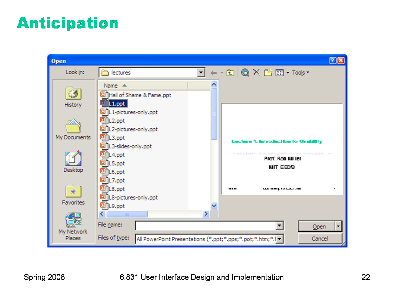
Anticipation means that a good design should put all needed information and tools within the user’s easy reach. If your current task has a precondition or a subtask, but the tool isn’t immediately available in the current mode, then you may have to back out of what you’re doing, at a cost to efficiency. Here’s the File Open dialog in Windows XP. This dialog demonstrates a number of efficiency improvements: * The toolbar icons across the top show some evidence of anticipating the user’s needs. Probably the most important is the New Folder icon, which lets you create a new folder to save your file in. * The icons on the left side are bookmarks for very common places that users go to open files, like the Desktop or the My Documents folder. * The History icon captures another aspect of the file-opening task: that users often need to open a file that they’ve opened recently. * If you click on My Network Places, you’ll see more evidence of anticipation: not just a list of the network places that you’ve already created (network places are basically bookmarks pointing to file servers), but also icons for the common subtasks involved in managing the list of network places: Add Network Place to add a new one; and the Network Setup Wizard if you aren’t connected to the network yet. It’s worth noting that all these operations are available elsewhere in Windows — recently opened files are found in PowerPoint’s File menu, the Network Setup wizard can be found from the Start menu or the Control Panel, and new folders can be made with Windows Explorer. So they’re here only as shortcuts to functionality that was already available — shortcuts that serve both learnability (since the user doesn’t have to learn about all those other places in order to perform the task of this dialog) and efficiency (since even if I know about those other places, I’m not forced to navigate to them to get the job done).
|
|
|