|
To print these notes, use the PDF version. |
|
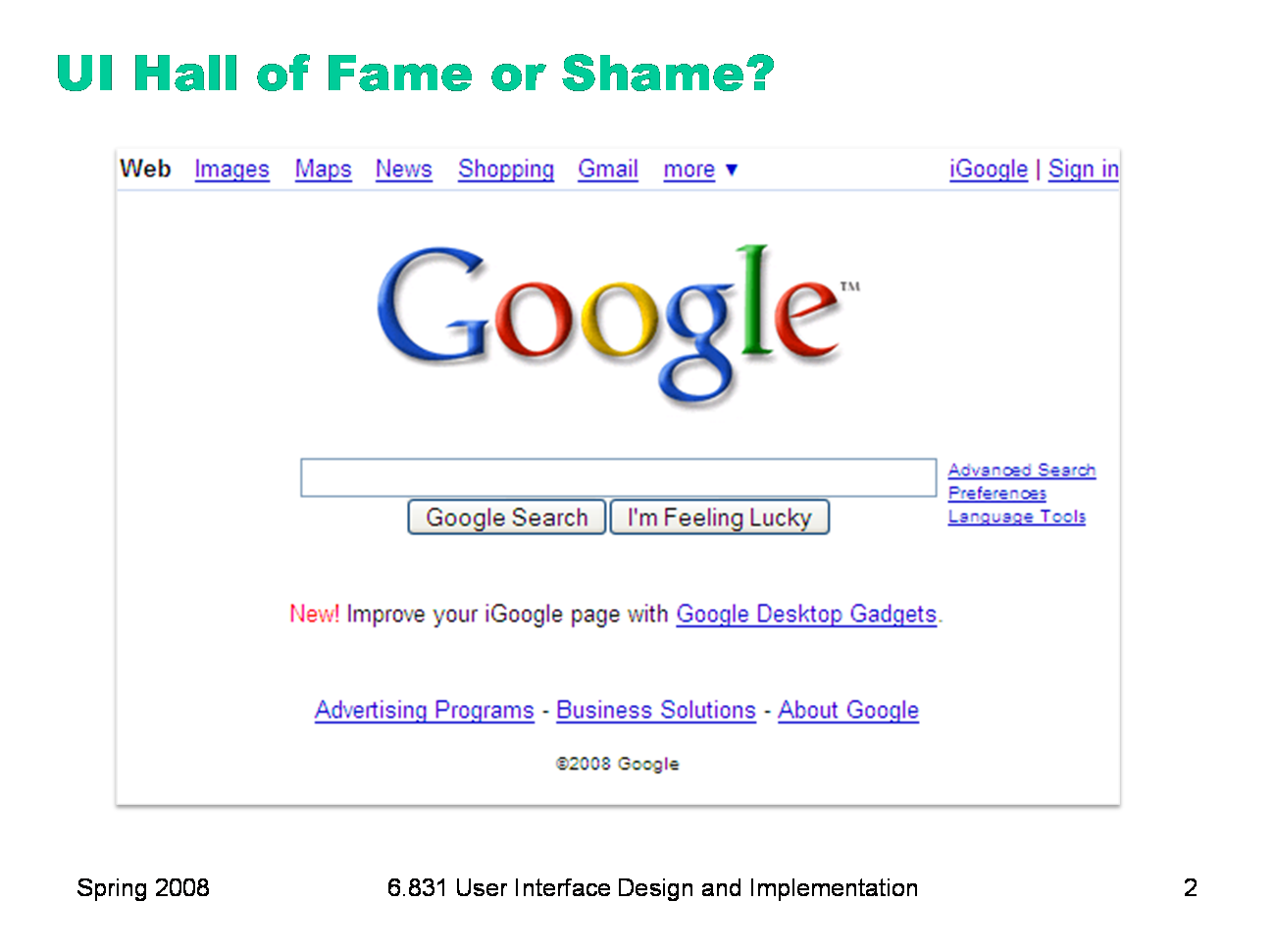
Here’s Google’s homepage. Let’s talk about just this page, in terms of: - simplicity - learnability - visibility, specifically information scent
|
|
Today, we’re going to look at some guidelines for graphic design. These guidelines are drawn from the excellent book Designing Visual Interfaces by Kevin Mullet and Darrell Sano (Prentice-Hall, 1995). Mullet & Sano’s book predates the Web, but the principles it describes are timeless and relevant to any visual medium. Another excellent book is Edward Tufte’s The Visual Display of Quantitative Information. Some of the examples in this lecture are inspired by Tufte.
|
|
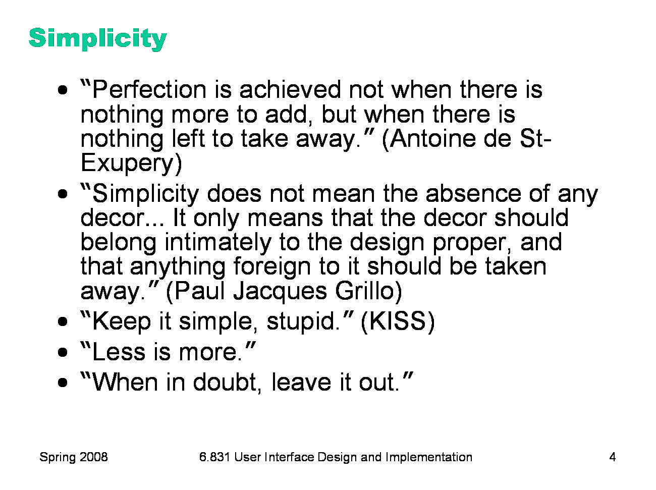
Okay, we’ll shout some slogans at you now. You’ve probably heard some of these before. What you should take from these slogans is that designing for simplicity is a process of elimination, not accretion. Simplicity is in constant tension with task analysis, information preconditions, and other design guidelines, which might otherwise encourage you to pile more and more elements into a design, “just in case.” Simplicity forces you to have a good reason for everything you add, and to take away anything that can’t survive hard scrutiny.
|
|
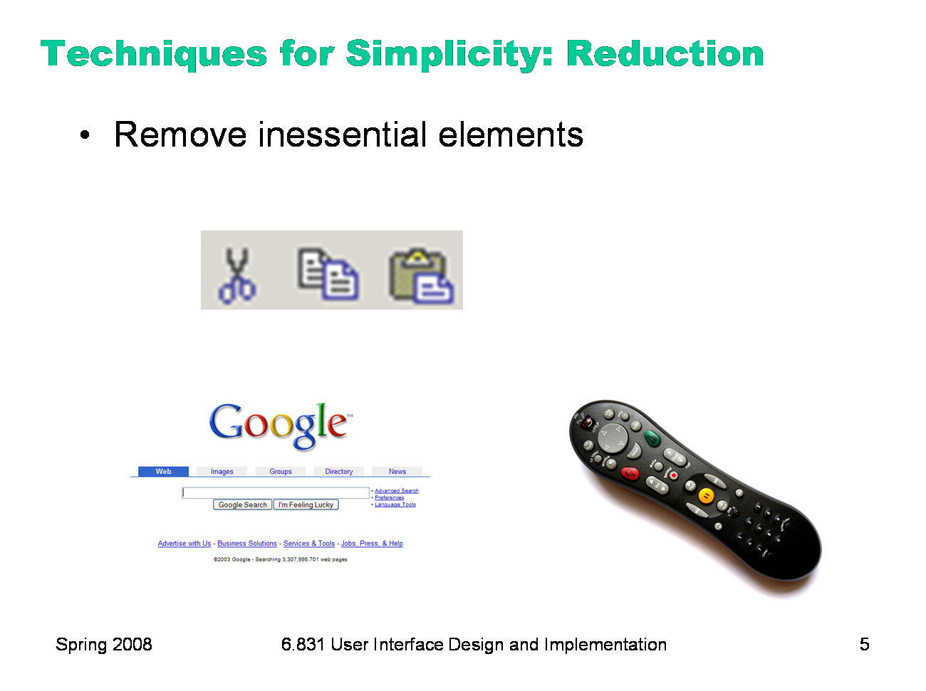
Here are three ways to make a design simpler. Reduction means that you eliminate whatever isn’t necessary. This technique has three steps: (1) decide what essentially needs to be conveyed by the design; (2) critically examine every element (label, control, color, font, line weight) to decide whether it serves an essential purpose; (3) remove it if it isn’t essential. Even if it seems essential, try removing it anyway, to see if the design falls apart. Icons demonstrate the principle of reduction well. A photograph of a pair of scissors can’t possibly work as a 32x32 pixel icon; instead, it has to be a carefully-drawn picture which includes the bare minimum of details that are essential to scissors: two lines for the blades, two loops for the handles. The standard US Department of Transportation symbol for handicapped access is likewise a marvel of reduction. No element remains that can be removed from it without destroying its meaning. We’ve already discussed the minimalism of Google and the Tivo remote in earlier classes. Here, the question is about functionality. Both Google and Tivo aggressively removed functions from their primary interfaces.
|
|
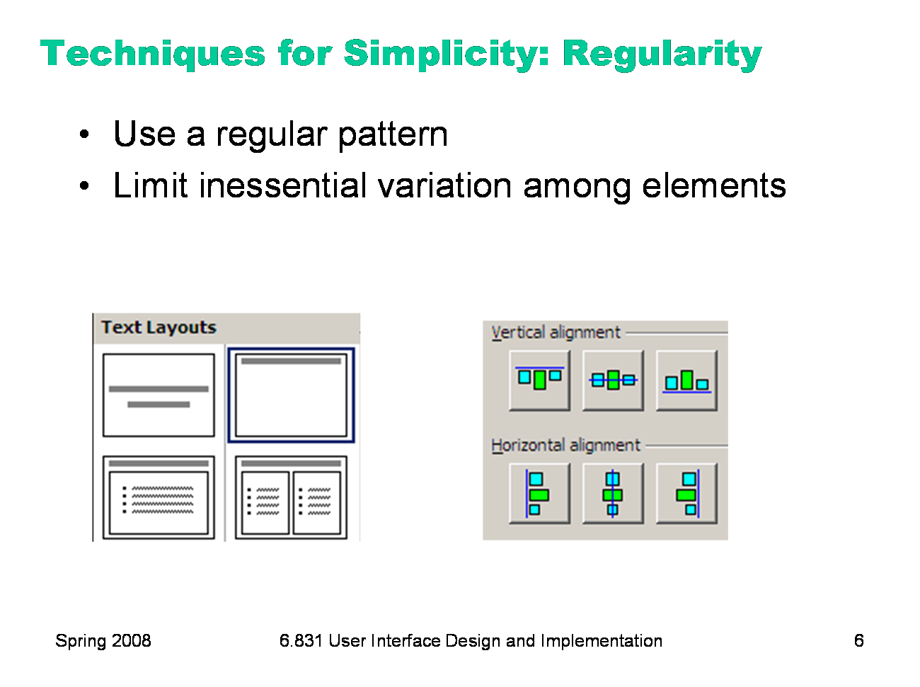
For the essential elements that remain, consider how you can minimize the unnecessary differences between them with regularity. Use the same font, color, line width, dimensions, orientation for multiple elements. Irregularities in your design will be magnified in the user’s eyes and assigned meaning and significance. Conversely, if your design is mostly regular, the elements that you do want to highlight will stand out better. PowerPoint’s Text Layouts menu shows both reduction (minimalist icons representing each layout) and regularity. Titles and bullet lists are shown the same way.
|
|
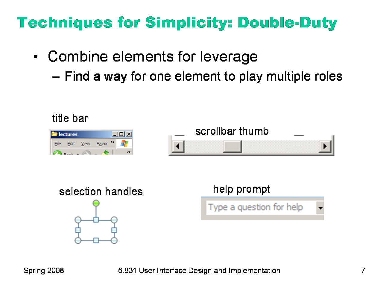
Finally, you can combine elements, making them serve multiple roles in the design. The desktop interface has a number of good examples of this kind of design. For example, the “thumb” in a scroll bar actually serves three roles. It affords dragging, indicates the position of the scroll window relative to the entire document, and indicates the fraction of the document displayed in the scroll window. Similarly, a window’s title bar plays several roles: label, dragging handle, window activation indicator, and location for window control buttons. In the classic Mac interface, in fact, even the activation indicator played two roles. When the window was activated, closely spaced horizontal lines filled the title bar, giving it a perceived affordance for dragging.
|
|
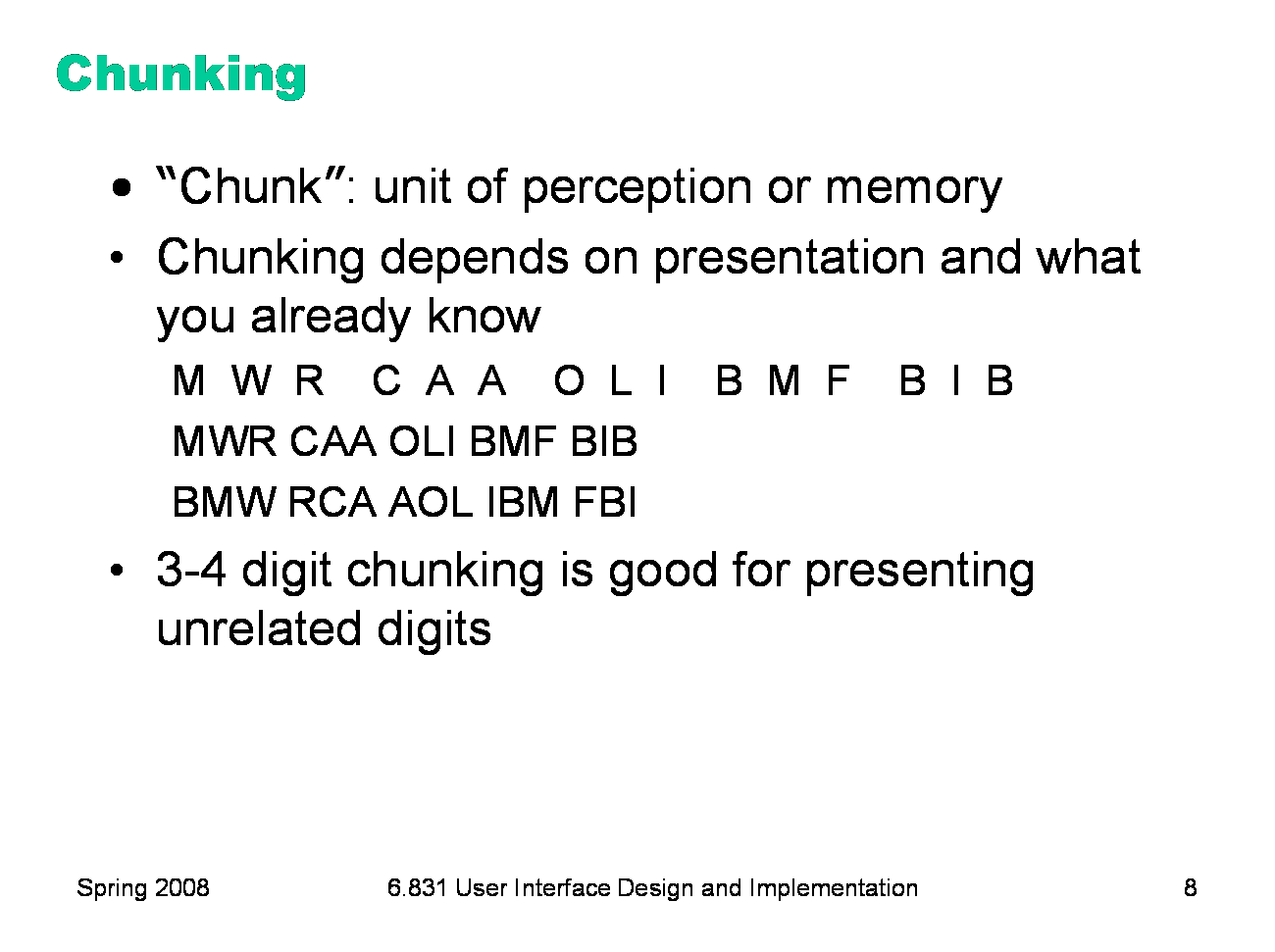
Presentation of information can often be simplified by dividing it up. The elements of perception and memory are called chunks. In one sense, chunks are defined symbols; in another sense, a chunk represents the activation of past experience. Our ability to form chunks in working memory depends strongly on how the information is presented — a sequence of individual letters tend to be chunked as letters, but a sequence of three-letter groups tend to be chunked as groups. It also depends on what we already know. If the three letter groups are well-known TLAs (three-letter acronyms) with well-established chunks in long-term memory, we are better able to retain them in working memory. Chunking is illustrated well by a famous study of chess players. Novices and chess masters were asked to study chess board configurations and recreate them from memory. The novices could only remember the positions of a few pieces. Masters, on the other hand, could remember entire boards, but only when the pieces were arranged in legal configurations. When the pieces were arranged randomly, masters were no better than novices. The ability of a master to remember board configurations derives from their ability to chunk the board, recognizing patterns from their past experience of playing and studying games. If you have to display a long number or a long code, you should divide it into shorter chunks for presentation. 3-4 digits per chunk is a good rule of thumb.
|
|
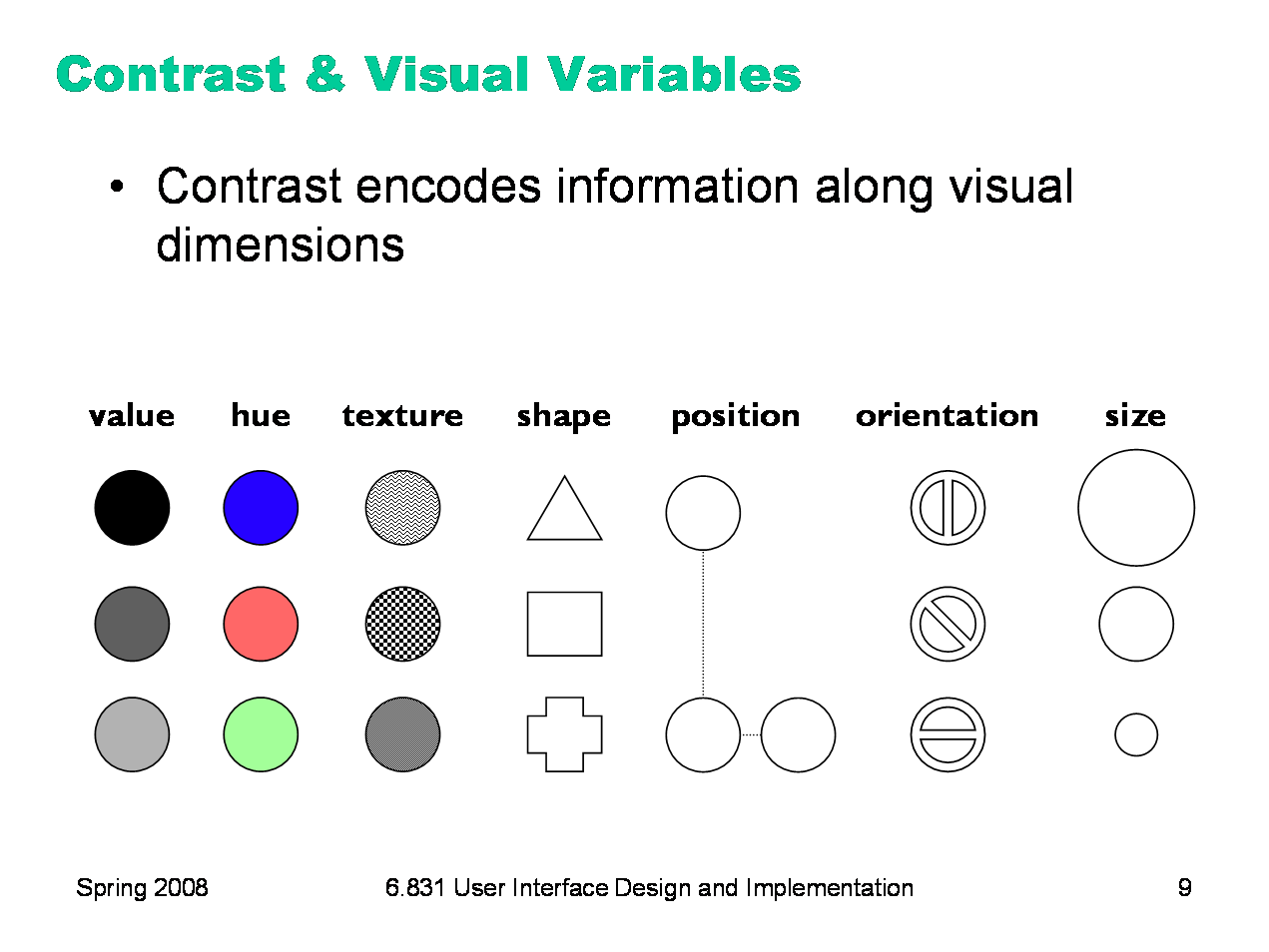
Contrast refers to perceivable differences along a visual dimension, such as size or color. Contrast is the irregularity in a design that communicates information or makes elements stand out. Simplicity says we should eliminate unimportant differences. Once we’ve decided that a difference is important, however, we should choose the dimension and degree of contrast in such a way that the difference is salient, easily perceptible, and appropriate to the task. Crucial to this decision is an understanding of the different visual dimensions. Jacques Bertin developed a theory of visual variables that is particularly useful here (Bertin, Graphics and Graphics Information Processing, 1989). The seven visual variables identified by Bertin are shown above. Bertin called these dimensions retinal variables, in fact, because they can be compared effortlessly without additional cognitive processing, as if the retina were doing all the work. In terms of the model human processor abstraction, differences along these dimensions can be detected by the Perceptual Processor. Comparing numbers, on the other hand, would require the participation of the Cognitive Processor. Each column in this display varies along only one of the seven variables. Most of the variables need no explanation, except perhaps for hue and value. Hue is pure color; value is the brightness or luminance of color. (Figure after Mullet & Sano, p. 54).
|
|
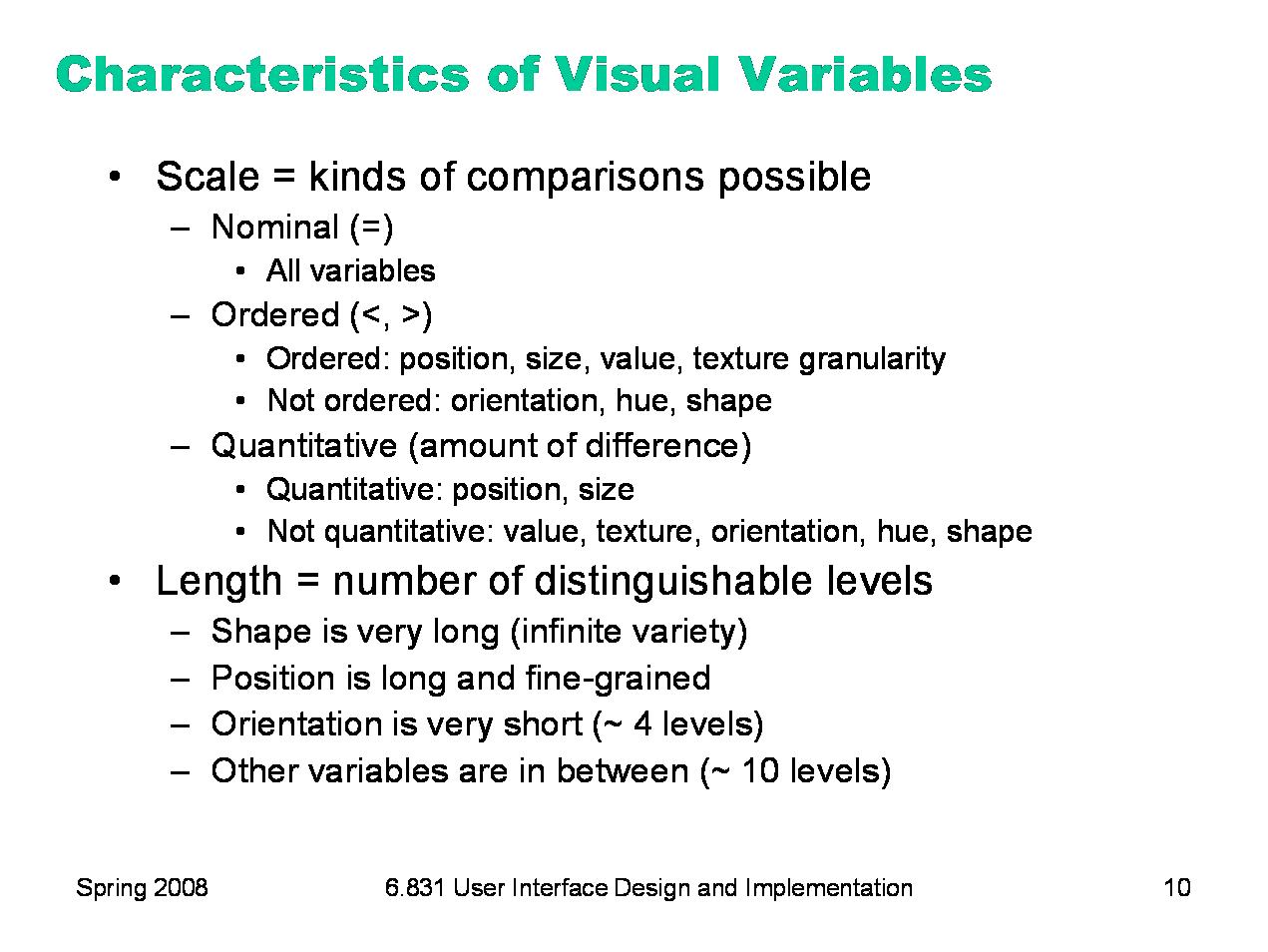
The visual variables are used for communication, by encoding data and drawing distinctions between visual elements. But the visual variables have different characteristics. Before you choose a visual variable to express some distinction, you should make sure that the visual variable’s properties match your communication. For example, you could display a temperature using any of the dimensions: position on a scale, length of a bar, color of an indicator, or shape of an icon (a happy sun or a chilly icicle). Your choice of visual variable will strongly affect how your users will be able to perceive and use the displayed data. Two characteristics of visual variables are the kind of scale and the length of the scale. A nominal scale is just a list of categories. Only comparison for equality is supported by a nominal scale. Different values have no ordering relationship. The shape variable is purely nominal. Hue is also purely nominal, at least as a perceptual variable. Although the wavelength of light assigns an ordering to colors, the human perceptual system takes no notice of it. Likewise, there may be some cultural ordering imposed on hue (red is “hotter” than blue), but it’s weak, doesn’t relate all the hues, and is processed at a higher cognitive level. An ordered scale adds an ordering to the values of the variable. Position, size, value, and to some extent texture (with respect to the grain size of the texture) are all ordered. With a quantitative variable, you can perceive the amount of difference in the ordering. Position is quantitative. You can look at two points on a graph and tell that one is twice as high as the other. Size is also quantitative, but note that we are far better at perceiving quantitative differences in one dimension (i.e., length) than in two dimensions (area). Value is not quantitative; we can’t easily perceive that one shade is twice as dark as another shade. The length of a variable is the number of distinguishable values that can be perceived. We can recognize a nearly infinite variety of shapes, so the shape variable is very long, but purely nominal. Position is also long, and particularly fine-grained. Orientation, by contrast, is very short; only a handful of different orientations can be perceived in a display before confusion starts to set in. The other variables lie somewhere in between, with roughly 10 useful levels of distinction, although size and color are somewhat longer than value and texture.
|
|
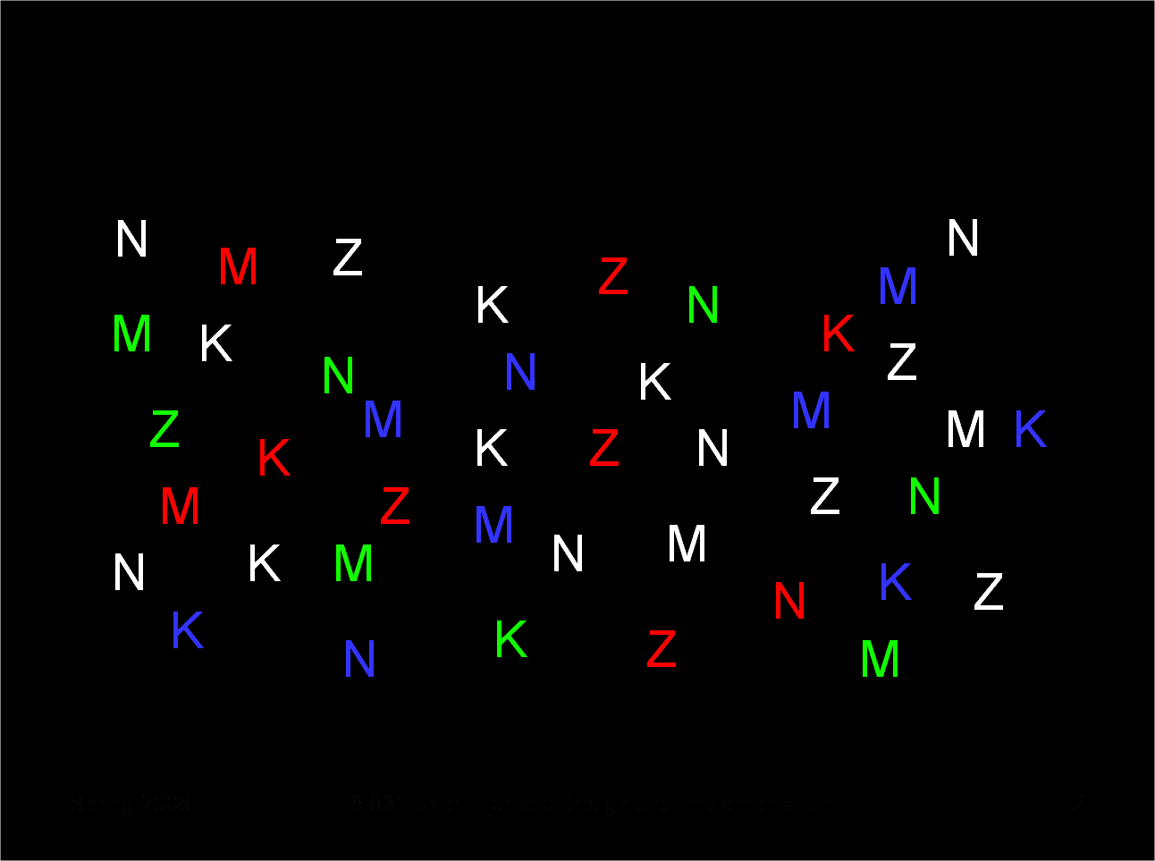
There are two ways that your choice of visual variables can affect the user’s ability to attend to them. Selectivity is the degree to which a single value of the variable can be selected from the entire visual field. Most variables are selective: e.g., you can locate green objects at a glance, or tiny objects. Shape, however, is not selective in general. It’s hard to pick out triangles amidst a sea of rectangles.
|
|
Ask yourself these questions: - find all the letters on the left edge of the page (position) - find all the red letters (hue) - find all the K’s (shape) Which of these questions felt easy to answer, and which felt hard? The easy ones were selective visual variables.
|
|
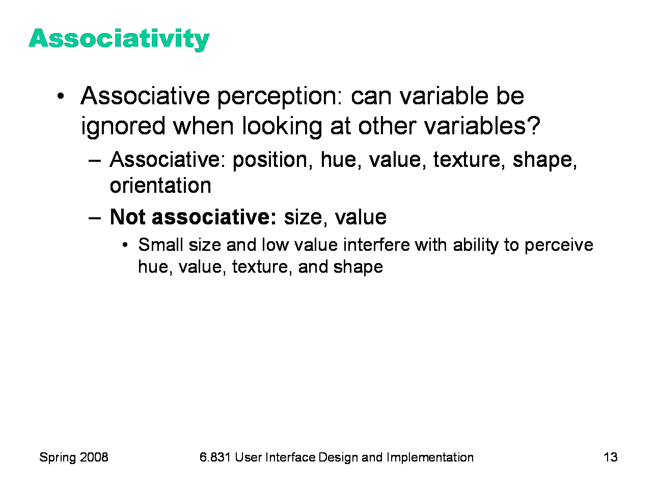
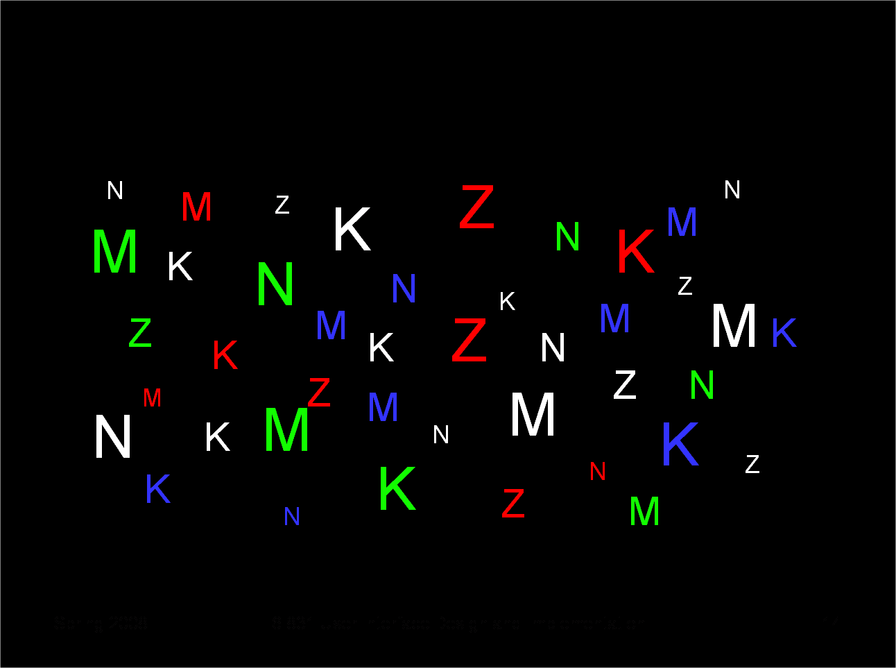
Associativity refers to how easy it is to ignore the variable, letting all of the distinctions along that dimension disappear. Variables with poor associativity interfere with the perception of other visual dimensions. In particular, size and value are dissociative, since tiny or faint objects are hard to make out.
|
|
Notice that when we use size as a visual variable as well, the shapes and hues of small objects become harder to detect.
|
|
Once you’ve decided that a contrast is essential in your interface, choose the right visual variable to represent it, keeping in mind the data you’re trying to communicate and the task users need to do with the data. For example, consider a text content hierarchy: title, chapter, section, body text, footnote. The data requires an ordered visual variable; a purely nominal variable like shape (e.g., font family) would not by itself be able to communicate the hierarchy ordering. If each element must communicate multiple independent dimensions of data at once (e.g., a graph that uses size, position, and color of points to encode different data variables), then you need to think about the effects of associativity and selectivity. Once you’ve chosen a variable, use as much of the length of the variable as you can. Determine the minimum and maximum value you can use, and exploit the whole range. In the interests of simplicity, you should minimize the number of distinct values you use. But once you’ve settled on N levels, distribute those N levels as widely across the variable as is reasonable. For position, this means using the full width of the window; for size, it means using the smallest and the largest feasible sizes. Choose variable values in such a way as to make sharp, easily perceptible distinctions between them. Multiplicative scaling (e.g., size growing by a factor of 1.5 or 2 at each successive level) is makes sharper distinctions than additive scaling (e.g., adding 5 pixels at each successive level). You can also use redundant coding, in several visual variables, to enhance important distinctions further. The title of a document is not only larger (size), but it’s also centered (position), bold (value), and maybe a distinct color as well. Exaggerated differences can be useful, particularly when you’re drawing icons: like a cartoonist, you have to give objects exaggerated proportions to make them easily recognizable. The squint test is a technique that simulates early visual processing, so you can see whether the contrasts you’ve tried to establish are readily apparent. Close one eye and squint the other, to disrupt your focus. Whatever distinctions you can still make out will be visible “at a glance.” |
|
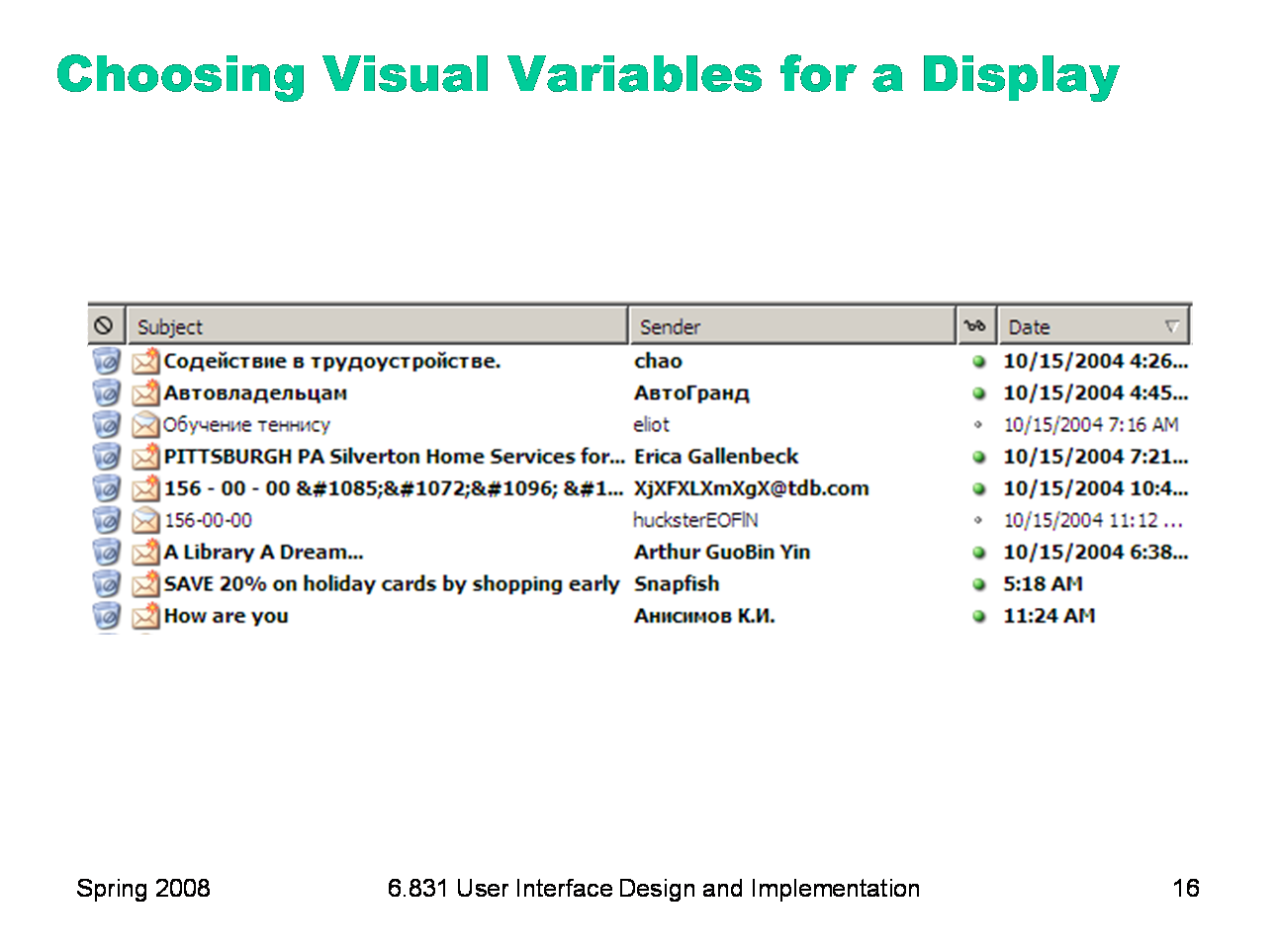
Let’s look at an email inbox to see how data associated with email messages are encoded into visual variables in the display. Here are the data fields shown above, in columns from left to right: Spam flag: nominal, 2 levels (spam or not) Subject: nominal (but can be ordered alphabetically), infinite (but maybe only ~100 are active) Sender: nominal (but can be ordered alphabetically), infinite (but maybe ~100 people you know + everybody else are useful simplifications) Unread flag: nominal, 2 levels (read or unread) Date: quantitative (but maybe ordered is all that matters), infinite (but maybe only ~10 levels matter: today, this week, this month, this year, older)
This information is redundantly coded into visual variables in the display shown above, for better contrast. First, all the fields use position as a variable, since each is assigned to a different column. In addition: Spam: shape, hue, value, size (big colorful icon vs. little dot) Subject: shape Sender: shape Unread: shape, hue, value, size (big green dot vs. little gray dot) and value of entire line (boldface vs. non) Date: shape, size (today is shorter than earlier dates), position (list is sorted by date)
|
|
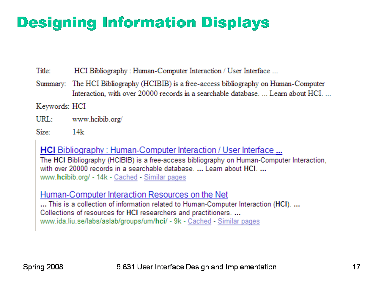
Here’s another example showing how redundant encoding can make an information display easier to scan and easier to use. Search engine results are basically just database records, but they aren’t rendered in a simplistic caption/field display like the one shown on top. Instead, they use rich visual variables — and no field labels! — to enhance the contrast among the items. Page titles convey the most information, so they use size, hue, and value (brightness), plus a little shape (the underline). The summary is in black for good readability, and the URL and size are in green to bracket the summary. Take a lesson from this: your program’s output displays do not have to be arranged like input forms. When data is self-describing, like names and dates, let it describe itself. (This is yet another example of the double duty technique for achieving greater simplicity — data is acting as its own label.) And choose good visual variables to enhance the contrast of information that the user needs to see at a glance.
|
|
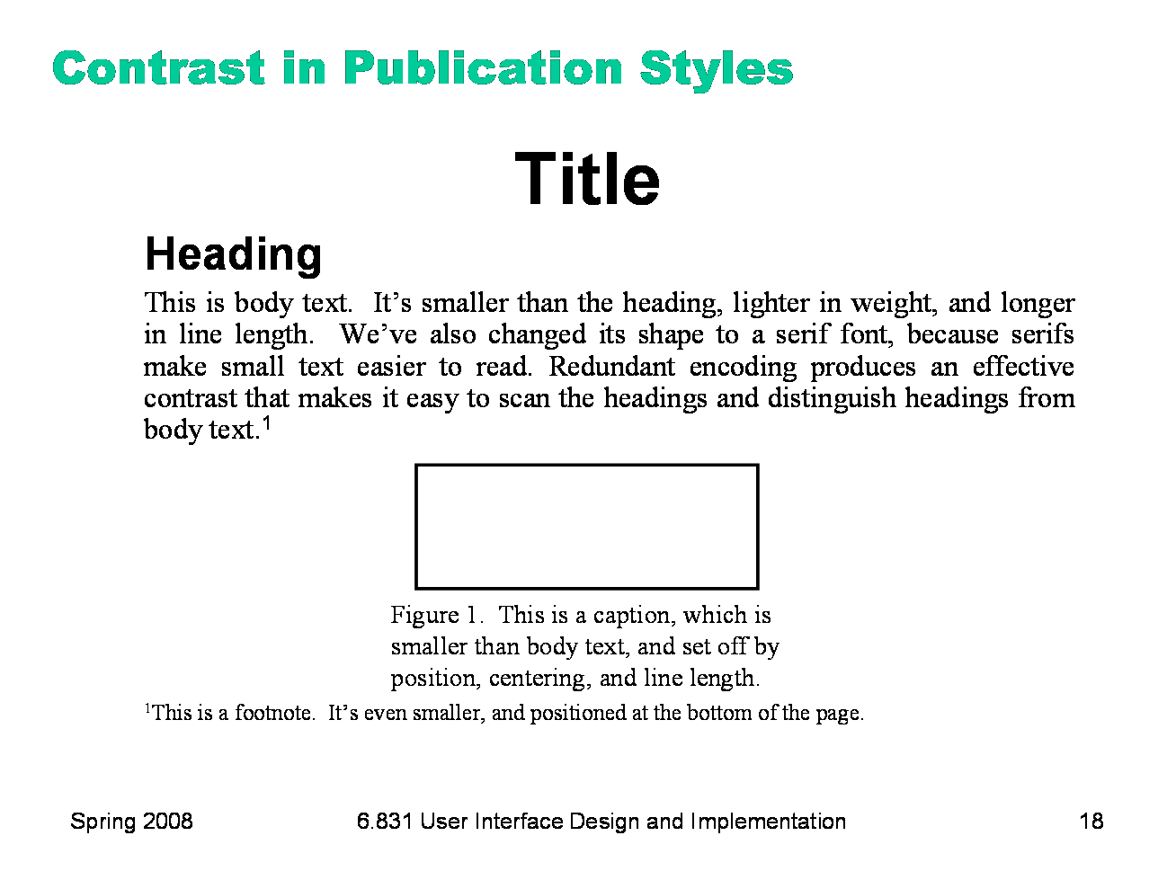
Titles, headings, body text, figure captions, and footnotes show how contrast is used to make articles easier to read. You can do this yourself when you’re writing papers and documentation. Does this mean contrast should be maximized by using lots of different fonts like Gothic and Bookman? No, for two reasons — contrast must be balanced against simplicity, and text shape variations aren’t the best way to establish contrast.
|
|
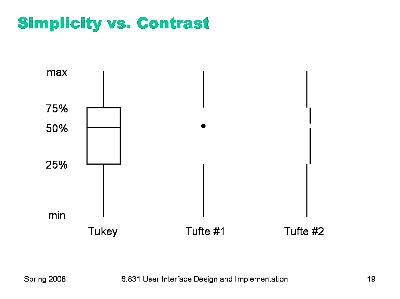
Conversely, here’s a case where simplicity is taken too far, and contrast suffers. Simplicity and contrast seem to fight with each other. The standard Tukey box plot shows 5 different statistics in a single figure. But it has unnecessary lines in it! Following the principle of simplicity to its logical extreme, Edward Tufte proposed two simplifications of the box plot which convey exactly the same information — but at a great cost in contrast. Try the squint test on the Tukey plot, and on Tufte’s second design. What do you see?
|
|
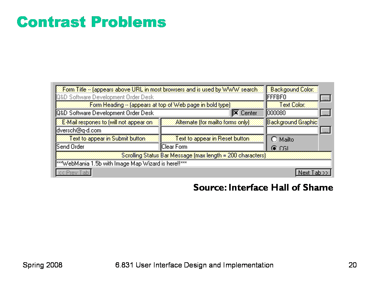
Here’s an example of too little contrast. It’s important to distinguish captions from text fields, but in this design, most of the visual variables are the same for both: - the position is very similar: the box around each caption and text field begins at the same horizontal position. The text itself begins at different positions (left-justified vs. aligned), but it isn’t a strong distinction, and some of the captions fill their column. - the size is the same: captions and text fields fill the same column width - the background hue is slightly different (yellow vs. white), but not easily differentiable by the squint test - the background value is the same (very bright) - the foreground hue and value are the same (black, plain font) - the orientation is the horizontal, because of course you have to read it. The result is that it’s hard to scan this form. The form is also terribly crowded, which leads us into our next topic�
|
|
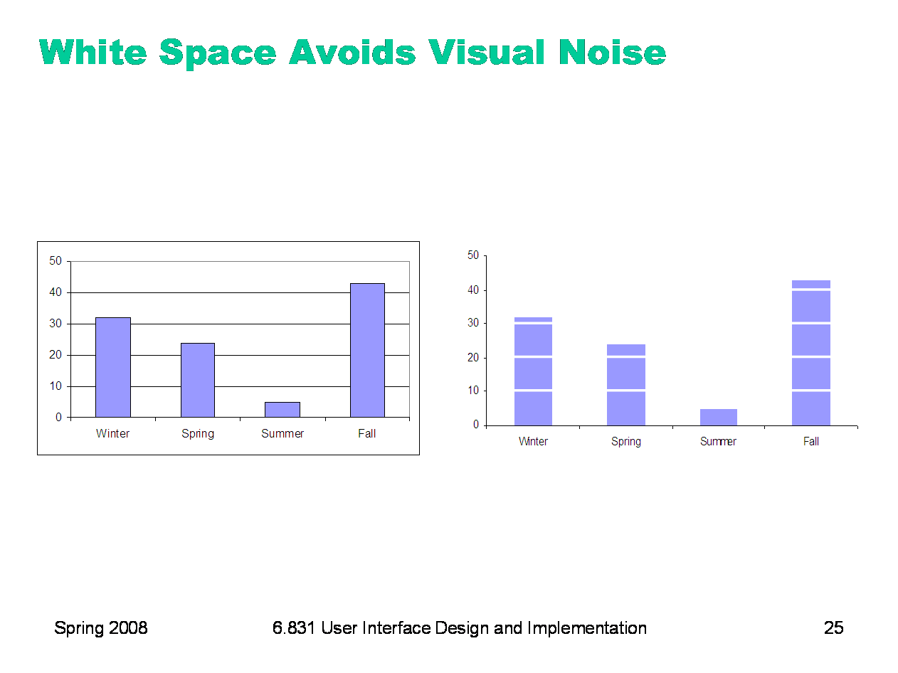
White space plays an essential role in composition. Screen real estate is at a premium in many graphical user interfaces, so it’s a constant struggle to balance the need for white space against a desire to pack information and controls into a display. But insufficient white space can have serious side-effects, making a display more painful to look at and much slower to scan. Put margins around all your content. Labels and controls that pack tightly against the edge of a window are much slower to scan. When an object is surrounded by white space, keep a sense of proportion between the object (the figure) and its surroundings (ground). Don’t crowd controls together, even if you’re grouping the controls. Crowding inhibits scanning, and produces distracting effects when two lines (such as the edges of text fields) are too close. Many UI toolkits unfortunately encourage this crowding by packing controls tightly together by default, but Java Swing (at least) lets you add empty margins to your controls that give them a chance to breathe.
|
|
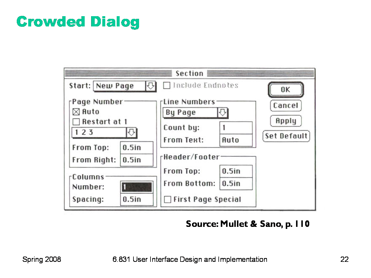
Here’s an example of an overcrowded dialog. The dialog has no margins around the edges; the controls are tightly packed together; and lines are used for grouping where white space would be more appropriate. Screen real estate isn’t terribly precious in a transient dialog box. The crowding leads to some bad perceptual effects. Lines appearing too close together — such as the bottom of the Spacing text field and the group line that surround it — blend together into a thicker, darker line, making a wart in the design. A few pixels of white space between the lines would completely eliminate this problem.
|
|
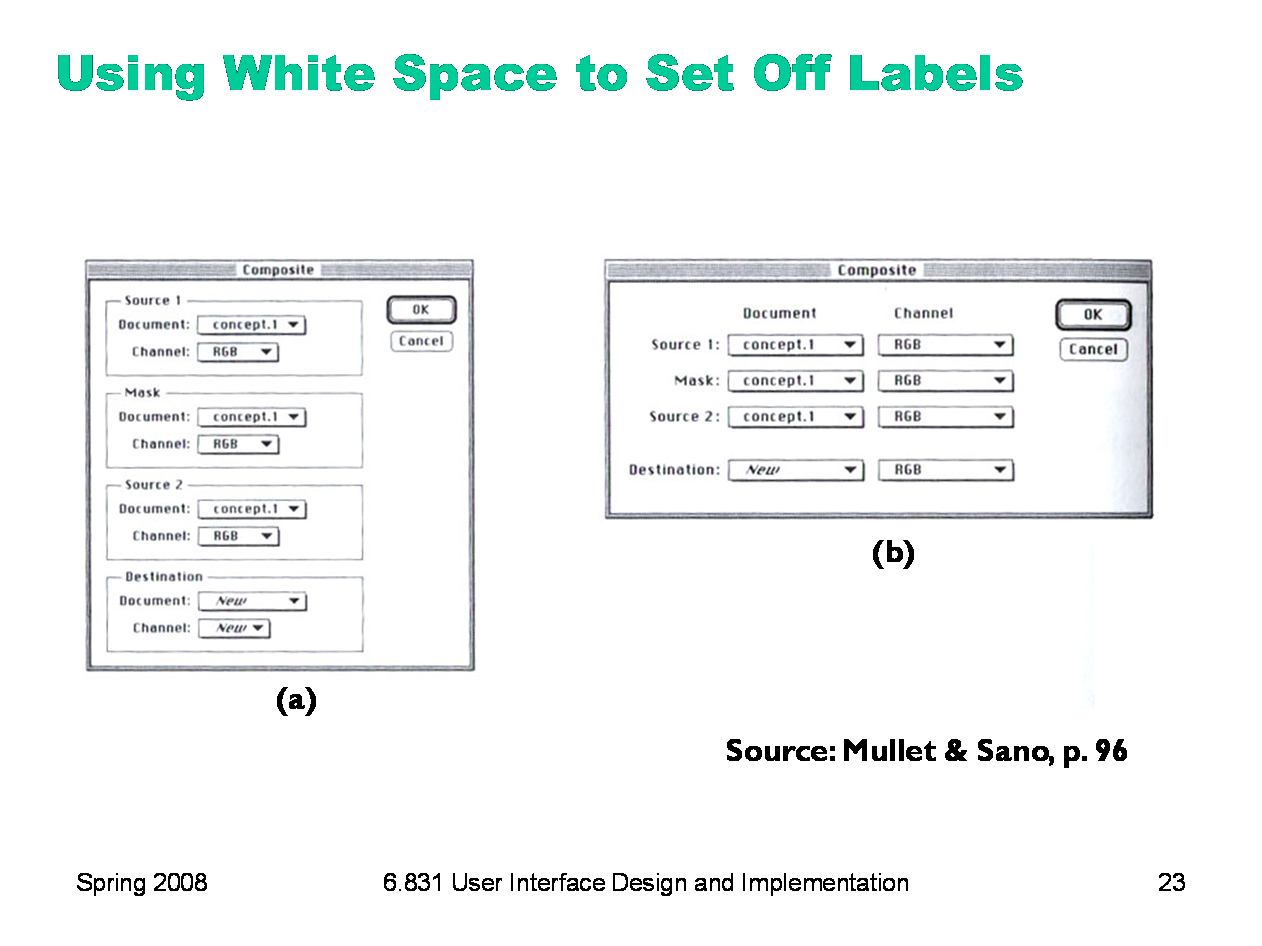
A particularly effective use of white space is to put labels in the left margin, where the white space sets off and highlights them. In dialog box (a), you can’t scan the labels and group names separately; they interfere with each other, as do the grouping lines. In the redesigned dialog (b), the labels are now alone on the left, making them much easier to scan. For the same reason, you should put labels to the left of controls, rather than above.
|
|
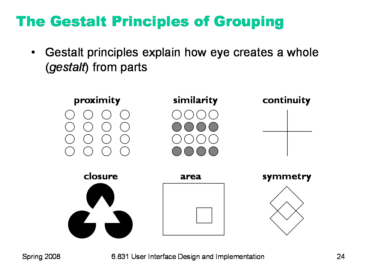
The power of white space for grouping derives from the Gestalt principle of proximity. These principles, discovered in the 1920’s by the Gestalt school of psychologists, describe how early visual processing groups elements in the visual field into larger wholes. Here are the six principles identified by the Gestalt psychologists: Proximity. Elements that are closer to each other are more likely to be grouped together. You see four vertical columns of circles, because the circles are closer vertically than they are horizontally. Similarity. Elements with similar attributes are more likely to be grouped. You see four rows of circles in the Similarity example, because the circles are more alike horizontally than they are vertically. Continuity. The eye expects to see a contour as a continuous object. You primarily perceive the Continuity example above as two crossing lines, rather than as four lines meeting at a point, or two right angles sharing a vertex. Closure. The eye tends to perceive complete, closed figures, even when lines are missing. We see a triangle in the center of the Closure example, even though its edges aren’t complete. Area. When two elements overlap, the smaller one will be interpreted as a figure in front of the larger ground. So we tend to perceive the Area example as a small square in front of a large square, rather than a large square with a hole cut in it. Symmetry. The eye prefers explanations with greater symmetry. So the Symmetry example is perceived as two overlapping squares, rather than three separate polygons. |
|
Here’s an interesting idea from Tufte: get rid of the grid rules on a standard bar chart, and use whitespace to show where the grid lines would cross the bars. It’s much less noisy. (But alas, impossible to do automatically in Excel.)
|
|
Balance and symmetry are valuable tools in a designer’s toolkit. In graphic design, symmetry rarely means exact, mirror-image equivalence. Instead, what we mean by symmetry is more like balance: is there the same amount of stuff on each side of the axis of symmetry. We measure “stuff” by both mass (quantity of nonwhite pixels) and extent (area covered by those pixels); both mass and extent should be balanced.
|
|
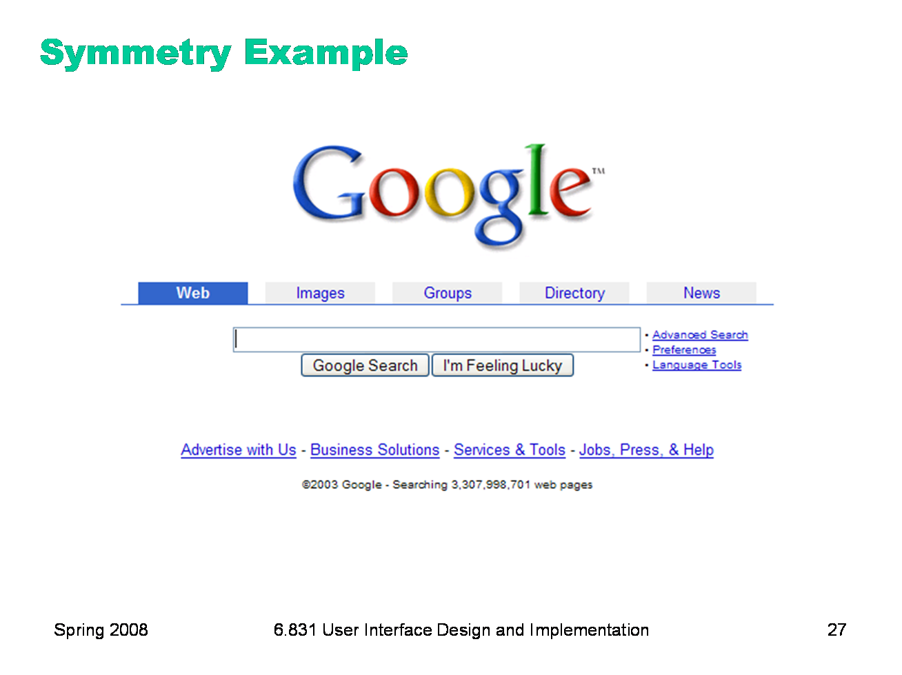
An easy way to achieve balance is to simply center the elements of your display. That automatically achieves balance around a vertical axis. If you look at Google’s home page, you’ll see this kind of approach in action. In fact, only one element of the Google home page breaks this symmetry: the stack of links for Advanced Search, Preferences, and Language Tools on the right. This slight irregularity (a kind of contrast) actually helps emphasize these links slightly.
|
|
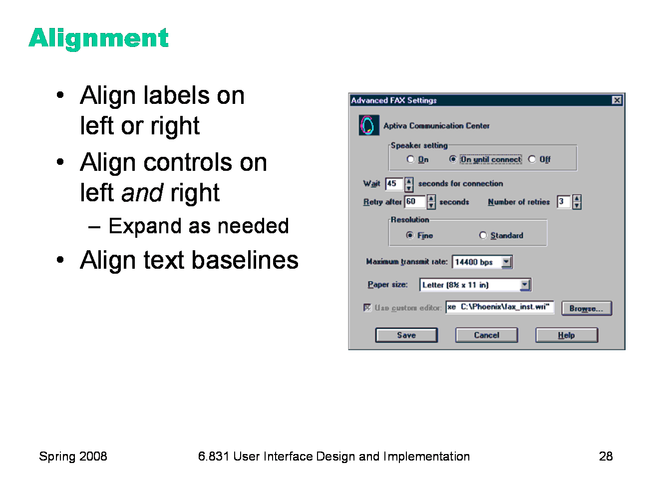
Finally, simplify your designs by aligning elements horizontally and vertically. Alignment contributes to the simplicity of a design. Fewer alignment positions means a simpler design. The dialog box shown has totally haphazard alignment, which makes it seem more complicated than it really is. Labels (e.g. “Wait” and “Retry after”). There are two schools of thought about label alignment: one school says that the left edges of labels should be aligned, and the other school says that their right edges (i.e., the colon following each label) should be aligned. Both approaches work, and experimental studies haven’t found any significant differences between them. Both approaches also fail when long labels and short labels are used in the same display. You’ll get best results if you can make all your labels about the same size, or else break long labels into multiple lines. Controls (e.g., text fields, combo boxes, checkboxes). A column of controls should be aligned on both the left and the right. Sometimes this seems unreasonable -- should a short date field be expanded to the same length as a filename? It doesn’t hurt the date to be larger than necessary, except perhaps for reducing its perceived affordance for receiving a date. You can also solve these kinds of problems by rearranging the display, moving the date elsewhere, although be careful of disrupting your design’s functional grouping or the expectations of your user. So far we’ve only discussed left-to-right alignment. Vertically, you should ensure that labels and controls on the same row share the same text baseline. Java Swing components are designed so that text baselines are aligned if the components are centered vertically with respect to each other, but not if the components’ tops or bottoms are aligned. Java AWT components are virtually impossible to align on their baselines. The dialog shown here has baseline alignment problems, particularly among the controls in the last row: the checkbox “Use custom editor”, the text field, and the Browse button.
|
|
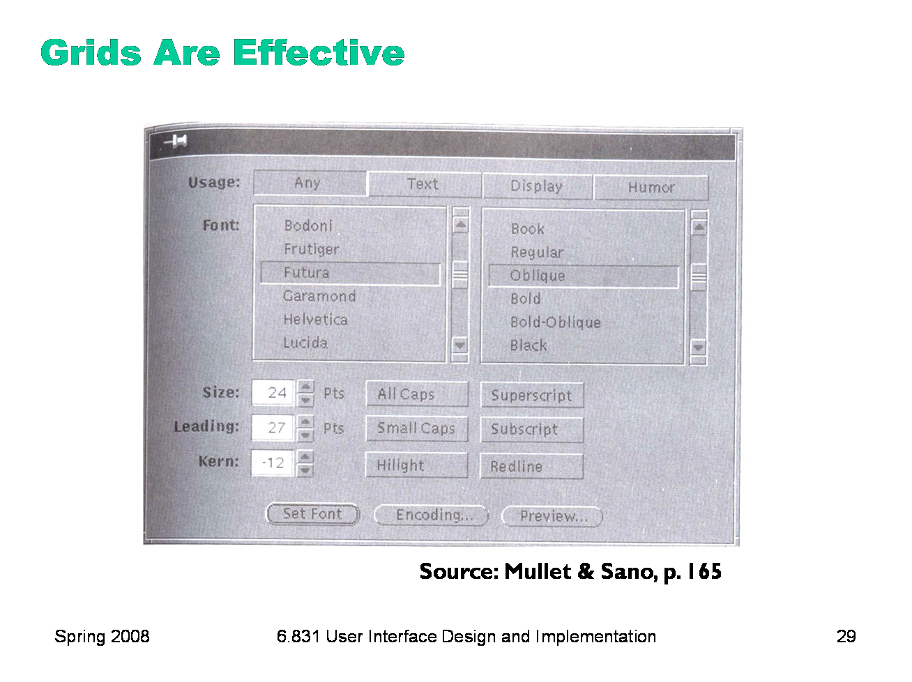
A grid is one effective way to achieve both alignment and balance, nearly automatically. Notice the four-column grid used in this dialog box (excluding the labels on the left). The only deviation from the grid is the row of three command buttons at the bottom which are nevertheless still balanced. In fact, their deviation from the grid helps to set them off, despite the minimal white space separating them from the rest of the display. One criticism of this dialog is false grouping. The controls for Size, All Caps, and Superscript tend to adhere because of their proximity, and likewise for the next two rows of the display. This might be fixed by pushing the toggle buttons further to the right, to occupy columns 3 and 4 instead of 2 and 3, but at the cost of some balance.
|
|
|