|
To print these notes, use the PDF version. |
|
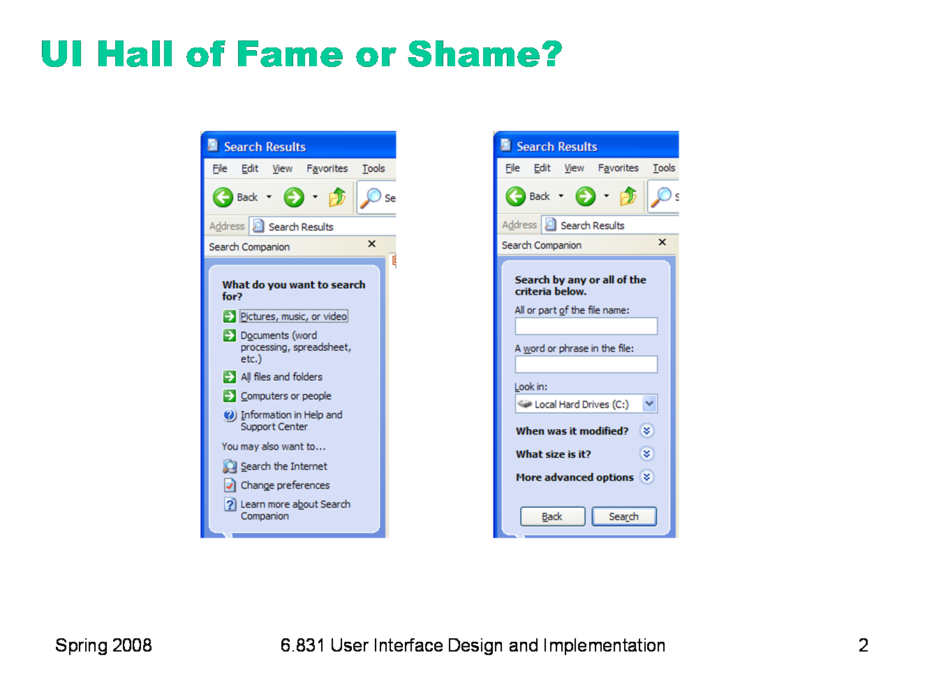
This is the Windows XP Search Companion. It appears when you press the Search button on a Windows Explorer toolbar, and is primarily intended for finding files on your hard disk. An interesting feature of this interface is that, rather than giving a textbox for search keywords right away, it first asks you to specify what kind of file you’re looking for. Let’s think about: - learnability (what overall design pattern is being used here?) - user control & freedom - efficiency - error prevention — can you anticipate an error in the second picture? (Hint: find two buttons with identical labels)
|
|
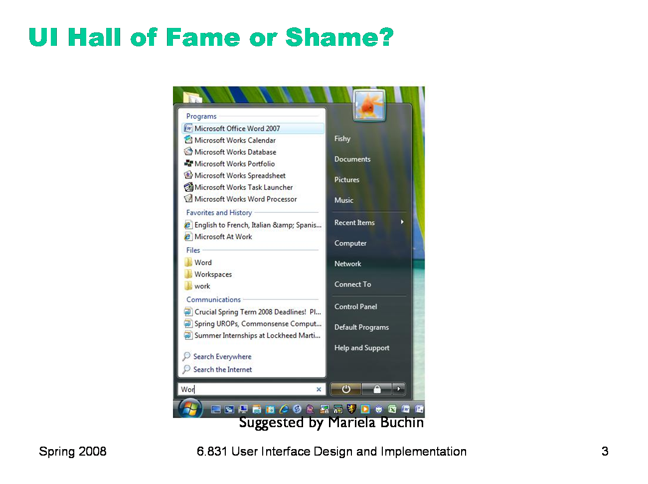
Now here’s the Start menu in Vista, which is similar to the Start menu in Windows XP and other desktops, but it adds an interesting new feature: a search box that incrementally searches through programs, web favorites, files, and emails. Think about: - efficiency - consistency - visibility Quicksilver for Mac OS offers a similar feature (although Quicksilver is much different in the details; we may look at it in a future Hall of Fame or Shame). |
|
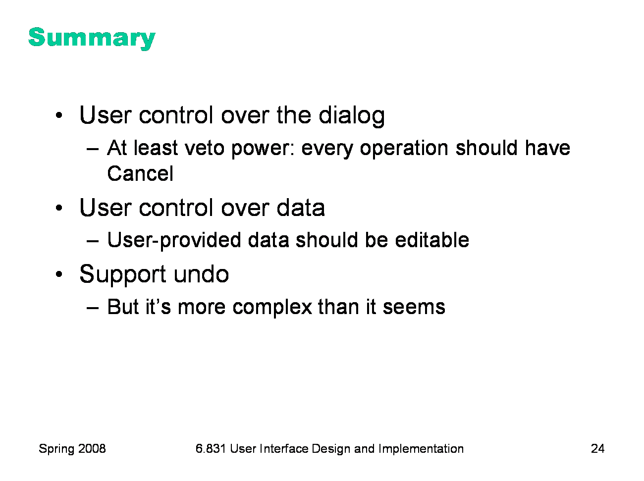
Today’s lecture is about user control and freedom (a term coined by Jakob Nielsen), which is the idea that in the give and take between the user and the system, the user should have ultimate control. We’ve touched on this idea several times in previous lectures. It’s one of the reasons we use event-driven programming in graphical user interfaces, for example, rather than synchronous prompt-and-response. But user control has design implications beyond that low-level detail. We’ll focus on two kinds of control in this lecture: control over the dialog (who says what when), and control over the data (e.g., what the user can enter, and whether it can be changed later). A common design pattern for increasing user control is undo. We’ll look at undo in detail, and see that it’s more complicated than it appears.
|
|
Good interfaces are explorable. One way users learn is by exploring: poking around an interface, trying things out. An interface should encourage this kind of exploration, not only by making things more visible, but also by making the consequences of errors less severe. For example, users navigating around a 3D world or a complex web site can easily get lost; give them an easy, obvious way to get back to some “home”, or default view. Users should be able to explore the interface without fear of being trapped in a corner.
|
|
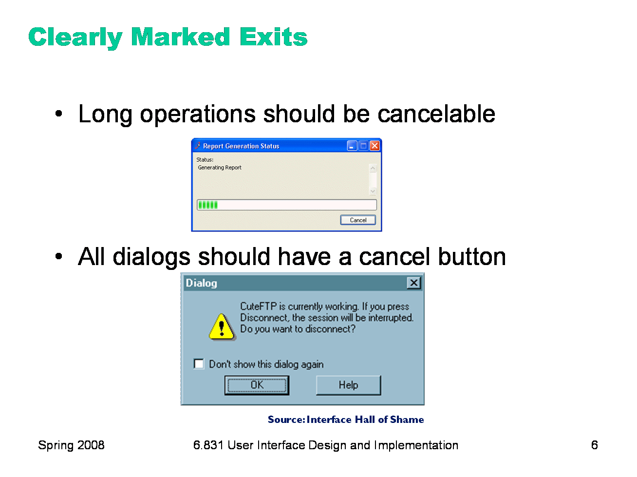
The simplest kind of user control is a veto — the ability to cancel an operation, even if it was something they asked for. Users should not be trapped by the interface. Long operations should not only have a progress bar, but a Cancel button too. Likewise, every dialog box should have a Cancel button. Where is it in this CuteFTP dialog box on the bottom? As a user of this dialog, would you feel like you’re in control?
|
|
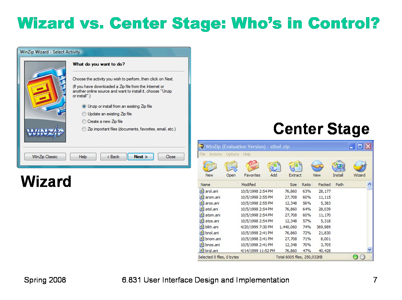
Let’s look a little further at who controls the dialog between the user and the system. (Here, dialog means the general pattern of back-and-forth communication between the user and the interface, as if the user and the system are having a conversation. A dialog box is a specific kind of window, a design pattern used in a dialog. We often say dialog as a shorthand for dialog box, but hopefully the distinction will be obvious from context.) We’ll contrast two patterns. The wizard design pattern is a familiar pattern for improving the learnability of a complex interaction, by structuring it as a step-by-step process, with each step in a dialog. Wizards are the conventional pattern for software installation. In a wizard, the system controls the dialog — it dictates the steps, the ordering of the steps, and what it asks for at each step. Imagine a travel agent who’s asking you a series of questions, and refuses to listen to what you say if it’s not relevant to the question they asked. That’s a wizard. Contrast that with the center stage pattern, which lays out data objects in the main section of the window, and gives the user a set of tools for operating on the objects. In this case, the user controls the dialog, deciding which objects to select and which tools to pick up. Wizards clearly restrict the user’s freedom, but for complex, infrequently-done tasks (like installation), the tradeoff is often worth it. Note, however, that a good wizard has two key features: a Back button (for backing out of errors) and a Cancel button (for vetoing the operation entirely). So even though the wizard pattern puts the system in control of the details, the user still has supervisory control.
|
|
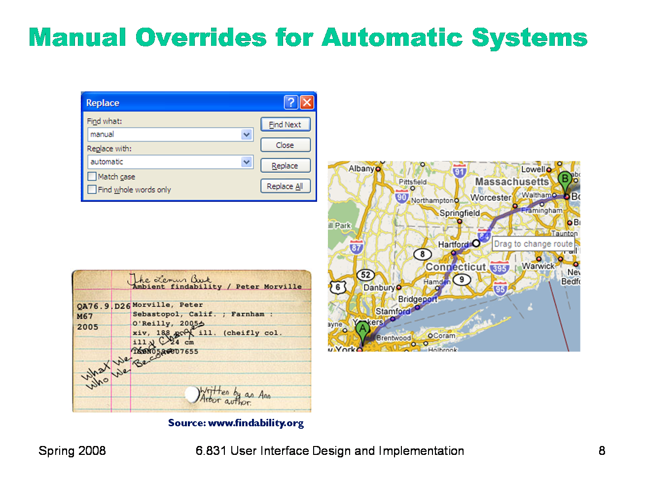
One of the main reasons we build software in the first place is to automate a process, taking some burden off the human users. But we can’t take away control entirely. Users should be able to manually override automation. The familiar Find & Replace command is a simple example of this. If Find & Replace were perfectly automatable, then all we’d need is Replace All. But the world isn’t that simple, and our documents are full of exceptions or incompletely-specified patterns, and there are plenty of cases where the user needs manual control over replacement — hence the Replace button. Google Maps offers an example of a different kind of control — starting with the output of an automatic algorithm (the shortest route between two points) and manually tweaking it (dragging the route around). Systems that solve big or complex optimization problems should offer the user the opportunity to make these tweaks, since often there are constraints or preferences that are difficult to specify in advance, but can easily be seen when a solution is presented. Some HCI researchers (prominently, Austin Henderson) argue that computer science in general, and corporate system developers in particular, have gone too far in trying to regularize the world, building systems that demand coherence from their users and their environment, expecting input that fits into expected categories and rejecting all others. For example, stating that every person has a first name and a last name, or assuming that every city belongs to only one country, or demanding a single shipping address for an order, are claims about the coherence of the world. But the real world is fuzzy, full of exceptions and oddities, and we should build pliant systems that can survive the exceptions. A great example of how paper-based systems are pliant is the marginal comment. Here’s a card from an old-fashioned card catalog. You can easily distinguish the coherent typewritten data, which might fit neatly into a database system nowadays, from the marginalia. Margins on paper forms are often used by experienced workers to get their jobs done when the form is inadequate. We have a few design patterns for pliant user interfaces — such as comment fields (though they appear very rarely!), and tagging instead of rigid hierarchies — but we don’t really know how to build systems that are coherent enough for automation yet still pliant enough for the real world. (Jon Udell, “Scribbling in the Margins”, Infoworld, http://www.infoworld.com/article/04/04/09/15OPstrategic_1.html)
|
|
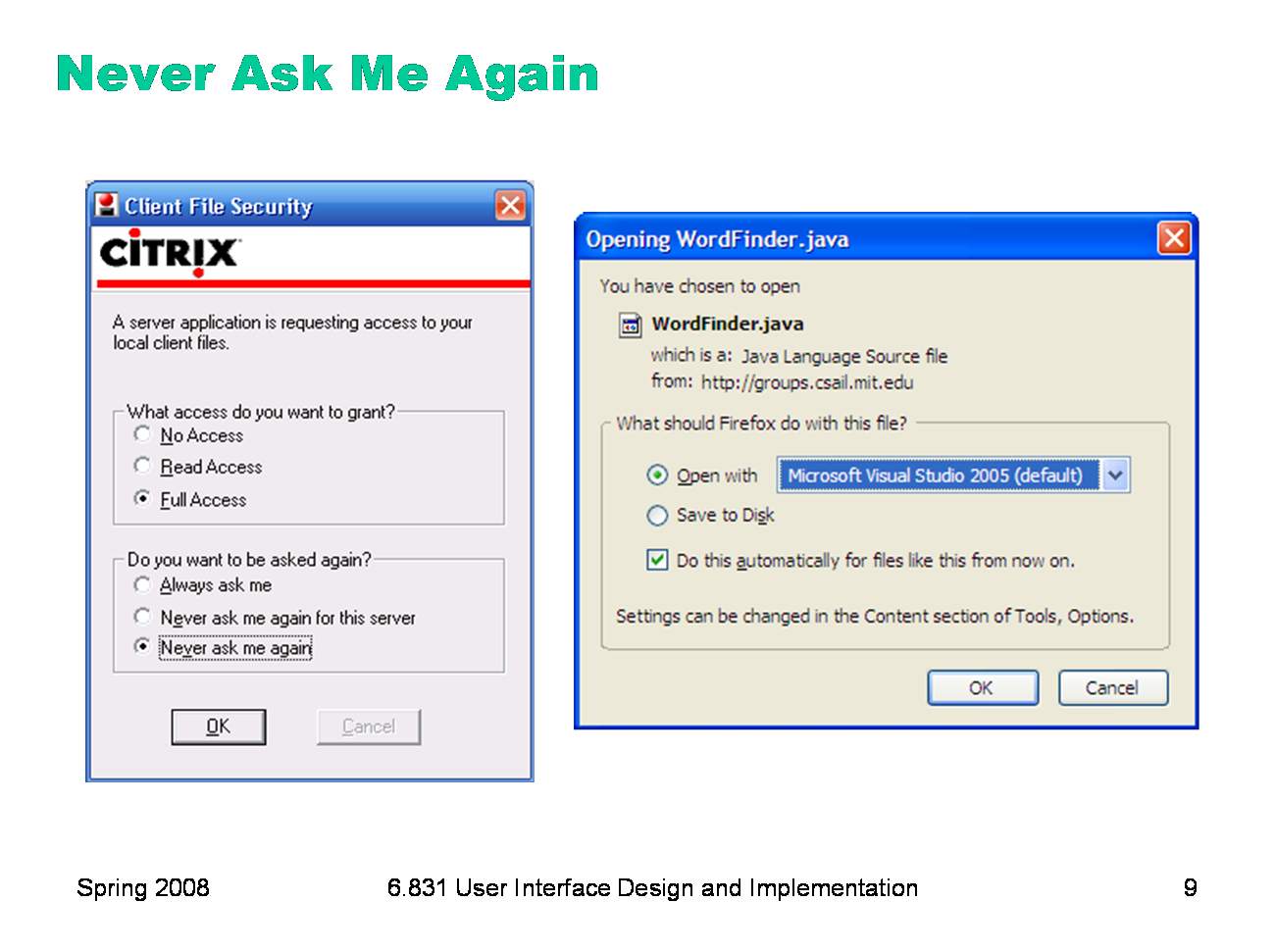
Here’s an interesting problem related to who’s in control of the dialog. Many interfaces interrupt users with questions, like the dialog boxes shown here. If the answer is always the same, it’s clearly inefficient (and annoying) to keep asking the same question repeatedly — so many of these dialogs offer the option Never ask me again. Good idea, and superficially seems to improve user control, because it’s like a veto over all future questions of the same type. But suppose later the user wants to change their decision? Because the system initiated this dialog, not the user, the user has no idea how to return to the question. And the system has promised never to ask it again! It’s a Catch-22. One patch to this problem can be seen in the Firefox window on the right — a help message that tells the user where to look to undo the decision. But remember that just because the user has seen a message doesn’t mean they’ve learned what it had to say. It’s not clear that this really fixes the problem, but I haven’t seen any better solutions.
|
|
So we’ve discussed user control over the dialog. Let’s now consider user control over the data itself. Editing is important. If the user is asked to provide any kind of data — whether it’s the name of an object, a list of email attachments, or the position of a rectangle — the interface should provide a way to go back and change what the user originally entered — rename the object, add or remove attachments, move around that rectangle some more. Data that is initialized by the user but can never again be touched will frustrate user control and freedom. Keep CRUD in mind — if you can Create an object or data field, you should be able to Read, Update, and Delete it, too. Providing user control and freedom can have strong effects on your backend model. You’ll have to make sure data are mutable. If you built your backend assuming that a user-provided piece of data would never change once it had been created, then you may have trouble building a good UI. One way that can happen is if you try to use user-provided data as a unique identifier in a database, like the user’s name, or their email address, or their phone number, or the title of a document. That’s generally not a good practice, because if any other object stores a reference to the identifier, then the user won’t be able to edit it. If an interface allows users to name things, then users should be free to choose long, descriptive names, with any characters or punctuation they want. Artificial limits on length or content should be avoided. DOS used to have a strong limit on filenames, an 8 character name and a 3 character extension, and a variety of punctuation characters are forbidden from filenames. Echoes of these limits persist in Windows even today.
|
|
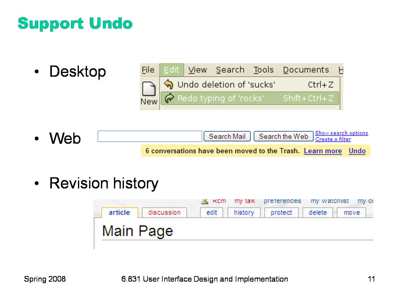
If Cancel is the most common answer for user control over dialog, then Undo is the most common answer to user control over data. Undo has been around in desktop applications since the dark ages of the first Macintosh, if not before. The first Mac applications supported only single-level undo — that is, you could undo the last command, but no farther. This was largely due to memory constraints, and modern desktop applications allow unlimited undo (or so much that it makes no difference given the current interface for Undo — nobody is going to press Ctrl-Z 1000 times, after all). Undo is also gradually appearing in web applications, like GMail. GMail’s interface (shown here) only supports single undo. But other web applications support much longer undo histories, particularly apps designed for collaboration, like wikis. In these apps, undo typically takes the form of a revision history, rather than an undo command.
|
|
You may think it’s obvious what the Undo command does: it reverses the effect of the user’s last action. But it’s not as simple as that. Undo’s behavior can be mysterious. Undo is an example of a case where the system model is not well communicated by the user interface. The actions managed by Undo are not visible; there’s no persistent, visual representation showing the next action to be undone. (Not quite true: in well-designed interfaces, the Undo menu command’s label gives a hint, like “Undo Typing” or “Undo Bold”. But it’s not prominent, so it doesn’t particularly help a user form their mental model from ordinary use.) If you ask users to predict what effect Undo will have in some particular case, they may have no idea. Let’s look at some of the questions we should ask when we’re designing an undo mechanism.
|
|
Undo reverses the last action made by the user, but it’s not necessarily the last one in the global stream. There is no global Undo in current GUI environments. Each application, sometimes even each widget, offers its own Undo command. A particular Undo command will only affect the action stream of the application or widget that it controls — so it will undo the last action in that application or widget’s stream, which isn’t necessarily the last command the user issued to the system as a whole. Some applications use a separate action stream for each window. Microsoft Office works this way, for example. If you type something into Word document A, then type something else into Word document B, then switch back to A and invoke Undo, then A’s insert will be undone — even though B’s insert is the last one you actually performed. Other applications treat each text widget as a separate action stream. Web browsers behave this way. Try visiting a form in a web browser, and type something into two different fields. You’ll find that Undo only affects the field with the current keyboard focus, ignoring actions you made on any other fields. Changes made in other kinds of form widgets — drop-down menus or listboxes, for example — aren’t added to any action stream. Applications with multiple simultaneous users — such as a shared network whiteboard, where anybody can scribble on it — face the question of whether Undo should affect only your own actions, or everybody’s actions. Usually, the best answer to this question is only your own actions, unless you have some kind of floor control mechanism that prevents people from working simultaneously [Abowd & Dix, “Giving undo attention,” Interacting with Computers, v4 n3, 1992].
|
|
Once you’ve decided which stream of actions to undo, the next question is, how is the stream divided into units? This is important because Undo reverses the last unit action of the stream. Dividing at the lexical level means low-level input events, so Undo might reverse the very last keyboard or mouse change. For example, if you just did a drag-and-drop, invoking Undo might undo your mouse button release, putting you back into drag-and-drop mode and allowing you to drop somewhere else. No user interface (that I know of) implements lexical Undo in a systematic way; it’s not clear how to get it right (since you’re not holding the button down anymore!), and it’s probably not what users want. At the syntactic level, you would undo commands or onscreen button presses. For menu items and toolbar buttons, this is the right thing. But if you just finished a dialog — say, using the Font dialog, or selecting a Color — then this would undo the OK button press, returning you into the dialog box. Most applications don’t do it at this level either. The semantic level is what most designers choose, where Undo reverses the most recent change to the backend model — whether it was caused by a simple command, like Boldface, or a complicated dialog, like Page Layout. That’s great for one kind of user control and freedom, since it makes complex changes just as easy to back out of as simple changes. But what if you just completed a long wizard dialog, only to discover that it didn’t do what you wanted, and Undo only reverses the effect of the entire dialog, instead of getting you back into the wizard and letting you Back up? There are tradeoffs in the decision to undo only at the semantic level, but it’s the most common. For undoing text, individual typed characters should be aggregated somehow — otherwise, Undo won’t be any faster than pressing Backspace. One natural way to do this might be word boundaries; but most text editors use edit commands and newlines as boundaries. In general, the action stream should be divided into chunks from the user’s perspective. For example, a user-defined macro is a chunk, so Undo should treat the entire macro as a unit action.
|
|
Many actions that affect visible program state may be completely ignored by Undo. Typically these actions affect the view, but don’t actually change the backend model. Examples include selection, keyboard focus, scrolling and zooming, window management, and user interface customizations. Since easy reversibility can be just as helpful for view changes, some applications define new commands for them, so they can reserve Undo for reversing model changes. Web browsers are a fine example: the Back button reverses a jump in view (whether caused by loading a new page or clicking on an internal hyperlink to jump to another place in the same page). Development environments like Eclipse have borrowed this idiom for navigation in code editors; you can press Back to undo window switching and scrolling.
|
|
Even if the Undo stream doesn’t include all the view changes you make, how much of the view state will be restored when it reverses a model change? When you undo a text edit, for example, will the selection highlight be restored as well? Will the text cursor be put back where it was before the edit? If the text scrolls, will it be scrolled back to the same place?
|
|
Finally, how far back will the undo history stream go? Old Macintosh applications had only single undo — i.e., you could only undo the last action, and no farther. Thankfully, cheap memory has made deep undo history feasible and commonplace. Even though memory no longer limits undo, the conventional model of undo still does. In most applications, Undo is a transient phenomenon, limited to a single application session. If you shut down the application, and then restart it, the undo history is erased. So you can’t undo past the start of the current session. Some applications even erase the undo history as soon as the user saves a document to disk. (Microsoft Office does this.) Presumably the reason is consistency — i.e., after you save, the model should be in the same state that it would be if you closed the application and restarted it — but it poses a serious cost on users who habitually save frequently.
|
|
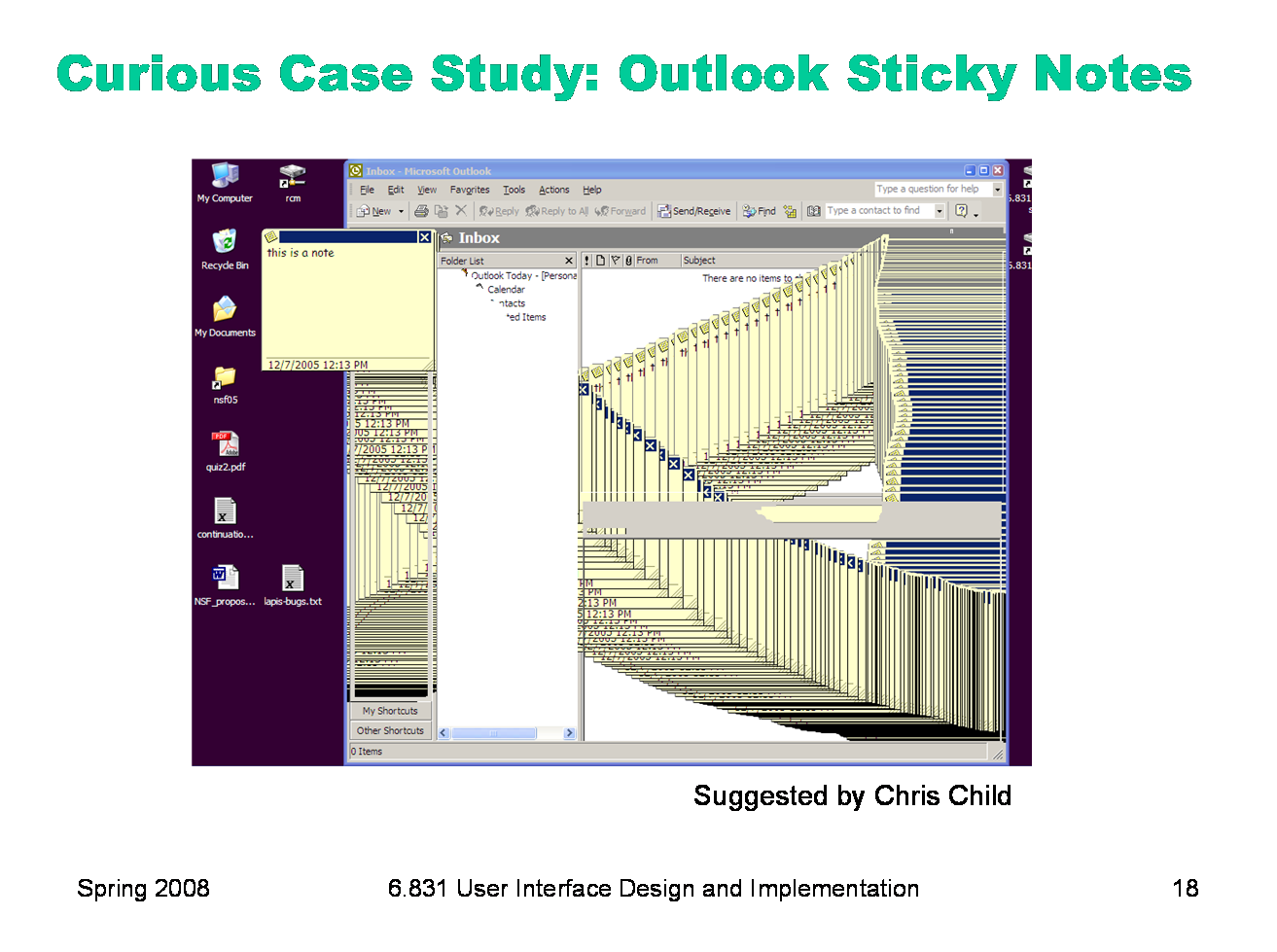
Try this in Outlook 2007 (or Outlook 2003, but doesn’t work in Outlook Express). Create a sticky note (File/New/Note). Type some text into the note, and move the note to a different place on the screen. Then press Ctrl-Z to undo. It undoes not only what you typed, but also the position of the note — and the note animates through all the different positions you moved it to on the screen. Recall the important dimensions of an undo model: - what stream of actions is undone? Only the actions that affected this sticky note; other sticky notes, and other Outlook windows, aren’t affected. - how is the stream divided into units? It turns out that the entire stream of actions since the note was created is a single unit — everything gets undone when you press Ctrl-Z once. - what state is actually restored? everything about the note — its position, its size, even its color. - how far back can you undo? As far as the creation of the note — unless you switch to another window. Switching away from the note clears the note’s undo history, so further undo is impossible. What else is wrong here? As the screenshot shows, the animation wasn’t even done properly — instead of animating using automatic redraw, Outlook paints the moving note directly on the screen, leaving a smear behind it. Notice that the smear is visible in some parts of the Outlook window, but not in others. Why do you think that is?
|
|
The upshot of all these questions is that it’s very hard for users to predict what Undo will do. Faced with this unpredictability, a common strategy is to press Undo until you see the effect you want to reverse actually go away, or until you realize it’s gone too far without solving the problem (i.e., it’s reversed an older, still-desired effect). So visibility of Undo’s effects is a critical part of making it usable. Whenever Undo undoes a command, it should make sure that the effects of that have a visible change on the screen. If the user has changed the viewpoint (e.g. scrolling) since doing the command that is now being undone, the viewpoint should be changed back, so that it’s easy to see what was reversed. The unit actions should correspond to chunks of the user’s interaction: whole typed words (or strings), complete dialogs, user-defined macros. Undo itself should be reversible, so that if you overshoot, you can come back. That’s what the Redo command is for. Another way to reverse an Undo is to manually issue the undone command again; a good undo mechanism should set up the conditions for this as well. For example, suppose you select a range of text and Delete it, and then Undo that deletion. The editor should not only restore the text, but also restore the selection highlight, so that you can immediately press Delete to delete the same text again. For consistency, reserve the Undo command for model changes. You can use other commands for view changes. Keep in mind that you don’t necessarily need a command named “Undo” to support reversibility. There are other commands that move through other action streams (Back), and physical manipulations (like scrollbar dragging) support direct reversibility. Users may not even think of reaching for Undo if the rest of your interface makes it easy to reverse undesired changes. Undo is a form of backward error recovery, which fixes errors by going back in time. A more natural way of thinking is forward error recovery — using other commands to reverse the change. For example, to undo a Bold command by forward error recovery, you select the text again and toggle Bold off. If your interface supports forward error recovery as much as possible, then warts in the Undo model won’t hurt as much. |
|
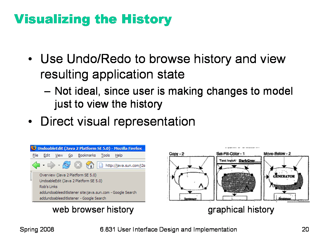
The biggest usability problem with Undo is lack of visibility — the user can’t directly see the history that they’re browsing through. That’s what makes it harder to learn and understand the model behind Undo. In practice, most applications only visualize the undo history implicitly — i.e., the user can press Undo and Redo to browse back and forth through the history, viewing the resulting states of the entire application or document. That’s hardly ideal. Some applications use direct visualizations of history to good effect. For example, a web browser displays the history of pages visited (here, the Back button is acting as an undo command for hyperlink browsing). The browser history is concise, has user-sensible labels (page titles, not URLs), and enables direct selection (clicking on a history item to jump to it). One research system, a drawing editor, experimented with graphical history — cartoon-strip visualizations of the effects of each command in the history on the actual document, zoomed in tightly to show just enough context (image from Kurlander & Feiner, “A history-based macro by example system”, UIST ’92). |
|
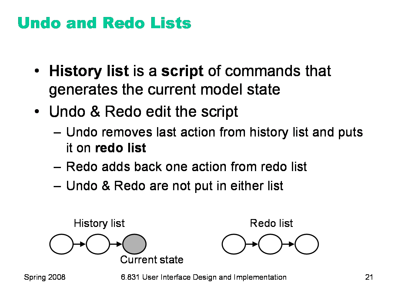
In many applications, the undo history can be formally regarded as a script of commands, with the invariant that the current state of the model is equivalent to the state that would be generated by running the script against the initial model state (e.g., the state of the file on disk). This model explains why applications like Microsoft Office choose to clear the undo history whenever you save the file. In this model, the Undo and Redo commands are not ordinary commands that are added to this script, but rather metacommands that edit the history. Undo removes the last command on the history list (and puts it at the start of a redo list). Redo puts the first command on the redo list back on the history list. In order to preserve the invariant, the current state of the model is changed likewise whenever the history list is changed. But the Undo and Redo commands issued by the user are not added to the history. |
|
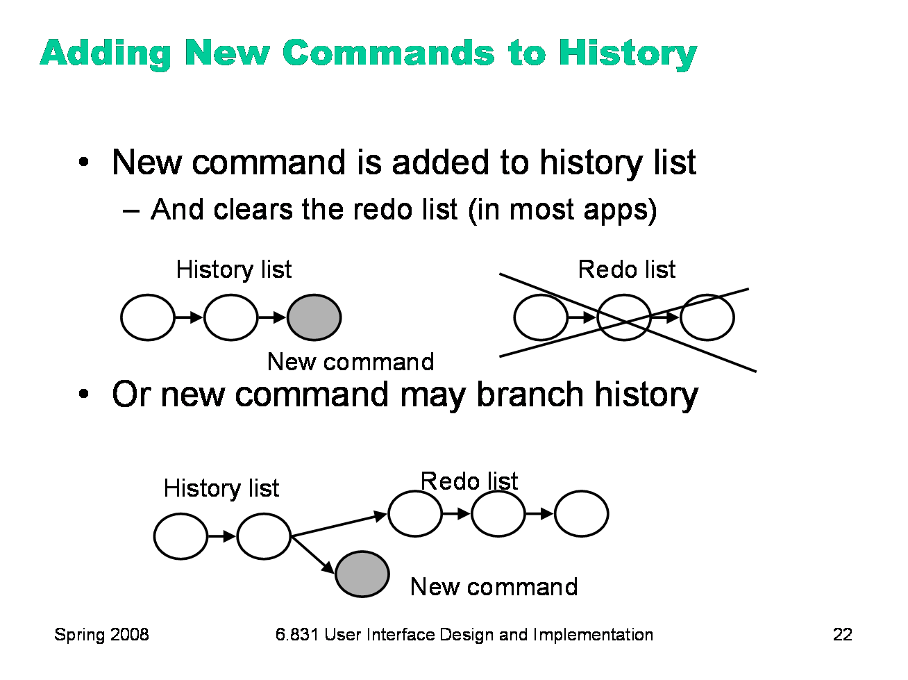
Invoking a new command usually clears the redo list. This is the safest approach, because the new command may destroy preconditions of commands sitting on the redo list. (For example, what if a command on the redo list changed the color of a certain circle, but the new command deleted that circle? What would redoing that command mean?) Some research systems have experimented with a history tree, in which invoking a new command creates a new branch, keeping the redo list as the other branch. If the user ever backs up to that branch again in the history, the Redo command would offer a choice going forward again. Some research web browsers have adopted a similar perspective on the page history, building a tree of browsing. In practice, these models are too complicated to understand without history visualization, and even then it’s not clear that they’re valuable enough to be worth the complication.
|
|
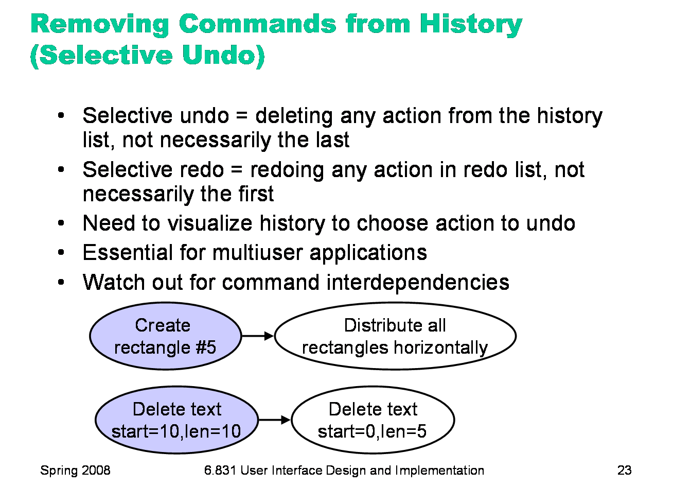
Another advanced feature is selective undo, which allows the user to reach back and remove the effect of any action in the history, not necessarily the last action (or conversely, reach forward to any action in the redo list and apply it). Making selective undo available to the user requires some visualization of the history; otherwise users won’t be able to indicate which action should be selectively undone. But multiuser applications (where users can make simultaneous changes to the same model) basically have to implement selective undo in order to support a local, per-user undo model. The application must reach back and undo this user’s last action, regardless of how many changes were made by other users in the interim. The tricky part of implementing selective undo is dependencies between commands in the history. Some examples are shown here. What happens if you selectively undo the create-rectangle action? Presumably rectangle #5 disappears -- but later in the history, the rectangle participated in an alignment operation. Do the other rectangles stay where they are, or do they behave as if the original rectangle never existed, redistributing themselves equally again? A script undo would dictate the latter, because of the invariant that the current state should match the result of running all the commands in the history. But a simpler model of selective undo would simply delete the rectangle (Berlage, “A Selective Undo Mechanism for Graphical User Interfaces Based on Command Objects”, TOCHI, v1 n3, September 1994), or perhaps forbid the create-rectangle to be selectively undone. Similarly, the representations used for commands may interfere with selective undo. Suppose the actions on a text editor’s undo history are described by absolute offsets (from the start of the text). Then if you selectively undo an old action, it may corrupt the coordinates of all subsequent actions in the history. This problem can be solved by choosing a different representation (e.g., invisible markers in the text), or by implementing commutativity rules which specify how to fix up the subsequent actions in the history. |
|
|